Bug Report
-
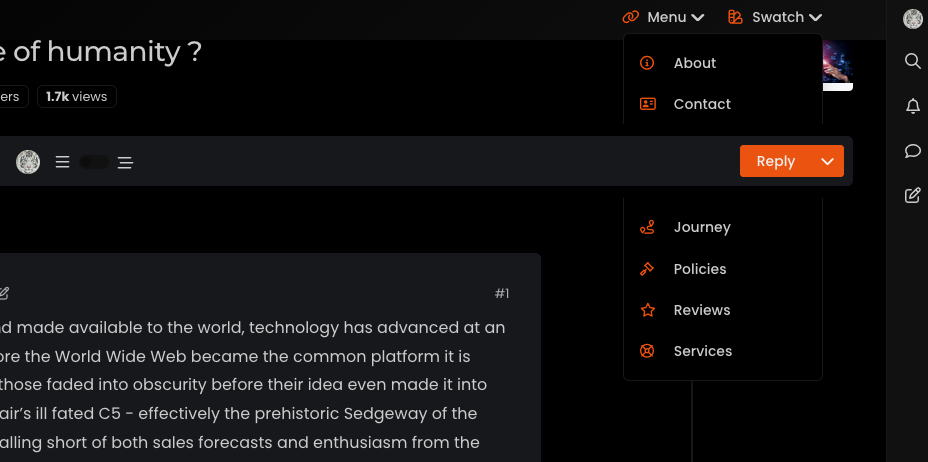
Hi @phenomlab , sticky topic toolbar is preventing “menu” and “swatch” panels… FYI…
-
Ok, I think finally fixed this by altering some of the
heightattributes of child elements, and setting the top navbar asz-index: 500Mark – Founder, Phenomlab Ltd
Executive IT & Security Leadership
Phenomlab Ltd -
Hi @phenomlab , sticky topic toolbar is preventing “menu” and “swatch” panels… FYI…
@crazycells ugh. Thanks. I thought I had fixed that. So you get the same issue if you reload the site and choose a different swatch?
Edit - wait. That looks like missing CSS from the threaded function. I’ll need to check that.
-
Hi @phenomlab , sticky topic toolbar is preventing “menu” and “swatch” panels… FYI…
@crazycells This should be fixed now.
EDIT: Actually, not fixed. This issue is in fact caused by a bug in Boostrap itself
It was reported in 2020, but still an issue in 2023 surprisingly
https://github.com/twbs/bootstrap/issues/31747
Based on this, I have some choices to make - bear with me.
Mark – Founder, Phenomlab Ltd
Executive IT & Security Leadership
Phenomlab Ltd -
 undefined phenomlab marked this topic as a question on
-
undefined phenomlab has marked this topic as solved on
-
@crazycells This should be fixed now.
EDIT: Actually, not fixed. This issue is in fact caused by a bug in Boostrap itself
It was reported in 2020, but still an issue in 2023 surprisingly
https://github.com/twbs/bootstrap/issues/31747
Based on this, I have some choices to make - bear with me.
@phenomlab Mark as you know i m using your CSS and JS codes also
") pls let me know changes on it?
pls let me know changes on it? -
@phenomlab Mark as you know i m using your CSS and JS codes also
pls let me know changes on it? @cagatay You aren’t using the most current CSS so this won’t affect you.
-
undefined phenomlab has marked this topic as unsolved on
-
Ok, I think finally fixed this by altering some of the
heightattributes of child elements, and setting the top navbar asz-index: 500Mark – Founder, Phenomlab Ltd
Executive IT & Security Leadership
Phenomlab Ltd -
undefined phenomlab has marked this topic as solved on
-
Ok, I think finally fixed this by altering some of the
heightattributes of child elements, and setting the top navbar asz-index: 500@phenomlab yes , it is fixed now

-
undefined phenomlab forked this topic on
-
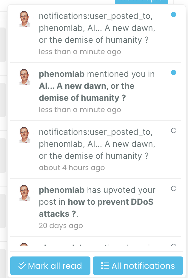
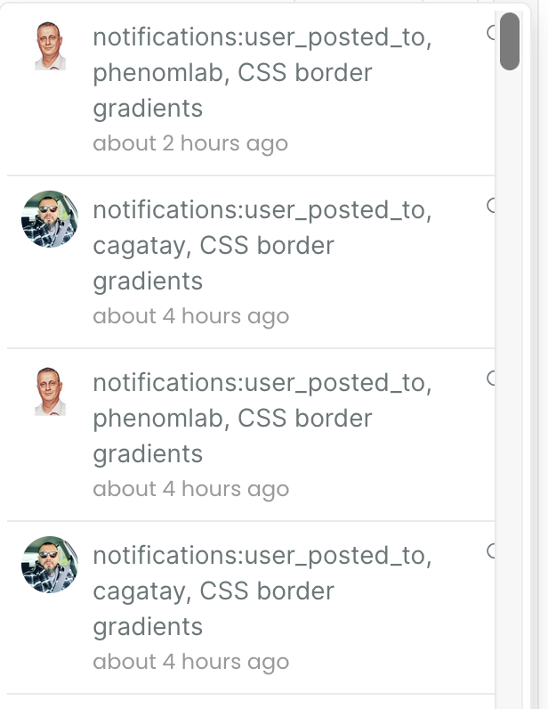
I think there is a problem related to notifications:
-
I think there is a problem related to notifications:
@crazycells that’s strange. I can’t see that on my end.
Mark – Founder, Phenomlab Ltd
Executive IT & Security Leadership
Phenomlab Ltd -
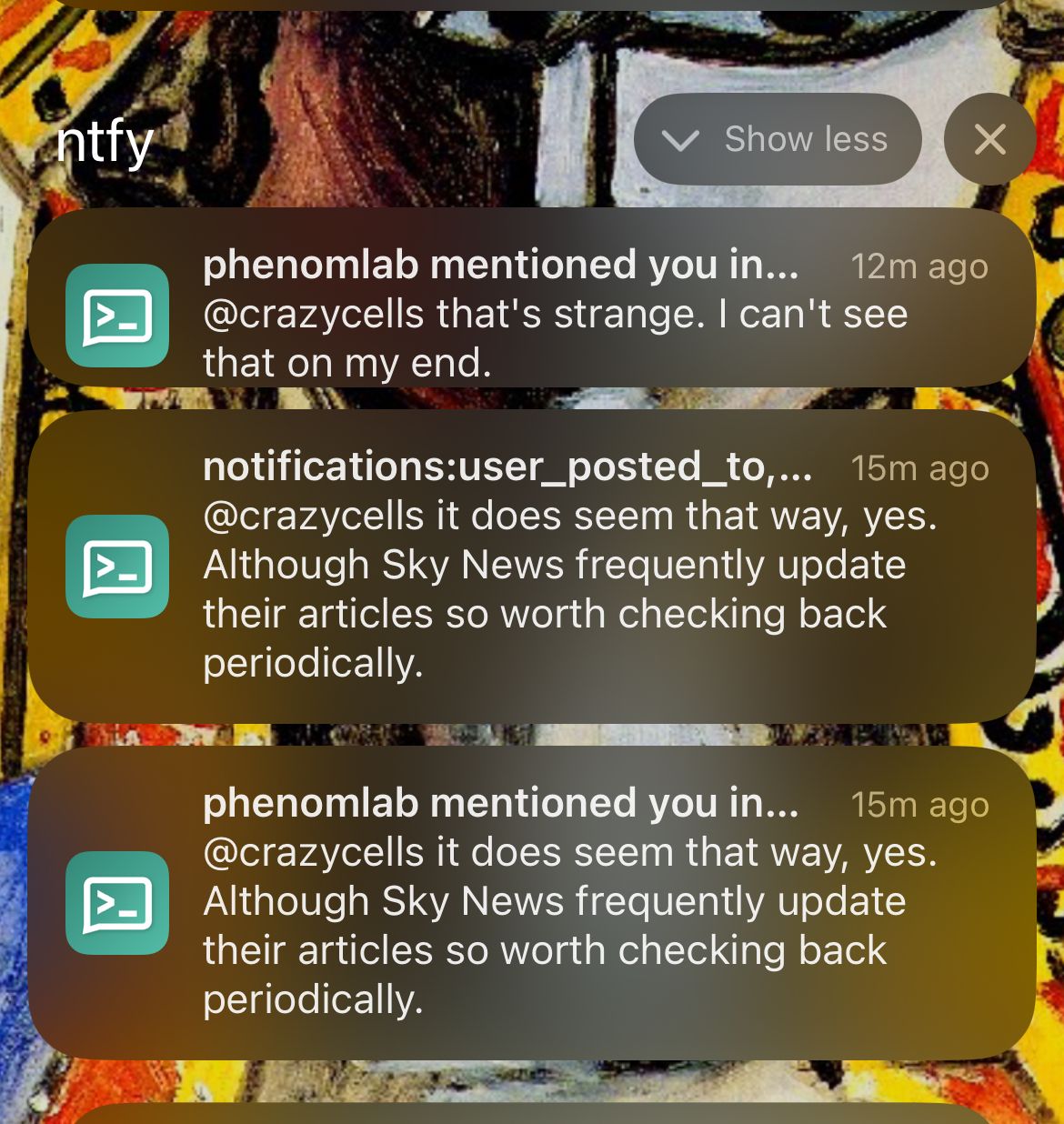
@crazycells that’s strange. I can’t see that on my end.
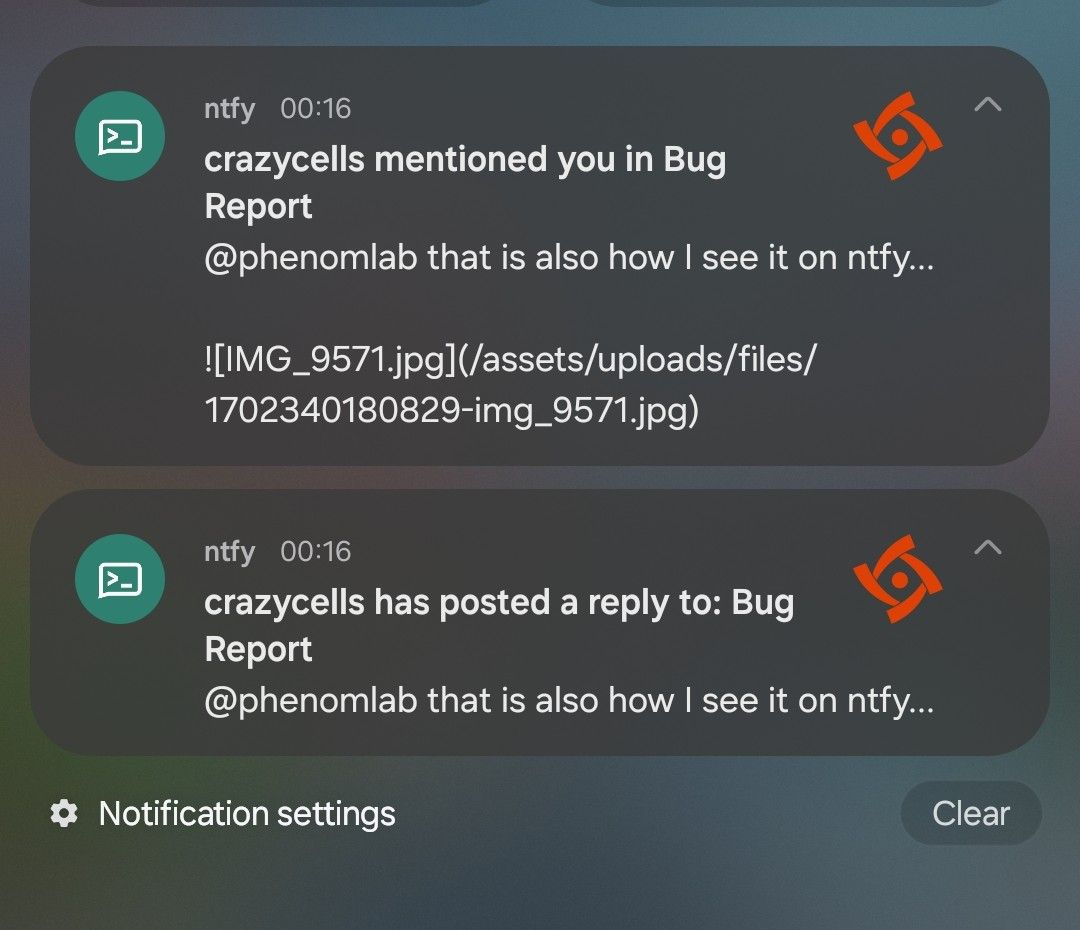
@phenomlab that is also how I see it on ntfy…
-
@phenomlab that is also how I see it on ntfy…
Mark – Founder, Phenomlab Ltd
Executive IT & Security Leadership
Phenomlab Ltd -
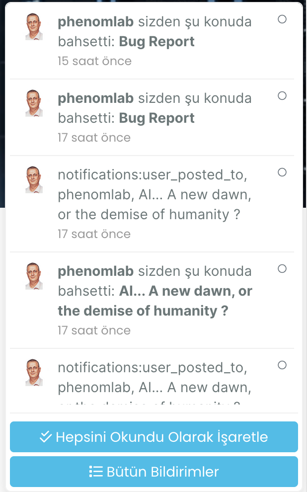
@phenomlab I see similar problem with Turkish translation as well… I am reporting this to @barisusakli
-
@phenomlab I see similar problem with Turkish translation as well… I am reporting this to @barisusakli
hi @phenomlab , I found this:
https://github.com/NodeBB/NodeBB/commit/844cb91beb3f2335e724770b29553081454b1297
so, recently
_is changed to-in notifications. are you using the last version of nodebb? -
hi @phenomlab , I found this:
https://github.com/NodeBB/NodeBB/commit/844cb91beb3f2335e724770b29553081454b1297
so, recently
_is changed to-in notifications. are you using the last version of nodebb?@crazycells yes, as far as I know
Mark – Founder, Phenomlab Ltd
Executive IT & Security Leadership
Phenomlab Ltd -
@crazycells yes, as far as I know
@phenomlab I guess this will be fixed in 3.6… so, we should wait…
-
@phenomlab I guess this will be fixed in 3.6… so, we should wait…
@crazycells yes, I think so. There are a number of other features in that release too such as extended social sharing.
-
hi @phenomlab , this notification problem continues for me… I believe those “user_posted_to” should be changed to “user-posted-to” in the codes…
-
do you use “nodebb-plugin-category-notifications” plugin?
-
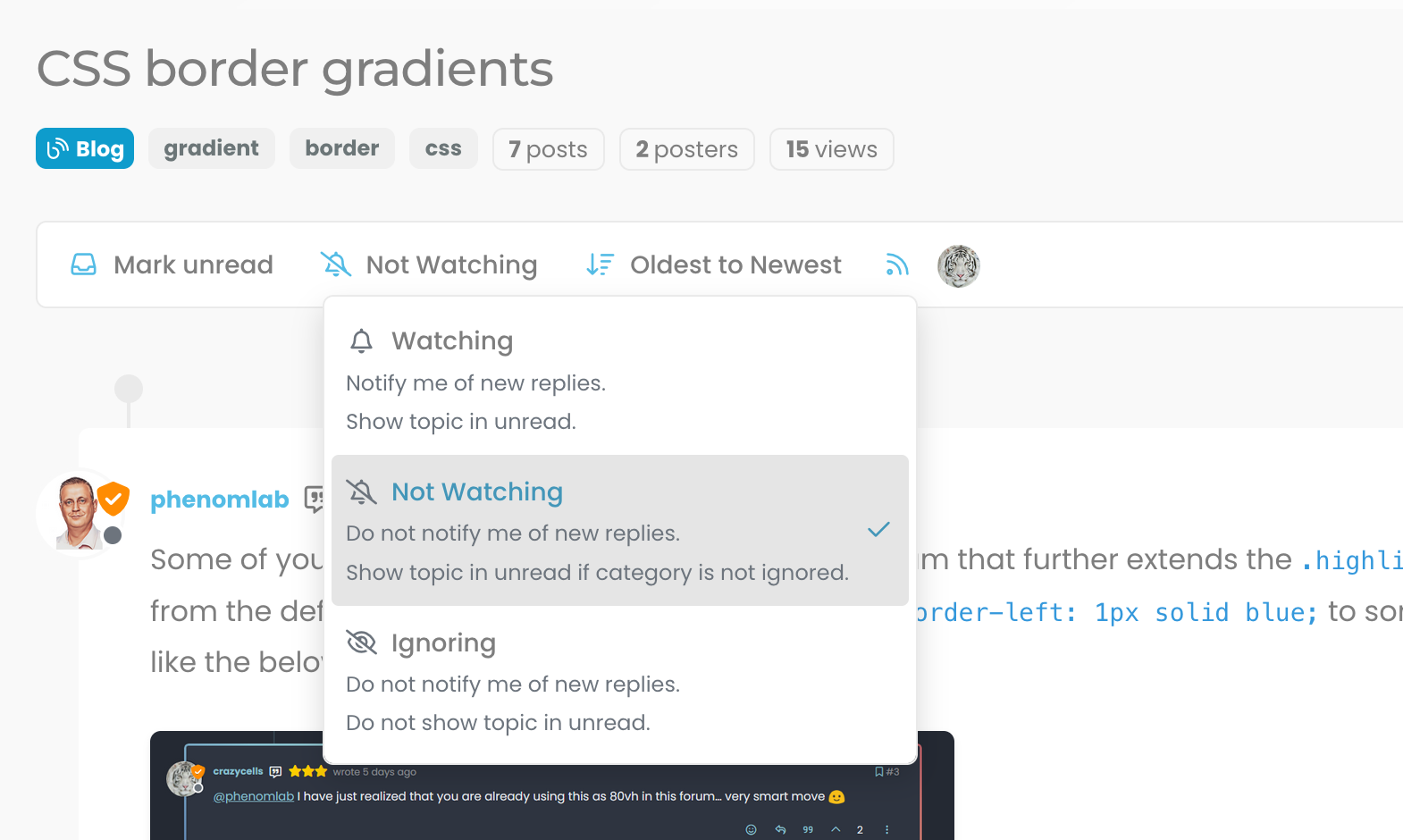
Additionally, it looks like I am not watching this topic, but I get notification… strange… Does category-notification plugin cause this?
-
do you use “nodebb-plugin-category-notifications” plugin?
@crazycells said in Bug Report:
do you use “nodebb-plugin-category-notifications” plugin?
Yes, but am going to remove it. I think that’s the case because it’s out of date.

Hello! It looks like you're interested in this conversation, but you don't have an account yet.
Getting fed up of having to scroll through the same posts each visit? When you register for an account, you'll always come back to exactly where you were before, and choose to be notified of new replies (either via email, or push notification). You'll also be able to save bookmarks and upvote posts to show your appreciation to other community members.
With your input, this post could be even better 💗
Register LoginDid this solution help you?
Related Topics
-
-
Test of youtube embeds
Solved Configure -
-
Block Domain
Solved Let's Build It -
-
-
Nodebb Hashtag plugin
Solved General -
Customising NodeBB
Locked Customisation