-
-
@downpw thanks. This fix has caused some other bugs too, so need to fix those also
-
 undefined phenomlab moved this topic from Announcements on
-
@DownPW those bugs should all be fixed now hopefully

-
As an interesting side note, I’ve noticed that exactly the same bug exists in the NodeBB community forums. Essentially, it’s caused by the sticky header which doesn’t seem to play very well when you are using custom html to render additional content as I do here.
The fix essentially is to make the header (bar)
fixedrather thanstickybut this does mean you need compensating CSS to resolve the mobile layout issues that this unfortunately creates. -
Thanks to @crazycells for spotting another bug - this has also been fixed.
-
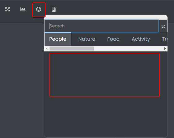
@downpw Seems like this has been broken for a while ! Not sure why this is, as I never really use it - I type the emojis directly

-
@downpw Seems like this has been broken for a while ! Not sure why this is, as I never really use it - I type the emojis directly

@phenomlab said in FIXED: Annoying cosmetic bug on mobile view:
Seems like this has been broken for a while ! Not sure why this is, as I never really use it - I type the emojis directly
No problem.
Maybe that ?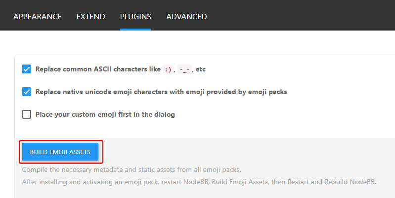
-
@phenomlab said in FIXED: Annoying cosmetic bug on mobile view:
Seems like this has been broken for a while ! Not sure why this is, as I never really use it - I type the emojis directly
No problem.
Maybe that ?
@downpw I tried that earlier and rebuilt the assets. Didn’t make any difference.
-
@phenomlab said in FIXED: Annoying cosmetic bug on mobile view:
Seems like this has been broken for a while ! Not sure why this is, as I never really use it - I type the emojis directly
No problem.
Maybe that ?
@downpw fixed
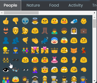
Landed up being caused by some rogue CSS
 from this block
.tab-content {
    max-height: 0;
    padding: 0 2em;
    color: #898989;
    background: #eeeeee;
    transition: all 0.35s;
    margin-top: -5px;
}
Not sure why I’m using that, but clearly it needs to be more specific

-
And now, after all this time
 I finally discovered that the CSS I previously referenced was for something else - and used the same CSS name, so I’ve had to reinstate this block
.tab-content {
    max-height: 0;
    padding: 0 2em;
    color: #898989;
    background: #eeeeee;
    transition: all 0.35s;
    margin-top: -5px;
}
And, add this below to make it more specific.
.emoji-tabs .tab-content {
    height: 100%;
    max-height: 100%;
    padding: 0;
    margin: 0;
}
Hello! It looks like you're interested in this conversation, but you don't have an account yet.
Getting fed up of having to scroll through the same posts each visit? When you register for an account, you'll always come back to exactly where you were before, and choose to be notified of new replies (either via email, or push notification). You'll also be able to save bookmarks and upvote posts to show your appreciation to other community members.
With your input, this post could be even better 💗
Register Login
 :
: