NodeBB customisation
-
I wonder if the slider can be customised with CSS?
Looking to add colour thoughout here and there without overdoing it of course.
@jac Can can customise anything with CSS…
-
@phenomlab very happy to hear this


-
@phenomlab very happy to hear this


@jac said in NodeBB customisation:
@phenomlab very happy to hear this


Yes, but the key here is to not over egg…
-
@jac said in NodeBB customisation:
@phenomlab very happy to hear this


Yes, but the key here is to not over egg…
@phenomlab Absolutely, I’m just looking to do subtle changes which I think you have achieved so far, can’t thank you enough for the help given via Sudonix

 .
. -
@phenomlab Absolutely, I’m just looking to do subtle changes which I think you have achieved so far, can’t thank you enough for the help given via Sudonix

 .
.Is there any way to chance the colour of these at all?
-
@jac I was thinking the boxes to have a blue background with white icons, and for the reply arrow to be a yellow background colour with a white or blue arrow icon.
-
@jac yes, but the css classes used by these are also used elsewhere which may result in undesirable behavior elsewhere.
-
@jac yes, but the css classes used by these are also used elsewhere which may result in undesirable behavior elsewhere.
@phenomlab hmm! I see, it’s a tough one then!?
-
@phenomlab hmm! I see, it’s a tough one then!?
@jac just looking at other little bits to improve then…
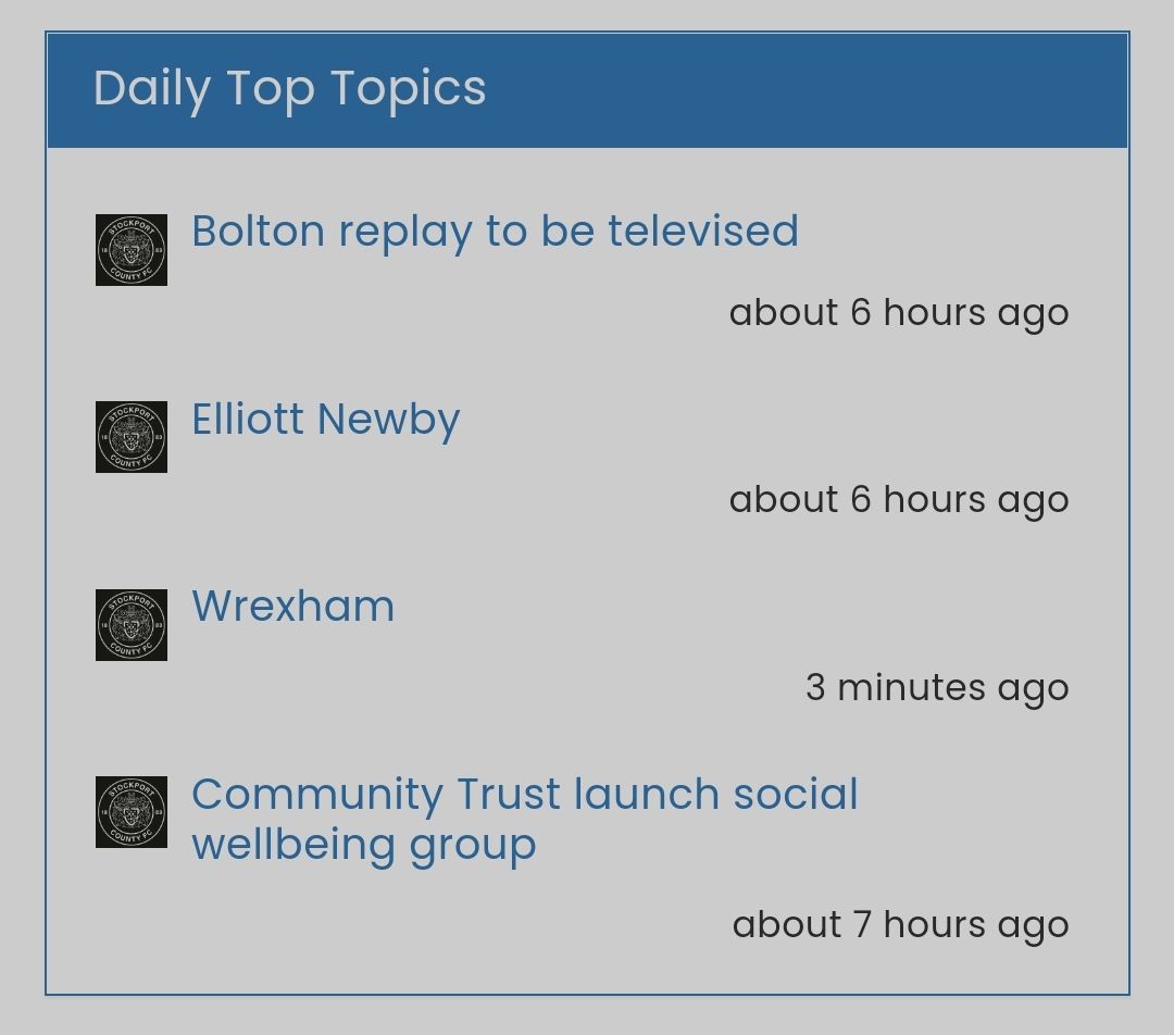
What about doing the reverse of the ‘forum stats’ widget?
Many thanks as always.
-
@jac just looking at other little bits to improve then…
What about doing the reverse of the ‘forum stats’ widget?
Many thanks as always.
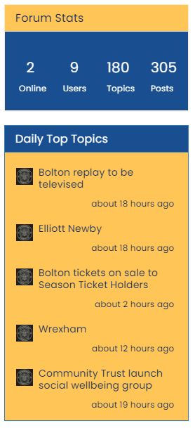
@jac Like this ?
Revised and simplified CSS
.custom { background: #ffc557 !important; color: #00205c!important } .custom a { color: #00205c !important; } .custom2 { background: #194F90 !important; color: #ffffff; } .custom2 small { color: #ffffff; font-size: 40%; } -
@jac Like this ?
Revised and simplified CSS
.custom { background: #ffc557 !important; color: #00205c!important } .custom a { color: #00205c !important; } .custom2 { background: #194F90 !important; color: #ffffff; } .custom2 small { color: #ffffff; font-size: 40%; }@phenomlab brilliant mate, thanks very much for that
 .
. -
@phenomlab brilliant mate, thanks very much for that
 .
.I wonder if it’s possible to see a preview of what the post titles (header) looks like without the yellow and with blue font?
-
I wonder if it’s possible to see a preview of what the post titles (header) looks like without the yellow and with blue font?
@jac said in NodeBB customisation:
I wonder if it’s possible to see a preview of what the post titles (header) looks like without the yellow and with blue font?
Either that or the blue background and white writing?
-
@jac said in NodeBB customisation:
I wonder if it’s possible to see a preview of what the post titles (header) looks like without the yellow and with blue font?
Either that or the blue background and white writing?
@jac I know we thought it would clash with the header but it’d certainly be interesting to see how it looks.
-
@jac I know we thought it would clash with the header but it’d certainly be interesting to see how it looks.
-
@phenomlab said in NodeBB customisation:
@jac Here you go
Blue font
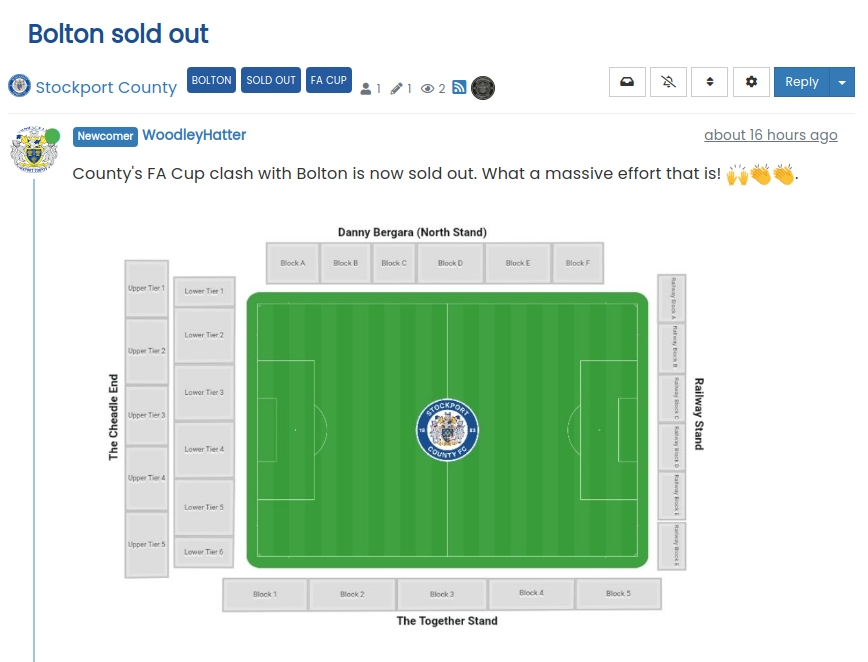
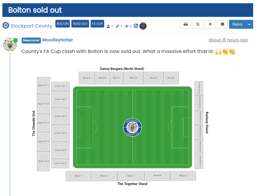
Blue background, writing font
The blue with white coloured font does look good!
-
@phenomlab said in NodeBB customisation:
Blue background, writing font
Definitely matches the team’s first colours better anyway
 how do I override the yellow Mark?
 -
@phenomlab said in NodeBB customisation:
Blue background, writing font
Definitely matches the team’s first colours better anyway
 how do I override the yellow Mark?
@jac It’s done mate.
-
-
Hi Mark,
How do get an image to show at the top of the the page? I think I discussed this in a previous thread or possibly this one, to have like Stockport fans at the top of the page or a big banner that reflects what the forum is about.
Hello! It looks like you're interested in this conversation, but you don't have an account yet.
Getting fed up of having to scroll through the same posts each visit? When you register for an account, you'll always come back to exactly where you were before, and choose to be notified of new replies (ether email, or push notification). You'll also be able to save bookmarks, use reactions, and upvote to show your appreciation to other community members.
With your input, this post could be even better 💗
RegisterLog in
