Reputation system update
-
Technically, how does this system work?
Do you use a specific plugin or is it homemade?
-
Technically, how does this system work?
Do you use a specific plugin or is it homemade?
-
hmm ok but it’s not this plugin who add this status or other

-
@downpw sorry ! This one
-
ha yes it’s not the same things

I have the first installed on server prod ^^
-
@downpw my fault.
-
No problem @phenomlab

I see you have the badge at the right of the name. It’s not the placement by default (left) of the plugin.
How do you do that? By CSS ?
I see other things like this :

I’m interested for this too.


-
No problem @phenomlab

I see you have the badge at the right of the name. It’s not the placement by default (left) of the plugin.
How do you do that? By CSS ?
I see other things like this :

I’m interested for this too.


@downpw said in Reputation system update:
I see you have the badge at the right of the name. It’s not the placement by default (left) of the plugin.
How do you do that? By CSS ?Yes. Try this
.user-level-topic { float: right; }@downpw said in Reputation system update:
I’m interested for this too.
That’s a custom CSS block I wrote
.topic-owner-post [itemprop="author"]:after { content: "Author"; background-image: linear-gradient(to right, #f75, #feaa4a); border-radius: 4px; color: #fff; margin-left: 10px; margin-right: 0px; vertical-align: middle; font-size: 10px; padding: 2px 10px 3px 10px; } -
Great. thanks @phenomlab
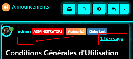
I’m trying to have the same button height and the whole block to be aligned but it’s difficult.
– I can’t get all anything perfect on pc and smarrtphone. I cheated with the height/padding/margin/top values but the result is approximate :

–On smartphone, the time ago class is not aligned because so many buttons title.
Maybe moved the Author button or timeago class on the topic header? What would be your opinion on that?
-
I think I will not use your author button because I use Badge group and 3 badge it’s too much to display…
But your idea is so cool ^^
Hello! It looks like you're interested in this conversation, but you don't have an account yet.
Getting fed up of having to scroll through the same posts each visit? When you register for an account, you'll always come back to exactly where you were before, and choose to be notified of new replies (either via email, or push notification). You'll also be able to save bookmarks and upvote posts to show your appreciation to other community members.
With your input, this post could be even better 💗
Register LoginRelated Topics
-
-
-
-
Rank icons
Moved Resources -
-
-
-


