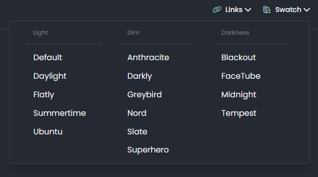
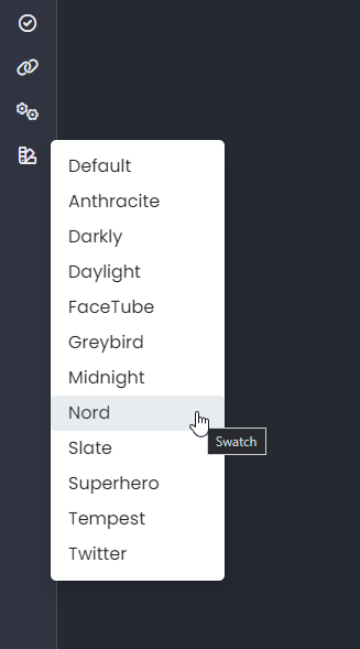
IMPORTANT: Theme / Swatch changes
-
Less really is more - @crazycells , I have to agree

See the post below for more detail around the decision
https://sudonix.org/topic/517/theme-retirement/2
I’ve spent a LOT of time completely redesigning the theme interface so that it matches modern standards, and colours. Based on this, there are several changes under the bonnet which you won’t be able to see or access unless you clear your cache.
I will make every effort to automate as much as possible on this platform, but of course, I have zero control over your browser cache, so you will need to that manually.
What’s changed?
I’ve made the entire forum “Material Design” themed. Whilst I’m not necessarily a Google fan, I do very much like the way the UI is put together, and it’s a familiar concept that just about everyone with a mobile phone and internet connection has encountered at some point (probably every day actually)
Did you dump Bootstrap?
Ha - no. Bootstrap is a major component of this platform, and it would look pretty odd without it. In a similar vein,
jQueryis also very much still present, and required for the custom functions I’ve written to run.How many themes are there now?
There are now 3 - down from 15. These are now
light,dim, anddark. Not very imaginative, but simple solutions are always best.What do they look like?
Below are examples
Light
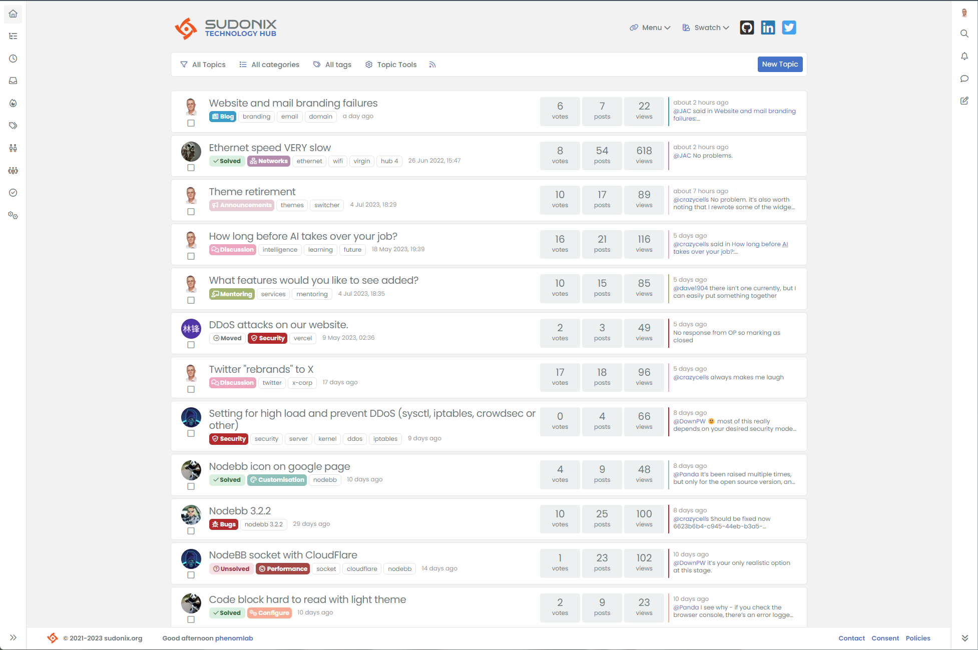
Dim
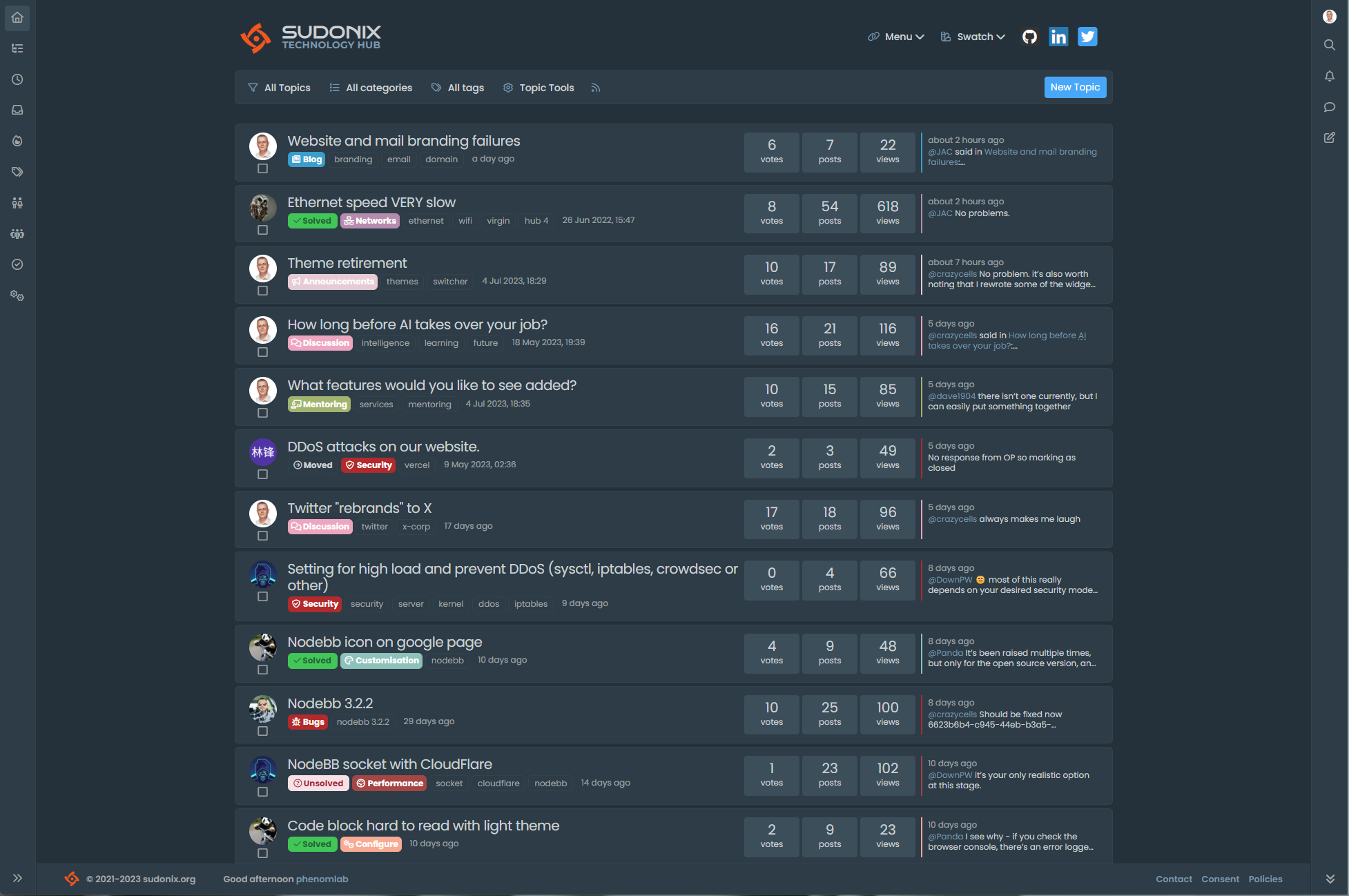
Dark
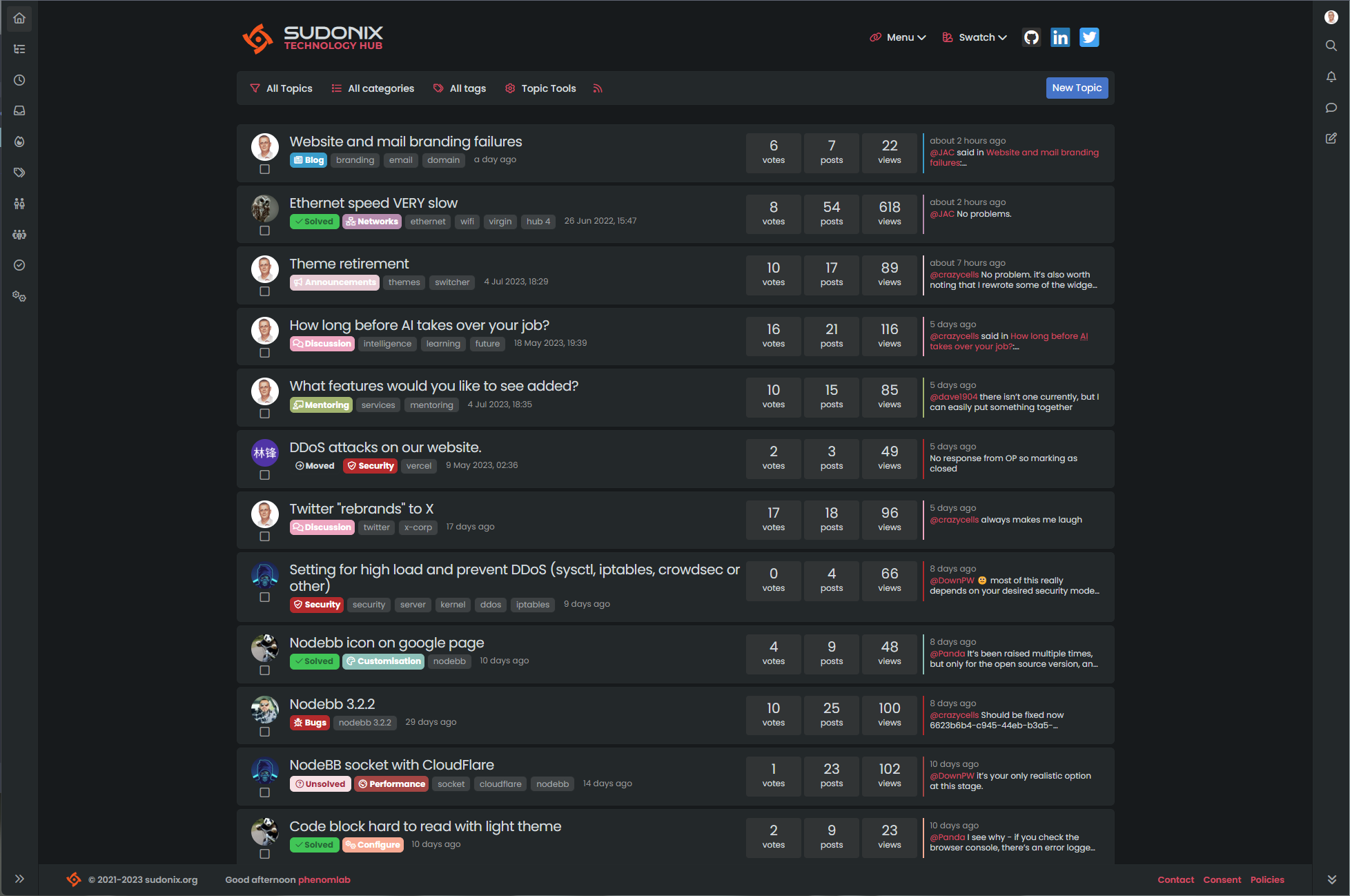
Can I still use “x” theme?
You can, but these are not directly compatible with the new theming system, and therefore, you will get very undesirable results unless you clear your cache and choose one of the new selections. I also will not be back porting these themes to make them work - they are now considered legacy
Any new features?
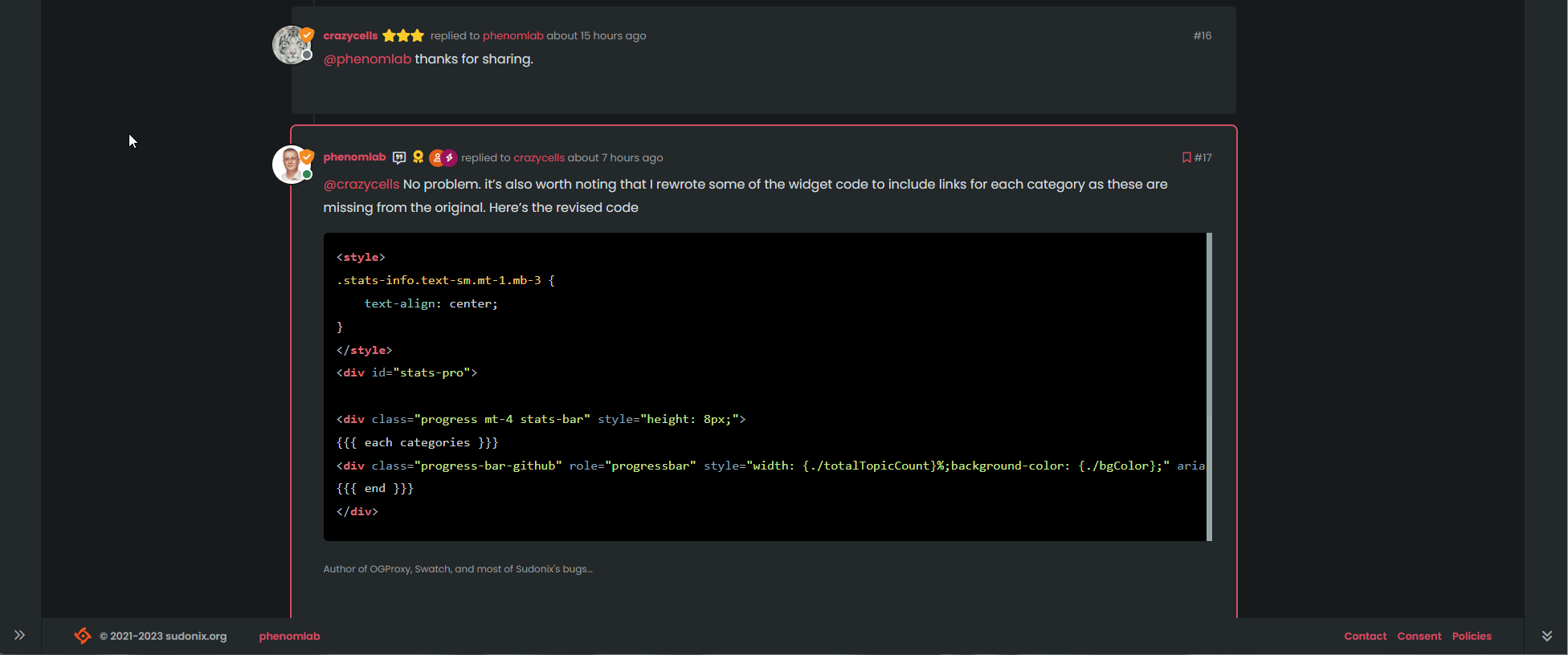
Kind of. I added components as I went, meaning that there are some obvious changes, and some you’ll never notice. The new themes make use of accents such as the below, and future updates (coming soon) will provide enhancements in this same area
Did you design the themes yourself?
Yes - and no. MD is a very mature standard, and therefore, there are a good number of colours natively available. However, not all that glitters is gold, so some modifications were necessary to enhance readability etc.
Can you share the resources you used for inspiration?
Of course
 See below
Material Design
Material Design
https://mdbootstrap.com/live/_doc/all-colors.html
GUI Challenges
https://gui-challenges.web.app/color-schemes/dist/
GUI Challenges - Git Demos
https://github.com/argyleink/gui-challenges
There are more - you literally just need to search for them. These are not direct “copies”, but merely for me take inspiration and create something special / sexy / unique (delete as applicable).
Hope you like these new themes. Over the coming weeks (as was always the long term plan), I will be using the Material theme Accents to define category colours so they make sense, and do not look “garish” against the new themes.
Enjoy.
-
good work Mark as always do your best.
-
Mark we should do anything also to get these changes?
-
@cagatay these changes aren’t published anywhere presently, so nothing for you to do.
Hello! It looks like you're interested in this conversation, but you don't have an account yet.
Getting fed up of having to scroll through the same posts each visit? When you register for an account, you'll always come back to exactly where you were before, and choose to be notified of new replies (either via email, or push notification). You'll also be able to save bookmarks and upvote posts to show your appreciation to other community members.
With your input, this post could be even better 💗
Register LoginRelated Topics
-
-
-
-
-
-
-
NodeBB templates
Locked Chitchat -
