Ch..ch..ch..ch..changes!
-
If you’re a Bowie fan, then the title of this post might mean something to you
") If not, sorry - obviously wasted…
If not, sorry - obviously wasted… 
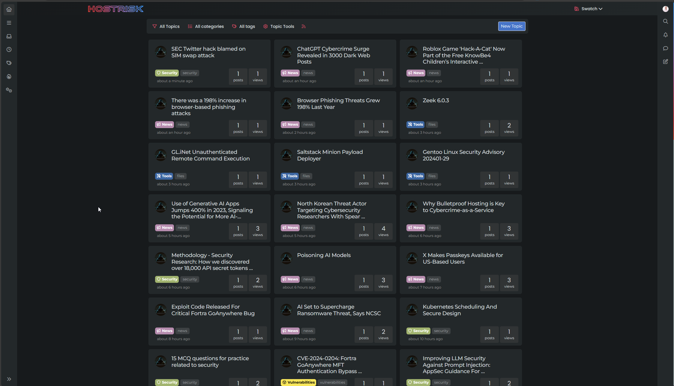
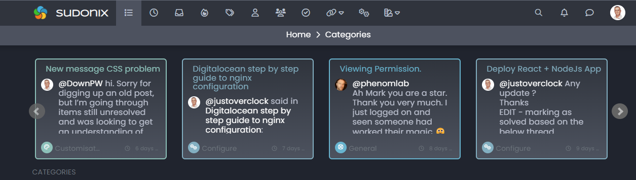
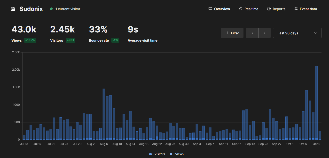
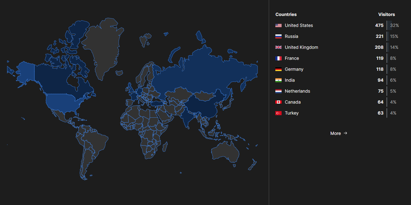
The main point of this post is to advise you of some changes that are happening within the platform. Over time, Sudonix has evolved (in a good way of course) and has attracted readers and new members alike across the world. Whilst the below stats are not in the millions, it does show modest growth which is always assuring given the nature of what is on offer here.
Based on the increasing number of new users, I wanted to improve the overall look of Sudonix and make it more appealing to the eye. Some of you may have already noticed the changes, or, as in the case of @Madchatthew, been hit with some odd-looking effects that mean you have to choose another theme, and then re-select the one you were using before. Thankfully, most of this work has now been completed, but these changes do have an impact on your daily usage as below
-
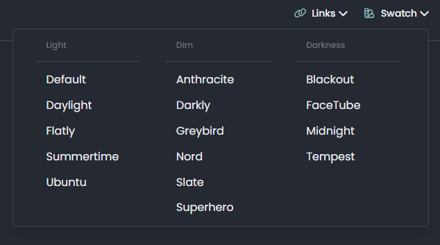
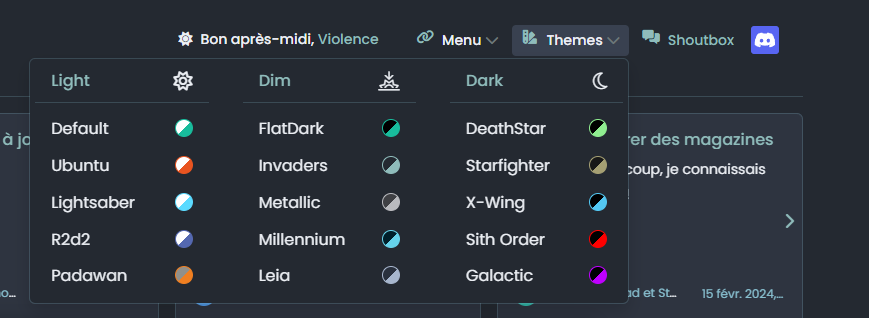
Support for multiple themes is going to be reduced - to the point where there will only be three. Light (Luminate), Dim (Dusk), and Dark (Tenebrous). The real reason for this is that, as @crazycells keeps telling me, “less is more” and I’m becoming a fan of that paradigm. Having a lot of themes also means a lot of maintenance, which is something I’m looking to avoid. If you use Dark Mode on your device, you’ll get issued with Tenebrous. If you use Light Mode (native), then you’ll get issued with Luminate. I am going to be removing the dropdown swatch and replacing this with a simple 3-way toggle (or something like that).
-
Font sizes have been reduced. The point here is that on a mobile device, these are a bit too large for my liking, so they have been scaled back on desktops to 98%, and 95% on mobile devices. The dominant font (Poppins) will remain as it’s a firm favourite and works well on all devices.
-
The look and feel experience has also changed. I’ve adapted something of a “Material” view which is on by default (currently, it cannot be disabled, but I will include this ability if desired as I helped write something similar for @DownPW some time ago). This uses
outlineinstead ofborderwhich is much easier to work with (under the guise of CSS) as it does not increase the element size, but simply adds a “wrapper” around it. Other “soft” changes have made their way into this release, and are subtle in nature, but will certainly improve the overall experience.
There are a ton of other changes, but some of these are either under-the-hood, or subtle enough that they go unnoticed - one such example is a change to
OGProxy(only CSS) that alters the rendering order making it faster, and aligning to what other sites are doing in terms of how the card is presented. There are numerous colour changes too, which typically attract new naming conventions which won’t be available under your session unless you change themes or clear your browser cache.I’m hoping most of this will simply pass most users by - but, do let me know if that is not the case.
-
-
Forgot to mention that I also reduced the intensity of the default font from 400 to 300
-
good job my friends

-
Where did the swatch dropdown go?
Glad you noticed
It’s gone, but not forgotten. It’s been replaced by a single icon you can cycle to get the theme you want (based on Luminate, Dusk, and Tenebrous, or Light, Dusk, and Dark for the uninitiated). On both desktop and mobile, you can find it at the top where the “Swatch” dropdown used to live. .
.Note that when you access the site for the first time, things might look a bit odd. Just tap and cycle the theme icon and you’ll get to where you want.
-
Awesome job with this site. Thank you for creating it and having a presence on here as well.
-
Personally I have a lot of themes, you know that.
LOL
Even if overall I have very few changes to make, your idea is still very interesting and I ask myself questions.
Do you think you’ll share the code for this new theme selector so we can test it ? or are you keeping it as your own code?
In any case, the idea seems very good to me because having just icons is I find less invasive than a selector with menu
cya
PW and WS Spirit alive
-
Personally I have a lot of themes, you know that.
LOL
Even if overall I have very few changes to make, your idea is still very interesting and I ask myself questions.
Do you think you’ll share the code for this new theme selector so we can test it ? or are you keeping it as your own code?
In any case, the idea seems very good to me because having just icons is I find less invasive than a selector with menu
cya
@DownPW said in Ch..ch..ch..ch..changes!:
Do you think you’ll share the code for this new theme selector so we can test it ? or are you keeping it as your own code?
No, the intention is to share it once I have it stable. There’s a couple of bugs I need to fix before release.
Mark – Founder, Phenomlab Ltd
Executive IT & Security Leadership
Phenomlab Ltd -
Hi all. Hope you’re enjoying the changes being made to the platform in terms of overall layout and themes.
If things look a bit odd, reload your browser and select from one of the three themes available.
This, from my perspective is the best Sudonix has looked since it’s inception. I’m still making changes here and there and you’ll see plenty more of these materialising over time.
Several of these changes require new code to be applied in order to generate the best possible experience.
At this point I’m looking for feedback to ensure the changes are received positively.
-
I think your site looks great! You have been doing an amazing job with the changes and I really like the looks and feel of Sudonix.org.
-
@DownPW said in Ch..ch..ch..ch..changes!:
Do you think you’ll share the code for this new theme selector so we can test it ? or are you keeping it as your own code?
No, the intention is to share it once I have it stable. There’s a couple of bugs I need to fix before release.
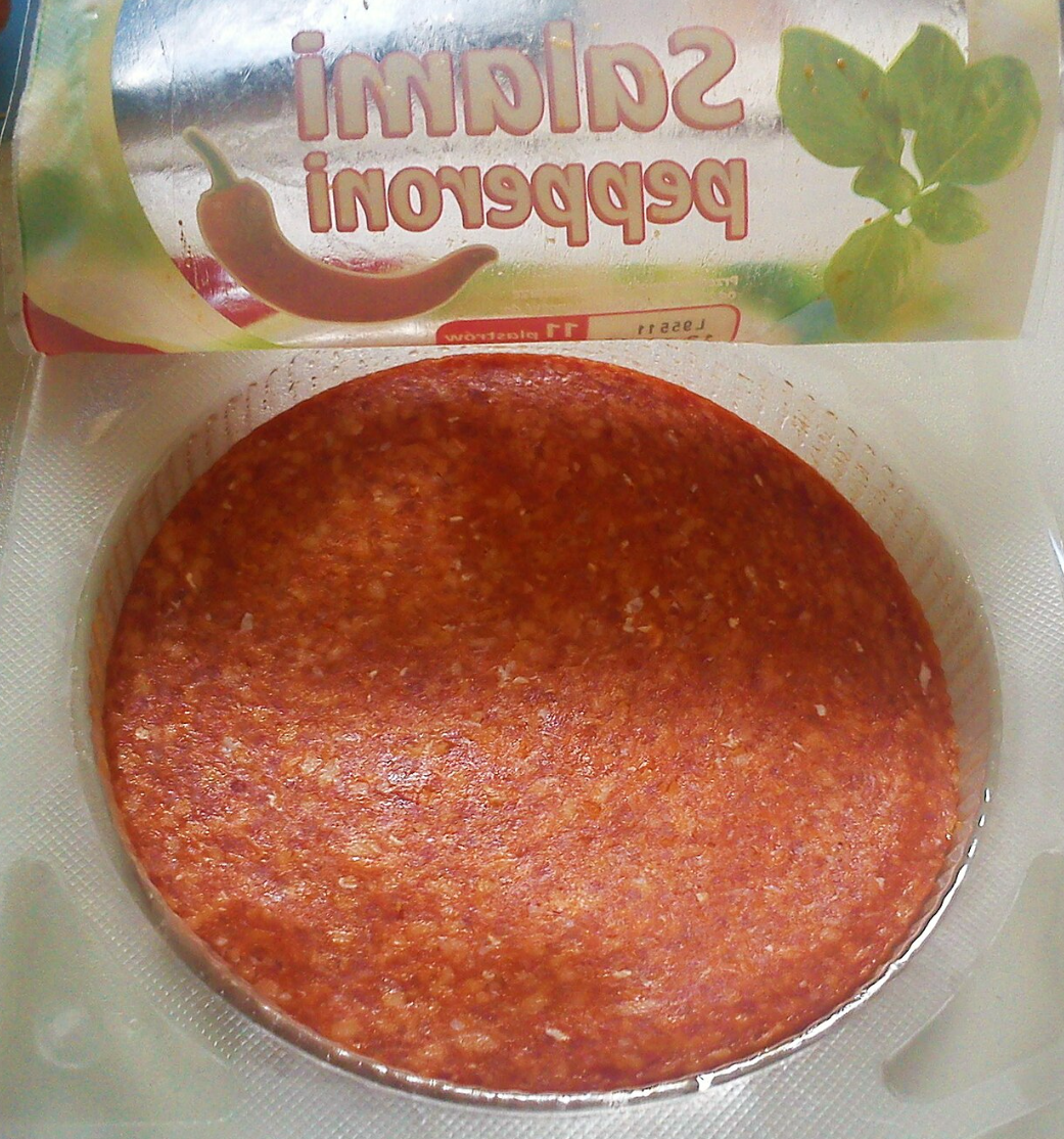
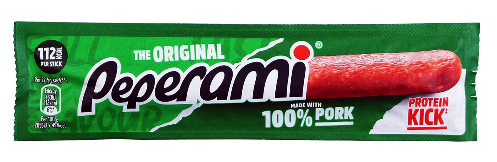
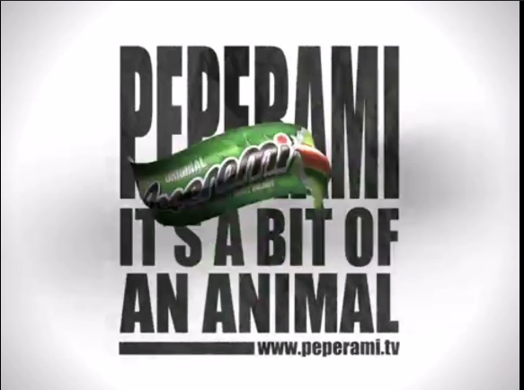
@DownPW here’s v3 of the theme switcher code. Note the category badge changes… This specific version has been codenamed “Peperami” - because it is a bit of an animal in terms of structure, and needs simplifying and cleanup.
But, it’s working…
-
peperonni or Pepperoni lol
PW and WS Spirit alive
-
@DownPW Pepperami
-
Your site is looking great! Every time I log in it looks better and better when I didn’t think it was possible.
-
Your site is looking great! Every time I log in it looks better and better when I didn’t think it was possible.
@Madchatthew said in Ch..ch..ch..ch..changes!:
Your site is looking great! Every time I log in it looks better and better when I didn’t think it was possible.
Couldn’t agree more, very impressive. I think I read on the NodeBB forum a few weeks ago that this forum is a fantastic example of customisation, you can see why

 .
.CSS changes are also good for SEO right!?
 .
. -
@Madchatthew said in Ch..ch..ch..ch..changes!:
Your site is looking great! Every time I log in it looks better and better when I didn’t think it was possible.
Couldn’t agree more, very impressive. I think I read on the NodeBB forum a few weeks ago that this forum is a fantastic example of customisation, you can see why
.CSS changes are also good for SEO right!?
.@JAC said in Ch..ch..ch..ch..changes!:
I think I read on the NodeBB forum a few weeks ago that this forum is a fantastic example of customisation
Yes, I read the same. Felt quite honoured and flattered at the same time.
@JAC said in Ch..ch..ch..ch..changes!:
CSS changes are also good for SEO right!?
Sadly, no. Web crawlers and scrapers are often JS based and read text only, so styles don’t have any bearing.
Mark – Founder, Phenomlab Ltd
Executive IT & Security Leadership
Phenomlab Ltd -
@JAC said in Ch..ch..ch..ch..changes!:
I think I read on the NodeBB forum a few weeks ago that this forum is a fantastic example of customisation
Yes, I read the same. Felt quite honoured and flattered at the same time.
@JAC said in Ch..ch..ch..ch..changes!:
CSS changes are also good for SEO right!?
Sadly, no. Web crawlers and scrapers are often JS based and read text only, so styles don’t have any bearing.
@phenomlab of course, to be recognised is fantastic.
@phenomlab said in Ch..ch..ch..ch..changes!:
Sadly, no. Web crawlers and scrapers are often JS based and read text only, so styles don’t have any bearing.
I’ve read mixed things about this, but no that does make sense, it was something I read a many years back when using Wordpress.
Hello! It looks like you're interested in this conversation, but you don't have an account yet.
Getting fed up of having to scroll through the same posts each visit? When you register for an account, you'll always come back to exactly where you were before, and choose to be notified of new replies (either via email, or push notification). You'll also be able to save bookmarks and upvote posts to show your appreciation to other community members.
With your input, this post could be even better 💗
Register LoginRelated Topics
-
-
-
-
-
-
NodeBB templates
Locked Chitchat -
-