Custom badges
-
@phenomlab which one i should remove?
@cagatay These
.self-post a[href*="/groups/verified"] .group-label { position: absolute !important; right: 51px; top: 44px; } .topic-response-post a[href*="/groups/verified"] .group-label { position: absolute !important; left: 20px; top: 44px; } .topic-response-post i[component="user/status"] { position: absolute; left: -1px; } -
@cagatay These
.self-post a[href*="/groups/verified"] .group-label { position: absolute !important; right: 51px; top: 44px; } .topic-response-post a[href*="/groups/verified"] .group-label { position: absolute !important; left: 20px; top: 44px; } .topic-response-post i[component="user/status"] { position: absolute; left: -1px; }@phenomlab its not work, nothing changed when i deleted those css.
-
@phenomlab its not work, nothing changed when i deleted those css.
@cagatay what isn’t working?
-
@phenomlab there is no changes after deleted css code;

-
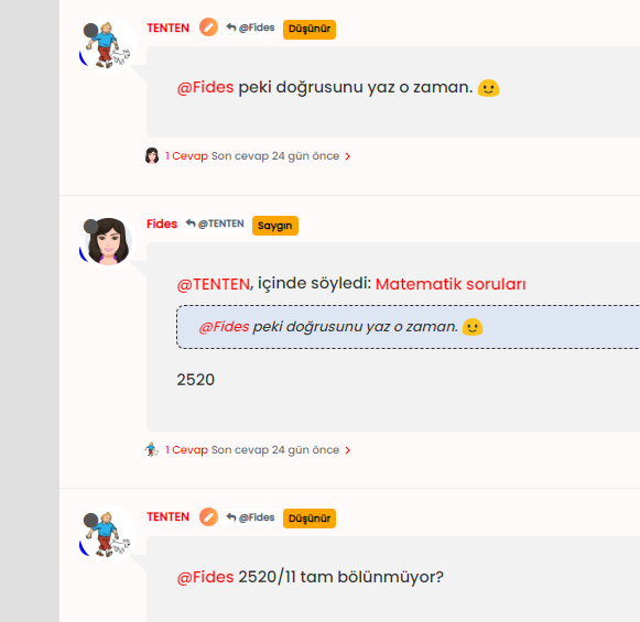
@phenomlab how can i set blue tick like sudonix to my own? coz codes which you are shared, it not look like yours;
-
@phenomlab how can i set blue tick like sudonix to my own? coz codes which you are shared, it not look like yours;

@cagatay It’s documented here

https://sudonix.com/topic/386/custom-badges/18?_=1669196219630 -
 undefined phenomlab referenced this topic on
-
@cagatay It’s documented here

https://sudonix.com/topic/386/custom-badges/18?_=1669196219630@phenomlab i read it and did it what you wrote. but result as below;

blue icon not seen, it hide by avatar

-
@phenomlab i read it and did it what you wrote. but result as below;

blue icon not seen, it hide by avatar

@cagatay Yes, having checked, I see what you mean. I’ve fixed this on your site.
This is the new applied code
.post-header a[href*="/groups/onaylı-üyeler"] {
    margin-right: 3px;
    margin-top: 1px;
    border-radius: 50%;
    line-height: 20px;
    display: inline-block;
    vertical-align: middle;
    text-align: center;
    overflow: hidden;
}
small.label.group-label.inline-block i {
    margin-top: 1px;
    margin-left: 0px;
    vertical-align: middle;
    justify-content: center;
    display: flex;
}
.post-header a[href*="/groups/onaylı-üyeler"] .group-label {
    min-width: 20px;
    display: flex;
    justify-content: center;
}
.self-post a[href*="/groups/onaylı-üyeler"] .group-label {
    position: absolute !important;
    right: 51px;
    top: 44px;
    z-index: 2;
}
.topic-response-post a[href*="/groups/onaylı-üyeler"] .group-label {
    position: absolute !important;
    left: 20px;
    top: 44px;
    z-index: 2;
}
.topic-response-post i[component="user/status"] {
    position: absolute;
    left: -1px;
}
.group-label {
    vertical-align: -6px;
}
However, there were some errors on your part. You were correct in renaming the actual group in CSS (good call) because of the language not being English, but the path was incorrect. You used the below, which was customized for @crazycells install

/forum/groups/onaylı-üyelerIt should be
/groups/onaylı-üyelerYou also have some overriding CSS somewhere that defines a lower
z-indexvalue which forces the “verified” icon behind the avatar, so I’ve added an adjustment for thatz-index: 2; -
@cagatay Yes, having checked, I see what you mean. I’ve fixed this on your site.
This is the new applied code
.post-header a[href*="/groups/onaylı-üyeler"] {
    margin-right: 3px;
    margin-top: 1px;
    border-radius: 50%;
    line-height: 20px;
    display: inline-block;
    vertical-align: middle;
    text-align: center;
    overflow: hidden;
}
small.label.group-label.inline-block i {
    margin-top: 1px;
    margin-left: 0px;
    vertical-align: middle;
    justify-content: center;
    display: flex;
}
.post-header a[href*="/groups/onaylı-üyeler"] .group-label {
    min-width: 20px;
    display: flex;
    justify-content: center;
}
.self-post a[href*="/groups/onaylı-üyeler"] .group-label {
    position: absolute !important;
    right: 51px;
    top: 44px;
    z-index: 2;
}
.topic-response-post a[href*="/groups/onaylı-üyeler"] .group-label {
    position: absolute !important;
    left: 20px;
    top: 44px;
    z-index: 2;
}
.topic-response-post i[component="user/status"] {
    position: absolute;
    left: -1px;
}
.group-label {
    vertical-align: -6px;
}
However, there were some errors on your part. You were correct in renaming the actual group in CSS (good call) because of the language not being English, but the path was incorrect. You used the below, which was customized for @crazycells install

/forum/groups/onaylı-üyelerIt should be
/groups/onaylı-üyelerYou also have some overriding CSS somewhere that defines a lower
z-indexvalue which forces the “verified” icon behind the avatar, so I’ve added an adjustment for thatz-index: 2;@phenomlab ah okey Mark
 you as always better then me so there is no word in my side for the explaniton
thank you again.
-
@phenomlab ah okey Mark
 you as always better then me so there is no word in my side for the explaniton
thank you again.
@cagatay said in Custom badges:
@phenomlab ah okey Mark
 you as always better then me so there is no word in my side for the explaniton
thank you again.
hi @cagatay , as a first step you have to create a group called “verified” , then everything is as it is written on this thread… but since your group name was different, it gave an error…
I am writing this explicitly so that others can be aware.
-
@cagatay said in Custom badges:
@phenomlab ah okey Mark
 you as always better then me so there is no word in my side for the explaniton
thank you again.
hi @cagatay , as a first step you have to create a group called “verified” , then everything is as it is written on this thread… but since your group name was different, it gave an error…
I am writing this explicitly so that others can be aware.
@crazycells said in Custom badges:
I am writing this explicitly so that others can be aware.
Good point. Thanks
-
@crazycells said in Custom badges:
I am writing this explicitly so that others can be aware.
Good point. Thanks
@phenomlab i have problem with my badges for ios and android users.
i can secret all of from mobile users?
-
@phenomlab i have problem with my badges for ios and android users.
i can secret all of from mobile users?
@cagatay Are they showing on mobile ? Can you send a screenshot ?
-
@phenomlab sure,
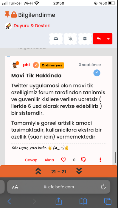
-
@phenomlab sure,

@cagatay Do you want the icon to show? Because of the size of the screen estate, I think it makes more sense to hide it?
-
@cagatay Do you want the icon to show? Because of the size of the screen estate, I think it makes more sense to hide it?
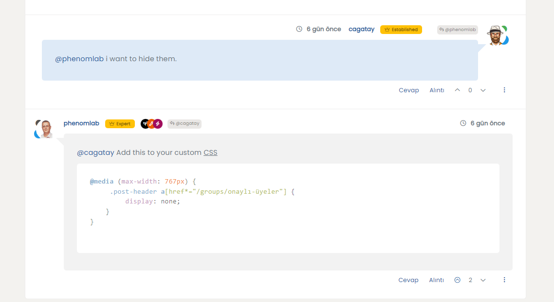
@phenomlab i want to hide them.
-
@phenomlab i want to hide them.
@cagatay Add this to your custom CSS
@media (max-width: 767px) { .post-header a[href*="/groups/onaylı-üyeler"] { display: none; } } -
@cagatay Add this to your custom CSS
@media (max-width: 767px) { .post-header a[href*="/groups/onaylı-üyeler"] { display: none; } } -
@cagatay Already fixed. Thanks.
This seems to have become an issue in the most recent update from NodeBB.
-
hi @phenomlab , I have made some updates to the CSS elements, and right now it looks like a badge with a wavy edge…

.post-header a[href*="/forum/groups/verified"] {
    margin-right: 3px;
    margin-top: 1px;
    border-radius: 50%;
    line-height: 20px;
    display: inline-block;
    vertical-align: middle;
    overflow: hidden;
    position: relative;
}

.post-header a[href*="/forum/groups/verified"]::before {
    content: "\f00c";
    position: absolute;
    z-index: 1; /* Added z-index to bring it to the front */
    width: 20px;
    height: 20px;
    background-image: url("data:image/svg+xml;charset=utf-8,%3Csvg xmlns='http://www.w3.org/2000/svg' width='24' height='24' stroke-width='1.5' viewBox='0 0 24 24' fill='%23085EAC'%3E%3Cpath d='M10.5213 2.62368C11.3147 1.75255 12.6853 1.75255 13.4787 2.62368L14.4989 3.74391C14.8998 4.18418 15.4761 4.42288 16.071 4.39508L17.5845 4.32435C18.7614 4.26934 19.7307 5.23857 19.6757 6.41554L19.6049 7.92905C19.5771 8.52388 19.8158 9.10016 20.2561 9.50111L21.3763 10.5213C22.2475 11.3147 22.2475 12.6853 21.3763 13.4787L20.2561 14.4989C19.8158 14.8998 19.5771 15.4761 19.6049 16.071L19.6757 17.5845C19.7307 18.7614 18.7614 19.7307 17.5845 19.6757L16.071 19.6049C15.4761 19.5771 14.8998 19.8158 14.4989 20.2561L13.4787 21.3763C12.6853 22.2475 11.3147 22.2475 10.5213 21.3763L9.50111 20.2561C9.10016 19.8158 8.52388 19.5771 7.92905 19.6049L6.41553 19.6757C5.23857 19.7307 4.26934 18.7614 4.32435 17.5845L4.39508 16.071C4.42288 15.4761 4.18418 14.8998 3.74391 14.4989L2.62368 13.4787C1.75255 12.6853 1.75255 11.3147 2.62368 10.5213L3.74391 9.50111C4.18418 9.10016 4.42288 8.52388 4.39508 7.92905L4.32435 6.41553C4.26934 5.23857 5.23857 4.26934 6.41554 4.32435L7.92905 4.39508C8.52388 4.42288 9.10016 4.18418 9.50111 3.74391L10.5213 2.62368Z' stroke='none'/%3E%3C/svg%3E");
    background-size: cover;
    color: #ffffff; /* Added to set the color of the checkmark */
    font-family: "Font Awesome 5 Free";
    font-weight: 900;
    font-size:8px;
    text-align: center;
    line-height: 20px;
}
small.label.group-label.inline-block i {
    margin-top: 1px;
    margin-left: 0px;
    vertical-align: middle;
    justify-content: center;
    display: flex;
}
.post-header a[href*="/forum/groups/verified"] .group-label {
    min-width: 20px;
    display: flex;
    justify-content: center;
    background-color: transparent !important;
}
.group-label {
    vertical-align: -6px;
}
This is achieved thanks to ChatGPT… the code specifically uses this “#085EAC” color… it can of course be changed…
Hello! It looks like you're interested in this conversation, but you don't have an account yet.
Getting fed up of having to scroll through the same posts each visit? When you register for an account, you'll always come back to exactly where you were before, and choose to be notified of new replies (either via email, or push notification). You'll also be able to save bookmarks and upvote posts to show your appreciation to other community members.
With your input, this post could be even better 💗
Register Login