Threaded post support for NodeBB
-
yes it’s good.
I use default view for thread (not custom like you) so I don’t know what that would be like, I’ll have to try it to see. -
yes it’s good.
I use default view for thread (not custom like you) so I don’t know what that would be like, I’ll have to try it to see.@DownPW It might need some adaptions to work before I can release it based on the points you’ve raised. Leave it with me.
-
@DownPW developing against sudonix.dev currently so you have something to test. Almost done, but still needs some work.
-
I’ll just leave this here

-
do you think it can be adapted for the stock default display of topics?
-
@DownPW yes, but it’ll need a rewrite to be compatible with the stock NodeBB harmony theme. Sudonix makes a lot changes to the default layout so without those additional modifications, it’ll look odd.
-
ooh ok. I would have liked to apply it on my site too bad for me then

-
@DownPW not necessarily. I can still develop something for you to use as a base.
-
Oh really ?
That would be super cool
Have 2 versions maybe. One adapted to your personalized code and one adapted to Harmony (without customizing the appearance of topics (stock))
I’m probably asking too much

-
Oh really ?
That would be super cool
Have 2 versions maybe. One adapted to your personalized code and one adapted to Harmony (without customizing the appearance of topics (stock))
I’m probably asking too much

@DownPW said in Threading support for NodeBB:
I’m probably asking too much
Nope. Not at all. I’m fact, developing one from stock Harmony is probably a better idea as it’ll work out of the box.
Leave it with me.
-
I’ve set my DEV environment to vanilla and will develop a working solution for that.
-
Hi All,
Some very early (subject to the odd bug) code released in DEV. You will need an account there - let me know if you need a password reset
https://sudonix.dev/topic/331/how-to-install-a-self-hosted-instance-of-iframely-for-use-with-nodebb
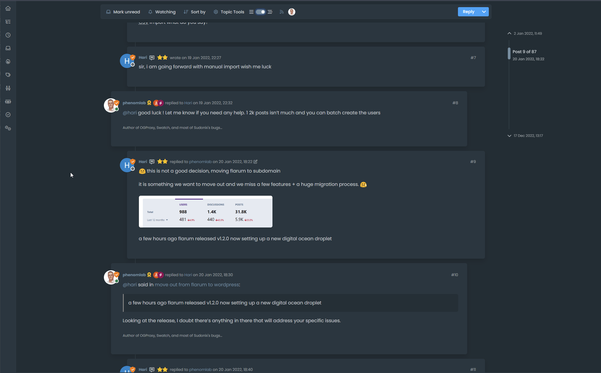
This code is quite complex, and leverages some interesting CSS classes. The most important change is that it removes the stock timeline bar, and will replace it with it’s own. This is for a variety of reasons - mostly around cumulative layout shift and pseudo elements being used in the stock CSS.
-
I have tested but I don’t see switch on dev

-
@DownPW It only triggers at
1200pxand above - do you have your browser size set smaller? -
Just added some transition effects. Note that depending on how many elements there are on the screen, this might cause layout shift.
-
oh yes I’m on 1920 x 1080 screen
oups

-
@DownPW Does it work now? By
1200pxI meant wide -
hmmmm nope
-
Odd. Seems to work for me.
-
nope it’s normal, i’m on 1080px height
Hello! It looks like you're interested in this conversation, but you don't have an account yet.
Getting fed up of having to scroll through the same posts each visit? When you register for an account, you'll always come back to exactly where you were before, and choose to be notified of new replies (either via email, or push notification). You'll also be able to save bookmarks and upvote posts to show your appreciation to other community members.
With your input, this post could be even better 💗
Register Login


