Threaded post support for NodeBB
-
Based on the previous “threaded” capabilities Sudonix had in v2 of NodeBB, and despite me stating that it wouldn’t return… well - I’ve missed it! So much so, that I’ve completely redesigned and developed it.
Those with eagle eyes might have noticed this toggle switch in the thread view - note that this will only trigger on desktops with a size of
1200pxminimum for obvious screen estate reasons, so it won’t be available on mobile devices. I “could” make it available, but in my opinion, it would look horrible (so I haven’t).
So that does this “toggle switch” do?

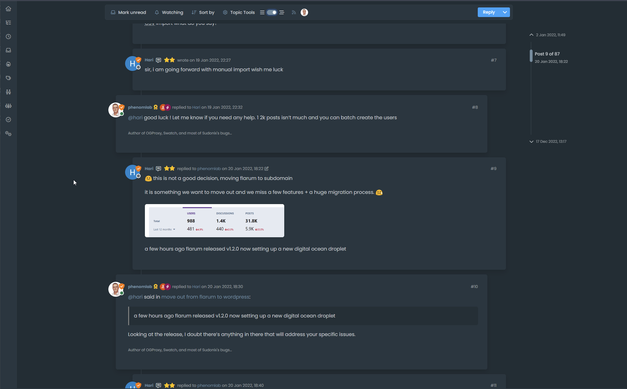
You’ll notice that to the left, you have a simple “bars” icon, and to the right, a “staggered bars” icon. This essentially means that if the toggle is off, the normal post view is presented -which looks a bit like this

Nothing new there you might say (apart from the timeline positioning perhaps…). Now toggle the switch…and you should see the “magic” happen

You’ll (hopefully) notice that the post view becomes “threaded” in the sense that it takes the approach of whom is posting, and makes a decision to reposition those elements to give you a “threaded” view. This (well, I think so) significantly improves readibility on larger screens and makes the reading experience so much better on the eyes.
Take a good long thread like the below to see it in full
https://sudonix.org/topic/184/move-out-from-flarum-to-wordpress
It’s hard to show you just how well this works without a video… So my advice is try it out for yourself

-
interesting.
Can this code be adapted to the default view (without block per response) -
interesting.
Can this code be adapted to the default view (without block per response)@DownPW Not sure what you mean here - can you elaborate?
-
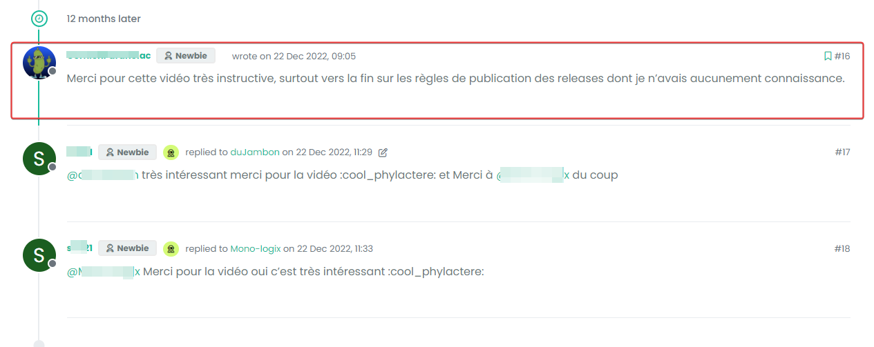
block like this :

And default view :
-
@DownPW Something like this I think?
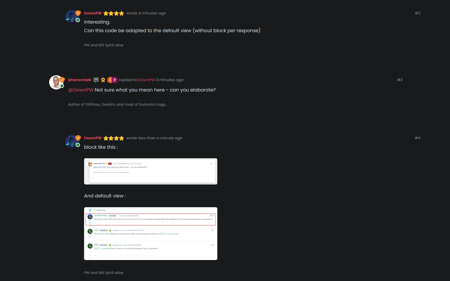
The answer is “yes”. I’m using custom styling on Sudonix, so the blocks won’t be seen by default - and that also means thaty the timeline needs to be moved also otherwise it looks terrible…
-
So, if you played around with the positioning a bit, and used
psuedonymelements, you could get something a bit “reddit” like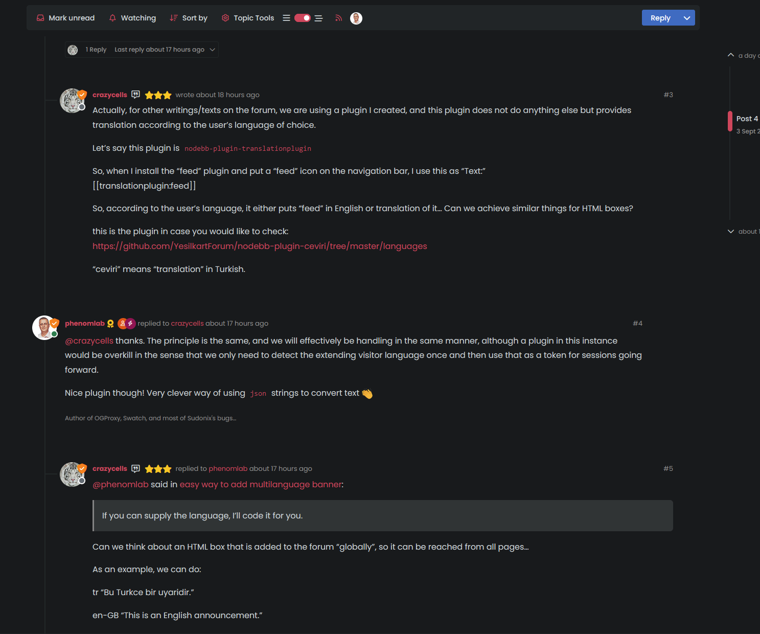
-
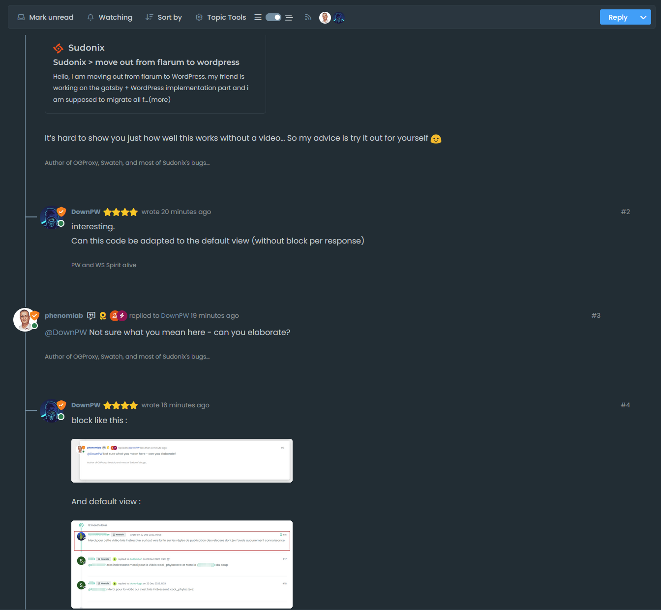
@DownPW better still…
-
yes it’s good.
I use default view for thread (not custom like you) so I don’t know what that would be like, I’ll have to try it to see. -
yes it’s good.
I use default view for thread (not custom like you) so I don’t know what that would be like, I’ll have to try it to see.@DownPW It might need some adaptions to work before I can release it based on the points you’ve raised. Leave it with me.
-
@DownPW developing against sudonix.dev currently so you have something to test. Almost done, but still needs some work.
-
I’ll just leave this here

-
do you think it can be adapted for the stock default display of topics?
-
@DownPW yes, but it’ll need a rewrite to be compatible with the stock NodeBB harmony theme. Sudonix makes a lot changes to the default layout so without those additional modifications, it’ll look odd.
-
ooh ok. I would have liked to apply it on my site too bad for me then

-
@DownPW not necessarily. I can still develop something for you to use as a base.
-
Oh really ?
That would be super cool
Have 2 versions maybe. One adapted to your personalized code and one adapted to Harmony (without customizing the appearance of topics (stock))
I’m probably asking too much

-
Oh really ?
That would be super cool
Have 2 versions maybe. One adapted to your personalized code and one adapted to Harmony (without customizing the appearance of topics (stock))
I’m probably asking too much

@DownPW said in Threading support for NodeBB:
I’m probably asking too much
Nope. Not at all. I’m fact, developing one from stock Harmony is probably a better idea as it’ll work out of the box.
Leave it with me.
-
I’ve set my DEV environment to vanilla and will develop a working solution for that.
-
Hi All,
Some very early (subject to the odd bug) code released in DEV. You will need an account there - let me know if you need a password reset
https://sudonix.dev/topic/331/how-to-install-a-self-hosted-instance-of-iframely-for-use-with-nodebb
This code is quite complex, and leverages some interesting CSS classes. The most important change is that it removes the stock timeline bar, and will replace it with it’s own. This is for a variety of reasons - mostly around cumulative layout shift and pseudo elements being used in the stock CSS.
-
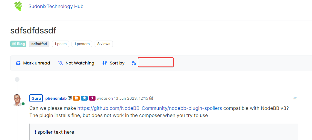
I have tested but I don’t see switch on dev
Hello! It looks like you're interested in this conversation, but you don't have an account yet.
Getting fed up of having to scroll through the same posts each visit? When you register for an account, you'll always come back to exactly where you were before, and choose to be notified of new replies (either via email, or push notification). You'll also be able to save bookmarks and upvote posts to show your appreciation to other community members.
With your input, this post could be even better 💗
Register LoginRelated Topics
-
-
MogoDB v6 to v7 upgrade
Solved Configure -
-
-
-
-
-
