Skip to content

Target the posts counter in categories using CSS and jQuery

Let's Build It
2 2 1.8k 1
  • For those who have delved as deep into styling NodeBB as I have, this is for you 🙂

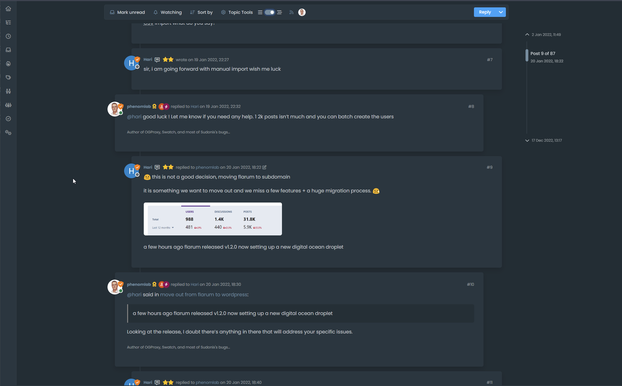
    It’s relatively easy to achieve this look when a topic is updated (note the different coloured posts card)

    84655243-fa6c-4007-9588-944e4a4800e1-image.png

    Here, we simply target the below class

    body:not(.user-guest) li.unread .stats-postcount
    

    However, it’s not so simple an affair to achieve the same look in the category view as the two DIVs are identical and have no unique classes


    c4ee50a6-5f48-4cd3-a103-3a15cb9c6461-image.png

    0fe2c02c-1b7d-451c-a3c4-bbcb7ce21115-image.png

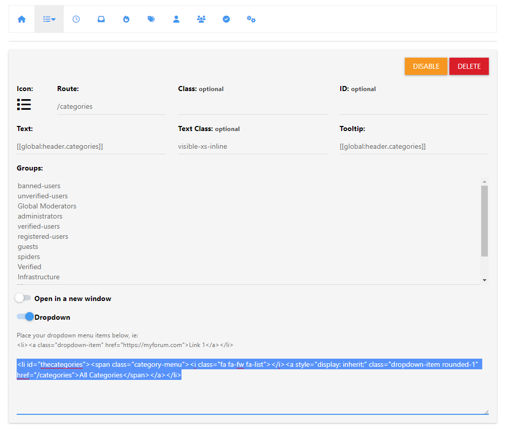
    To work around this, we can use a very simple function that adds an ID to the “posts” DIV as shown below (this is placed in /admin/appearance/customise#custom-js)

    $(document).ready(function() {
            $(window).on('action:ajaxify.end', function(data) {
        // Select the div using its class
        $('.card.card-header.border-0.p-2.overflow-hidden.rounded-1.d-flex.flex-column.align-items-center').each(function() {
            // Check if the div contains the word "Posts"
            if ($(this).text().trim().includes("Posts")) {
                // Assign the id 'updated-posts' to the div
                $(this).attr('id', 'updated-posts');
            }
        });
    });
    });
    

    This code will first look for the classes .card.card-header.border-0.p-2.overflow-hidden.rounded-1.d-flex.flex-column.align-items-center in the DOM, and if there, it will add the ID of updated-posts, meaning you can then target with the same CSS you are using in the recent view. See below

    c4e1119b-89dd-4cc0-b433-862d83c73782-image.png

    You’ll see that the ID has been added as required, and this means we can now adjust the original CSS so it looks like the below

    body:not(.user-guest) li.unread .stats-postcount, body:not(.user-guest) .unread #updated-posts
    

    NOTE: body:not(.user-guest) is being used so that the effect is not being applied to those who are not logged in as that wouldn’t make any sense - your mileage here may vary though.

    6d1ea244-a15d-449f-b674-db9e7063f1b4-image.png

    Doesn’t that look better? For the life of me, I can’t understand why these two elements do not have ID’s set already, but there you go.

    Enjoy.

  • Very great 😉


Related Topics
  • CSS border gradients

    Blog gradient border css
    10
    3
    2 Votes
    10 Posts
    2k Views
    ah f5 need
  • 14 Votes
    16 Posts
    6k Views
    Hmm - seems I never committed this code. I’ll do that now… EDIT - here it is https://github.com/phenomlab/category-list/tree/main
  • The best css to customize our logo?

    Solved Customisation css
    2
    1 Votes
    2 Posts
    2k Views
    @Sala This should look better .sidenav .navbar-brand { padding-top: 0.5rem; padding-bottom: 0.5rem; } [image: 1669026666905-e5cec20e-be36-4ee8-9129-fd11ad4656ac-image.png] You can increase the top and bottom padding by increasing the values above.
  • hover link effect

    Solved Customisation css link hover
    18
    1
    6 Votes
    18 Posts
    5k Views
    @DownPW Looking at the underlying code, class start is being added on hover by jQuery in this function document.querySelectorAll(".button-gradient, .button-transparent").forEach((button) => { const style = getComputedStyle(button); const lines = document.createElement("div"); lines.classList.add("lines"); const groupTop = document.createElement("div"); const groupBottom = document.createElement("div"); const svg = createSVG( button.offsetWidth, button.offsetHeight, parseInt(style.borderRadius, 10) ); groupTop.appendChild(svg); groupTop.appendChild(svg.cloneNode(true)); groupTop.appendChild(svg.cloneNode(true)); groupTop.appendChild(svg.cloneNode(true)); groupBottom.appendChild(svg.cloneNode(true)); groupBottom.appendChild(svg.cloneNode(true)); groupBottom.appendChild(svg.cloneNode(true)); groupBottom.appendChild(svg.cloneNode(true)); lines.appendChild(groupTop); lines.appendChild(groupBottom); button.appendChild(lines); button.addEventListener("pointerenter", () => { button.classList.add("start"); }); svg.addEventListener("animationend", () => { button.classList.remove("start"); }); }); }) The CSS for start is below .button-gradient.start .lines svg, .button-transparent.start .lines svg { animation: stroke 0.3s linear; } And this is the corresponding keyframe @keyframes stroke { 30%, 55% { opacity: 1; } 100% { stroke-dashoffset: 5; opacity: 0; } } It’s using both CSS and SVG, so might not be a simple affair to replicate without the SVG files.
  • CSS3: Gradient Generator

    Development css gradient
    1
    1 Votes
    1 Posts
    749 Views
    No one has replied
  • Fontawesome 5

    Unsolved Customisation fonts css nodebb
    14
    1 Votes
    14 Posts
    4k Views
    @pwsincd hi. Just following up on this thread (I know it’s old) but was curious to understand if it’s still an issue or not ?
  • About this category

    Pinned Let's Build It lab
    5
    2 Votes
    5 Posts
    2k Views
    I’m going to be adding some new posts to the labs category, and will use this going forward when writing code that could easily be adopted by others (a great example is the OGProxy, which I will move here). If you have any ideas of would like a walkthrough of how to set something up, then this is the place it should go.
  • Avatar on Topic Header

    Solved Customisation css avatar header
    9
    1
    0 Votes
    9 Posts
    2k Views
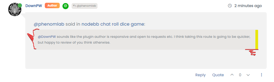
    @jac said in Avatar on Topic Header: @downpw said in Avatar on Topic Header: Great Plugin I make it a bit cleaner via this CSS code: /*------------------------------------------------------------------*/ /*---------------- nodebb-plugin-browsing-users -----------------*/ /*------------------------------------------------------------------*/ /*Space between the avatar and the RSS icon */ .topic [component="topic/browsing-users"] { margin-bottom: -5px; padding-left: 10px; } /*Space between avatars*/ .pull-left { float: left!important; padding-right: 5px; } Do you have a screenshot of how this looks with the CSS change? Just added this change, thanks @DownPW