Targeting a disappearing element for its CSS
-
Have you ever tried to target dynamic elements such as as Tooltips under
bootstraponly to find that they disappear when you try to inspect them? You’re not alone.Fortunately (and inspired by this post), there is a workaround in case you find yourself in a similar boat.
The Problem
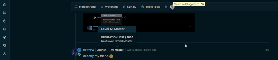
You locate the
popoverelement you’d like to change, right-click then selectInspect Elementand then element itself disappears - along with any hope of you finding the related CSS.The Solution
We need to use a bit of ingenuity here. This is where the browser (in the case of Webkit, such as Google Chrome etc) debug facilities come in handy.
- Fire up the page where the element appears that you want to inspect
- Press F8 to open the developer tools
- Click on the
consoletab - Paste the below into the console
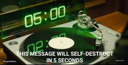
setTimeout(function(){debugger;},5000);Note that
5000is adjustable (and the inspiration for the Mission: impossible - Rogue Nation sequence") ) It should look like the below - essentially,
) It should look like the below - essentially, 5000is 5 seconds… Now you see (hopefully) the paradigm.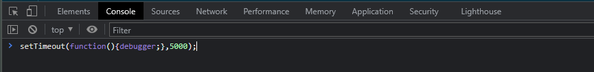
- Now press enter
- You have 5 seconds before the debugger will launch, which should be enough time for you to active the element you want to target
- Wait until the debugger fires
- Now select the element you want to inspect in the usual manner
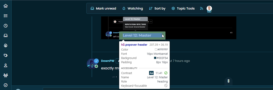
- Expose the CSS as required
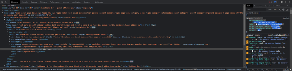
Customise as necessary
-
 undefined phenomlab marked this topic as a regular topic on
-
undefined phenomlab moved this topic from Configure on
-
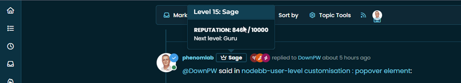
Nice. Very good tips Mark

PW and WS Spirit alive
-
undefined phenomlab moved this topic from Guides on
-
undefined phenomlab referenced this topic on

Hello! It looks like you're interested in this conversation, but you don't have an account yet.
Getting fed up of having to scroll through the same posts each visit? When you register for an account, you'll always come back to exactly where you were before, and choose to be notified of new replies (either via email, or push notification). You'll also be able to save bookmarks and upvote posts to show your appreciation to other community members.
With your input, this post could be even better 💗
Register Login