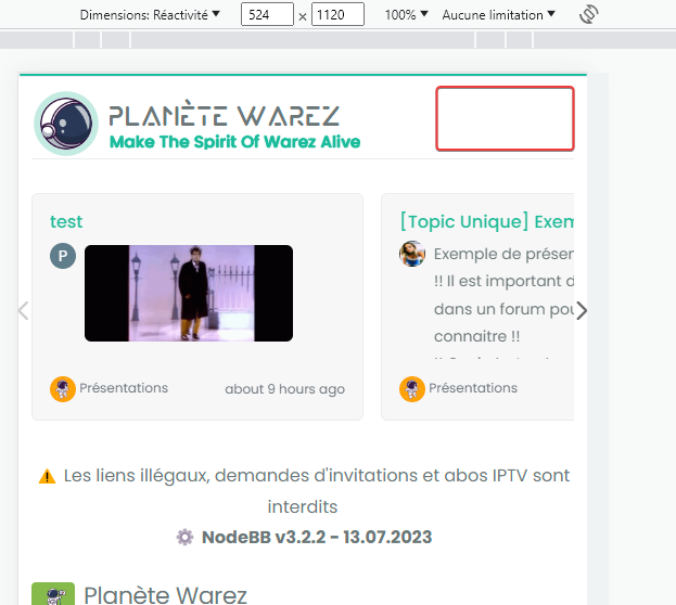
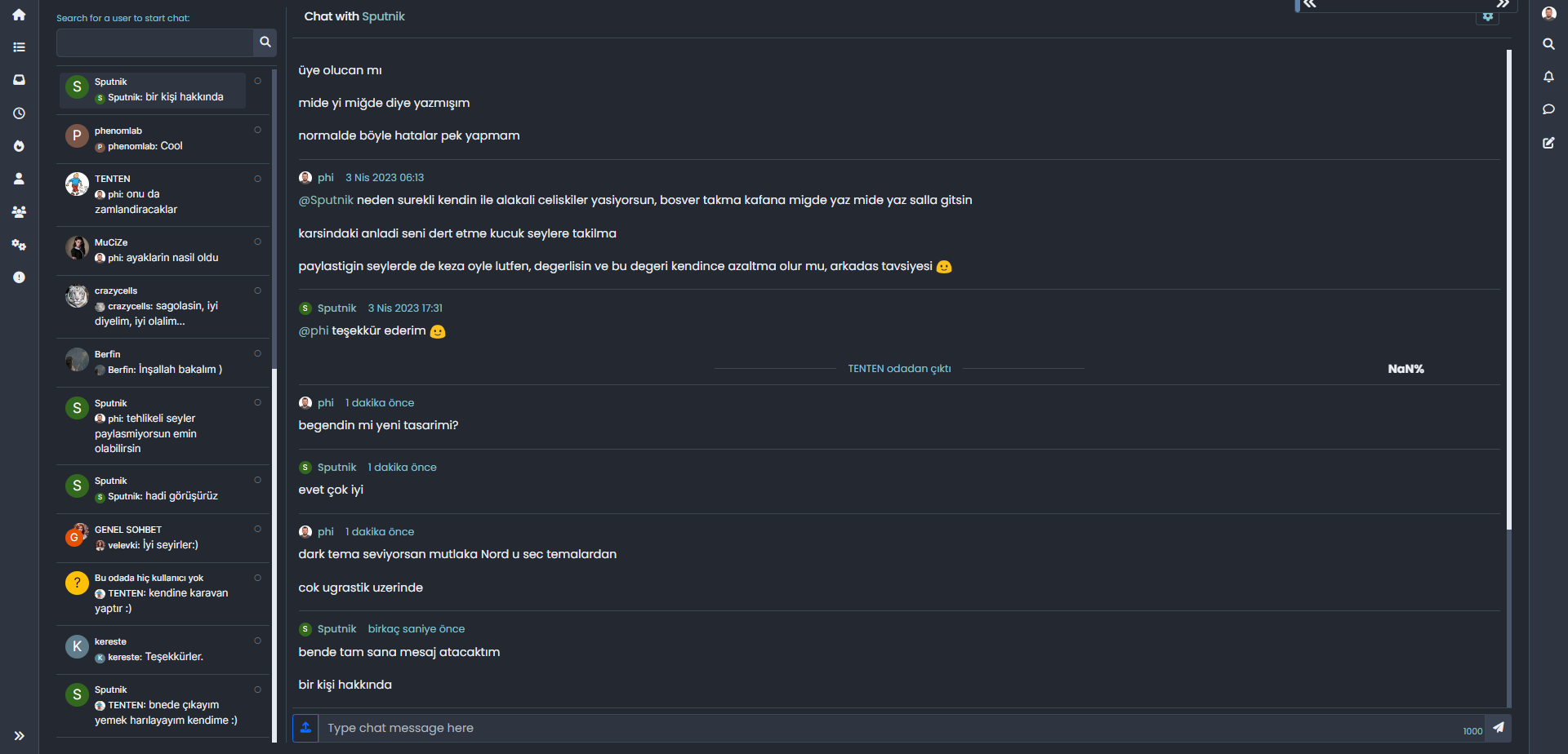
What is this bar called?
-
Hi @phenomlab
Thanks for sharing

It’s the code for this reading bar :
In my point of view, it’s definitively better

-
It seems to be missing things because I don’t have the reading bar in the header and not have the button at the bottom right too

Could you provide me with the complete code in JS & CSS as if I was starting from scratch?
@DownPW Here you go. Remove any other references you have in custom JS that relate to the previous progress bar, and replace with this
// Scroll to top function
$(window).on('action:ajaxify.end', function(data) {
    var matched = false;
    $(document).ready(function() {
        var pageUp = $('#pageUp');
        var bar = $('.reading-meter');
        var perWidth = $('.reading-meter').width();

        // Main progressbar function
        function pageScroller() {
        var winScroll = document.body.scrollTop || document.documentElement.scrollTop;
        var height = document.documentElement.scrollHeight - document.documentElement.clientHeight;
        var scrolled = (winScroll / height) * 100;

        document.getElementById("progress-bar").style.width = parseFloat(scrolled).toFixed(0) + "%";
        $('#percentage').val(parseFloat(scrolled).toFixed(0) + "%");

        // Prevent the mouse scroll wheel from scrolling down after the pageUp button is clicked
        if ($('#pageUp').is(':focus')) {
        event.preventDefault();
        }
    }

        // Bind the pageScroller function to the window's scroll event
        $(window).scroll(function() {
            pageScroller();
        });

        // Check the URL and composer visibility separately from the scroll event
        $(window).scroll(function() {
            var thisURL = window.location.href;
            var checkURL = ["topic", "notifications", "user"];
            var isFound = false;
            for (var i = 0, len = checkURL.length; i < len; i++) {
                if (thisURL.indexOf(checkURL[i]) > -1) {
                    isFound = true;
                    break;
                }
            }
            if (isFound) {
                bar.removeClass('show');
                pageUp.removeClass('show');
            } else {
                // Exception here is that we don't want the scroll bar to show when the composer is active
                if ($(window).scrollTop() > 0 && (!$('[component="composer"]').is(":visible"))) {
                    bar.addClass('show');
                    pageUp.addClass('show');
                } else {
                    bar.removeClass('show');
                    pageUp.removeClass('show');
                }
            }
        });

        // Scroll to top when #pageUp is clicked
        $(document).on("click", "#pageUp", function(e) {
            const firstTopic = $('[component="category/topic"][data-index="0"]');
            if (firstTopic.length) {
                $("html, body").animate({
                    scrollTop: 0
                }, '300');
            } else {
                ajaxify.refresh();
            }
        });
    });
});
Now in the custom header, remove the previous code that probably looks something like this
<div id="readingposition" class="reading-meter" style="bottom: 0px;">
    <div class="pageUp" id="pageUp"><i class="fa fa-angle-double-left pointer" aria-hidden="true"></i></div>
    <div class="pageDown" id="pageDown"><i class="fa fa-angle-double-right pointer" aria-hidden="true"></i></div>
    <div class="reading-meter-background rounded-1 border border-gray-300 ready">
    <div class="reading-meter-progress-bar rounded-1" id="progress-bar">
        <input disabled="disabled" type="text" id="percentage" name="percentage">
        </div>
  </div>
  </div>
And replace with this
<a id="pageUp" class=""><i class="fas fa-chevron-up"></i></a>
<div id="readingposition" class="reading-meter" style="bottom: 0px;">
    <div class="reading-meter-background rounded-1 border border-gray-300 ready">
    <div class="reading-meter-progress-bar rounded-1" id="progress-bar">
        </div>
  </div>
  </div>
Now use the CSS provided below (note, that you may have previous CSS that already exists if you used the older version of the progress bar - you should remove that)
#pageUp {
  display: inline-block;
  background: var(--bs-body-component-active);
  width: 50px;
  height: 50px;
  text-align: center;
  border-radius: 0.375rem;
  position: fixed;
  bottom: 70px;
  right: 80px;
  transition: background-color .3s, opacity .5s, visibility .5s;
  opacity: 0;
  visibility: hidden;
}
#pageUp.show {
  opacity: 1;
  visibility: visible;
  z-index: 10000;
  color: var(--bs-body-navbar-color) !important;
}
a#pageUp.show:hover {
  background: var(--bs-dropdown-link-hover-bg);
  border: 1px solid var(--bs-border-color);
}
a#pageUp i {
    position: absolute;
    top: 32%;
    left: 35%;
}
.reading-meter {
    position: fixed;
    width: 100%;
    top: 0;
    left: 0;
    right: 0;
    height: 2px !important;
}
.reading-meter {
    visibility: hidden;
}
.reading-meter.show {
    visibility: visible;
}


div#readingposition {
    background-color: var(--bs-body-navbar) !important;
    color: var(--bs-body-color) !important;
    height: 2px;
    z-index: 1000;
}

.reading-meter-progress {
    border: 1px solid var(--bs-border-color);
    width: 100%;
}

.reading-meter-background {
    background: var(--bs-body-bg);
}

.reading-meter-progress-bar {
    background: var(--bs-progress-bg-bar);
    height: 2px;
}
input#percentage {
    display: none;
}

@media (max-width: 767px) {
    #pageUp {
        bottom: 60px;
        right: 30px;
      }
    }
That should do it.
-
Will test ASAP, i’m on new OGproxy conf now
-
@DownPW Here you go. Remove any other references you have in custom JS that relate to the previous progress bar, and replace with this
// Scroll to top function $(window).on('action:ajaxify.end', function(data) { var matched = false; $(document).ready(function() { var pageUp = $('#pageUp'); var bar = $('.reading-meter'); var perWidth = $('.reading-meter').width(); // Main progressbar function function pageScroller() { var winScroll = document.body.scrollTop || document.documentElement.scrollTop; var height = document.documentElement.scrollHeight - document.documentElement.clientHeight; var scrolled = (winScroll / height) * 100; document.getElementById("progress-bar").style.width = parseFloat(scrolled).toFixed(0) + "%"; $('#percentage').val(parseFloat(scrolled).toFixed(0) + "%"); // Prevent the mouse scroll wheel from scrolling down after the pageUp button is clicked if ($('#pageUp').is(':focus')) { event.preventDefault(); } } // Bind the pageScroller function to the window's scroll event $(window).scroll(function() { pageScroller(); }); // Check the URL and composer visibility separately from the scroll event $(window).scroll(function() { var thisURL = window.location.href; var checkURL = ["topic", "notifications", "user"]; var isFound = false; for (var i = 0, len = checkURL.length; i < len; i++) { if (thisURL.indexOf(checkURL[i]) > -1) { isFound = true; break; } } if (isFound) { bar.removeClass('show'); pageUp.removeClass('show'); } else { // Exception here is that we don't want the scroll bar to show when the composer is active if ($(window).scrollTop() > 0 && (!$('[component="composer"]').is(":visible"))) { bar.addClass('show'); pageUp.addClass('show'); } else { bar.removeClass('show'); pageUp.removeClass('show'); } } }); // Scroll to top when #pageUp is clicked $(document).on("click", "#pageUp", function(e) { const firstTopic = $('[component="category/topic"][data-index="0"]'); if (firstTopic.length) { $("html, body").animate({ scrollTop: 0 }, '300'); } else { ajaxify.refresh(); } }); }); });Now in the custom header, remove the previous code that probably looks something like this
<div id="readingposition" class="reading-meter" style="bottom: 0px;"> <div class="pageUp" id="pageUp"><i class="fa fa-angle-double-left pointer" aria-hidden="true"></i></div> <div class="pageDown" id="pageDown"><i class="fa fa-angle-double-right pointer" aria-hidden="true"></i></div> <div class="reading-meter-background rounded-1 border border-gray-300 ready"> <div class="reading-meter-progress-bar rounded-1" id="progress-bar"> <input disabled="disabled" type="text" id="percentage" name="percentage"> </div> </div> </div>And replace with this
<a id="pageUp" class=""><i class="fas fa-chevron-up"></i></a> <div id="readingposition" class="reading-meter" style="bottom: 0px;"> <div class="reading-meter-background rounded-1 border border-gray-300 ready"> <div class="reading-meter-progress-bar rounded-1" id="progress-bar"> </div> </div> </div>Now use the CSS provided below (note, that you may have previous CSS that already exists if you used the older version of the progress bar - you should remove that)
#pageUp { display: inline-block; background: var(--bs-body-component-active); width: 50px; height: 50px; text-align: center; border-radius: 0.375rem; position: fixed; bottom: 70px; right: 80px; transition: background-color .3s, opacity .5s, visibility .5s; opacity: 0; visibility: hidden; } #pageUp.show { opacity: 1; visibility: visible; z-index: 10000; color: var(--bs-body-navbar-color) !important; } a#pageUp.show:hover { background: var(--bs-dropdown-link-hover-bg); border: 1px solid var(--bs-border-color); } a#pageUp i { position: absolute; top: 32%; left: 35%; } .reading-meter { position: fixed; width: 100%; top: 0; left: 0; right: 0; height: 2px !important; } .reading-meter { visibility: hidden; } .reading-meter.show { visibility: visible; } div#readingposition { background-color: var(--bs-body-navbar) !important; color: var(--bs-body-color) !important; height: 2px; z-index: 1000; } .reading-meter-progress { border: 1px solid var(--bs-border-color); width: 100%; } .reading-meter-background { background: var(--bs-body-bg); } .reading-meter-progress-bar { background: var(--bs-progress-bg-bar); height: 2px; } input#percentage { display: none; } @media (max-width: 767px) { #pageUp { bottom: 60px; right: 30px; } }That should do it.
And where you put/replace this @phenomlab ? :
@phenomlab said in What is this bar called?:
And replace with this
<div id="readingposition" class="reading-meter" style="bottom: 0px;"> <div class="reading-meter-background rounded-1 border border-gray-300 ready"> <div class="reading-meter-progress-bar rounded-1" id="progress-bar"> </div> </div> </div>``` In the custom header I guess ?
-
It seems to be worse. The JS no longer works.
When I remove the customJS and custom Header code. The website is OK
Could there be an error/omission in the given code? A typo in the code?
@DownPW strange. Is this on your dev server? I’ll take a look tomorrow morning.
-
@DownPW ok. I’ll try it there tomorrow.
-
It seems to be worse. The JS no longer works.
When I remove the customJS and custom Header code. The website is OK
Could there be an error/omission in the given code? A typo in the code?
@DownPW said in What is this bar called?:
It seems to be worse. The JS no longer works.
When I remove the customJS and custom Header code. The website is OK
Could there be an error/omission in the given code? A typo in the code?
I must have been drunk or high on something else when I provided the code as there are large chunks of CSS missing, and a rogue closing parenthesis! That’s what too much work does I suppose

I’ve implemented the CORRECT version of this on your DEV site (tested ok) and updated the post so it reflects reality

-
I thought something was missing…

I totally understand. Very tired me too at the moment and like you a lot of work provided between my job and the one done outside on PW
-
I thought something was missing…

I totally understand. Very tired me too at the moment and like you a lot of work provided between my job and the one done outside on PW
@DownPW said in What is this bar called?:
I totally understand. Very tired me too at the moment and like you a lot of work provided between my job and the one done outside on PW
Yes, that’s exactly the problem. Work is very demanding and has to come first, so I fit this (Sudonix) in whenever I can - often late into evenings and it’s easy to make even the simplest of mistakes

-
All - i found some bugs in the previous code that was posted, and have rectified the error. Please replace any code you are using with the revised version.
-
I don’t know why the reading-meter-progress-bar doesn’t appear on my smartphone (dev instance) when I scroll down but appear a little on scroll top ?
-
I don’t know why the reading-meter-progress-bar doesn’t appear on my smartphone (dev instance) when I scroll down but appear a little on scroll top ?

@DownPW That must be some sort custom CSS. I can’t reproduce that here. ,
-
odd, no problem on desktop, just smartphone
-
It seems that code who caused problem :
/* Menu Brand Header */
@media (max-width: 767px)  {
  .socialicons {
    display: none !important;
  }
  [data-widget-area=brand-header] .d-none {
    display: inherit !important;
  }
  /* Button topic navbar header color */
  .sticky-tools .btn-ghost-sm i {
    color: var(--bs-alert-info-color) !important;
  }
}
If i delete :
[data-widget-area=brand-header] .d-none {
  display: inherit !important;
}
Reading progress bar is good now but my icons (menu and theme swatch applet) dissapear

-
It seems that code who caused problem :
/* Menu Brand Header */ @media (max-width: 767px) { .socialicons { display: none !important; } [data-widget-area=brand-header] .d-none { display: inherit !important; } /* Button topic navbar header color */ .sticky-tools .btn-ghost-sm i { color: var(--bs-alert-info-color) !important; } }If i delete :
[data-widget-area=brand-header] .d-none { display: inherit !important; }Reading progress bar is good now but my icons (menu and theme swatch applet) dissapear


@DownPW I’d put that CSS back. It’s set like that for a reason, so you’ll need to be more specific with the target so you can unset.
-
Sorry but I do not understand too much @phenomlab because if I keep this code, the reading bar does not work on smartphone
-
Sorry but I do not understand too much @phenomlab because if I keep this code, the reading bar does not work on smartphone
@DownPW what I mean is target from higher above so the CSS you apply to the end target is not the same as an existing element.


