What is this bar called?
-
Hi @phenomlab
Thanks for sharing

It’s the code for this reading bar :

In my point of view, it’s definitively better

-
It seems to be missing things because I don’t have the reading bar in the header and not have the button at the bottom right too

Could you provide me with the complete code in JS & CSS as if I was starting from scratch?
-
It seems to be missing things because I don’t have the reading bar in the header and not have the button at the bottom right too

Could you provide me with the complete code in JS & CSS as if I was starting from scratch?
@DownPW Here you go. Remove any other references you have in custom JS that relate to the previous progress bar, and replace with this
// Scroll to top function
$(window).on('action:ajaxify.end', function(data) {
    var matched = false;
    $(document).ready(function() {
        var pageUp = $('#pageUp');
        var bar = $('.reading-meter');
        var perWidth = $('.reading-meter').width();

        // Main progressbar function
        function pageScroller() {
        var winScroll = document.body.scrollTop || document.documentElement.scrollTop;
        var height = document.documentElement.scrollHeight - document.documentElement.clientHeight;
        var scrolled = (winScroll / height) * 100;

        document.getElementById("progress-bar").style.width = parseFloat(scrolled).toFixed(0) + "%";
        $('#percentage').val(parseFloat(scrolled).toFixed(0) + "%");

        // Prevent the mouse scroll wheel from scrolling down after the pageUp button is clicked
        if ($('#pageUp').is(':focus')) {
        event.preventDefault();
        }
    }

        // Bind the pageScroller function to the window's scroll event
        $(window).scroll(function() {
            pageScroller();
        });

        // Check the URL and composer visibility separately from the scroll event
        $(window).scroll(function() {
            var thisURL = window.location.href;
            var checkURL = ["topic", "notifications", "user"];
            var isFound = false;
            for (var i = 0, len = checkURL.length; i < len; i++) {
                if (thisURL.indexOf(checkURL[i]) > -1) {
                    isFound = true;
                    break;
                }
            }
            if (isFound) {
                bar.removeClass('show');
                pageUp.removeClass('show');
            } else {
                // Exception here is that we don't want the scroll bar to show when the composer is active
                if ($(window).scrollTop() > 0 && (!$('[component="composer"]').is(":visible"))) {
                    bar.addClass('show');
                    pageUp.addClass('show');
                } else {
                    bar.removeClass('show');
                    pageUp.removeClass('show');
                }
            }
        });

        // Scroll to top when #pageUp is clicked
        $(document).on("click", "#pageUp", function(e) {
            const firstTopic = $('[component="category/topic"][data-index="0"]');
            if (firstTopic.length) {
                $("html, body").animate({
                    scrollTop: 0
                }, '300');
            } else {
                ajaxify.refresh();
            }
        });
    });
});
Now in the custom header, remove the previous code that probably looks something like this
<div id="readingposition" class="reading-meter" style="bottom: 0px;">
    <div class="pageUp" id="pageUp"><i class="fa fa-angle-double-left pointer" aria-hidden="true"></i></div>
    <div class="pageDown" id="pageDown"><i class="fa fa-angle-double-right pointer" aria-hidden="true"></i></div>
    <div class="reading-meter-background rounded-1 border border-gray-300 ready">
    <div class="reading-meter-progress-bar rounded-1" id="progress-bar">
        <input disabled="disabled" type="text" id="percentage" name="percentage">
        </div>
  </div>
  </div>
And replace with this
<a id="pageUp" class=""><i class="fas fa-chevron-up"></i></a>
<div id="readingposition" class="reading-meter" style="bottom: 0px;">
    <div class="reading-meter-background rounded-1 border border-gray-300 ready">
    <div class="reading-meter-progress-bar rounded-1" id="progress-bar">
        </div>
  </div>
  </div>
Now use the CSS provided below (note, that you may have previous CSS that already exists if you used the older version of the progress bar - you should remove that)
#pageUp {
  display: inline-block;
  background: var(--bs-body-component-active);
  width: 50px;
  height: 50px;
  text-align: center;
  border-radius: 0.375rem;
  position: fixed;
  bottom: 70px;
  right: 80px;
  transition: background-color .3s, opacity .5s, visibility .5s;
  opacity: 0;
  visibility: hidden;
}
#pageUp.show {
  opacity: 1;
  visibility: visible;
  z-index: 10000;
  color: var(--bs-body-navbar-color) !important;
}
a#pageUp.show:hover {
  background: var(--bs-dropdown-link-hover-bg);
  border: 1px solid var(--bs-border-color);
}
a#pageUp i {
    position: absolute;
    top: 32%;
    left: 35%;
}
.reading-meter {
    position: fixed;
    width: 100%;
    top: 0;
    left: 0;
    right: 0;
    height: 2px !important;
}
.reading-meter {
    visibility: hidden;
}
.reading-meter.show {
    visibility: visible;
}


div#readingposition {
    background-color: var(--bs-body-navbar) !important;
    color: var(--bs-body-color) !important;
    height: 2px;
    z-index: 1000;
}

.reading-meter-progress {
    border: 1px solid var(--bs-border-color);
    width: 100%;
}

.reading-meter-background {
    background: var(--bs-body-bg);
}

.reading-meter-progress-bar {
    background: var(--bs-progress-bg-bar);
    height: 2px;
}
input#percentage {
    display: none;
}

@media (max-width: 767px) {
    #pageUp {
        bottom: 60px;
        right: 30px;
      }
    }
That should do it.
-
Will test ASAP, i’m on new OGproxy conf now
-
@DownPW Here you go. Remove any other references you have in custom JS that relate to the previous progress bar, and replace with this
// Scroll to top function
$(window).on('action:ajaxify.end', function(data) {
    var matched = false;
    $(document).ready(function() {
        var pageUp = $('#pageUp');
        var bar = $('.reading-meter');
        var perWidth = $('.reading-meter').width();

        // Main progressbar function
        function pageScroller() {
        var winScroll = document.body.scrollTop || document.documentElement.scrollTop;
        var height = document.documentElement.scrollHeight - document.documentElement.clientHeight;
        var scrolled = (winScroll / height) * 100;

        document.getElementById("progress-bar").style.width = parseFloat(scrolled).toFixed(0) + "%";
        $('#percentage').val(parseFloat(scrolled).toFixed(0) + "%");

        // Prevent the mouse scroll wheel from scrolling down after the pageUp button is clicked
        if ($('#pageUp').is(':focus')) {
        event.preventDefault();
        }
    }

        // Bind the pageScroller function to the window's scroll event
        $(window).scroll(function() {
            pageScroller();
        });

        // Check the URL and composer visibility separately from the scroll event
        $(window).scroll(function() {
            var thisURL = window.location.href;
            var checkURL = ["topic", "notifications", "user"];
            var isFound = false;
            for (var i = 0, len = checkURL.length; i < len; i++) {
                if (thisURL.indexOf(checkURL[i]) > -1) {
                    isFound = true;
                    break;
                }
            }
            if (isFound) {
                bar.removeClass('show');
                pageUp.removeClass('show');
            } else {
                // Exception here is that we don't want the scroll bar to show when the composer is active
                if ($(window).scrollTop() > 0 && (!$('[component="composer"]').is(":visible"))) {
                    bar.addClass('show');
                    pageUp.addClass('show');
                } else {
                    bar.removeClass('show');
                    pageUp.removeClass('show');
                }
            }
        });

        // Scroll to top when #pageUp is clicked
        $(document).on("click", "#pageUp", function(e) {
            const firstTopic = $('[component="category/topic"][data-index="0"]');
            if (firstTopic.length) {
                $("html, body").animate({
                    scrollTop: 0
                }, '300');
            } else {
                ajaxify.refresh();
            }
        });
    });
});
Now in the custom header, remove the previous code that probably looks something like this
<div id="readingposition" class="reading-meter" style="bottom: 0px;">
    <div class="pageUp" id="pageUp"><i class="fa fa-angle-double-left pointer" aria-hidden="true"></i></div>
    <div class="pageDown" id="pageDown"><i class="fa fa-angle-double-right pointer" aria-hidden="true"></i></div>
    <div class="reading-meter-background rounded-1 border border-gray-300 ready">
    <div class="reading-meter-progress-bar rounded-1" id="progress-bar">
        <input disabled="disabled" type="text" id="percentage" name="percentage">
        </div>
  </div>
  </div>
And replace with this
<a id="pageUp" class=""><i class="fas fa-chevron-up"></i></a>
<div id="readingposition" class="reading-meter" style="bottom: 0px;">
    <div class="reading-meter-background rounded-1 border border-gray-300 ready">
    <div class="reading-meter-progress-bar rounded-1" id="progress-bar">
        </div>
  </div>
  </div>
Now use the CSS provided below (note, that you may have previous CSS that already exists if you used the older version of the progress bar - you should remove that)
#pageUp {
  display: inline-block;
  background: var(--bs-body-component-active);
  width: 50px;
  height: 50px;
  text-align: center;
  border-radius: 0.375rem;
  position: fixed;
  bottom: 70px;
  right: 80px;
  transition: background-color .3s, opacity .5s, visibility .5s;
  opacity: 0;
  visibility: hidden;
}
#pageUp.show {
  opacity: 1;
  visibility: visible;
  z-index: 10000;
  color: var(--bs-body-navbar-color) !important;
}
a#pageUp.show:hover {
  background: var(--bs-dropdown-link-hover-bg);
  border: 1px solid var(--bs-border-color);
}
a#pageUp i {
    position: absolute;
    top: 32%;
    left: 35%;
}
.reading-meter {
    position: fixed;
    width: 100%;
    top: 0;
    left: 0;
    right: 0;
    height: 2px !important;
}
.reading-meter {
    visibility: hidden;
}
.reading-meter.show {
    visibility: visible;
}


div#readingposition {
    background-color: var(--bs-body-navbar) !important;
    color: var(--bs-body-color) !important;
    height: 2px;
    z-index: 1000;
}

.reading-meter-progress {
    border: 1px solid var(--bs-border-color);
    width: 100%;
}

.reading-meter-background {
    background: var(--bs-body-bg);
}

.reading-meter-progress-bar {
    background: var(--bs-progress-bg-bar);
    height: 2px;
}
input#percentage {
    display: none;
}

@media (max-width: 767px) {
    #pageUp {
        bottom: 60px;
        right: 30px;
      }
    }
That should do it.
And where you put/replace this @phenomlab ? :
@phenomlab said in What is this bar called?:
And replace with this
<div id="readingposition" class="reading-meter" style="bottom: 0px;">
    <div class="reading-meter-background rounded-1 border border-gray-300 ready">
    <div class="reading-meter-progress-bar rounded-1" id="progress-bar">
        </div>
  </div>
  </div>```
In the custom header I guess ?
-
It seems to be worse. The JS no longer works.
When I remove the customJS and custom Header code. The website is OK
Could there be an error/omission in the given code? A typo in the code?
-
It seems to be worse. The JS no longer works.
When I remove the customJS and custom Header code. The website is OK
Could there be an error/omission in the given code? A typo in the code?
@DownPW strange. Is this on your dev server? I’ll take a look tomorrow morning.
-
nope on my VM but you have an account on dev server
-
@DownPW ok. I’ll try it there tomorrow.
-
It seems to be worse. The JS no longer works.
When I remove the customJS and custom Header code. The website is OK
Could there be an error/omission in the given code? A typo in the code?
@DownPW said in What is this bar called?:
It seems to be worse. The JS no longer works.
When I remove the customJS and custom Header code. The website is OK
Could there be an error/omission in the given code? A typo in the code?
I must have been drunk or high on something else when I provided the code as there are large chunks of CSS missing, and a rogue closing parenthesis! That’s what too much work does I suppose

I’ve implemented the CORRECT version of this on your DEV site (tested ok) and updated the post so it reflects reality

-
I thought something was missing…

I totally understand. Very tired me too at the moment and like you a lot of work provided between my job and the one done outside on PW
-
I thought something was missing…

I totally understand. Very tired me too at the moment and like you a lot of work provided between my job and the one done outside on PW
@DownPW said in What is this bar called?:
I totally understand. Very tired me too at the moment and like you a lot of work provided between my job and the one done outside on PW
Yes, that’s exactly the problem. Work is very demanding and has to come first, so I fit this (Sudonix) in whenever I can - often late into evenings and it’s easy to make even the simplest of mistakes

-
All - i found some bugs in the previous code that was posted, and have rectified the error. Please replace any code you are using with the revised version.
-
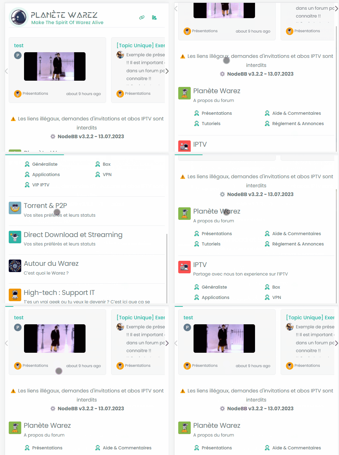
I don’t know why the reading-meter-progress-bar doesn’t appear on my smartphone (dev instance) when I scroll down but appear a little on scroll top ?
-
I don’t know why the reading-meter-progress-bar doesn’t appear on my smartphone (dev instance) when I scroll down but appear a little on scroll top ?

@DownPW That must be some sort custom CSS. I can’t reproduce that here. ,
-
odd, no problem on desktop, just smartphone
-
It seems that code who caused problem :
/* Menu Brand Header */
@media (max-width: 767px)  {
  .socialicons {
    display: none !important;
  }
  [data-widget-area=brand-header] .d-none {
    display: inherit !important;
  }
  /* Button topic navbar header color */
  .sticky-tools .btn-ghost-sm i {
    color: var(--bs-alert-info-color) !important;
  }
}
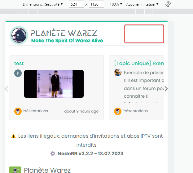
If i delete :
[data-widget-area=brand-header] .d-none {
  display: inherit !important;
}
Reading progress bar is good now but my icons (menu and theme swatch applet) dissapear


@DownPW I’d put that CSS back. It’s set like that for a reason, so you’ll need to be more specific with the target so you can unset.
-
Sorry but I do not understand too much @phenomlab because if I keep this code, the reading bar does not work on smartphone
-
Sorry but I do not understand too much @phenomlab because if I keep this code, the reading bar does not work on smartphone
@DownPW what I mean is target from higher above so the CSS you apply to the end target is not the same as an existing element.
Hello! It looks like you're interested in this conversation, but you don't have an account yet.
Getting fed up of having to scroll through the same posts each visit? When you register for an account, you'll always come back to exactly where you were before, and choose to be notified of new replies (either via email, or push notification). You'll also be able to save bookmarks and upvote posts to show your appreciation to other community members.
With your input, this post could be even better 💗
Register Login


