v3 & Harmony diary / thoughts / code snippets
-
More styling work completed today. Started looking at an decent alternative to the scroll top navigator featured on this site. I designed this a while ago and it’s designed to mimic the post scroller in Persona. With a little bit of modification, it would fit harmony very well in my view.
Currently the code I wrote for this is lying dormant on a VM I created for v3 development but since abandoned when the announcement around the harmony theme was announced. Its going to be hard to walk away from what constitutes around 100 hours of new CSS and
jsbut this was designed for Persona, and my thoughts are given all the fanfare with Harmony, the previous staple theme will fade into obscurity - perhaps no longer developed, meaning I’d have to both fork the last version and maintain it going forward.Honestly, I just don’t have time to commit to that, so the decision to turn my back on Persona development has been made, and it’s all harmony from now on. Sadly, this does mean the death knell for the conversation style CSS I developed. I won’t be including this in harmony as it’s difficult to support given it needs to add various new CSS classes into the DOM as posts are being loaded by Ajax. Clearly, this isn’t exactly optimum, and in fact, will slow down the rendering process if poorly coded.
Not sure if it’s my imagination, but v3 seems “oh so slightly” slower than v2. Literally nothing in it, but noticeable to me so clearly, there’s some room for tuning here which I think will be at the nginx level.
Stay tuned.
@phenomlab it seems i gonne use v2 end of this year. because i see that v2 very fast than v3 i mean page speed, user test etc.
-
@phenomlab said in v3 / Harmony diary:
perhaps no longer developed
well, although I understand your choice with Harmony, I believe Persona has its charm and will continue to be developed. you do not think so?
@crazycells said in v3 / Harmony diary:
I believe Persona has its charm and will continue to be developed. you do not think so?
It’s a feeling I have, and in my experience, something I’ve seen many times. Persona was the default theme shipped with v2, and has been the mainstay of that version for a long time. However, things change, and by NodeBB’s own admission, it needed an update to bring it in line with modern layouts and mobile design. As you know, Harmony is not a fork, but a completely new design that also requires v3 for it to work at all.
To me, this is the final whistle for Persona. Harmony will supersede it in every way, and eventually, development will stall for the former product with all the focus being on Harmony itself. My view is that Persona will become a community fork to stop it from disappearing completely, but in the same vein, I think most (like me) will jump ship and move to Harmony.
-
@phenomlab it seems i gonne use v2 end of this year. because i see that v2 very fast than v3 i mean page speed, user test etc.
@cagatay said in v3 / Harmony diary:
it seems i gonne use v2 end of this year. because i see that v2 very fast than v3 i mean page speed, user test etc
Yes, I’m glad I’m not the only one to witness this. I am going to raise this with the NodeBB team
EDIT - raised in the v3 Bug thread
https://community.nodebb.org/topic/16914/3-0-0-bug-report-thread/76?_=1675420990079 -
@cagatay said in v3 / Harmony diary:
it seems i gonne use v2 end of this year. because i see that v2 very fast than v3 i mean page speed, user test etc
Yes, I’m glad I’m not the only one to witness this. I am going to raise this with the NodeBB team
EDIT - raised in the v3 Bug thread
https://community.nodebb.org/topic/16914/3-0-0-bug-report-thread/76?_=1675420990079Ok, spun up the dev VM I started working on
And here’s a video of the reworked pagination / scroller utility I wrote that fires on pages
This was originally designed to work in tandem with the Persona scroller / navigation, but would be simple to convert to Harmony and BS5.
-
Ok, spun up the dev VM I started working on
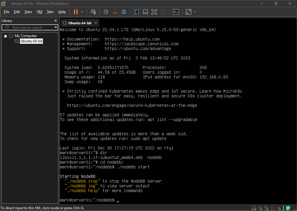
And here’s a video of the reworked pagination / scroller utility I wrote that fires on pages
https://sudonix.com/assets/uploads/files/screen-capture.webm
This was originally designed to work in tandem with the Persona scroller / navigation, but would be simple to convert to Harmony and BS5.
Today’s playground

Here’s a video… still needs a bit more work, but…
 Notice the newer scroll and progress bar I was talking about earlier…
 -
Today’s playground


Here’s a video… still needs a bit more work, but…
 Notice the newer scroll and progress bar I was talking about earlier…
Oh It’s very good. I love it

-
Today’s playground


Here’s a video… still needs a bit more work, but…
 Notice the newer scroll and progress bar I was talking about earlier…
@phenomlab waiting

-
@phenomlab said in v3 / Harmony diary:
Today’s playground

Here’s a video… still needs a bit more work, but…
 Notice the newer scroll and progress bar I was talking about earlier…
Hello Mark,
I just tested the functioning of the scroll bar and I saw this bug:
It should be moved to the left so as not to encroach on the collapse button of the custom footer navbar.
Then, when we play with the collapse button of the custom footer navbar we should:
-
When the custom footer navbar is deactivated: it sticks to the bottom right while not encroaching on the right sidebar. All this taking into account the collapse of the right sidebar (not obvious, I don’t know if I’m clear
 )
) -
When the custom footer navbar is activated: it moves just to the left of the floatright block or can be above the floatright block?
The solution may be less difficult to code would be to make a vertical scrollbar inside the right sidebar like in topics. There might be less to manage
Keep the good work my friend

-
-
@phenomlab said in v3 / Harmony diary:
Today’s playground


Here’s a video… still needs a bit more work, but…
 Notice the newer scroll and progress bar I was talking about earlier…
Hello Mark,
I just tested the functioning of the scroll bar and I saw this bug:
https://i.imgur.com/VQw5zw5.mp4
It should be moved to the left so as not to encroach on the collapse button of the custom footer navbar.
Then, when we play with the collapse button of the custom footer navbar we should:
-
When the custom footer navbar is deactivated: it sticks to the bottom right while not encroaching on the right sidebar. All this taking into account the collapse of the right sidebar (not obvious, I don’t know if I’m clear
 )
) -
When the custom footer navbar is activated: it moves just to the left of the floatright block or can be above the floatright block?
The solution may be less difficult to code would be to make a vertical scrollbar inside the right sidebar like in topics. There might be less to manage
Keep the good work my friend

Edit: [- https://i.imgur.com/VQw5zw5.mp4 -]
-
-
@phenomlab said in v3 / Harmony diary:
Today’s playground


Here’s a video… still needs a bit more work, but…
 Notice the newer scroll and progress bar I was talking about earlier…
Hello Mark,
I just tested the functioning of the scroll bar and I saw this bug:
https://i.imgur.com/VQw5zw5.mp4
It should be moved to the left so as not to encroach on the collapse button of the custom footer navbar.
Then, when we play with the collapse button of the custom footer navbar we should:
-
When the custom footer navbar is deactivated: it sticks to the bottom right while not encroaching on the right sidebar. All this taking into account the collapse of the right sidebar (not obvious, I don’t know if I’m clear
 )
) -
When the custom footer navbar is activated: it moves just to the left of the floatright block or can be above the floatright block?
The solution may be less difficult to code would be to make a vertical scrollbar inside the right sidebar like in topics. There might be less to manage
Keep the good work my friend

@DownPW fixed in Dev. Have a look. Many improvements and I think you’ll like it. Try it on both desktop and mobile.
-
-
@phenomlab said in v3 / Harmony diary:
Today’s playground


Here’s a video… still needs a bit more work, but…
 Notice the newer scroll and progress bar I was talking about earlier…
Hello Mark,
I just tested the functioning of the scroll bar and I saw this bug:
https://i.imgur.com/VQw5zw5.mp4
It should be moved to the left so as not to encroach on the collapse button of the custom footer navbar.
Then, when we play with the collapse button of the custom footer navbar we should:
-
When the custom footer navbar is deactivated: it sticks to the bottom right while not encroaching on the right sidebar. All this taking into account the collapse of the right sidebar (not obvious, I don’t know if I’m clear
 )
) -
When the custom footer navbar is activated: it moves just to the left of the floatright block or can be above the floatright block?
The solution may be less difficult to code would be to make a vertical scrollbar inside the right sidebar like in topics. There might be less to manage
Keep the good work my friend

@DownPW said in v3 / Harmony diary:
The solution may be less difficult to code would be to make a vertical scrollbar inside the right sidebar like in topics. There might be less to manage
Nope. The newest version of Harmony appears to have the same pagination as Flarum and Discourse, so it’s been moved into the
contentarea
-
-
@DownPW said in v3 / Harmony diary:
The solution may be less difficult to code would be to make a vertical scrollbar inside the right sidebar like in topics. There might be less to manage
Nope. The newest version of Harmony appears to have the same pagination as Flarum and Discourse, so it’s been moved into the
contentarea
yessss fixed. Love it


-
yessss fixed. Love it


-
@DownPW it’s definitely there. Won’t work without it

-
I guess, I don’t find it in inspector lol .I will search

-
I guess, I don’t find it in inspector lol .I will search

Can I test it on my dev env ?
EDIT: I test it. If you don’t want tell me Mark
If I have problem, can I ask you @phenomlab ?
-
Can I test it on my dev env ?
EDIT: I test it. If you don’t want tell me Mark
If I have problem, can I ask you @phenomlab ?
@DownPW no problems.
-
@phenomlab said in v3 / Harmony diary:
@DownPW no problems.
Seems I miss something
 @phenomlab but good start
[- https://i.imgur.com/cN0YeN0.mp4 -]
EDIT: Maybe find
EDIT 2: @phenomlab
Find --> I have forget toAbove and toBottom css directives
It’s better now, just seems toBottom doesn’t work :.toBottom { bottom: 0px !important; right: 0px!important; } .toAbove { bottom: -5px !important; right: 400px !important; } -
@phenomlab said in v3 / Harmony diary:
@DownPW no problems.
Seems I miss something
 @phenomlab but good start
[- https://i.imgur.com/cN0YeN0.mp4 -]
EDIT: Maybe find
EDIT 2: @phenomlab
Find --> I have forget toAbove and toBottom css directives
It’s better now, just seems toBottom doesn’t work :
.toBottom { bottom: 0px !important; right: 0px!important; } .toAbove { bottom: -5px !important; right: 400px !important; }@DownPW likely you are missing
z-indexon that class. As you are usingposition: absolutethe index is needed to bring that specific element forward. By default, it’ll sit behind the progress bar meaning it cannot be clicked, but can be seen. -
@DownPW likely you are missing
z-indexon that class. As you are usingposition: absolutethe index is needed to bring that specific element forward. By default, it’ll sit behind the progress bar meaning it cannot be clicked, but can be seen.Thanks for your reply my friend

I will test tomorrow and again, it’s a very great job, I like it a lot.
Hello! It looks like you're interested in this conversation, but you don't have an account yet.
Getting fed up of having to scroll through the same posts each visit? When you register for an account, you'll always come back to exactly where you were before, and choose to be notified of new replies (ether email, or push notification). You'll also be able to save bookmarks, use reactions, and upvote to show your appreciation to other community members.
With your input, this post could be even better 💗
RegisterLog in
