How to fix header side as boxed
-
Hi again,
Could we fix header as boxed type? I wanna fix it like contet size.
-
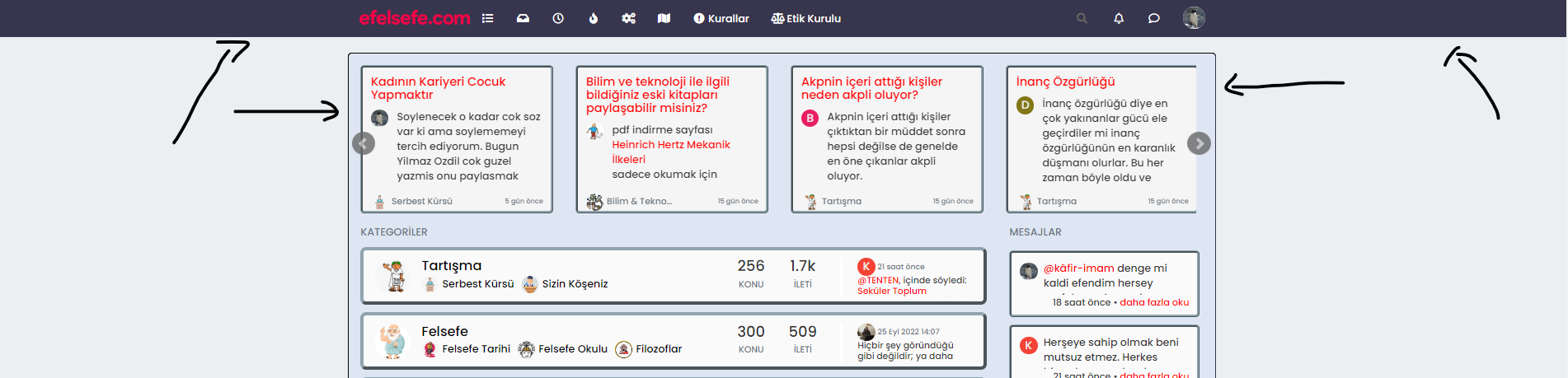
@cagatay Hi - do you want the view wider ?
You can amend the
containerclass such as below@media (min-width: 1200px) { .container { width: 1920px; } }That would give you the below

Mark – Founder, Phenomlab Ltd
Executive IT & Security Leadership
Phenomlab Ltd -
@cagatay Hi - do you want the view wider ?
You can amend the
containerclass such as below@media (min-width: 1200px) { .container { width: 1920px; } }That would give you the below
@phenomlab no dear i want to view header side like boxed type not wide. Where is dark blue colored.
-
@phenomlab no dear i want to view header side like boxed type not wide. Where is dark blue colored.
like this ?
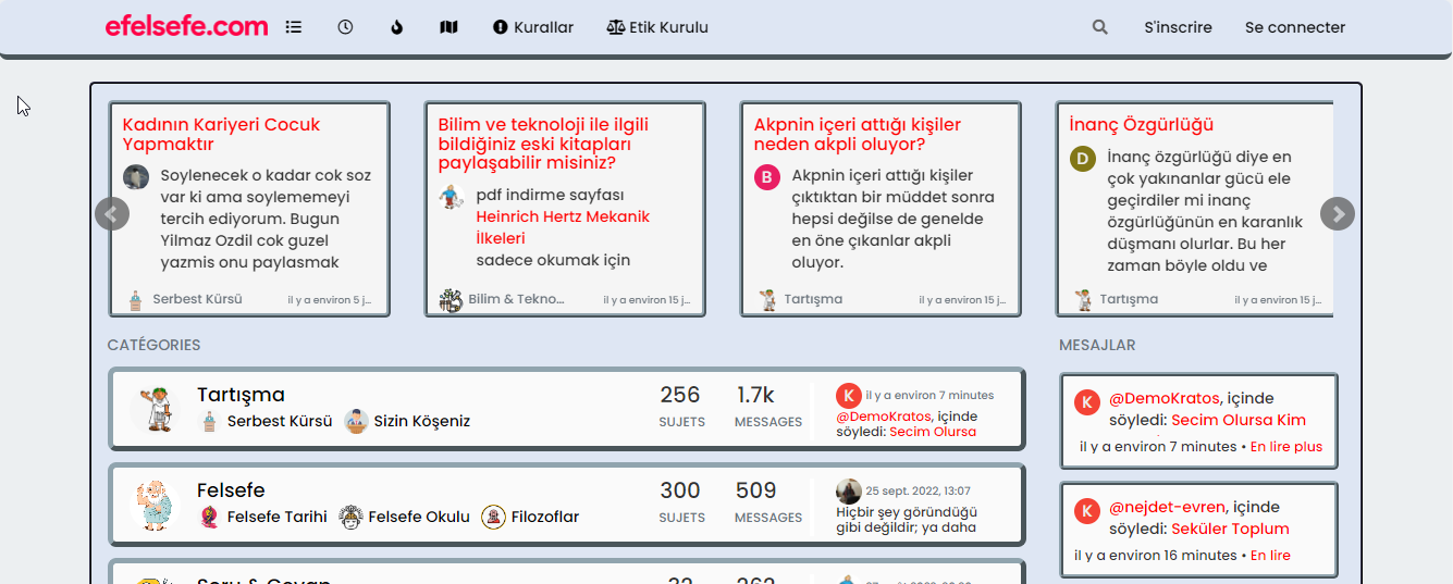
if yes :
.navbar-fixed-top {
    background: #dee6f3;
    border-bottom: 5px outset #90A4AE;
    border-radius: 8px;
}

.navbar-default .navbar-nav>li>a {
    color: #000;
}
PW and WS Spirit alive
-
like this ?
if yes :
.navbar-fixed-top { background: #dee6f3; border-bottom: 5px outset #90A4AE; border-radius: 8px; } .navbar-default .navbar-nav>li>a { color: #000; }@DownPW no, I want the header to align with the contents of my homepage.
i want to narrow my header which shown photo. (header = navbar)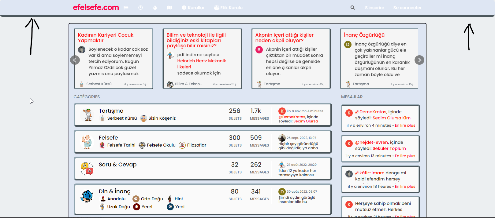
-
@DownPW no, I want the header to align with the contents of my homepage.
i want to narrow my header which shown photo. (header = navbar)@cagatay You want the header to be the same width as the main content, yes? I personally wouldn’t do that because if you do, it’s likely to impact the main content
-
@DownPW no, I want the header to align with the contents of my homepage.
i want to narrow my header which shown photo. (header = navbar)ha okkk sorry
yo ucan play with left and right like this :
.navbar-fixed-bottom, .navbar-fixed-top {
    position: fixed;
    right: 80px;
    left: 80px;
    z-index: 1030;
}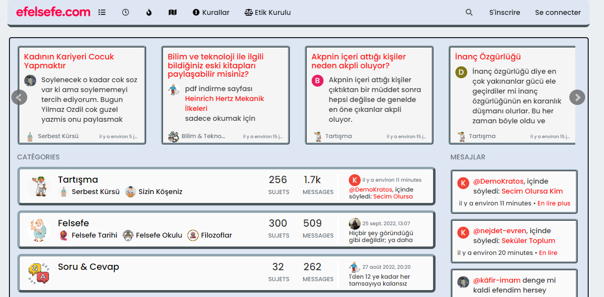
EDIT:
But @phenomlab is right, this can be a problem depending on the content of this element
")
PW and WS Spirit alive
-
ha okkk sorry
yo ucan play with left and right like this :
.navbar-fixed-bottom, .navbar-fixed-top {
    position: fixed;
    right: 80px;
    left: 80px;
    z-index: 1030;
}
EDIT:
But @phenomlab is right, this can be a problem depending on the content of this element
@DownPW Whilst this works, I wouldn’t recommend changing it. The CSS above is global in nature and will be effective against all breakpoints, including mobile, which doesn’t work very well for the user experience. The theme is responsive out of the box, so (in my view) you should leave it as it is.
It’s the Bootstrap standard
Mark – Founder, Phenomlab Ltd
Executive IT & Security Leadership
Phenomlab Ltd -
@DownPW Whilst this works, I wouldn’t recommend changing it. The CSS above is global in nature and will be effective against all breakpoints, including mobile, which doesn’t work very well for the user experience. The theme is responsive out of the box, so (in my view) you should leave it as it is.
It’s the Bootstrap standard
@phenomlab absolutely

-
@DownPW Whilst this works, I wouldn’t recommend changing it. The CSS above is global in nature and will be effective against all breakpoints, including mobile, which doesn’t work very well for the user experience. The theme is responsive out of the box, so (in my view) you should leave it as it is.
It’s the Bootstrap standard
@phenomlab yes it caused a problem for mobile users.
thank you for helping … -
 undefined cagatay has marked this topic as solved on
Hello! It looks like you're interested in this conversation, but you don't have an account yet.
Getting fed up of having to scroll through the same posts each visit? When you register for an account, you'll always come back to exactly where you were before, and choose to be notified of new replies (either via email, or push notification). You'll also be able to save bookmarks and upvote posts to show your appreciation to other community members.
With your input, this post could be even better 💗
Register Login