NodeBB customisation
-
@phenomlab said in NodeBB - Created pages not found?:
@jac Done
fantastic! thank you very much for all the continued help as always
 .
. -
11 days later
-
@phenomlab said in NodeBB - Created pages not found?:
@jac Done
fantastic! thank you very much for all the continued help as always
 .
.Thinking of changing the title font to blue (without the blue strip) is this possible?
Many thanks
-
Thinking of changing the title font to blue (without the blue strip) is this possible?
Many thanks
@jac Done
-
@phenomlab said in NodeBB customisation:
@jac Done
Thanks mate for that.
I can’t get used to having the white background
 sorry to mess you around mate, is there any way to have the yellow background back with the blue writing sorry matey.
 -
@phenomlab said in NodeBB customisation:
@jac Done
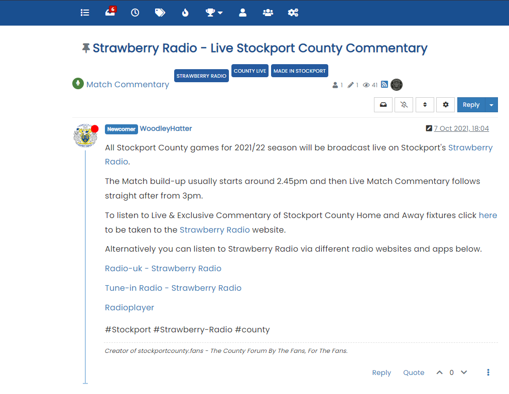
Thanks mate for that.
I can’t get used to having the white background
 sorry to mess you around mate, is there any way to have the yellow background back with the blue writing sorry matey.
@jac said in NodeBB customisation:
sorry to mess you around mate, is there any way to have the yellow background back with the blue writing sorry matey.
I know you’re a busy man Mark, just wanted to make sure that you’d seen this.
-
@jac said in NodeBB customisation:
sorry to mess you around mate, is there any way to have the yellow background back with the blue writing sorry matey.
I know you’re a busy man Mark, just wanted to make sure that you’d seen this.
@jac Done
-
-
22 days later
-
-
Hi Mark,
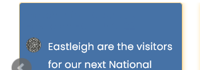
Is there any way to put a borer on these boxes or style them to match the other widgets? So for example like the quote link and hover colour?
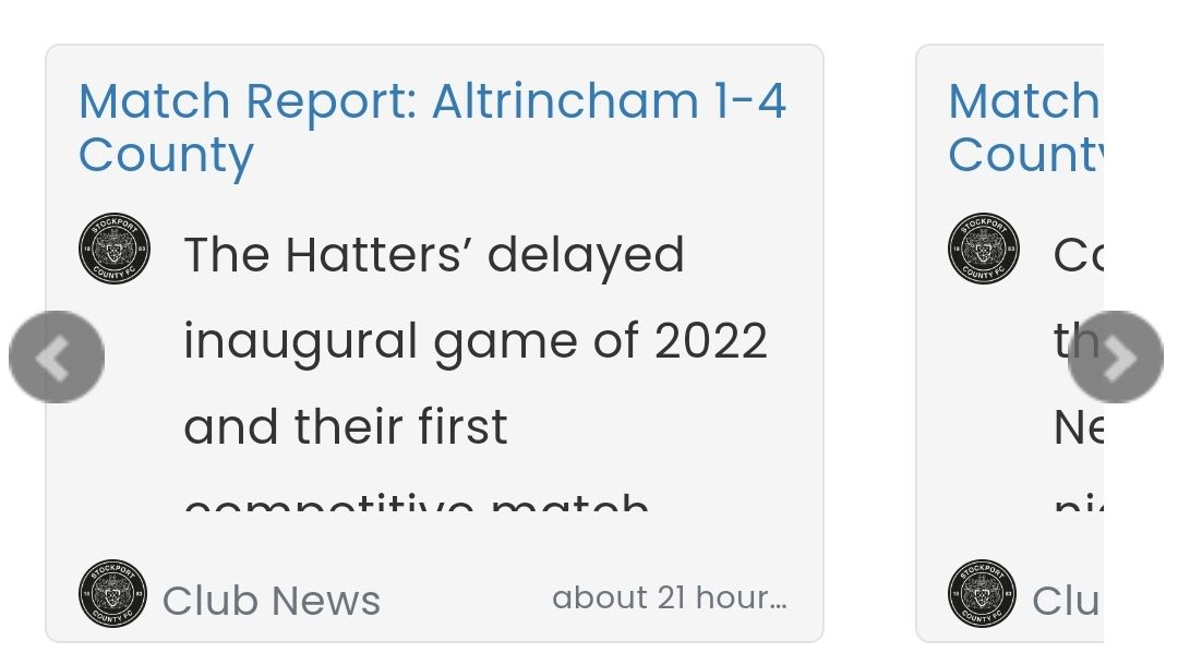
Many thanks
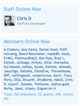
@jac also do you know if the “user reading discussion” plugin will enable to view who’s reading the thread on mobile?
-
@jac said in NodeBB customisation:
@phenomlab
Hi Mark,
Is there any way to put a borer on these boxes or style them to match the other widgets? So for example like the quote link and hover colour?Many thanks
Yeah it’s possible
example here for border color, background, or shadow, transparency, border radius :
.recent-cards .recent-card-container .recent-card {
    height: 200px;
    width: 100%;
    padding: 10px;
    position: relative;
    border: 1px solid #YOURCOLOR; /*border color*/
    box-shadow: 0px 0px 8px #YOURCOLOR; /*add a border shadow color*/
    background-color: #YOURCOLOR; /*background color*/
    border-radius: 5px; /*Radius*/
    margin-bottom: 10px;
    color: #YOURCOLOR; /* Text color*/
    opacity: 0.8; /*Opacity, trnasparency*/
}
Other example for categories and time :
.recent-cards .recent-card-container .recent-card .footer .category-item a,
.recent-cards .recent-card-container .recent-card .footer .sort-info {
    color: #YOURCOLOR;
    white-space: nowrap;
    text-overflow: ellipsis;
    display: block;
    overflow: hidden;
}
@jac said in NodeBB customisation:
@jac also do you know if the “user reading discussion” plugin will enable to view who’s reading the thread on mobile?
EDIT:
Hmm if you talk about nodebb-plugin-browsing-users, the don’t work on mobile (we don’t see who read or talk at real time like on desktop).
But when a user is on a topic or write a comment, you see him on desktop.I think this is normal because there is not enough free space in the header topic on mobile to display the avatars like on desktop
@downpw said in NodeBB customisation:
@jac said in NodeBB customisation:
@phenomlabHi Mark,
Is there any way to put a borer on these boxes or style them to match the other widgets? So for example like the quote link and hover colour?Many thanks
Yeah it’s possible
example here for border color, background, or shadow, transparency, border radius :
.recent-cards .recent-card-container .recent-card {
    height: 200px;
    width: 100%;
    padding: 10px;
    position: relative;
    border: 1px solid #YOURCOLOR; /*border color*/
    box-shadow: 0px 0px 8px #YOURCOLOR; /*add a border shadow color*/
    background-color: #YOURCOLOR; /*background color*/
    border-radius: 5px; /*Radius*/
    margin-bottom: 10px;
    color: #YOURCOLOR; /* Text color*/
    opacity: 0.8; /*Opacity, trnasparency*/
}
Other example for categories and time :
.recent-cards .recent-card-container .recent-card .footer .category-item a,
.recent-cards .recent-card-container .recent-card .footer .sort-info {
    color: #YOURCOLOR;
    white-space: nowrap;
    text-overflow: ellipsis;
    display: block;
    overflow: hidden;
}
@jac said in NodeBB customisation:
@jac also do you know if the “user reading discussion” plugin will enable to view who’s reading the thread on mobile?
Hmm if you talk about nodebb-plugin-browsing-users, the don’t work on mobile
Brilliant thank you very much for the information @DownPW

-
@downpw said in NodeBB customisation:
@jac said in NodeBB customisation:
@phenomlabHi Mark,
Is there any way to put a borer on these boxes or style them to match the other widgets? So for example like the quote link and hover colour?Many thanks
Yeah it’s possible
example here for border color, background, or shadow, transparency, border radius :
.recent-cards .recent-card-container .recent-card {
    height: 200px;
    width: 100%;
    padding: 10px;
    position: relative;
    border: 1px solid #YOURCOLOR; /*border color*/
    box-shadow: 0px 0px 8px #YOURCOLOR; /*add a border shadow color*/
    background-color: #YOURCOLOR; /*background color*/
    border-radius: 5px; /*Radius*/
    margin-bottom: 10px;
    color: #YOURCOLOR; /* Text color*/
    opacity: 0.8; /*Opacity, trnasparency*/
}
Other example for categories and time :
.recent-cards .recent-card-container .recent-card .footer .category-item a,
.recent-cards .recent-card-container .recent-card .footer .sort-info {
    color: #YOURCOLOR;
    white-space: nowrap;
    text-overflow: ellipsis;
    display: block;
    overflow: hidden;
}
@jac said in NodeBB customisation:
@jac also do you know if the “user reading discussion” plugin will enable to view who’s reading the thread on mobile?
Hmm if you talk about nodebb-plugin-browsing-users, the don’t work on mobile
Brilliant thank you very much for the information @DownPW

@jac said in NodeBB customisation:
@downpw said in NodeBB customisation:
@jac said in NodeBB customisation:
@phenomlabHi Mark,
Is there any way to put a borer on these boxes or style them to match the other widgets? So for example like the quote link and hover colour?Many thanks
Yeah it’s possible
example here for border color, background, or shadow, transparency, border radius :
.recent-cards .recent-card-container .recent-card {
    height: 200px;
    width: 100%;
    padding: 10px;
    position: relative;
    border: 1px solid #YOURCOLOR; /*border color*/
    box-shadow: 0px 0px 8px #YOURCOLOR; /*add a border shadow color*/
    background-color: #YOURCOLOR; /*background color*/
    border-radius: 5px; /*Radius*/
    margin-bottom: 10px;
    color: #YOURCOLOR; /* Text color*/
    opacity: 0.8; /*Opacity, trnasparency*/
}
Other example for categories and time :
.recent-cards .recent-card-container .recent-card .footer .category-item a,
.recent-cards .recent-card-container .recent-card .footer .sort-info {
    color: #YOURCOLOR;
    white-space: nowrap;
    text-overflow: ellipsis;
    display: block;
    overflow: hidden;
}
@jac said in NodeBB customisation:
@jac also do you know if the “user reading discussion” plugin will enable to view who’s reading the thread on mobile?
Hmm if you talk about nodebb-plugin-browsing-users, the don’t work on mobile
Brilliant thank you very much for the information @DownPW

How to do this


 .
. -
@downpw said in NodeBB customisation:
Hmm if you talk about nodebb-plugin-browsing-users, the don’t work on mobile (we don’t see who read or talk at real time like on desktop).
I think that’s just CSS set to hide on mobile viewport ?
-
@jac said in NodeBB customisation:
@downpw said in NodeBB customisation:
@jac said in NodeBB customisation:
@phenomlabHi Mark,
Is there any way to put a borer on these boxes or style them to match the other widgets? So for example like the quote link and hover colour?Many thanks
Yeah it’s possible
example here for border color, background, or shadow, transparency, border radius :
.recent-cards .recent-card-container .recent-card {
    height: 200px;
    width: 100%;
    padding: 10px;
    position: relative;
    border: 1px solid #YOURCOLOR; /*border color*/
    box-shadow: 0px 0px 8px #YOURCOLOR; /*add a border shadow color*/
    background-color: #YOURCOLOR; /*background color*/
    border-radius: 5px; /*Radius*/
    margin-bottom: 10px;
    color: #YOURCOLOR; /* Text color*/
    opacity: 0.8; /*Opacity, trnasparency*/
}
Other example for categories and time :
.recent-cards .recent-card-container .recent-card .footer .category-item a,
.recent-cards .recent-card-container .recent-card .footer .sort-info {
    color: #YOURCOLOR;
    white-space: nowrap;
    text-overflow: ellipsis;
    display: block;
    overflow: hidden;
}
@jac said in NodeBB customisation:
@jac also do you know if the “user reading discussion” plugin will enable to view who’s reading the thread on mobile?
Hmm if you talk about nodebb-plugin-browsing-users, the don’t work on mobile
Brilliant thank you very much for the information @DownPW

How to do this


 .
.@jac said in NodeBB customisation:
How to do this
You should be able to use the (example) CSS provided by @DownPW
-
@downpw said in NodeBB customisation:
Hmm if you talk about nodebb-plugin-browsing-users, the don’t work on mobile (we don’t see who read or talk at real time like on desktop).
I think that’s just CSS set to hide on mobile viewport ?
@phenomlab said in NodeBB customisation:
@downpw said in NodeBB customisation:
Hmm if you talk about nodebb-plugin-browsing-users, the don’t work on mobile (we don’t see who read or talk at real time like on desktop).
I think that’s just CSS set to hide on mobile viewport ?
Yeah maybe

@phenomlab said in NodeBB customisation:
@jac said in NodeBB customisation:
How to do this
You should be able to use the (example) CSS provided by @DownPW
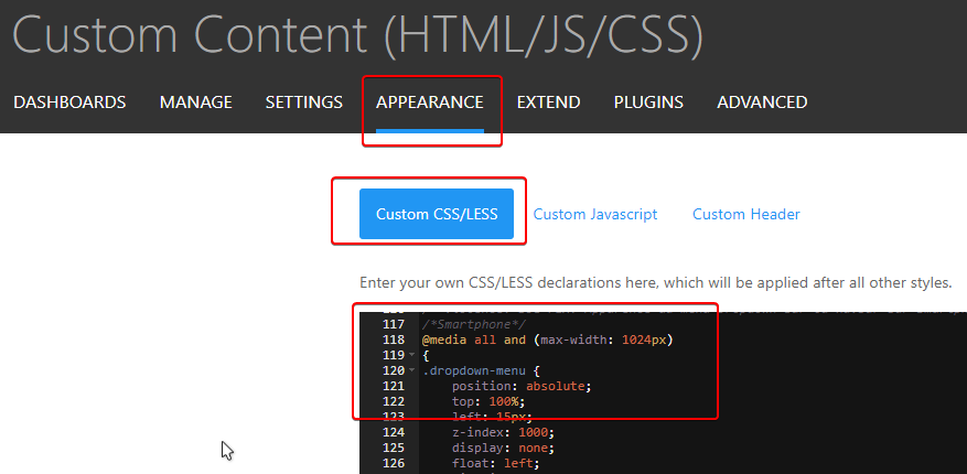
Like said @phenomlab, you can use this CSS code on ACP/APPEARANCE/Custom CSS/LESS :
-
@phenomlab said in NodeBB customisation:
@downpw said in NodeBB customisation:
Hmm if you talk about nodebb-plugin-browsing-users, the don’t work on mobile (we don’t see who read or talk at real time like on desktop).
I think that’s just CSS set to hide on mobile viewport ?
Yeah maybe

@phenomlab said in NodeBB customisation:
@jac said in NodeBB customisation:
How to do this
You should be able to use the (example) CSS provided by @DownPW
Like said @phenomlab, you can use this CSS code on ACP/APPEARANCE/Custom CSS/LESS :
@downpw said in NodeBB customisation:
@phenomlab said in NodeBB customisation:
@downpw said in NodeBB customisation:
Hmm if you talk about nodebb-plugin-browsing-users, the don’t work on mobile (we don’t see who read or talk at real time like on desktop).
I think that’s just CSS set to hide on mobile viewport ?
Yeah maybe

@phenomlab said in NodeBB customisation:
@jac said in NodeBB customisation:
How to do this
You should be able to use the (example) CSS provided by @DownPW
Like said @phenomlab, you can use this CSS code on ACP/APPEARANCE/Custom CSS/LESS :
Many thanks to both

-
@downpw said in NodeBB customisation:
@phenomlab said in NodeBB customisation:
@downpw said in NodeBB customisation:
Hmm if you talk about nodebb-plugin-browsing-users, the don’t work on mobile (we don’t see who read or talk at real time like on desktop).
I think that’s just CSS set to hide on mobile viewport ?
Yeah maybe

@phenomlab said in NodeBB customisation:
@jac said in NodeBB customisation:
How to do this
You should be able to use the (example) CSS provided by @DownPW
Like said @phenomlab, you can use this CSS code on ACP/APPEARANCE/Custom CSS/LESS :

Many thanks to both

@jac said in NodeBB customisation:
@downpw said in NodeBB customisation:
@phenomlab said in NodeBB customisation:
@downpw said in NodeBB customisation:
Hmm if you talk about nodebb-plugin-browsing-users, the don’t work on mobile (we don’t see who read or talk at real time like on desktop).
I think that’s just CSS set to hide on mobile viewport ?
Yeah maybe

@phenomlab said in NodeBB customisation:
@jac said in NodeBB customisation:
How to do this
You should be able to use the (example) CSS provided by @DownPW
Like said @phenomlab, you can use this CSS code on ACP/APPEARANCE/Custom CSS/LESS :
Many thanks to both

Must try this tomorrow


-
@jac said in NodeBB customisation:
@downpw said in NodeBB customisation:
@phenomlab said in NodeBB customisation:
@downpw said in NodeBB customisation:
Hmm if you talk about nodebb-plugin-browsing-users, the don’t work on mobile (we don’t see who read or talk at real time like on desktop).
I think that’s just CSS set to hide on mobile viewport ?
Yeah maybe

@phenomlab said in NodeBB customisation:
@jac said in NodeBB customisation:
How to do this
You should be able to use the (example) CSS provided by @DownPW
Like said @phenomlab, you can use this CSS code on ACP/APPEARANCE/Custom CSS/LESS :

Many thanks to both

Must try this tomorrow


@jac said in NodeBB customisation:
@jac said in NodeBB customisation:
@downpw said in NodeBB customisation:
@phenomlab said in NodeBB customisation:
@downpw said in NodeBB customisation:
Hmm if you talk about nodebb-plugin-browsing-users, the don’t work on mobile (we don’t see who read or talk at real time like on desktop).
I think that’s just CSS set to hide on mobile viewport ?
Yeah maybe

@phenomlab said in NodeBB customisation:
@jac said in NodeBB customisation:
How to do this
You should be able to use the (example) CSS provided by @DownPW
Like said @phenomlab, you can use this CSS code on ACP/APPEARANCE/Custom CSS/LESS :
Many thanks to both

Must try this tomorrow


Would there be any reason why the colour shows differently in the nav bar and card slider?
Obviously needs a lot of work with the link colours etc.
-
@jac said in NodeBB customisation:
@jac said in NodeBB customisation:
@downpw said in NodeBB customisation:
@phenomlab said in NodeBB customisation:
@downpw said in NodeBB customisation:
Hmm if you talk about nodebb-plugin-browsing-users, the don’t work on mobile (we don’t see who read or talk at real time like on desktop).
I think that’s just CSS set to hide on mobile viewport ?
Yeah maybe

@phenomlab said in NodeBB customisation:
@jac said in NodeBB customisation:
How to do this
You should be able to use the (example) CSS provided by @DownPW
Like said @phenomlab, you can use this CSS code on ACP/APPEARANCE/Custom CSS/LESS :

Many thanks to both

Must try this tomorrow


Would there be any reason why the colour shows differently in the nav bar and card slider?
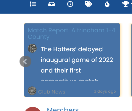
Obviously needs a lot of work with the link colours etc.
@jac Yes, because they are links that sit inside another DIV, so they will auto inherit from the
a hrefCSS. You can override that with this (as an example - choose the colour you prefer).recent-card-body a { color: #ffffff; } -
@jac Yes, because they are links that sit inside another DIV, so they will auto inherit from the
a hrefCSS. You can override that with this (as an example - choose the colour you prefer).recent-card-body a { color: #ffffff; }@phenomlab Thanks Mark for the fast response.
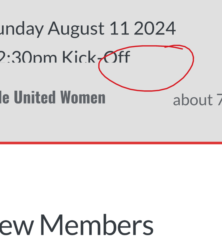
Unfortunately the above change only changes the title colour?
