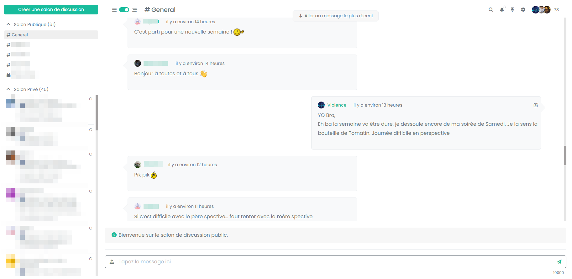
Threaded chat support for NodeBB
-
@phenomlab i also should copy/paste git codes?
i have a problem chat area… -
@phenomlab i also should copy/paste git codes?
i have a problem chat area…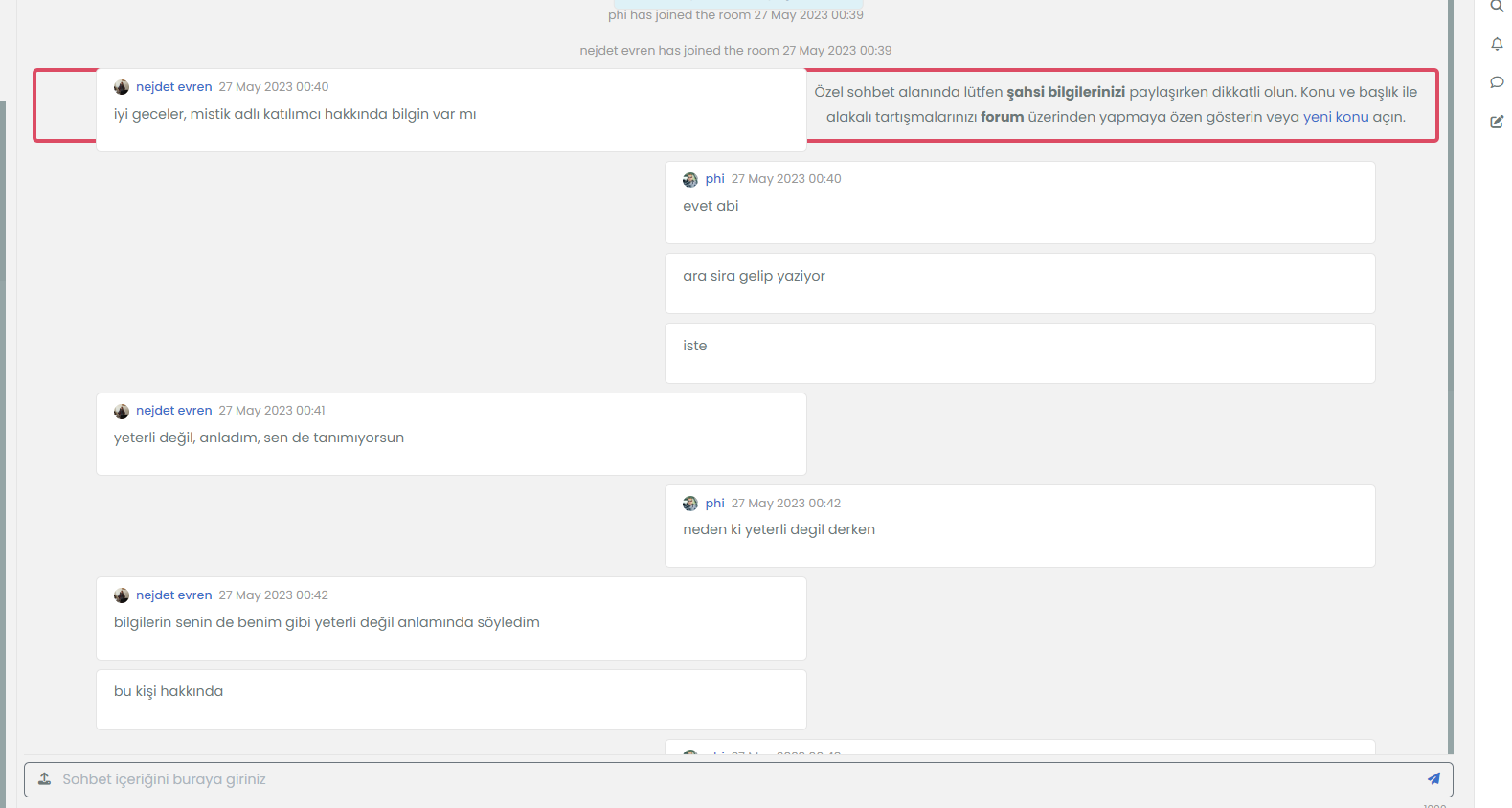
@cagatay Yes, you should. The problem in the chat area is because you haven’t updated the
chatBannerfunction as I mentioned. -
what is your git adress for it?
-
-
-
thank you did it, but there is a small problem, button is transparented and do not seem.

@cagatay this is because your are using the sudonix theme which isn’t stock Harmony which this post is designed for.
You will need custom CSS to resolve this which is why I am reluctant to provide the sudonix code and associated themes because of the issues it will cause further down the line when you attempt to use add-on code that is not designed for direct usage, but for stock Harmony.
-
hello @phenomlab
Test the last code.
Working very well, definitively better
Notice the bug for system event persist even having updated the chat banner code
And other question : I see that there is no border for the arrows, can we add some like this ?
-
hello @phenomlab
Test the last code.
Working very well, definitively better
Notice the bug for system event persist even having updated the chat banner code
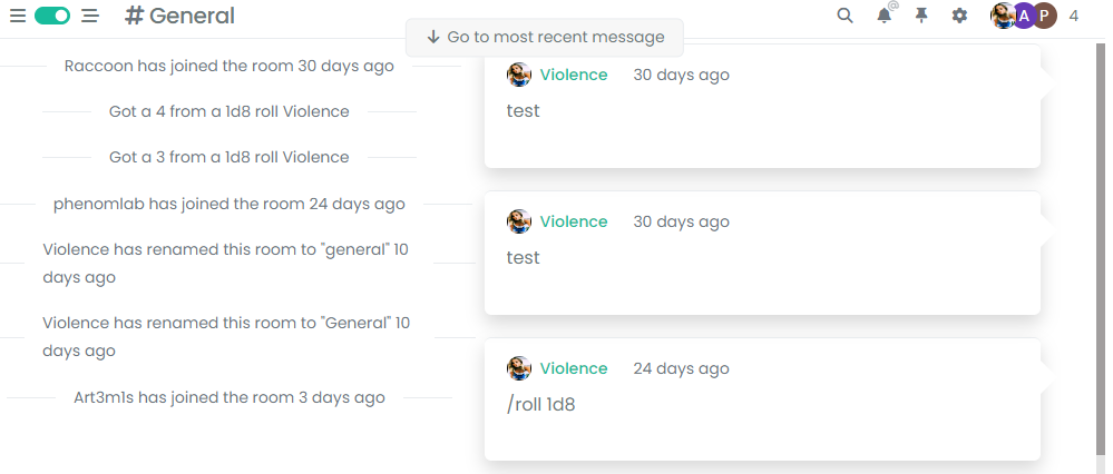
And other question : I see that there is no border for the arrows, can we add some like this ?

@DownPW Yep. Let me have a quick look.
-
hello @phenomlab
Test the last code.
Working very well, definitively better
Notice the bug for system event persist even having updated the chat banner code

And other question : I see that there is no border for the arrows, can we add some like this ?

@DownPW said in Threaded chat support for NodeBB:
And other question : I see that there is no border for the arrows, can we add some like this ?
This is actually a lot more complex than it looks - mostly because you cannot draw an additional border around the pseudo element because one already exists. It’s still possible, with the below changes
[data-self="1"].threaded { /* box-shadow: 0 0.5rem 1rem rgba(0, 0, 0, 0.15) !important; */ } [data-self="0"].threaded { /* box-shadow: 0 0.5rem 1rem rgba(0, 0, 0, 0.15) !important; */ } [data-self="1"].threaded { border: 1px solid var(--bs-border-color); } [data-self="0"].threaded { border: 1px solid var(--bs-border-color); } [data-self="0"].threaded::before { border-color: transparent var(--bs-border-color) transparent transparent !important; } [data-self="0"].threaded:after { content: " "; position: absolute; top: 20px; z-index: 2; border: 15px solid var(--bs-body-bg); border-color: transparent var(--bs-body-bg) transparent transparent !important; left: -14px; border-width: 15px 15px 15px 0; } [data-self="1"].threaded::before { border-color: transparent transparent transparent var(--bs-border-color) !important; } [data-self="1"].threaded:after { content: " "; position: absolute; top: 20px; z-index: 2; border: 15px solid var(--bs-body-bg); border-color: transparent transparent transparent var(--bs-body-bg) !important; right: -29px; border-width: 15px 15px 15px 0; border: 15px solid var(--bs-body-bg); } Obviously, we are removing the
box-shadowdirective here and replacing it with a border. Then we need to add:afterpseudo elements to “overlay” the:beforeto create the transparent background. This then yields the below effectIf you want to go cheap, you could skip this CSS altogether, and just use a background on the
[data-self="0"].threadedand[data-self="1"].threadedelements - as long as it is the same color as the border, it’ll be fine.For example
[data-self="1"].threaded { /* box-shadow: 0 0.5rem 1rem rgba(0, 0, 0, 0.15) !important; */ background: var(--bs-body-navbar); } [data-self="0"].threaded { /* box-shadow: 0 0.5rem 1rem rgba(0, 0, 0, 0.15) !important; */ background: var(--bs-body-navbar); } [data-self="0"].threaded::before { border-color: transparent var(--bs-body-navbar) transparent transparent !important; } [data-self="1"].threaded::before { border-color: transparent transparent transparent var(--bs-body-navbar) !important; } This would yield
As you can see, it’s a lot less effort to not include any borders. However, there are some great examples shown here - it really depends on how complex you want it to be
-
hello @phenomlab
Test the last code.
Working very well, definitively better
Notice the bug for system event persist even having updated the chat banner code

And other question : I see that there is no border for the arrows, can we add some like this ?

@DownPW said in Threaded chat support for NodeBB:
Notice the bug for system event persist even having updated the chat banner code
I cannot replicate this on your dev environment.
-
-
 Definitively better, you can add it to git
In any case, enormous work and as usual : many thanks
I think my users will be happy to have this functionality !!!@DownPW said in Threaded chat support for NodeBB:
I think my users will be happy to have this functionality !!!
Yes, I think this makes chat so much easier to navigate.
-
@DownPW said in Threaded chat support for NodeBB:
I think my users will be happy to have this functionality !!!
Yes, I think this makes chat so much easier to navigate.
@phenomlab said in Threaded chat support for NodeBB:
@DownPW said in Threaded chat support for NodeBB:
I think my users will be happy to have this functionality !!!
Yes, I think this makes chat so much easier to navigate.
Yes, it’s actually easier to read and more ergonomic and pretty to top it off ! (I don’t know if this expression exists in English
 )
) -
@phenomlab said in Threaded chat support for NodeBB:
@DownPW said in Threaded chat support for NodeBB:
I think my users will be happy to have this functionality !!!
Yes, I think this makes chat so much easier to navigate.
Yes, it’s actually easier to read and more ergonomic and pretty to top it off ! (I don’t know if this expression exists in English
 )
)@DownPW a perfect translation and expression. Same in English!
-
you think I can have with result with a background (bubble + arrow) different to border color (more light) ?
EDIT :
Find the trick

@media (min-width:1200px) { [data-self="1"].threaded { width: 50%; float: right; margin-right: 5% !important; transition: margin-left 0.3s ease, margin-right 0.3s ease; position: relative; padding-bottom: 20px !important; margin-bottom: 20px; padding: 20px; border-radius: 0.375rem; border: 1px solid var(--bs-border-color); background-color: var(--bs-body-navbar); } [data-self="1"].threaded::before { content: " "; height: 0; position: absolute; top: 20px; width: 0; z-index: 1; right: -30px; border-width: 15px 15px 15px 0; border: 15px solid var(--bs-border-color); border-color: transparent transparent transparent var(--bs-border-color) !important; } [data-self="1"].threaded:after { content: " "; position: absolute; top: 20px; z-index: 2; border: 15px solid var(--bs-body-bg); border-color: transparent transparent transparent var(--bs-body-navbar) !important; right: -29px; border-width: 15px 15px 15px 0; border: 15px solid var(--bs-body-navbar); } [data-self="0"].threaded { width: 50%; float: left; margin-left: 5% !important; transition: margin-left 0.3s ease, margin-right 0.3s ease; position: relative; padding-bottom: 20px !important; margin-bottom: 20px; padding: 20px; border-radius: 0.375rem; border: 1px solid var(--bs-border-color); background-color: var(--bs-body-navbar); } [data-self="0"].threaded::before { content: " "; height: 0; position: absolute; top: 20px; width: 0; z-index: 1; left: -30px; border-width: 15px 15px 15px 0; border: 15px solid var(--bs-border-color); border-color: transparent var(--bs-border-color) transparent transparent !important; } [data-self="0"].threaded:after { content: " "; position: absolute; top: 20px; z-index: 2; border: 15px solid var(--bs-body-navbar); border-color: transparent var(--bs-body-navbar) transparent transparent !important; left: -14px; border-width: 15px 15px 15px 0; } [component="chat/message"] { transition: margin-left 0.3s ease, margin-right 0.3s ease; } [data-self="1"][component="chat/message"] .message-body-wrapper.threaded { float: right; } [data-self="1"][component="chat/message"] .message-header.threaded{ float: right; } [component="chat/message/controls"] { top: 30px; } [component="chat/system-message"] { clear: both; } } -
It seems that when the 2 codes are together, the thread view for topics no longer works.
On the first screen below, my post should be shifted to the right and it is no longer.
On the other hand, my post in “highlight” mode is quite offbeatmaybe a problem just with my CSS, I’m looking for the directive that could bother me

EDIT :
Seems to find the trick again, just add an
!importantto thread View post css codeli.pt-4.self-post:not(.self-post .topic-owner-post).threaded { margin-left: 0rem !important; } -
It seems that when the 2 codes are together, the thread view for topics no longer works.
On the first screen below, my post should be shifted to the right and it is no longer.
On the other hand, my post in “highlight” mode is quite offbeat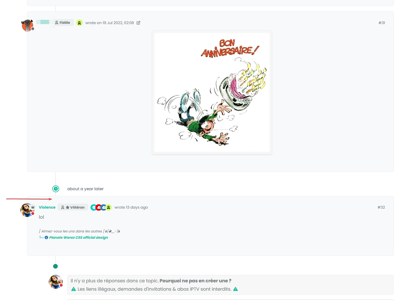
maybe a problem just with my CSS, I’m looking for the directive that could bother me

EDIT :
Seems to find the trick again, just add an
!importantto thread View post css codeli.pt-4.self-post:not(.self-post .topic-owner-post).threaded { margin-left: 0rem !important; }@DownPW said in Threaded chat support for NodeBB:
just add an !important to thread View post css code
Yep. Just don’t overuse that directive.
Hello! It looks like you're interested in this conversation, but you don't have an account yet.
Getting fed up of having to scroll through the same posts each visit? When you register for an account, you'll always come back to exactly where you were before, and choose to be notified of new replies (ether email, or push notification). You'll also be able to save bookmarks, use reactions, and upvote to show your appreciation to other community members.
With your input, this post could be even better 💗
RegisterLog in
Related Topics
-
-
-
-
-
Welcome to NodeBB V3!
Pinned Moved General 26 Apr 2023, 18:51 -
-
-
