What is this bar called?
-
I thought something was missing…

I totally understand. Very tired me too at the moment and like you a lot of work provided between my job and the one done outside on PW
-
I thought something was missing…

I totally understand. Very tired me too at the moment and like you a lot of work provided between my job and the one done outside on PW
@DownPW said in What is this bar called?:
I totally understand. Very tired me too at the moment and like you a lot of work provided between my job and the one done outside on PW
Yes, that’s exactly the problem. Work is very demanding and has to come first, so I fit this (Sudonix) in whenever I can - often late into evenings and it’s easy to make even the simplest of mistakes

-
All - i found some bugs in the previous code that was posted, and have rectified the error. Please replace any code you are using with the revised version.
-
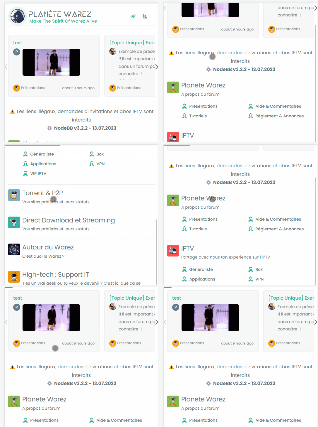
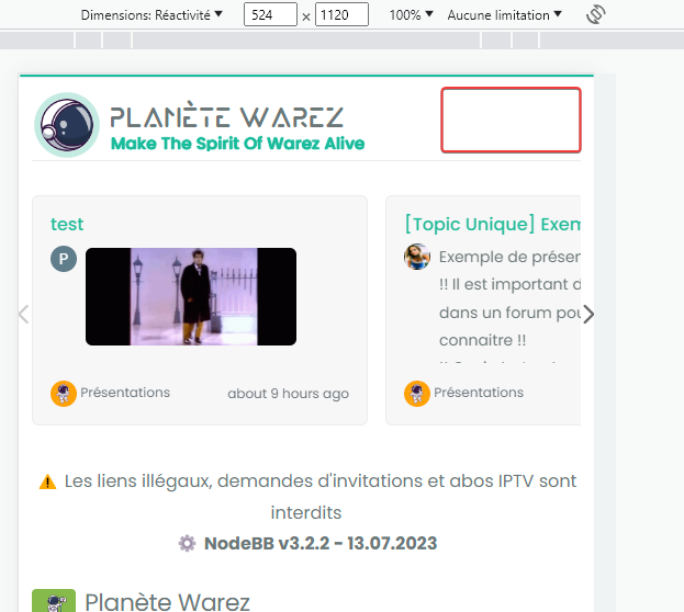
I don’t know why the reading-meter-progress-bar doesn’t appear on my smartphone (dev instance) when I scroll down but appear a little on scroll top ?

-
I don’t know why the reading-meter-progress-bar doesn’t appear on my smartphone (dev instance) when I scroll down but appear a little on scroll top ?

@DownPW That must be some sort custom CSS. I can’t reproduce that here. ,
-
odd, no problem on desktop, just smartphone
-
It seems that code who caused problem :
/* Menu Brand Header */
@media (max-width: 767px)  {
  .socialicons {
    display: none !important;
  }
  [data-widget-area=brand-header] .d-none {
    display: inherit !important;
  }
  /* Button topic navbar header color */
  .sticky-tools .btn-ghost-sm i {
    color: var(--bs-alert-info-color) !important;
  }
}
If i delete :
[data-widget-area=brand-header] .d-none {
  display: inherit !important;
}
Reading progress bar is good now but my icons (menu and theme swatch applet) dissapear


@DownPW I’d put that CSS back. It’s set like that for a reason, so you’ll need to be more specific with the target so you can unset.
-
Sorry but I do not understand too much @phenomlab because if I keep this code, the reading bar does not work on smartphone
-
Sorry but I do not understand too much @phenomlab because if I keep this code, the reading bar does not work on smartphone
@DownPW what I mean is target from higher above so the CSS you apply to the end target is not the same as an existing element.
-
for brand header or for progress bar ?
-
@DownPW progress bar.
-
I just tested by deleting all the custom CSS code and keeping only the following CSS code
#pageUp {
  display: inline-block;
  background: var(--bs-body-component-active);
  width: 50px;
  height: 50px;
  text-align: center;
  border-radius: 0.375rem;
  position: fixed;
  bottom: 70px;
  right: 80px;
  transition: background-color .3s, opacity .5s, visibility .5s;
  opacity: 0;
  visibility: hidden;
}
#pageUp.show {
  opacity: 1;
  visibility: visible;
  z-index: 10000;
  color: var(--bs-body-navbar-color) !important;
}
a#pageUp.show:hover {
  background: var(--bs-dropdown-link-hover-bg);
  border: 1px solid var(--bs-border-color);
}
a#pageUp i {
    position: absolute;
    top: 32%;
    left: 35%;
}
.reading-meter {
    position: fixed;
    width: 100%;
    top: 0;
    left: 0;
    right: 0;
    height: 2px !important;
}

div#readingposition {
    background-color: var(--bs-body-navbar) !important;
    color: var(--bs-body-color) !important;
    height: 2px;
    z-index: 1000;
}

.reading-meter-progress {
    border: 1px solid var(--bs-border-color);
    width: 100%;
}

.reading-meter-background {
    background: var(--bs-body-bg);
}

.reading-meter-progress-bar {
    background: var(--bs-progress-bg-bar);
    height: 2px;
}
input#percentage {
    display: none;
}

@media (max-width: 767px) {
    #pageUp {
        bottom: 60px;
        right: 30px;
      }
    }


 /* Menu Brand Header */
@media (max-width: 767px)  {
  .socialicons {
    display: none !important;
  }
  [data-widget-area=brand-header] .d-none {
    display: inherit !important;
  }
  /* Button topic navbar header color */
  .sticky-tools .btn-ghost-sm i {
    color: var(--bs-alert-info-color) !important;
  }
}
There is clearly a conflict between his 2 codes.
-
What I don’t understand is that we have the same code and you don’t have this problem.
-
What I don’t understand is that we have the same code and you don’t have this problem.
@DownPW this is the point I was trying to make about custom CSS.
-
I have find, it’s a zoom problem :
If we zoom in on a page like the home page, even a tiny zoom invisible to the naked eye (which was my case), we end up with the bug described above.
Solution: zoomed out to maximum
-
When I refresh the page or first visit, the Reading bar appear when she shouldn’t appear.
An idea?Same things when I disable all the other custom CSS

-
When I refresh the page or first visit, the Reading bar appear when she shouldn’t appear.
An idea?Same things when I disable all the other custom CSS

@DownPW Let me have a look.
-
It’s weird @phenomlab because I tested by removing all the custom css except the reading bar and it’s the same.
Have you testing without custom css for see that ?
On custom JS maybe ?
-
It’s weird @phenomlab because I tested by removing all the custom css except the reading bar and it’s the same.
Have you testing without custom css for see that ?
On custom JS maybe ?
@DownPW I am able to reproduce this, yes. There are some CSS classes missing
.reading-meter {
    visibility: hidden;
}
.reading-meter.show {
    visibility: visible;
}
I’ve added these on your DEV server and updated the original post. Sorry

Hello! It looks like you're interested in this conversation, but you don't have an account yet.
Getting fed up of having to scroll through the same posts each visit? When you register for an account, you'll always come back to exactly where you were before, and choose to be notified of new replies (either via email, or push notification). You'll also be able to save bookmarks and upvote posts to show your appreciation to other community members.
With your input, this post could be even better 💗
Register Login


