Custom badges

-
additionally, these pages need some adjustments: https://sudonix.org/user/phenomlab

-
additionally, these pages need some adjustments: https://sudonix.org/user/phenomlab
@crazycells that’s odd. Shouldn’t look like that (at least, it doesn’t on my device). What device are you using?
-
hi @phenomlab, we should be able to download this…
https://commons.wikimedia.org/wiki/File:Twitter_Verified_Badge.svg
…and recolor it accordingly and upload it to the forum the same way, right? These colors are reminding everyone “twitter” , I believe it would be nicer if it is changed according to the personality of the forum, so it will look more original while maintaining “meaning”…
I think here on this forum, “sudonix orange” color would look cooler than “twitter blue”
@crazycells hmm. That’s a good idea. Let me have a look at that.
-
I had already reported this little problem to you @phenomlab
The problem only occurs on the profile of other users and not on his own profile. (of memories)
For my part, I solved this bug with the following code (to be adapted)
/*----------------------------------------------------------------------------*/
/*-------------------      USER PROFILE ANIMATION     ------------------------*/
/*----------------------------------------------------------------------------*/

/*[component="profile/change/picture"] img {
    z-index: 300 !important;
}*/


.avatar-wrapper:before {
    animation-iteration-count: infinite;
    animation: pulsate 4s ease-out infinite;
    border-radius: 50%;
    border: 15px solid var(--bs-link-color);
    content: "";
    height: 180px;
    left: -19px;
    top: -19px;
    opacity: 0;
    position: absolute;
    width: 180px;
    z-index: -1;
}

/* Change z-index Cover img profile for animation effect */
.cover, .cover>.container {
    z-index: -2;
}

/* Avatar on user profile page */
.account .avatar-wrapper {
    /* border: 4px solid var(--bs-link-color); */
    margin-right: 20px;
}
PW and WS Spirit alive
-
I had already reported this little problem to you @phenomlab
The problem only occurs on the profile of other users and not on his own profile. (of memories)
For my part, I solved this bug with the following code (to be adapted)
/*----------------------------------------------------------------------------*/ /*------------------- USER PROFILE ANIMATION ------------------------*/ /*----------------------------------------------------------------------------*/ /*[component="profile/change/picture"] img { z-index: 300 !important; }*/ .avatar-wrapper:before { animation-iteration-count: infinite; animation: pulsate 4s ease-out infinite; border-radius: 50%; border: 15px solid var(--bs-link-color); content: ""; height: 180px; left: -19px; top: -19px; opacity: 0; position: absolute; width: 180px; z-index: -1; } /* Change z-index Cover img profile for animation effect */ .cover, .cover>.container { z-index: -2; } /* Avatar on user profile page */ .account .avatar-wrapper { /* border: 4px solid var(--bs-link-color); */ margin-right: 20px; }@DownPW yes, I remember, but anything that uses
absolutepositioning will always be problematic when it comes to dynamically placing elements when the browser window is resized.I have another idea which I’m going to try. If that doesn’t work, I’ll likely remove this altogether.
-
I had already reported this little problem to you @phenomlab
The problem only occurs on the profile of other users and not on his own profile. (of memories)
For my part, I solved this bug with the following code (to be adapted)
/*----------------------------------------------------------------------------*/ /*------------------- USER PROFILE ANIMATION ------------------------*/ /*----------------------------------------------------------------------------*/ /*[component="profile/change/picture"] img { z-index: 300 !important; }*/ .avatar-wrapper:before { animation-iteration-count: infinite; animation: pulsate 4s ease-out infinite; border-radius: 50%; border: 15px solid var(--bs-link-color); content: ""; height: 180px; left: -19px; top: -19px; opacity: 0; position: absolute; width: 180px; z-index: -1; } /* Change z-index Cover img profile for animation effect */ .cover, .cover>.container { z-index: -2; } /* Avatar on user profile page */ .account .avatar-wrapper { /* border: 4px solid var(--bs-link-color); */ margin-right: 20px; }@DownPW yeap, you are absolutely right. I have just checked, it is not on my profile, but anyone else…
-
hi @phenomlab, we should be able to download this…
https://commons.wikimedia.org/wiki/File:Twitter_Verified_Badge.svg
…and recolor it accordingly and upload it to the forum the same way, right? These colors are reminding everyone “twitter” , I believe it would be nicer if it is changed according to the personality of the forum, so it will look more original while maintaining “meaning”…
I think here on this forum, “sudonix orange” color would look cooler than “twitter blue”
@crazycells This proved to be much harder than I anticipated. The issue here is that the background is already transparent, so if you make the rosette itself transparent, you can no longer use the
:afterelement as it’s designed to fill in the check mark - not the remainder of the image.The only real way this would be possible and without losing yourself in overlapping CSS code would be to edit the image with Illustrator, or InkScape (Open Source) and change the rosette and border colour according to taste.
Ultimately, it’s not possible to change this on the fly using CSS without significant work. As a result of this, plus your idea yesterday, I have elected to use a Font Awesome icon (Shield with Check Mark) and have made it “Sudonix Orange”.
Mark Cutting also advises organisations as a Fractional CIO, Fractional CISO and Executive Advisor, helping boards improve technology governance, cyber resilience and executive decision making. Learn more at Gratmore Ltd
-
I had already reported this little problem to you @phenomlab
The problem only occurs on the profile of other users and not on his own profile. (of memories)
For my part, I solved this bug with the following code (to be adapted)
/*----------------------------------------------------------------------------*/ /*------------------- USER PROFILE ANIMATION ------------------------*/ /*----------------------------------------------------------------------------*/ /*[component="profile/change/picture"] img { z-index: 300 !important; }*/ .avatar-wrapper:before { animation-iteration-count: infinite; animation: pulsate 4s ease-out infinite; border-radius: 50%; border: 15px solid var(--bs-link-color); content: ""; height: 180px; left: -19px; top: -19px; opacity: 0; position: absolute; width: 180px; z-index: -1; } /* Change z-index Cover img profile for animation effect */ .cover, .cover>.container { z-index: -2; } /* Avatar on user profile page */ .account .avatar-wrapper { /* border: 4px solid var(--bs-link-color); */ margin-right: 20px; }@DownPW so me a favor, and let me know if the CSS you provided works as expected when browsing users as a guest? I’m not using the same CSS, but a slightly modified version.
Interested to get other experiences.
-
@crazycells This proved to be much harder than I anticipated. The issue here is that the background is already transparent, so if you make the rosette itself transparent, you can no longer use the
:afterelement as it’s designed to fill in the check mark - not the remainder of the image.The only real way this would be possible and without losing yourself in overlapping CSS code would be to edit the image with Illustrator, or InkScape (Open Source) and change the rosette and border colour according to taste.
Ultimately, it’s not possible to change this on the fly using CSS without significant work. As a result of this, plus your idea yesterday, I have elected to use a Font Awesome icon (Shield with Check Mark) and have made it “Sudonix Orange”.
@phenomlab thanks for the explanation. I assumed it would not be easy, and additionally, if it is easy for you, it was going to be harder for me… since it is already hard for you, I give up

by the way, I was referring to the orange color in your logo, but I see that the stars are “sudonix orange” and the checkmark is changing depending on the theme you are in…
But in any case, I believe these more “coherent” colors definitely look better than the previous version…

-
@phenomlab thanks for the explanation. I assumed it would not be easy, and additionally, if it is easy for you, it was going to be harder for me… since it is already hard for you, I give up
by the way, I was referring to the orange color in your logo, but I see that the stars are “sudonix orange” and the checkmark is changing depending on the theme you are in…
But in any case, I believe these more “coherent” colors definitely look better than the previous version…
@crazycells yes, I noticed that too. It’s because that specific element uses the link color variable which changes with the theme. I need to create a static entry for that as it’s not intended behavior.
Mark Cutting also advises organisations as a Fractional CIO, Fractional CISO and Executive Advisor, helping boards improve technology governance, cyber resilience and executive decision making. Learn more at Gratmore Ltd
-
@crazycells yes, I noticed that too. It’s because that specific element uses the link color variable which changes with the theme. I need to create a static entry for that as it’s not intended behavior.
@phenomlab in any case, it looks better than yesterday though

-
Hello
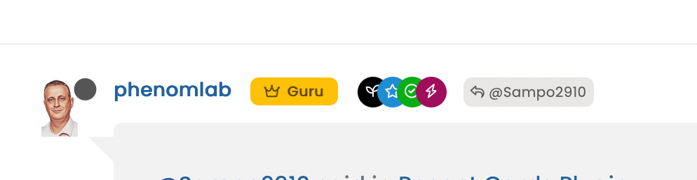
I have added a badge for admin group users, my code works good :
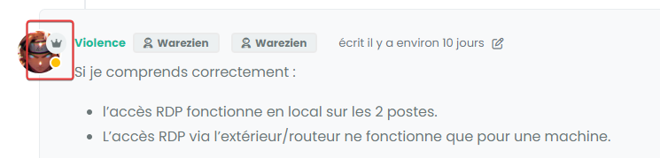
but I have this bug when users with this badge provide a solution to an answer. (Quesntion and answer plugin)
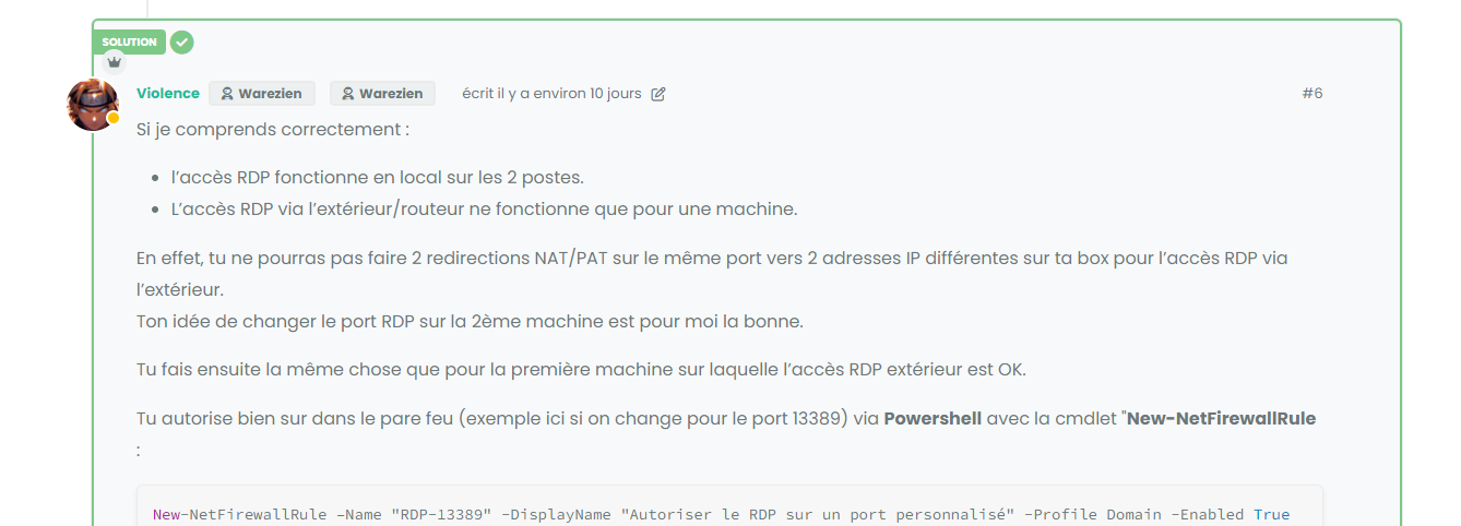
An idea ?
here my code :
/*----------------------------------------------------------------------------*/
/*------------------      Admin members custom badge     ---------------------*/
/*----------------------------------------------------------------------------*/

/* On avatar */

li[component="post"] a[href*="/groups/administrators"] span.badge-text.align-text-bottom {
    display: none !important;
}

li[component=post] a[href*="/groups/administrators"] {
    position: absolute !important;
    top: 25px;
    left: 7px;
    z-index: 2;
    margin-top: 1px;
    border-radius: 999px !important;
    line-height: 14px;
    display: block;
    height: auto;
    margin-left: 0px !important;
    background: var(--bs-user-level-bg) !important;
    color: var(--bs-body-color-primary) !important;
    padding-left: 6px !important;
    width: auto;
}

/* Display icon  */
li[component=post] a[href*="/groups/administrators"] .fa.fa-crown.me-1 {
    border-radius: 999px !important;
    margin-left: 0px !important;
    margin-top: 3px !important;
}

/* Disabled on Smartphone */
@media (max-width: 767px) {
    li[component="post"] a[href*="/groups/administrators"].badge {
            display: none !important;
        }
}
PW and WS Spirit alive
-
Hello
I have added a badge for admin group users, my code works good :
but I have this bug when users with this badge provide a solution to an answer. (Quesntion and answer plugin)
An idea ?
here my code :
/*----------------------------------------------------------------------------*/ /*------------------ Admin members custom badge ---------------------*/ /*----------------------------------------------------------------------------*/ /* On avatar */ li[component="post"] a[href*="/groups/administrators"] span.badge-text.align-text-bottom { display: none !important; } li[component=post] a[href*="/groups/administrators"] { position: absolute !important; top: 25px; left: 7px; z-index: 2; margin-top: 1px; border-radius: 999px !important; line-height: 14px; display: block; height: auto; margin-left: 0px !important; background: var(--bs-user-level-bg) !important; color: var(--bs-body-color-primary) !important; padding-left: 6px !important; width: auto; } /* Display icon */ li[component=post] a[href*="/groups/administrators"] .fa.fa-crown.me-1 { border-radius: 999px !important; margin-left: 0px !important; margin-top: 3px !important; } /* Disabled on Smartphone */ @media (max-width: 767px) { li[component="post"] a[href*="/groups/administrators"].badge { display: none !important; } }@DownPW Try something like
li[component=post].isSolved a[href*="/groups/administrators"] { top: 52px; } -
Perfect




Hello! It looks like you're interested in this conversation, but you don't have an account yet.
Getting fed up of having to scroll through the same posts each visit? When you register for an account, you'll always come back to exactly where you were before, and choose to be notified of new replies (either via email, or push notification). You'll also be able to save bookmarks and upvote posts to show your appreciation to other community members.
With your input, this post could be even better 💗
Register Login