Skip to content

Difficult to move posts now, on mobile.

Bugs
16 3 5.3k 1
  • I’m curious if this is just on my mobile, or if this is replicated on iphone?
    I have posted previously about difficulties doing Admin tasks on mobile, and accept that more complicated tasks may not be achieveable.
    However since upgrading to v3.x, some simpler tasks have become difficult.
    An example is moving a topic from one category to another.
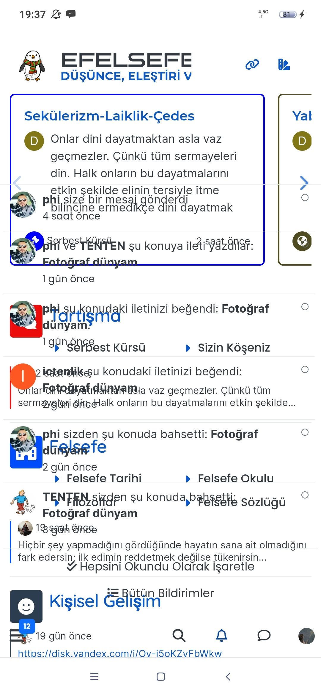
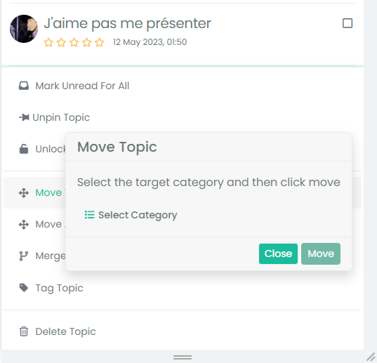
    On mobile, in mobile or desktop view, a popup window obscures clicking the category to move to.
    Here is example, clicking Move seems to do nothing!
    The box asking ‘to which category’ has opened but is completely obscured behind this menu!
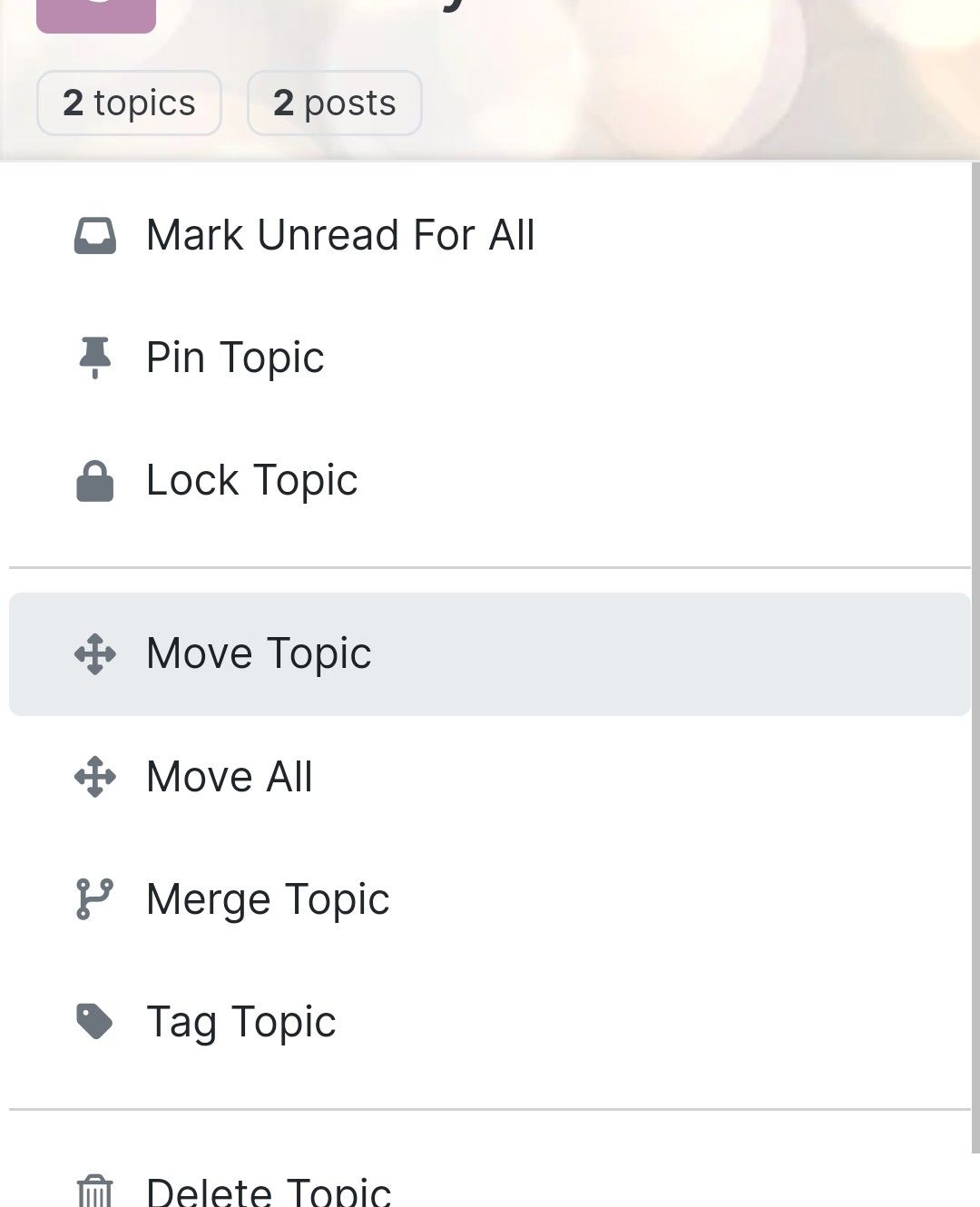
    Screenshot_20230624_141510_Chrome~2.jpg

    wrote on last edited by
    #2

    @Panda nope. You’re not imagining it. I too have seen this and it’s pretty annoying. Looking in more detail, it should be easily fixed with a simple z-index CSS value.

    I’ll have a look at this later.

  • wrote on last edited by
    #3

    Yep in my dev env, popup background is transparent

  • Yep in my dev env, popup background is transparent

    wrote on last edited by Panda
    #4

    @DownPW said in Difficult to move posts now, on mobile.:

    Yep in my dev env, popup background is transparent

    How do you achieve that? And can you click through transparent areas?

  • @DownPW said in Difficult to move posts now, on mobile.:

    Yep in my dev env, popup background is transparent

    How do you achieve that? And can you click through transparent areas?

    wrote on last edited by
    #5

    @Panda you can provided the index order places that specific element on the top.

  • @DownPW said in Difficult to move posts now, on mobile.:

    Yep in my dev env, popup background is transparent

    How do you achieve that? And can you click through transparent areas?

    wrote on last edited by DownPW
    #6

    @Panda

    Yep i select topic, topic tools, move topics and I have the transparent popup and I Can click through transparent area but I’m on an Android OS and it Can be different on IOS

  • @Panda

    Yep i select topic, topic tools, move topics and I have the transparent popup and I Can click through transparent area but I’m on an Android OS and it Can be different on IOS

    wrote on last edited by
    #7

    @DownPW ok!
    What and where do I put something to make the pop up transparent?

  • @DownPW ok!
    What and where do I put something to make the pop up transparent?

    wrote on last edited by
    #8

    @Panda why would you want it transparent ? It’s probably like this for us because we have heavily customized themes.

  • @Panda why would you want it transparent ? It’s probably like this for us because we have heavily customized themes.

    wrote on last edited by
    #9

    @phenomlab if I was understanding correctly, by making that pop-up transparent I can click through an area of it and get to the move post box that is currently hidden?

  • @phenomlab if I was understanding correctly, by making that pop-up transparent I can click through an area of it and get to the move post box that is currently hidden?

    wrote on last edited by Panda
    #10

    @Panda Also happy to do it the way you suggest, making the back box z-index higher.
    What would I type to do that?

  • @phenomlab if I was understanding correctly, by making that pop-up transparent I can click through an area of it and get to the move post box that is currently hidden?

    wrote on last edited by
    #11

    @Panda no, you wouldn’t be able to. The issue is z-index which is the stacking order of elements. The higher the value the higher the reference.

    For example, -1 means place under everything else. By default, the index figure is 1, so you’d need a much higher value to ensure it was always positioned over other elements.

  • @Panda Also happy to do it the way you suggest, making the back box z-index higher.
    What would I type to do that?

    wrote on last edited by
    #12

    @Panda said in Difficult to move posts now, on mobile.:

    What would I type to do that?

    I’ll provide some custom CSS for this once I’m in front of a pc.

  • wrote on last edited by
    #13

    Yes I understand the principal, just dont know how to make that CSS

  • wrote on last edited by DownPW
    #14

    Yep I have the same no transparency menu at first :
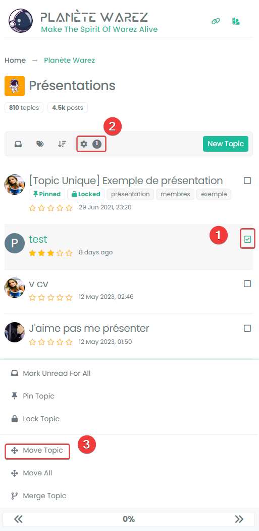
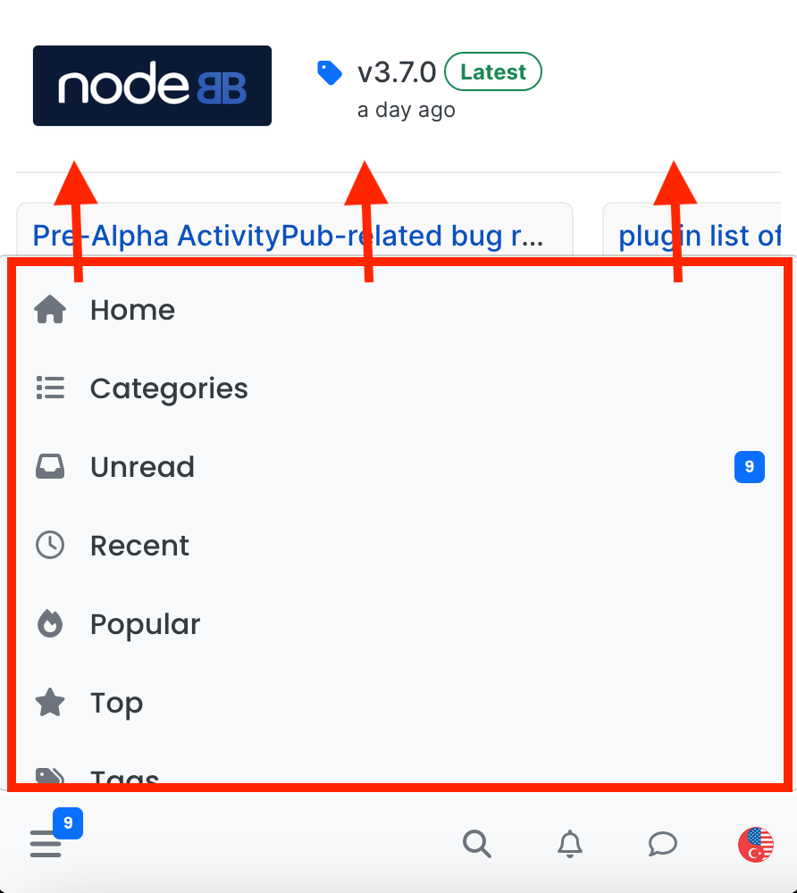
    8c593780-3263-48cf-9b7f-eb24e21592b6-image.png

    It’s just the popoup after select move topics who is transparent :
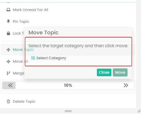
    12fb3015-a1a2-491a-9b78-56f641a4491f-image.png

    I have customcss code, maybe on your site this is not transparent.

    I solved the problem with this code (to be adapted to your environment) :

    /* BUGFIX: Popup topic tool transparency */
    .card {
      --bs-card-cap-bg: var(--bs-node-card-cap-bg);
      background-color: var(--bs-node-card-cap-bg);
    }
    

    RESULT :
    d4b6f923-d71b-4978-9bef-006aaac7fe03-image.png

  • wrote on last edited by DownPW
    #15

    Arf I just realized that we don’t have the same problem at all 😆
    In fact you don’t see the popup name “Move Topics” at all whereas I see it transparent

    The z-index solution suggested by Mark is indeed the correct solution I think

    Maybe this :

    .tool-modal {
        z-index: 1055;
    }
    
  • Arf I just realized that we don’t have the same problem at all 😆
    In fact you don’t see the popup name “Move Topics” at all whereas I see it transparent

    The z-index solution suggested by Mark is indeed the correct solution I think

    Maybe this :

    .tool-modal {
        z-index: 1055;
    }
    
    wrote on last edited by
    #16

    @DownPW Yes, it is. It’s set far too low meaning other elements with a higher preference will sit over the top of it.


Related Topics
  • "most votes" ranking option is not respecting the plugin

    Bugs nodebb
    5
    1
    3 Votes
    5 Posts
    2k Views
    phenomlab
    @crazycells Agreed. It takes a more sensible approach. Nobody ever upvotes the first post - it’s usually much further down as the conversation progresses.
  • navigation menu panel on mobile

    Solved Customisation nodebb css
    8
    1
    7 Votes
    8 Posts
    3k Views
    phenomlab
    @crazycells hmm. That’s odd. I haven’t made any changes from recollection but I could be wrong. I’ll need to check. EDIT - very strange. I honestly don’t recall adding the below CSS block to alter the bottom bar, but you’re right… .bottombar-nav { padding: 0px !important; } I’ve removed this so it reflects stock Harmony.
  • Rendering issues post migration to Sudonix theme/code

    Solved Bugs
    49
    1
    20 Votes
    49 Posts
    21k Views
    phenomlab
    @cagatay Those are in /admin/extend/widgets/brand header. Look inside the HTML widget that is there, and you’ll find <div class="socialicons"> <a class="btn-ghost p-2" href="https://github.com/phenomlab" rel="noreferrer noopener"><i style="color: #333;background: #ffffff; width: 26px" class="fa fa-2x fa-github-square"></i></a> <a class="btn-ghost p-2" href="https://linkedin.com/in/phenomlab" rel="noreferrer noopener"><i style="color: #0077B5;background: #ffffff; width: 26px" class="fa fa-2x fa-brands fa-linkedin-square"></i></a> <a class="btn-ghost p-2" href="https://twitter.com/phenomlab" rel="noreferrer noopener"><i style="color: #1DA1F2;background: #ffffff; width: 26px" class="fa fa-2x fa-twitter-square"></i></a> <!-- <a class="btn-ghost p-2" href="https://www.facebook.com/sudonixtech" rel="noreferrer noopener"><i style="color: #4268B2;background: #ffffff; width: 26px" class="fa fa-2x fa-facebook-square"></i></a> --> </div> Remove that block and save.
  • Whitespace fixes in Nodebb

    Solved Customisation nodebb
    18
    2
    7 Votes
    18 Posts
    7k Views
    phenomlab
    @Panda Just circling back here with something of an update (which I think you’ll like). I’ve completely restructured the ranking system. There are now less ranks, with a higher point threshold to reach them. More importantly, if you reload the site, you’ll notice that the ranks are now icons. I also removed the “Author” badge, and made this a single icon, which (to me) looks much better.
  • Composer Zen icon?

    Solved Configure nodebb
    8
    1
    2 Votes
    8 Posts
    3k Views
    phenomlab
    @DownPW exactly. Not really a new concept, and in all honesty, not something I’ve ever used. If you consider the need to add links and references, or citations, you’d need to be able to see other parts of the screen!
  • NodeBB: The global Search option

    Solved Configure search nodebb
    5
    0 Votes
    5 Posts
    2k Views
    phenomlab
    @mventures Yes, exactly. The other icon will restart NodeBB whilst the first icon I referenced will rebuild (recompile) it. The huge strength of NodeBB over Flarum (for example) is that the code is precompiled, and called once at boot. PHP’s code has to repeatedly reload code from source making it much slower.
  • FIXED: Annoying cosmetic bug on mobile view

    Moved Bugs bugs
    13
    3 Votes
    13 Posts
    4k Views
    phenomlab
    And now, after all this time I finally discovered that the CSS I previously referenced was for something else - and used the same CSS name, so I’ve had to reinstate this block .tab-content { max-height: 0; padding: 0 2em; color: #898989; background: #eeeeee; transition: all 0.35s; margin-top: -5px; } And, add this below to make it more specific. .emoji-tabs .tab-content { height: 100%; max-height: 100%; padding: 0; margin: 0; }
  • nodebb-plugin-customize error

    Solved Customisation
    25
    2 Votes
    25 Posts
    17k Views
    RiekMedia
    @phenomlab it work, thanks