Skip to content

Blinking text Effect

Customisation
3 2 1.2k 1
  • Hello 🙂

    small blinking text effect that I put on the name of my forum:

    here the code :

    :root {
         --site-title-blink: #CCCCCC;
    }
    
    /*Blink text effect */
    @keyframes text-blink {
        0%,
        20%,
        22%,
        25%,
        28%,
        55%,
        80%,
        100% {
            text-shadow: 0 0 2px #000,
                0 0 10px var(--site-title-blink),
                0 0 5px var(--site-title-blink),
                0 0 25px var(--site-title-blink);
            opacity: 1;
            color: var(--site-title-blink);
        }
    
        21%,
        24%,
        56% {
            opacity: 0.2;
            text-shadow: none;
        }
    }
    
    .navbar-default .navbar-brand {
        animation: 0.5s text-blink 1.5s infinite alternate;
        animation-iteration-count: 5;
        animation-duration: 1000ms;
    }
    
  • DownPWundefined DownPW marked this topic as a regular topic on
  • Hello 🙂

    small blinking text effect that I put on the name of my forum:

    here the code :

    :root {
         --site-title-blink: #CCCCCC;
    }
    
    /*Blink text effect */
    @keyframes text-blink {
        0%,
        20%,
        22%,
        25%,
        28%,
        55%,
        80%,
        100% {
            text-shadow: 0 0 2px #000,
                0 0 10px var(--site-title-blink),
                0 0 5px var(--site-title-blink),
                0 0 25px var(--site-title-blink);
            opacity: 1;
            color: var(--site-title-blink);
        }
    
        21%,
        24%,
        56% {
            opacity: 0.2;
            text-shadow: none;
        }
    }
    
    .navbar-default .navbar-brand {
        animation: 0.5s text-blink 1.5s infinite alternate;
        animation-iteration-count: 5;
        animation-duration: 1000ms;
    }
    

    @DownPW looks great ! Has that “broken neon light” look that you see in films. When I saw the title of this post, I instantly thought of the flashing text everyone had on their website in the 90’s and early 00’s but I like this effect a lot.

    Custom-Bates-Motel-No-Vacancy-Glass-Neon-Light-Sign-Beer-Bar.jpg_Q90.jpg_.webp

  • @DownPW looks great ! Has that “broken neon light” look that you see in films. When I saw the title of this post, I instantly thought of the flashing text everyone had on their website in the 90’s and early 00’s but I like this effect a lot.

    Custom-Bates-Motel-No-Vacancy-Glass-Neon-Light-Sign-Beer-Bar.jpg_Q90.jpg_.webp

    @phenomlab

    I love it too

    @phenomlab said in Blinking text Effect:

    Has that “broken neon light” look that you see in films.

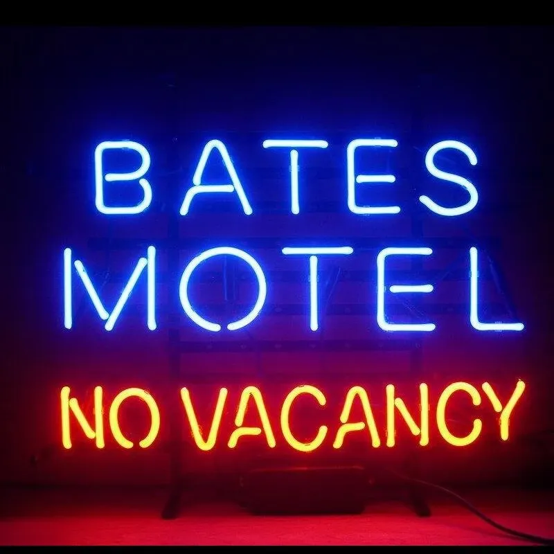
    It’s exactly that, kind of old neon signs of bar or pubs a bit cyberpunk too 😉


Related Topics
  • Custom Page - nodebb

    Solved Customisation custom-pages nodebb
    13
    2
    5 Votes
    13 Posts
    1k Views
    I’m happy to see this
  • Test of youtube embeds

    Solved Configure nodebb
    14
    11 Votes
    14 Posts
    3k Views
    @phenomlab Perfect!!! Many thanks.
  • 14 Votes
    17 Posts
    3k Views
    No problem dude ! I hope you have a good vacation. Enjoy your loved ones!
  • Following the API docs but its not clear ...

    Solved Customisation api nodebb
    8
    2 Votes
    8 Posts
    2k Views
    @Panda you’d be surprised. If you consider that you’d need to use the API to be able to populate a WordPress widget for example (which in turn would of course be PHP), taking this route is still immensely popular.
  • What is this bar called?

    Solved Customisation nodebb
    92
    1
    36 Votes
    92 Posts
    27k Views
    This is good
  • 6 Votes
    15 Posts
    4k Views
    No no, I said that in the sense that he told me it was simple ^^ I was able to see that this was not the case by targeting the elements he had advised me.
  • Footer bar add center text

    Solved Customisation css
    41
    1
    8 Votes
    41 Posts
    12k Views
    @phenomlab said in Footer bar add center text: div#console-nav-tab Ah ok test with bottom: 0px !important; idem
  • hover link effect

    Solved Customisation css link hover
    18
    1
    6 Votes
    18 Posts
    4k Views
    @DownPW Looking at the underlying code, class start is being added on hover by jQuery in this function document.querySelectorAll(".button-gradient, .button-transparent").forEach((button) => { const style = getComputedStyle(button); const lines = document.createElement("div"); lines.classList.add("lines"); const groupTop = document.createElement("div"); const groupBottom = document.createElement("div"); const svg = createSVG( button.offsetWidth, button.offsetHeight, parseInt(style.borderRadius, 10) ); groupTop.appendChild(svg); groupTop.appendChild(svg.cloneNode(true)); groupTop.appendChild(svg.cloneNode(true)); groupTop.appendChild(svg.cloneNode(true)); groupBottom.appendChild(svg.cloneNode(true)); groupBottom.appendChild(svg.cloneNode(true)); groupBottom.appendChild(svg.cloneNode(true)); groupBottom.appendChild(svg.cloneNode(true)); lines.appendChild(groupTop); lines.appendChild(groupBottom); button.appendChild(lines); button.addEventListener("pointerenter", () => { button.classList.add("start"); }); svg.addEventListener("animationend", () => { button.classList.remove("start"); }); }); }) The CSS for start is below .button-gradient.start .lines svg, .button-transparent.start .lines svg { animation: stroke 0.3s linear; } And this is the corresponding keyframe @keyframes stroke { 30%, 55% { opacity: 1; } 100% { stroke-dashoffset: 5; opacity: 0; } } It’s using both CSS and SVG, so might not be a simple affair to replicate without the SVG files.