[NODEBB] Wallpapers BUG on Firefox Mobile ?
-
Hello @phenomlab
My wallpapers works great on Chrome, Vivaldi, Brave on mobile but no on firefox.
If I don’t scroll the page, wallpaper is OK. If i scroll on a category with lot of topics, i have a black color at the bottom of the sreeen after the wallpeper.ONLY on FIREFOX
I have this code :
/* Smartphone */
@media (min-width: 320px) {
        body {
        background: url(https://domain.com/assets/customcss/backgrounds/default/default_01.png) no-repeat center center fixed; /*Background01*/
        -webkit-background-size: cover;
        -moz-background-size: cover;
        -o-background-size: cover;
        background-size: cover;
        background-color: transparent !important;
    }
}
-moz-background-size: cover is declared for Gecho but I have this :
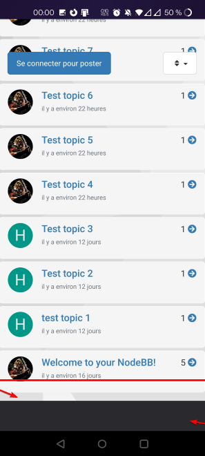
Thanks

-
I have fixed the bug with a body: after like this :
/* Smartphone */
@media (min-width: 320px) {
        body {
        background: url(https://XXXX.XXX/assets/customcss/backgrounds/default/default_01.png) no-repeat center center scroll; /*Background01*/
        -webkit-background-size: cover;
        -moz-background-size: cover;
        -o-background-size: cover;
        background-size: cover;
        background-color: transparent !important;
    }

    body:after{
      content:"";
      position:fixed; /* stretch a fixed position to the whole screen */
      top:0;
      height:100vh; /* fix for mobile browser address bar appearing disappearing */
      left:0;
      right:0;
      z-index:-1; /* needed to keep in the background */
      background: url(https://XXXX.XXXX/assets/customcss/backgrounds/default/default_01.png) center center;
      -webkit-background-size: cover;
      -moz-background-size: cover;
      -o-background-size: cover;
      background-size: cover;
      background-color: transparent !important;
}
}
But I don’t know if this is a good solution.
What do you think ?
Could it be simpler than that?
PW and WS Spirit alive
-
I have fixed the bug with a body: after like this :
/* Smartphone */
@media (min-width: 320px) {
        body {
        background: url(https://XXXX.XXX/assets/customcss/backgrounds/default/default_01.png) no-repeat center center scroll; /*Background01*/
        -webkit-background-size: cover;
        -moz-background-size: cover;
        -o-background-size: cover;
        background-size: cover;
        background-color: transparent !important;
    }

    body:after{
      content:"";
      position:fixed; /* stretch a fixed position to the whole screen */
      top:0;
      height:100vh; /* fix for mobile browser address bar appearing disappearing */
      left:0;
      right:0;
      z-index:-1; /* needed to keep in the background */
      background: url(https://XXXX.XXXX/assets/customcss/backgrounds/default/default_01.png) center center;
      -webkit-background-size: cover;
      -moz-background-size: cover;
      -o-background-size: cover;
      background-size: cover;
      background-color: transparent !important;
}
}
But I don’t know if this is a good solution.
What do you think ?
Could it be simpler than that?
@downpw This looks extremely complex. I think you should be looking at
background-repeat- see https://www.w3schools.com/CSSref/pr_background-repeat.asp -
I will test soon and let you know if it’s ok
like this ?
/* Smartphone */
@media (min-width: 320px) {
        body {
        background-image: url(https://XXXX.XXX/assets/customcss/backgrounds/default/default_01.png)
        background-repeat: repeat-y
        -webkit-background-size: cover;
        -moz-background-size: cover;
        -o-background-size: cover;
        background-size: cover;
        background-color: transparent !important;
    }
}
PW and WS Spirit alive
-
I will test soon and let you know if it’s ok
like this ?
/* Smartphone */ @media (min-width: 320px) { body { background-image: url(https://XXXX.XXX/assets/customcss/backgrounds/default/default_01.png) background-repeat: repeat-y -webkit-background-size: cover; -moz-background-size: cover; -o-background-size: cover; background-size: cover; background-color: transparent !important; } }@downpw yes, that should work, but you probably need to experiment to get the best results.
-
Thats works but It’s really not very pretty

The code I have find on the web is complex, but it do the job perfectly.
The result is exactly the same on Chrome based browsers and Firefox Mobile.
and that’s what I’m looking for because I have a lot of FF users on mobile.I don’t understand why Firefox Mobile doesn’t interpret this code the same way.
It is very frustrating
If you have better for the same result, I’m a taker of course

PW and WS Spirit alive
-
Thats works but It’s really not very pretty
The code I have find on the web is complex, but it do the job perfectly.
The result is exactly the same on Chrome based browsers and Firefox Mobile.
and that’s what I’m looking for because I have a lot of FF users on mobile.I don’t understand why Firefox Mobile doesn’t interpret this code the same way.
It is very frustrating
If you have better for the same result, I’m a taker of course
@downpw this is very odd. Firefox uses the Gecko engine and Chrome uses WebKit. They aren’t too far apart in terms of standards, so it should be the same across browsers.
-
the code which is complex does the job.
He remove the black bar without repeating the wallpaper.
I had trouble finding this code.
A lot of people have the same problem apparently under Firefox Mobile app. On firefox desktop app, it’s OK.
This is really a specificity of the mobile version.
Maybe on the renderer.PW and WS Spirit alive
-
the code which is complex does the job.
He remove the black bar without repeating the wallpaper.
I had trouble finding this code.
A lot of people have the same problem apparently under Firefox Mobile app. On firefox desktop app, it’s OK.
This is really a specificity of the mobile version.
Maybe on the renderer.@downpw I’m inclined to agree with this. There isn’t much else you can do, and provided it works with no odd looking artefacts in other browsers, then ok. The
:beforeand:afterare pseudo classes and very well supported across all browsers (except perhaps Internet Exploder, but who uses that these days ?) -
 undefined phenomlab has marked this topic as solved on

Hello! It looks like you're interested in this conversation, but you don't have an account yet.
Getting fed up of having to scroll through the same posts each visit? When you register for an account, you'll always come back to exactly where you were before, and choose to be notified of new replies (either via email, or push notification). You'll also be able to save bookmarks and upvote posts to show your appreciation to other community members.
With your input, this post could be even better 💗
Register Login