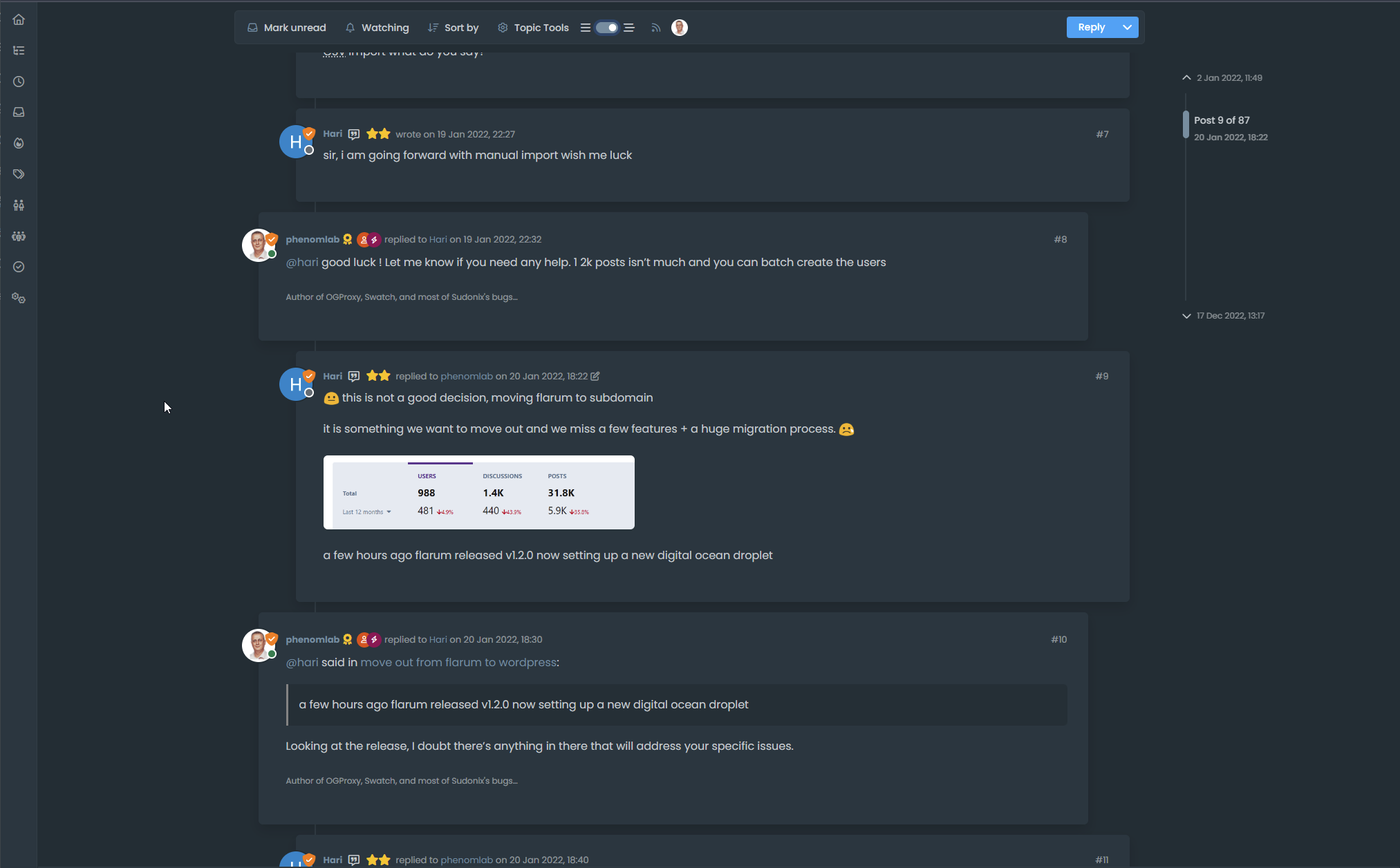
Threaded post support for NodeBB
-
Here’s a video of the threading code working on stock Harmony on NodeBB.
However, it’s important to note that the timeline bar is removed and recreated. There is a good reason for this, as without taking this route, it would mean that the timeline bar will look out of place. It’s certainly possible to use the existing bar and use a variety of CSS to move it around, although this is VERY inconsistent in my testing, and lands up being far too complex when it comes to having multiple CSS classes that do not include a specific scenario etc.
In this case, it’s so much quicker to hide and replace the existing one - we do this in the default view also with the threaded view disabled, and I’m sure you won’t notice the difference
 For obvious reasons, this code is configured to only fire on displays of
 1200pxor more - obviously, firing on a mobile device wouldn’t look very good at all.Here’s the video
If you like what you see, here’s the code.
Final note - The code you see in the video is designed to work with stock Harmony. The code running on Sudonix is VERY different and uses a variety of CSS to render the view you see here. It’s “possible” to emulate this look, although it does mean that you will have to replace your custom CSS with that of Sudonix.
-
Here’s a video of the threading code working on stock Harmony on NodeBB.
However, it’s important to note that the timeline bar is removed and recreated. There is a good reason for this, as without taking this route, it would mean that the timeline bar will look out of place. It’s certainly possible to use the existing bar and use a variety of CSS to move it around, although this is VERY inconsistent in my testing, and lands up being far too complex when it comes to having multiple CSS classes that do not include a specific scenario etc.
In this case, it’s so much quicker to hide and replace the existing one - we do this in the default view also with the threaded view disabled, and I’m sure you won’t notice the difference
 For obvious reasons, this code is configured to only fire on displays of
 1200pxor more - obviously, firing on a mobile device wouldn’t look very good at all.Here’s the video
If you like what you see, here’s the code.
https://github.com/phenomlab/nodebb-harmony-threading
Final note - The code you see in the video is designed to work with stock Harmony. The code running on Sudonix is VERY different and uses a variety of CSS to render the view you see here. It’s “possible” to emulate this look, although it does mean that you will have to replace your custom CSS with that of Sudonix.
@phenomlab wow… that looks really cool. I need to fire up a NodeBB box and test.
-
-
this is very cool. Thanks @phenomlab
-
Very cool like as already said above and a big thanks for hard work (I see the th function.js and woowwww
 )
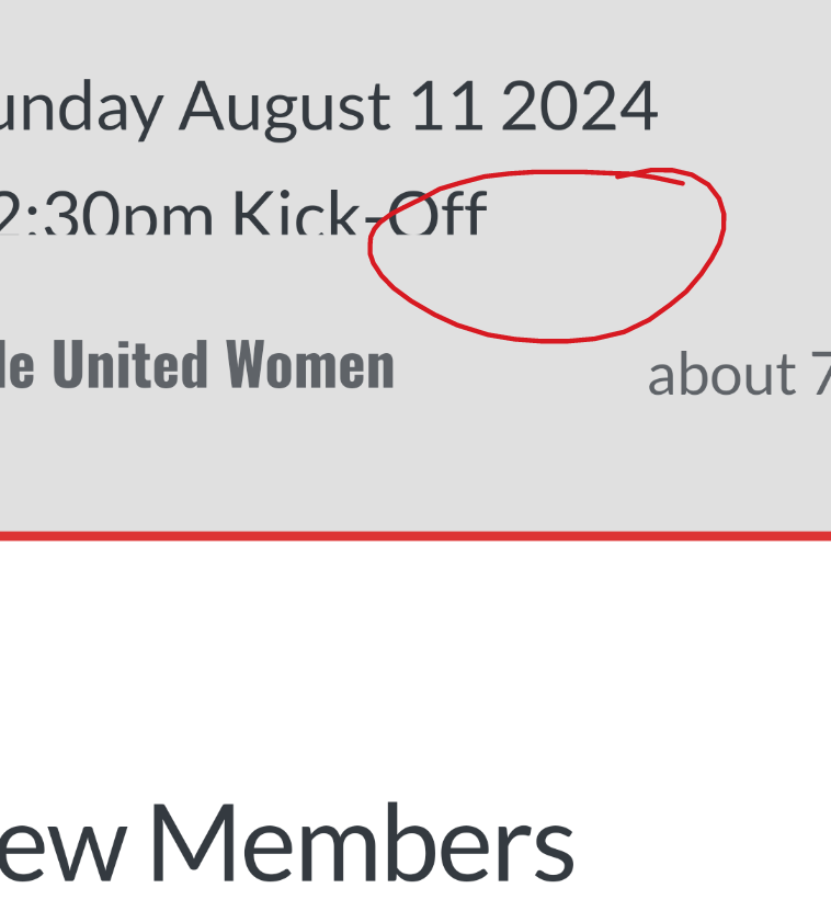
)I test it now and I have see this with plugin user-browsers :
Do you know where it could come from?
This also breaks the display of the site title
Can we do the same thing but without expanding the topic toolbar on header ?
EDIT :
I see that you seem put other things in the function.js on github like banner, logo, fancybox…

I said to myself that I found this file way too long without asking too many questions !–> But I have the bug display with user browsers plugin which I will try to solve
-
Very cool like as already said above and a big thanks for hard work (I see the th function.js and woowwww
 )
)I test it now and I have see this with plugin user-browsers :

Do you know where it could come from?
This also breaks the display of the site title
Can we do the same thing but without expanding the topic toolbar on header ?
EDIT :
I see that you seem put other things in the function.js on github like banner, logo, fancybox…

I said to myself that I found this file way too long without asking too many questions !–> But I have the bug display with user browsers plugin which I will try to solve
@DownPW hmm. Not sure why I copied all of that code, but will change asap. I also have a fix for the browsing users plugin issue but didn’t include it because others might not be using it.
I’ll get to this as soon as I can.
EDIT - Done
EDIT 2 - I just noticed on your DEV box that you have (thanks to me - sorry) a ton of JS code you don’t need. You should probably clean that up. -
Very cool like as already said above and a big thanks for hard work (I see the th function.js and woowwww
 )
)I test it now and I have see this with plugin user-browsers :

Do you know where it could come from?
This also breaks the display of the site title
Can we do the same thing but without expanding the topic toolbar on header ?
EDIT :
I see that you seem put other things in the function.js on github like banner, logo, fancybox…

I said to myself that I found this file way too long without asking too many questions !–> But I have the bug display with user browsers plugin which I will try to solve
@DownPW said in Threading support for NodeBB:
Can we do the same thing but without expanding the topic toolbar on header ?
Yes, but then you’ll have elements that are wider than the sticky bar which looks odd on scroll.
-
Very cool like as already said above and a big thanks for hard work (I see the th function.js and woowwww
 )
)I test it now and I have see this with plugin user-browsers :

Do you know where it could come from?
This also breaks the display of the site title
Can we do the same thing but without expanding the topic toolbar on header ?
EDIT :
I see that you seem put other things in the function.js on github like banner, logo, fancybox…

I said to myself that I found this file way too long without asking too many questions !–> But I have the bug display with user browsers plugin which I will try to solve
@DownPW said in Threading support for NodeBB:
Do you know where it could come from?
Yes, just fixed it in your dev environment. I assumed (probably incorrectly) that people may not have this installed, so omitted it. I fixed it in prod because I do have it there, but wanted to keep DEV as vanilla as possible.
I’ll need to write a function that checks for the existence of this plugin then determines where to inject the toggle switch
For now, see the below
$('.topic .sticky-tools ul .hidden-xs').append(threadView); // If you have browsing users plugin, comment out the above line and uncomment the one below //$('.topic .sticky-tools ul [component="topic/browsing-users"]:last-of-type').append(threadView); Result (might need some position tweaking…)
-
@DownPW hmm. Not sure why I copied all of that code, but will change asap. I also have a fix for the browsing users plugin issue but didn’t include it because others might not be using it.
I’ll get to this as soon as I can.
EDIT - Done
EDIT 2 - I just noticed on your DEV box that you have (thanks to me - sorry) a ton of JS code you don’t need. You should probably clean that up.@phenomlab said in Threading support for NodeBB:
EDIT 2 - I just noticed on your DEV box that you have (thanks to me - sorry) a ton of JS code you don’t need. You should probably clean that up.
no I need it

@phenomlab said in Threading support for NodeBB:
@DownPW said in Threading support for NodeBB:
Can we do the same thing but without expanding the topic toolbar on header ?
Yes, but then you’ll have elements that are wider than the sticky bar which looks odd on scroll.
Could you still explain to me how to obtain this result so that I can see what I prefer?
-
@phenomlab said in Threading support for NodeBB:
EDIT 2 - I just noticed on your DEV box that you have (thanks to me - sorry) a ton of JS code you don’t need. You should probably clean that up.
no I need it

@phenomlab said in Threading support for NodeBB:
@DownPW said in Threading support for NodeBB:
Can we do the same thing but without expanding the topic toolbar on header ?
Yes, but then you’ll have elements that are wider than the sticky bar which looks odd on scroll.
Could you still explain to me how to obtain this result so that I can see what I prefer?
@DownPW said in Threading support for NodeBB:
Could you still explain to me how to obtain this result so that I can see what I prefer?
Yes, of course. Locate the below block in the CSS, and comment out
margin-left: -8%;.topic .threaded.sticky-tools { margin-left: -8%; margin-top: 0px; margin-bottom: 0px; transition: margin-left 0.3s ease, margin-right 0.3s ease; } -
Great, thank you Mark !
–> I also have a little suggestion to add a tooltip on the button mouse hover like "Thread view On and thread View Off depending on the state or maybe just one?
What do you think about it ?
@DownPW said in Threading support for NodeBB:
What do you think about it ?
Great idea. I’ll add that.
-
maybe with an HTML SPAN class like this ?
<span class="title-tooltip top" tooltip-text="Thread View On"> -
maybe with an HTML SPAN class like this ?
<span class="title-tooltip top" tooltip-text="Thread View On">@DownPW yes, that should work, although probably better to use one tooltip with on/off text.
-
Small specific request.
I try to adapt the code to my environment.
I modified the background of the following classes:
.page-topic .topic .posts.timeline .timeline-event,
.page-topic .topic .posts.timeline > [component="post/placeholder"],
.page-topic .topic .posts.timeline > [component="post"] {
  border-left: none;
  transition: transform 0.3s ease !important;
  background: var(--bs-body-bg);
  background: var(--bs-body-navbar);
}
.post-container.threaded { background: var(--bs-body-bg) !important; background: var(--bs-body-navbar)!important; } li.pt-4.self-post:not(.self-post .topic-owner-post).threaded { transform: translateX(0px) !important; transition: transform 0.3s ease !important; background: var(--bs-body-bg); background: var(--bs-body-navbar)!important; padding-right: 30px; } and other code, for example :
.page-topic .topic .posts.timeline [component="topic/event"].timeline-event, .page-topic .topic .posts.timeline [component="topic/necro-post"].timeline-event {
    background: transparent;
}
.page-topic .topic .posts.timeline .timeline-event:last-child, .page-topic .topic .posts.timeline>[component="post/placeholder"]:last-child, .page-topic .topic .posts.timeline>[component=post]:last-child { margin-left: 0.5rem; } When I activate mode it works without problem but it does not disappear when I deactivate the mode. (Return to vanilla)
I think I understand by reading the code that it is necessary to specify the classes chnaged in the function.js (with add .threaded) but I don’t really see how to add more
-
Small specific request.
I try to adapt the code to my environment.
I modified the background of the following classes:
.page-topic .topic .posts.timeline .timeline-event, .page-topic .topic .posts.timeline > [component="post/placeholder"], .page-topic .topic .posts.timeline > [component="post"] { border-left: none; transition: transform 0.3s ease !important; background: var(--bs-body-bg); background: var(--bs-body-navbar); }.post-container.threaded { background: var(--bs-body-bg) !important; background: var(--bs-body-navbar)!important; }li.pt-4.self-post:not(.self-post .topic-owner-post).threaded { transform: translateX(0px) !important; transition: transform 0.3s ease !important; background: var(--bs-body-bg); background: var(--bs-body-navbar)!important; padding-right: 30px; }and other code, for example :
.page-topic .topic .posts.timeline [component="topic/event"].timeline-event, .page-topic .topic .posts.timeline [component="topic/necro-post"].timeline-event { background: transparent; }.page-topic .topic .posts.timeline .timeline-event:last-child, .page-topic .topic .posts.timeline>[component="post/placeholder"]:last-child, .page-topic .topic .posts.timeline>[component=post]:last-child { margin-left: 0.5rem; }When I activate mode it works without problem but it does not disappear when I deactivate the mode. (Return to vanilla)
I think I understand by reading the code that it is necessary to specify the classes chnaged in the function.js (with add .threaded) but I don’t really see how to add more
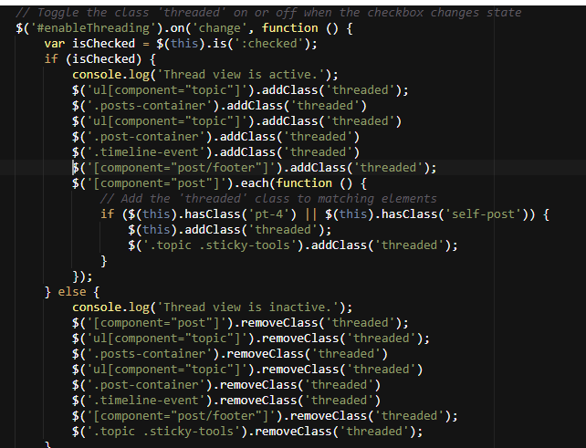
@DownPW any reason as to why you’ve defined
backgroundtwice ?See
background: var(--bs-body-bg); background: var(--bs-body navbar)!important; -
@DownPW just curious 🤭
The second would override the first anyway.
I’m in transit currently and not in front of a pc but will review this as soon as I can.
-
Hello! It looks like you're interested in this conversation, but you don't have an account yet.
Getting fed up of having to scroll through the same posts each visit? When you register for an account, you'll always come back to exactly where you were before, and choose to be notified of new replies (ether email, or push notification). You'll also be able to save bookmarks, use reactions, and upvote to show your appreciation to other community members.
With your input, this post could be even better 💗
RegisterLog in
