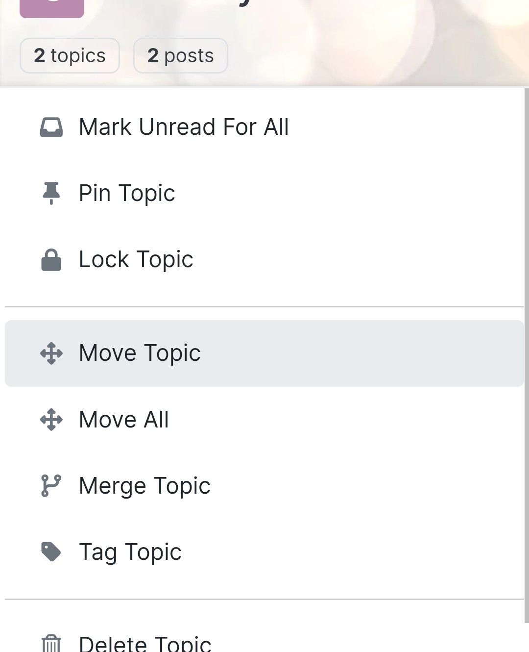
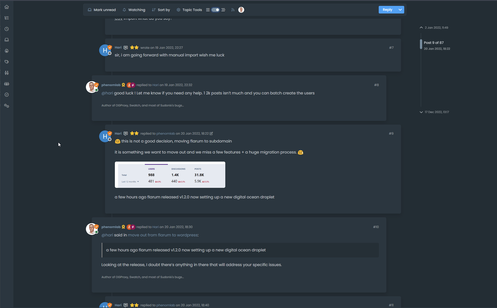
Difficult to move posts now, on mobile.
-
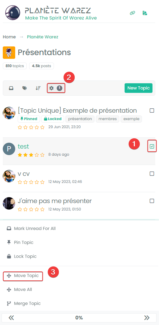
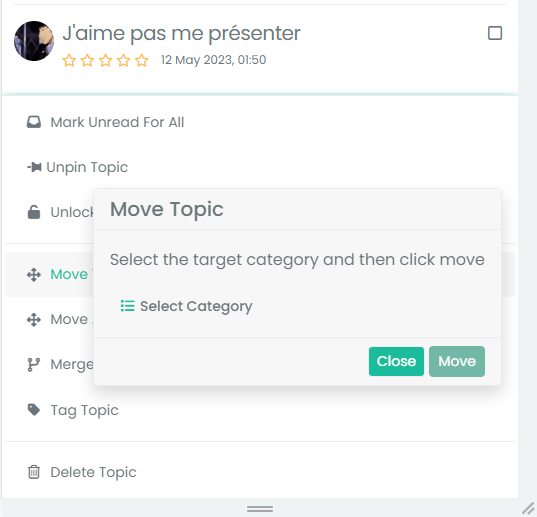
Yep i select topic, topic tools, move topics and I have the transparent popup and I Can click through transparent area but I’m on an Android OS and it Can be different on IOS
@DownPW ok!
What and where do I put something to make the pop up transparent? -
@Panda why would you want it transparent ? It’s probably like this for us because we have heavily customized themes.
-
@Panda why would you want it transparent ? It’s probably like this for us because we have heavily customized themes.
@phenomlab if I was understanding correctly, by making that pop-up transparent I can click through an area of it and get to the move post box that is currently hidden?
-
@phenomlab if I was understanding correctly, by making that pop-up transparent I can click through an area of it and get to the move post box that is currently hidden?
@Panda Also happy to do it the way you suggest, making the back box z-index higher.
What would I type to do that? -
@phenomlab if I was understanding correctly, by making that pop-up transparent I can click through an area of it and get to the move post box that is currently hidden?
@Panda no, you wouldn’t be able to. The issue is
z-indexwhich is the stacking order of elements. The higher the value the higher the reference.For example,
-1means place under everything else. By default, the index figure is1, so you’d need a much higher value to ensure it was always positioned over other elements. -
@Panda Also happy to do it the way you suggest, making the back box z-index higher.
What would I type to do that?@Panda said in Difficult to move posts now, on mobile.:
What would I type to do that?
I’ll provide some custom CSS for this once I’m in front of a pc.
-
Yes I understand the principal, just dont know how to make that CSS
-
Yep I have the same no transparency menu at first :
It’s just the popoup after select move topics who is transparent :
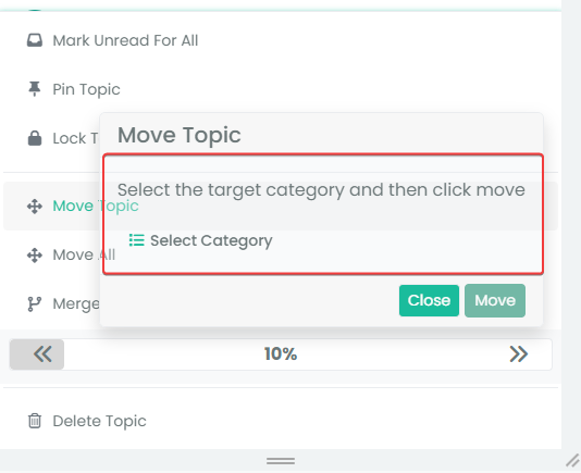
I have customcss code, maybe on your site this is not transparent.
I solved the problem with this code (to be adapted to your environment) :
/* BUGFIX: Popup topic tool transparency */
.card {
  --bs-card-cap-bg: var(--bs-node-card-cap-bg);
  background-color: var(--bs-node-card-cap-bg);
}
RESULT :
-
Arf I just realized that we don’t have the same problem at all

In fact you don’t see the popup name “Move Topics” at all whereas I see it transparentThe
z-indexsolution suggested by Mark is indeed the correct solution I thinkMaybe this :
.tool-modal { z-index: 1055; } -
Arf I just realized that we don’t have the same problem at all

In fact you don’t see the popup name “Move Topics” at all whereas I see it transparentThe
z-indexsolution suggested by Mark is indeed the correct solution I thinkMaybe this :
.tool-modal { z-index: 1055; }@DownPW Yes, it is. It’s set far too low meaning other elements with a higher preference will sit over the top of it.
Hello! It looks like you're interested in this conversation, but you don't have an account yet.
Getting fed up of having to scroll through the same posts each visit? When you register for an account, you'll always come back to exactly where you were before, and choose to be notified of new replies (either via email, or push notification). You'll also be able to save bookmarks and upvote posts to show your appreciation to other community members.
With your input, this post could be even better 💗
Register LoginRelated Topics
-
Spam spam spam
Solved Configure -
-
-
NodeBB upgrade now cant post
Solved Bugs -
-
-
-
