Composer Zen icon?
-
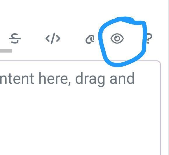
I believe this Nodebb composer icon is called Zen, Im still confused what it does?
When clicked it turns the background grey, but posts appear the same?
-
I believe this Nodebb composer icon is called Zen, Im still confused what it does?
When clicked it turns the background grey, but posts appear the same?
@Panda that’s not the Zen icon, it’s the preview window 🤭
Mark – Founder, Phenomlab Ltd
Executive IT & Security Leadership
Phenomlab Ltd -
@phenomlab Ah ok, so what is the Zen icon that I saw in the CSS list?
-
-
@phenomlab ah so its just the maximise window.
I wonder why they called it Zen…
I was hoping it was something cool
-
 undefined Panda has marked this topic as solved on
-
@phenomlab ah so its just the maximise window.
I wonder why they called it Zen…
I was hoping it was something cool@Panda it is! Zen mode traditionally refers to distraction free writing allowing you to focus solely on what’s in front of you without your mind wandering off and surfing the web for example
https://wptavern.com/wordpress-zen-mode-5-compelling-reasons-to-turn-on-distraction-free-writing
-
Zen because you haven’t got any other distraction to write a topic
PW and WS Spirit alive
-
@DownPW exactly. Not really a new concept, and in all honesty, not something I’ve ever used.
If you consider the need to add links and references, or citations, you’d need to be able to see other parts of the screen!
Hello! It looks like you're interested in this conversation, but you don't have an account yet.
Getting fed up of having to scroll through the same posts each visit? When you register for an account, you'll always come back to exactly where you were before, and choose to be notified of new replies (either via email, or push notification). You'll also be able to save bookmarks and upvote posts to show your appreciation to other community members.
With your input, this post could be even better 💗
Register LoginDid this solution help you?
Related Topics
-
-
-
-
-
Gettin Erors NodeBB
Solved Configure -
-
-