background color of the footer area
-
How can I change the background color of the footer area?
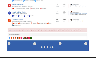
we have forum-stats widget, social media links and “powered by NodeBB” label at the bottom as “global footer widgets”. We would like to change the color of this background (whole this footer area from right to left)
-
@crazycells Can you provide me access to your site (details over PM obviously) so I can look at this ? I have an idea as to how this should work, but would like to see how you have it working now.
@phenomlab For your footers, I changed to
div class="row text-center adjust">For the “Powered by…” I changed this to
<div class="row pad-10 text-center adjust">And finally, added a new class
.row.text-center.adjust {
    margin-left: -30px;
    margin-right: -30px;
}
At the top of your custom CSS

Reload your page and have a look


The class of
rowexists already (part of Bootstrap) and.row.text-center.adjustis explicit and will only apply to that code -
How can I change the background color of the footer area?
we have forum-stats widget, social media links and “powered by NodeBB” label at the bottom as “global footer widgets”. We would like to change the color of this background (whole this footer area from right to left)

@crazycells from what I currently see, this is a custom HTML widget added directly below the forum-stats widget ?

As this appears outside of the
rowelement from the stats widget, it won’t automatically inherit the space you desire. The way to fix this would typically be with classes and CSS. Can you provide the code you’ve used for this ?Thanks
-
-
@crazycells from what I currently see, this is a custom HTML widget added directly below the forum-stats widget ?

As this appears outside of the
rowelement from the stats widget, it won’t automatically inherit the space you desire. The way to fix this would typically be with classes and CSS. Can you provide the code you’ve used for this ?Thanks
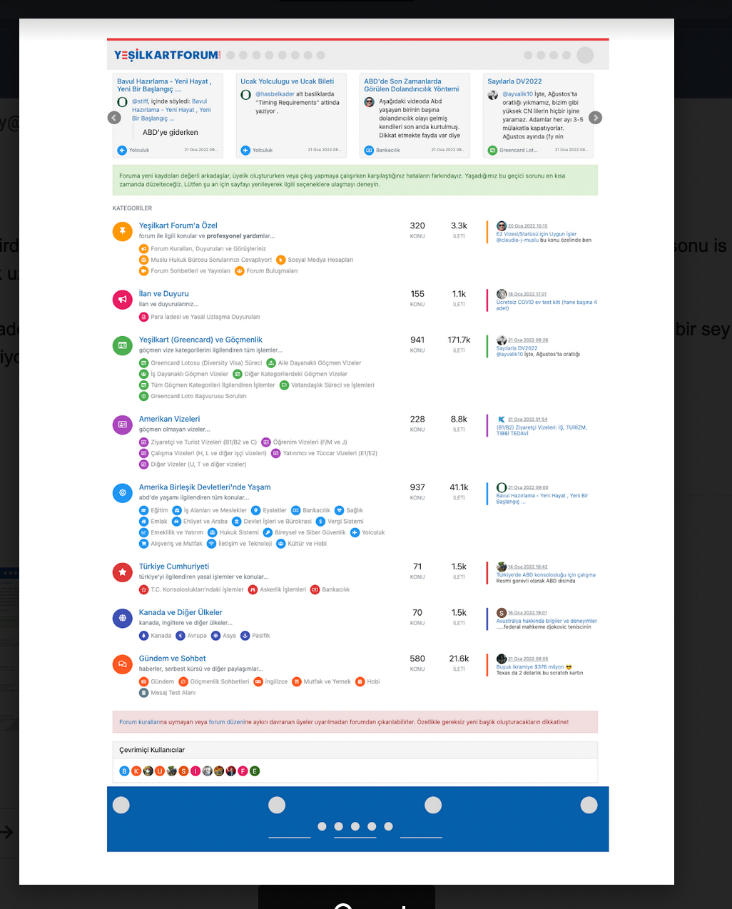
@phenomlab thanks. I need all footer region (from left side to right side) to be the same color, the current form of the site is just experiments

Do you think it is possible to easily add a “custom global footer” to the nodebb? I could move the links there… (I am OK with leaving the forum-stats widget outside of this custom footer region)
Here is the code I am using currently:
//footer color modifications start
.forum-stats {
    .row {
    background-color: #085EAC;
    }

    h2 {
        color: #eceff1;

        small {
        color: #eceff1;
        }

    }
}


[data-widget-area="footer"] {
    .text-center {
        background-color: #085EAC;

        a {
            color: #eceff1;
        }
    }
}
//footer color modifications end
This is what I am trying to achieve:
-
@phenomlab thanks. I need all footer region (from left side to right side) to be the same color, the current form of the site is just experiments

Do you think it is possible to easily add a “custom global footer” to the nodebb? I could move the links there… (I am OK with leaving the forum-stats widget outside of this custom footer region)
Here is the code I am using currently:
//footer color modifications start
.forum-stats {
    .row {
    background-color: #085EAC;
    }

    h2 {
        color: #eceff1;

        small {
        color: #eceff1;
        }

    }
}


[data-widget-area="footer"] {
    .text-center {
        background-color: #085EAC;

        a {
            color: #eceff1;
        }
    }
}
//footer color modifications end
This is what I am trying to achieve:

@crazycells Can you provide me access to your site (details over PM obviously) so I can look at this ? I have an idea as to how this should work, but would like to see how you have it working now.
-
@crazycells Can you provide me access to your site (details over PM obviously) so I can look at this ? I have an idea as to how this should work, but would like to see how you have it working now.
@phenomlab For your footers, I changed to
div class="row text-center adjust">For the “Powered by…” I changed this to
<div class="row pad-10 text-center adjust">And finally, added a new class
.row.text-center.adjust {
    margin-left: -30px;
    margin-right: -30px;
}
At the top of your custom CSS

Reload your page and have a look


The class of
rowexists already (part of Bootstrap) and.row.text-center.adjustis explicit and will only apply to that code -
 undefined phenomlab has marked this topic as solved on
-
@phenomlab For your footers, I changed to
div class="row text-center adjust">For the “Powered by…” I changed this to
<div class="row pad-10 text-center adjust">And finally, added a new class
.row.text-center.adjust {
    margin-left: -30px;
    margin-right: -30px;
}
At the top of your custom CSS

Reload your page and have a look


The class of
rowexists already (part of Bootstrap) and.row.text-center.adjustis explicit and will only apply to that code@phenomlab thank you very much

Hello! It looks like you're interested in this conversation, but you don't have an account yet.
Getting fed up of having to scroll through the same posts each visit? When you register for an account, you'll always come back to exactly where you were before, and choose to be notified of new replies (either via email, or push notification). You'll also be able to save bookmarks and upvote posts to show your appreciation to other community members.
With your input, this post could be even better 💗
Register LoginDid this solution help you?
Related Topics
-
-
-
Smart Widgets
Solved Configure -
-
-
-
-


