CSS codes for fa-info icon
-
Hi @phenomlab , how are you?
I have an info icon because of the glossary plugin, however, the icon is not at the place where I want it to be… I made it smaller with this code, however, I also want to change its position, I think I prefer it further above, on the upper right corner of the word. Do you know which codes should I use?
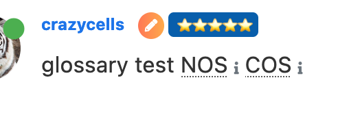
.glossary-wrapper { .fa-info { font-size: .500em; } } -
Hi @phenomlab , how are you?
I have an info icon because of the glossary plugin, however, the icon is not at the place where I want it to be… I made it smaller with this code, however, I also want to change its position, I think I prefer it further above, on the upper right corner of the word. Do you know which codes should I use?

.glossary-wrapper { .fa-info { font-size: .500em; } }@crazycells hi. Can you supply your site url so I can have a look ? Either here or via PM if you’d prefer.
-
Hi @phenomlab , how are you?
I have an info icon because of the glossary plugin, however, the icon is not at the place where I want it to be… I made it smaller with this code, however, I also want to change its position, I think I prefer it further above, on the upper right corner of the word. Do you know which codes should I use?

.glossary-wrapper { .fa-info { font-size: .500em; } }@crazycells Something like this would probably do it. Sadly, it requires
position: absoluteand you will need to play around with this to get the desired effect you are looking for, but it does work.glossary-wrapper .fa-info { font-size: .5em; display: inline-block; position: absolute; margin-left: -5px; }
-
@crazycells Something like this would probably do it. Sadly, it requires
position: absoluteand you will need to play around with this to get the desired effect you are looking for, but it does work.glossary-wrapper .fa-info { font-size: .5em; display: inline-block; position: absolute; margin-left: -5px; }
@phenomlab yes, thanks a lot. this works

-
 undefined crazycells has marked this topic as solved on
-
hi @phenomlab , I have a follow up question about the glossary plugin… is there any way to target the underlying “…” I want them smaller and maybe will change the color… I could not identify the specific class to target…

-
hi @phenomlab , I have a follow up question about the glossary plugin… is there any way to target the underlying “…” I want them smaller and maybe will change the color… I could not identify the specific class to target…

@crazycells You can find that here
.glossary-wrapper .glossary-word {
    text-decoration: underline;
    text-decoration-style: dotted;
}
Specifically, you want to either remove or change the
text-decoration-stylevalue
-
@crazycells You can find that here
.glossary-wrapper .glossary-word {
    text-decoration: underline;
    text-decoration-style: dotted;
}
Specifically, you want to either remove or change the
text-decoration-stylevalue
@phenomlab thank you very much

-
@phenomlab thank you very much

@phenomlab it looks like I am going with
wavy… at least it does not interfere with the visibility of the word…
is there any way to target the wave line only, and not the word? I am trying to change the color of the wavy line, but the code changes the color of the word too…
-
I have just figured it out…
it can be targeted with
text-decoration-color:I was mistakenly using
color
Hello! It looks like you're interested in this conversation, but you don't have an account yet.
Getting fed up of having to scroll through the same posts each visit? When you register for an account, you'll always come back to exactly where you were before, and choose to be notified of new replies (either via email, or push notification). You'll also be able to save bookmarks and upvote posts to show your appreciation to other community members.
With your input, this post could be even better 💗
Register Login