Fixed background to nodebb forum
-
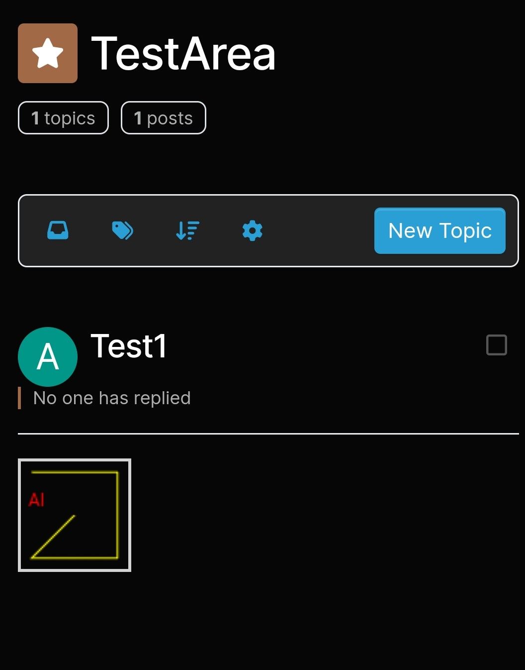
Apart from the slight move issue
The dark background was also too stong and making forum text hard to read.I asked chatGPT for fix, both its suggestions didnt work
1st suggestion change alpha value on rgb made no difference
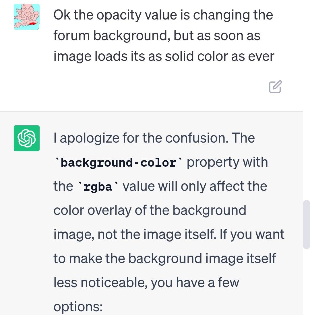
2nd idea, filter:
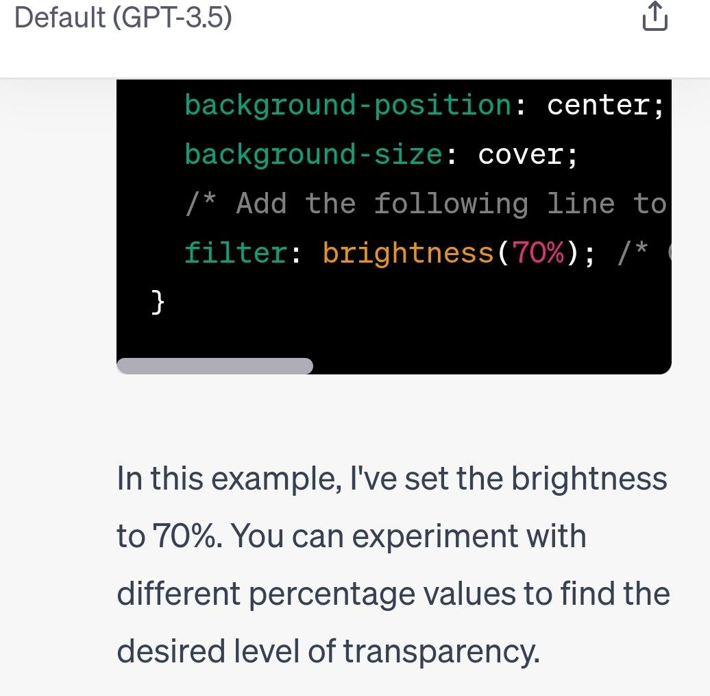
This only made forum text weaker!
Its now saying I need to edit the image in a paint program, and save it with more transparency, but as Im loading from website I cant do that
Is there a CSS way to reduce alpha value on image from external url?
-
Ah I figured out needed
body {Its working but got this funny response as if background is being clicked, and slightly moves sometimes, when you scroll up and down on forum content
@Panda yes, sorry. I’ve updated the original post
-
Apart from the slight move issue
The dark background was also too stong and making forum text hard to read.I asked chatGPT for fix, both its suggestions didnt work
1st suggestion change alpha value on rgb made no difference

2nd idea, filter:

This only made forum text weaker!
Its now saying I need to edit the image in a paint program, and save it with more transparency, but as Im loading from website I cant do that
Is there a CSS way to reduce alpha value on image from external url?
@Panda there is. What you are seeing here with the image moving when clicked is called Cumulative Layout Shift which occurs when the body height is set incorrectly.
Filter and Opacity are a bad idea as you are targeting the
bodyelement meaning all ancestors are affected by that change which in turn makes the text even harder to read.Tired want to use a overlay with the image, to add background color with transparency which should solve the issue.
-
@Panda there is. What you are seeing here with the image moving when clicked is called Cumulative Layout Shift which occurs when the body height is set incorrectly.
Filter and Opacity are a bad idea as you are targeting the
bodyelement meaning all ancestors are affected by that change which in turn makes the text even harder to read.Tired want to use a overlay with the image, to add background color with transparency which should solve the issue.
@phenomlab
I did try putting 95% height, but didnt solve itRe: putting a background color on…
If you look at the aignite site can you suggest what line to put to make the dark background more transparentI try to avoid CSS, so dont know it!
-
@phenomlab
I did try putting 95% height, but didnt solve itRe: putting a background color on…
If you look at the aignite site can you suggest what line to put to make the dark background more transparentI try to avoid CSS, so dont know it!
@Panda said in Fixed background to nodebb forum:
I try to avoid CSS, so dont know it!
You’ll never avoid having to use it. I’d recommend you start to learn it because you’ll come across this in all aspects of web development.
-
@Panda said in Fixed background to nodebb forum:
I try to avoid CSS, so dont know it!
You’ll never avoid having to use it. I’d recommend you start to learn it because you’ll come across this in all aspects of web development.
@phenomlab making min height 90% fixed it

-
 undefined Panda has marked this topic as solved on
-
@phenomlab making min height 90% fixed it

@Panda Good. And the background image with the text?
-
@phenomlab
Sort of …
Its taken me ages to get a skin that looks ok even over a feint backgroundIf I pick a skin can I change just one of the colors if its not dark enough?
-
@phenomlab
Sort of …
Its taken me ages to get a skin that looks ok even over a feint backgroundIf I pick a skin can I change just one of the colors if its not dark enough?
@Panda yes, but you should start with a sane value and work backwards. The lower the last number in terms of
rgbathe higher the transparency. -
@Panda yes, but you should start with a sane value and work backwards. The lower the last number in terms of
rgbathe higher the transparency.@phenomlab ah ok
So how do I change one color in a skin? -
@phenomlab ah ok
So how do I change one color in a skin?@Panda first, define “skin”
-
@phenomlab I go to admin menu and select skins
Current one is Quartz -
@phenomlab I go to admin menu and select skins
Current one is Quartz@Panda ok, but which code runs this? Is it mine, or someone else’s work (it does make a difference.
Edit - ok, unless I login, I cannot change the skin if it’s under admin. I’m being forced to wear sunglasses currently.
-
@Panda ok, but which code runs this? Is it mine, or someone else’s work (it does make a difference.
Edit - ok, unless I login, I cannot change the skin if it’s under admin. I’m being forced to wear sunglasses currently.
@phenomlab
on aignite.nodebb.com I want to pick skin with colors that look ok over back image.
But all the skins I try have at least one text color that is light and hard to see over image -
@phenomlab
on aignite.nodebb.com I want to pick skin with colors that look ok over back image.
But all the skins I try have at least one text color that is light and hard to see over image@Panda it seems you are using the NodeBB skins which frankly, are terrible. They are all based on bootswatch and all have issues.
You really need to custom develop a skin if your want it to look right.
-
@Panda it seems you are using the NodeBB skins which frankly, are terrible. They are all based on bootswatch and all have issues.
You really need to custom develop a skin if your want it to look right.
@phenomlab yea, this is what Im asking,
Using a skin but maybe modifying one of the color choices -
@phenomlab yea, this is what Im asking,
Using a skin but maybe modifying one of the color choices@Panda the really depends on what you want to do. Are you offering the same skin to everyone, or do you want to have light and dark modes etc?
If the one skin, then this is simple enough, but you’d need a lot of custom css to make this work.
-
@Panda the really depends on what you want to do. Are you offering the same skin to everyone, or do you want to have light and dark modes etc?
If the one skin, then this is simple enough, but you’d need a lot of custom css to make this work.
@phenomlab the background is supposed to be different for every user everytime they reload page
but its always covered in light yellow color (alpha .86) so background will always be lightIts just in each skin theres always one text color that is also light
-
Not sure why you are using a
beforepseudonym element to set the overlay. It’s much more efficient to do it this way (for example)body { position: relative; background-image: linear-gradient(to bottom, rgba(245, 246, 252, 0.52), rgba(117, 19, 93, 0.73)), url(https://loremflickr.com/500/500/flame); min-height: 90%; background-repeat: no-repeat; background-attachment: fixed; background-position: center; background-size: cover; }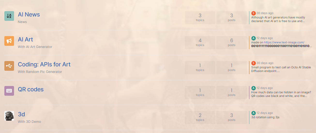
The below CSS block should be removed
body::before {
    content: "";
    position: absolute;
    top: 0;
    left: 0;
    width: 100%;
    height: 100%;
    background-color: rgba(255, 240, 220, 0.85);
    z-index: -100;
}
z-index: -100;is also overkill --1is usually always enough as this places the target element behind everything else. -
Not sure why you are using a
beforepseudonym element to set the overlay. It’s much more efficient to do it this way (for example)body { position: relative; background-image: linear-gradient(to bottom, rgba(245, 246, 252, 0.52), rgba(117, 19, 93, 0.73)), url(https://loremflickr.com/500/500/flame); min-height: 90%; background-repeat: no-repeat; background-attachment: fixed; background-position: center; background-size: cover; }
The below CSS block should be removed
body::before {
    content: "";
    position: absolute;
    top: 0;
    left: 0;
    width: 100%;
    height: 100%;
    background-color: rgba(255, 240, 220, 0.85);
    z-index: -100;
}
z-index: -100;is also overkill --1is usually always enough as this places the target element behind everything else.@phenomlab ah…
Chatgpt told me the ::before method.
Thanks for the human input
Hello! It looks like you're interested in this conversation, but you don't have an account yet.
Getting fed up of having to scroll through the same posts each visit? When you register for an account, you'll always come back to exactly where you were before, and choose to be notified of new replies (either via email, or push notification). You'll also be able to save bookmarks and upvote posts to show your appreciation to other community members.
With your input, this post could be even better 💗
Register LoginDid this solution help you?
Related Topics
-
-
-
-
-
-
NodeBB: Creating pages
Solved Configure -
-
NodeBB metadata
Solved Configure
