Theming support in Sudonix


-
A bit more eye candy from the mobile perspective
Several changes in the mobile viewport to make the most of limited screen estate, yet retaining a much functionality as possible.
The search applet has been modified to make it look more modern on mobile devices. Anything over 767px remains unchanged.
-
It’s worth noting at this point that all new themes leverage Font Awesome 6 Pro (I have a paid subscription) to make the most of the newly available icons. Of course, it’s perfectly feasible to use the free version, although this will require the replacement of various icons from Pro if they aren’t available in the free version. Another issue here is that you can only use the solid icons.
-
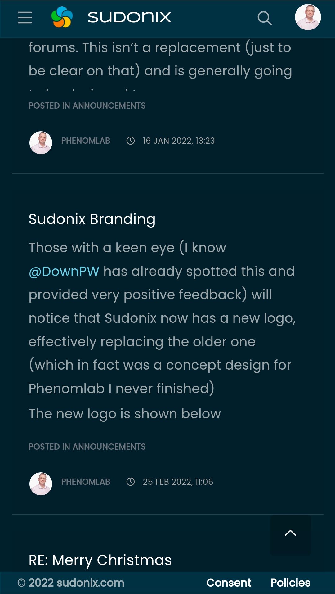
In addition to the theming support, I’m also going to be branding the email templates, so they look as follows
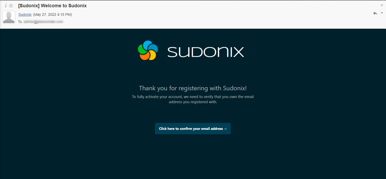
This uses the new logo, new layout (based on Midnight, as this is the flagship theme if you use Dark Mode by default). The Welcome template has been completed so far, and we have some way to go to complete all of the templates - but as soon as we do, the PROD instance of Sudonix will get the update
")
-
Theming support in Sudonix is now live !!!
Enjoy. if you’re using dark mode on your operating system, then the newer
midnighttheme is now active. The originaldarktheme is still there, but will be revamped shortly. -
-
** NEW *** NORD theme added - enjoy

-
** NEW ** SLATE theme added - enjoy

-
*** NEW *** Superhero (from Bootstrap 3 because I think the colours from v4 are hideous
) theme added - enjoy
-
*** NEW *** Darkly theme added (supersedes previous “dark” theme) - enjoy

-
-
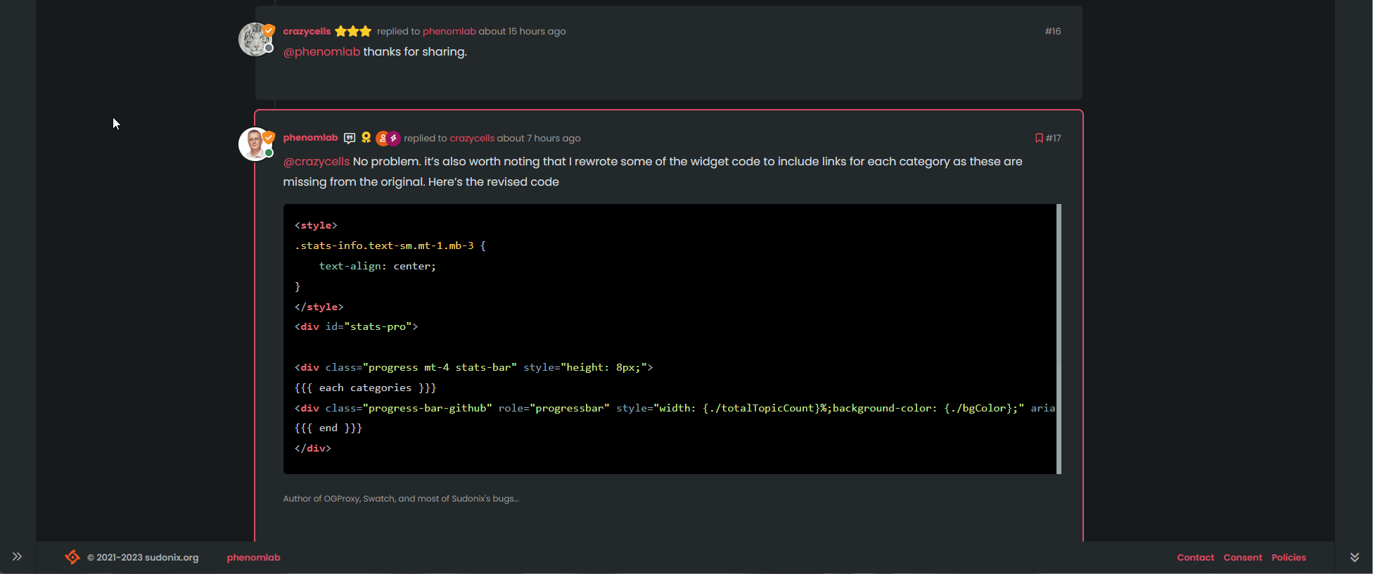
Great Job Bro Mark @phenomlab
")
@DownPW thanks
-
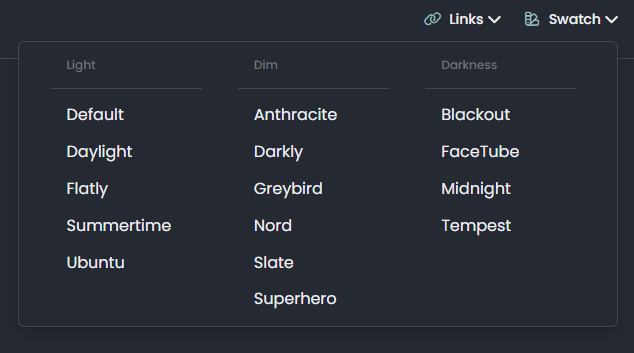
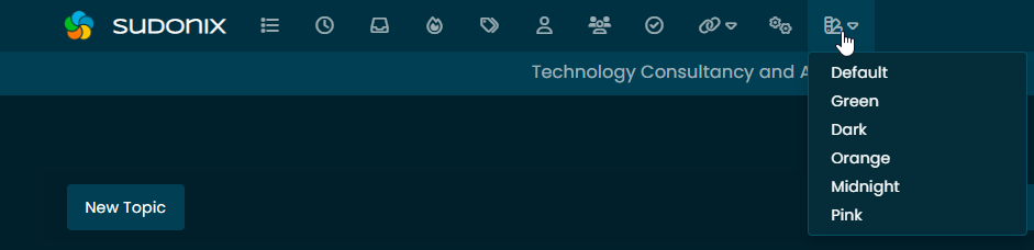
I can’t believe I actually missed this part - the icon where the magic happens ! To change the swatch to something else, use the “swatch” icon as shown below
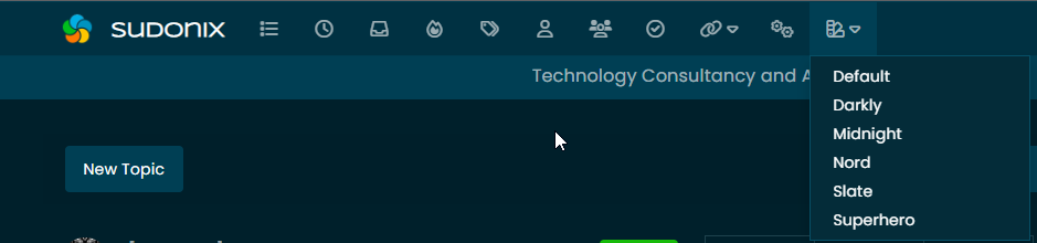
Select the swatch you’d like and the site will reload with the new colours.
-
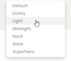
Something of a slight deviation here in the sense that I’m developing a new stock light theme that will override the default. It’s designed to be easy on the eye, appealing from the layout perspective, and to be engaging… Here goes…

It’s not quite ready yet as it needs some final polish before it gets officially released. However, I’ll let you into a secret. If you click on the swatch icon, you’ll see “Light” in the list which is the working title for this theme
Give it a spin, and let me know what you think. Just remember that this is a moving target currently and still has bugs

Let me know if you find anything major (aside from what @crazycells has already reported which relates to the modified core CSS)
-
Small addition of sexy looking gradient popular tags
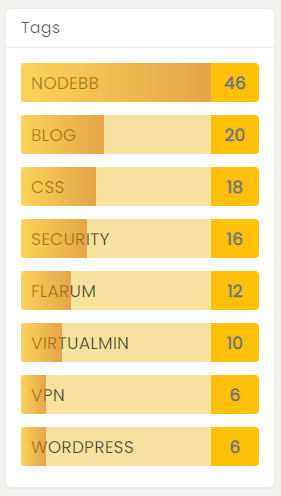
This is part of the
lighttheme I’ve been working on, and is designed to match the progress bar
Seriously falling in love with this new design. It’s clean, sharp, and attractive all at once
-
Beautiful
-
For anyone following this thread or using the “light” theme, it’s been renamed to “Daylight” to more accurately reflect the colour scheme in use. If you are using this, when you reload, the default theme will probably be loaded. This is expected because the cookie is storing “light” and there will no longer be a match.
If you select “Daylight”, then you should be good to go.
-
I spent some more time this afternoon / evening reviewing the overall structure of the themes, and had a lightbulb moment in the sense that it could (and should) be leaner / quicker. The big mistake here is duplicating the CSS in each Swatch (note I’m using the word “Swatch” here because the “theme” is undergoing major refactoring) makes the initial loading slower than it really should be as the entire page has to be reloaded to remove the previous CSS classes.
From a design perspective, this didn’t make any sense the more I thought about it. So, off to Dev I went and began refactoring. The end result (in Dev at least) is that there is now one “common” CSS file that gets loaded once, and the “swatches” are just CSS variables (rather like mixins) where the existing ones are replaced with a new set on selection.
Instead of adding another large CSS file, and effectively increasing the load time, we now simply call around 15 mixins and inject these into the head with an Ajax request. This means the Swatch changes instantly, and the site no longer needs to be reloaded to clear out any odd looking artefacts.
Admittedly, this has now “broken” the daylight theme in the sense that I have to restructure it as it was experiential at the time, and something of a deviation in that the mixins used do not align properly as they do in the other swatches. This was more about attempting to achieve a specific look.
I succeeded on that front as per the previous post, but now have to rework it based on the changes I’ve made to the other swatches in order to streamline them. One thing I did take from the daylight Swatch is the user posting style (giving an illusion of threaded replies) that makes the overall reading experience better in my view - this is now sewn into all swatches meaning a consistent viewing experience throughout.
Tomorrow will hopefully allow me time to get the daylight Swatch working again. Once done and tested, I’ll implement it in production.
-
wooo it’s very good work Mark.
I’m very interrested with taht features to improve what we have done together in order to less overload the load of my forum when using the theme switcher
-
Most of the work on the daylight Swatch has been completed. However, I did realise quite early on that I’d need to add some unique variables otherwise it meant having to remove functionality from the daylight colour scheme which I didn’t want to do.
I’ve found a way around this hopefully so work will continue tomorrow as time permits.
-
Over the past couple of days, I’ve been making significant headway with this, and the performance benefits are huge. Hoping to release to production in the coming weeks.
Hello! It looks like you're interested in this conversation, but you don't have an account yet.
Getting fed up of having to scroll through the same posts each visit? When you register for an account, you'll always come back to exactly where you were before, and choose to be notified of new replies (either via email, or push notification). You'll also be able to save bookmarks and upvote posts to show your appreciation to other community members.
With your input, this post could be even better 💗
Register Login