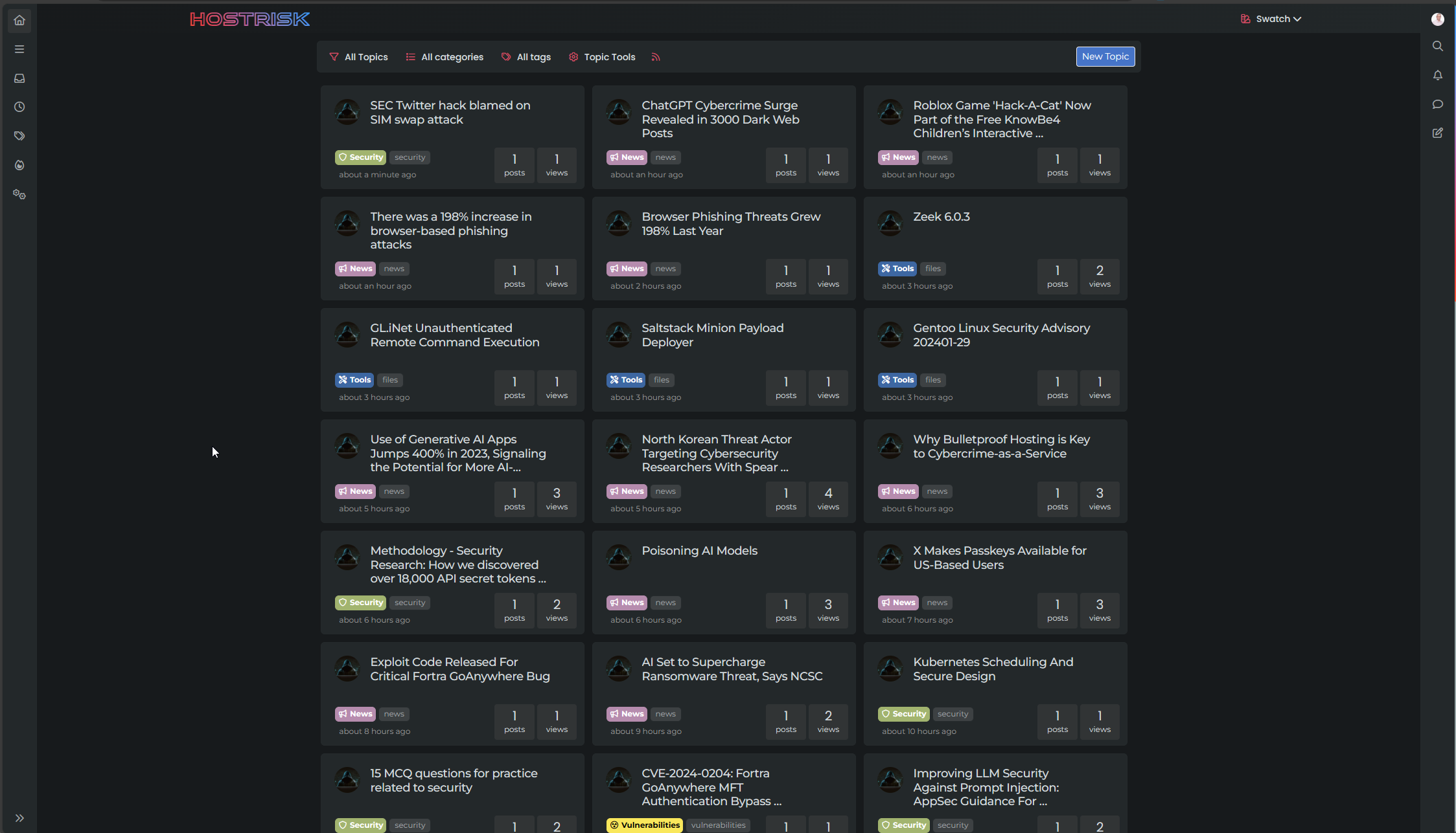
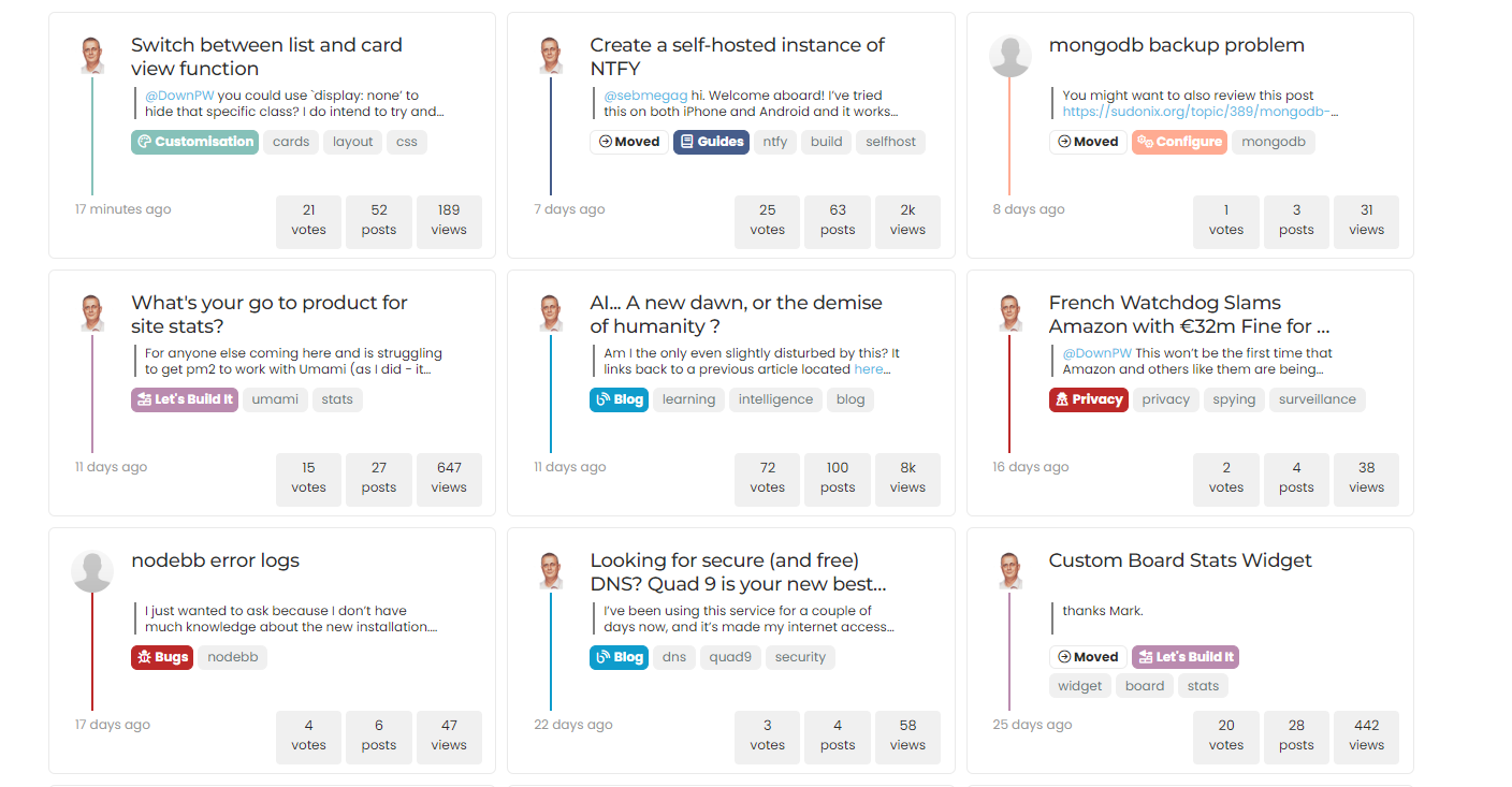
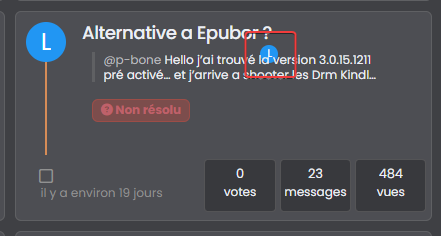
Switch between list and card view function
-
Ok @phenomlab Thanks to you for find the solution for this problem
so what is the good parameters in CF for this script ?
Maybe include this on your github ?@DownPW yes, absolutely, although I’m not entirely sure why CF behaves in this manner as in most cases, a present query string that changes frequently (on each page load) should not present itself as an issue.
Still checking.
-
It’s a shame to do without the CF cache in my opinion.
Do you just have to activate development mode in CF?
-
It’s a shame to do without the CF cache in my opinion.
Do you just have to activate development mode in CF?
@DownPW yes, in my testing, just enable development mode and then reload the site a few times and you’ll notice it works as intended.
-
hmm I think they was other thing.
I have not update the css file, I have just :
- activated development mode in CF,
- purge everything cache in CF,
- and test in new incognito windows on firefox
and I have the bug.
Edit : Same with the CSS updated
@DownPW is this in your dev environment? I checked that earlier and the bug wasn’t present.
-
@DownPW yes, correct.
-
@DownPW it wasn’t there when I tested incognito.
-
I do all my tets in incognito too
I will test with another accountYou must scroll down a little to see
@DownPW I scrolled through but found no issues
-
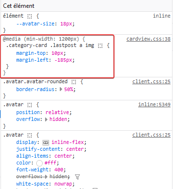
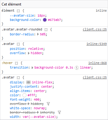
@DownPW can you target both the correctly positioned elements and the incorrectly positioned and compare the results?
I’m guessing they are different, but shouldn’t be.
-
-
@DownPW so the class isn’t being applied. Thanks. Let me have another look at this.
-
@DownPW from my further testing, this is 100% CF, but I don’t know why. I’ve tried Page Rules, Cache Rules, setting security in the page rules to “Essentially Off” - nothing seems to work (for me at least). I’ve stripped back my testing domain and disabled CF completely, and everything works as intended.
I was never able to reproduce the issue here, and that’s because I don’t use CF !
-
Too bad. I will therefore not be able to use this function or perhaps by just deleting the problematic avatar if that is possible
@DownPW you could use `display: none’ to hide that specific class? I do intend to try and identify the issue with CF but it’s difficult because I don’t traditionally use it.
Hello! It looks like you're interested in this conversation, but you don't have an account yet.
Getting fed up of having to scroll through the same posts each visit? When you register for an account, you'll always come back to exactly where you were before, and choose to be notified of new replies (ether email, or push notification). You'll also be able to save bookmarks, use reactions, and upvote to show your appreciation to other community members.
With your input, this post could be even better 💗
RegisterLog in
