Bug Report
-
do you use “nodebb-plugin-category-notifications” plugin?
-
-
do you use “nodebb-plugin-category-notifications” plugin?
@crazycells said in Bug Report:
do you use “nodebb-plugin-category-notifications” plugin?
Yes, but am going to remove it. I think that’s the case because it’s out of date.
-
Additionally, it looks like I am not watching this topic, but I get notification… strange… Does category-notification plugin cause this?
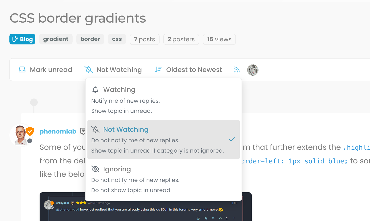
@crazycells It might do. Sudonix does not impose anything on it’s users - they have complete control over notifications and emails they receive. I’ve just disabled the plugin. Let me know if it continues.
-
@crazycells It might do. Sudonix does not impose anything on it’s users - they have complete control over notifications and emails they receive. I’ve just disabled the plugin. Let me know if it continues.
@phenomlab no need to worry
 I am aware how sensitive you are about GDPR compliance… You are probably the one who is the most careful regarding GDPR within the NodeBB community. I was simply trying to understand the cause of this problem, receiving notifications from your forum at any time is perfectly fine with me
-
@phenomlab no need to worry
 I am aware how sensitive you are about GDPR compliance… You are probably the one who is the most careful regarding GDPR within the NodeBB community. I was simply trying to understand the cause of this problem, receiving notifications from your forum at any time is perfectly fine with me
@crazycells Thanks for the comments. Yes, I take privacy very seriously, and would much rather users of this site have control over their own content.
-
13 days later
-
-
hi Mark,
“go to top of the page arrow” on the lower right side is overlapping with the post navigation bar on mobile, fyi…
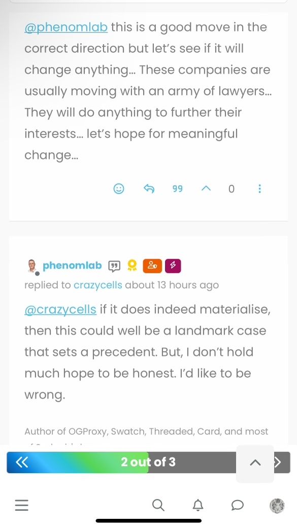
@crazycells Fixed. Thanks
-
@crazycells Fixed. Thanks
@phenomlab yeap, it is much better now
 thanks…
 -
@phenomlab yeap, it is much better now
 thanks…
@phenomlab the arrow stays up when I am not on a topic (so there is no post navigation tool)…
-
@phenomlab the arrow stays up when I am not on a topic (so there is no post navigation tool)…
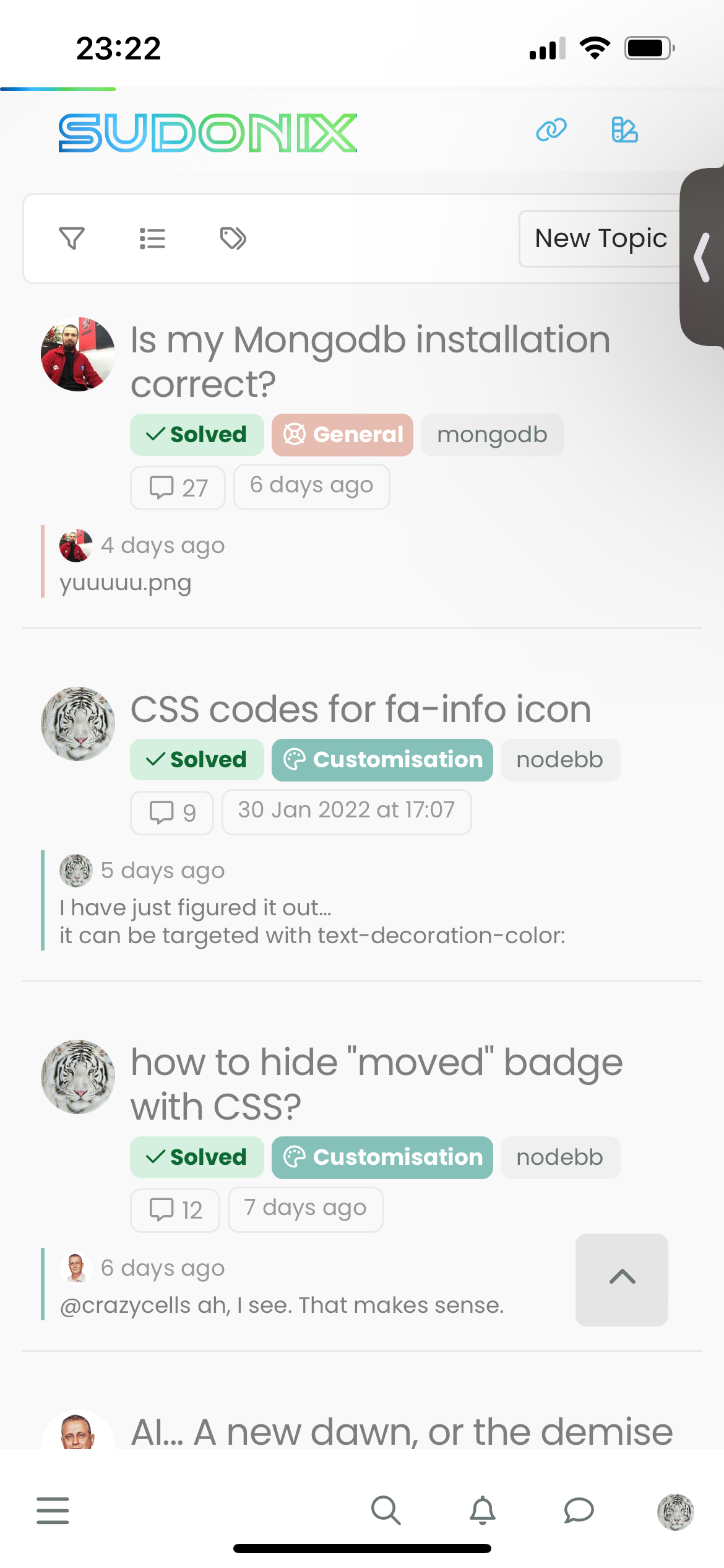
@crazycells that’s intended behaviour. If you press it, it’ll return to the top of the screen and then disappear.
-
@crazycells that’s intended behaviour. If you press it, it’ll return to the top of the screen and then disappear.
@phenomlab yeah, but isn’t it too up? I thought ideal place would be right above the menu bar on those pages?
-
additionally, do you think a similar button can be made for “go back one page” button? something I have mentioned here before?
https://community.nodebb.org/topic/17931/page-control-arrows-for-pwa
-
@phenomlab yeah, but isn’t it too up? I thought ideal place would be right above the menu bar on those pages?
@crazycells Hmm, yes, I see what you mean, but that would require 2 sets of code. Worth thinking about though

-
additionally, do you think a similar button can be made for “go back one page” button? something I have mentioned here before?
https://community.nodebb.org/topic/17931/page-control-arrows-for-pwa
@crazycells Yes, easily. Wouldn’t be difficult at all.
-
@crazycells Yes, easily. Wouldn’t be difficult at all.
@phenomlab then here it is

-
-
composer previews have problems… when I show the preview, it becomes transparent.

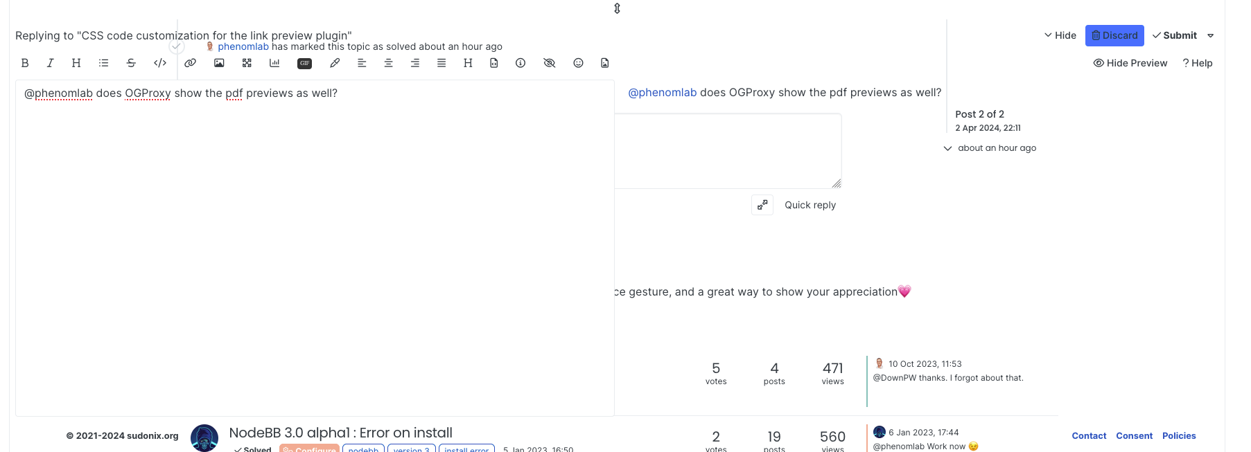
@crazycells Can you reload your browser and try again?
-
@crazycells Can you reload your browser and try again?
@phenomlab yeap, it is fixed… somehow I was on the wrong theme… what is the theme that was loaded first? cache issue?
-
@phenomlab yeap, it is fixed… somehow I was on the wrong theme… what is the theme that was loaded first? cache issue?
@crazycells Yes - sorry. It’s because I’ve been changing the theme names so the old ones aren’t officially supported (as such - they have been renamed). If you are using light mode on your OS, then you’ll get the light theme (which you clearly have). Reloading forces the
JSto reevaluate and select the right theme.Should have made an announcement about this. Sorry.
