Rendering issues post migration to Sudonix theme/code
-
I fixed it

-
This means that the variable is also used for other elements.
2 solutions:Find a color that works well for all elements
Change the variable for problem itemsedit: oups
@DownPW said in Rendering issues post migration to Sudonix theme/code:
This means that the variable is also used for other elements.
Exactly.
-
Hi
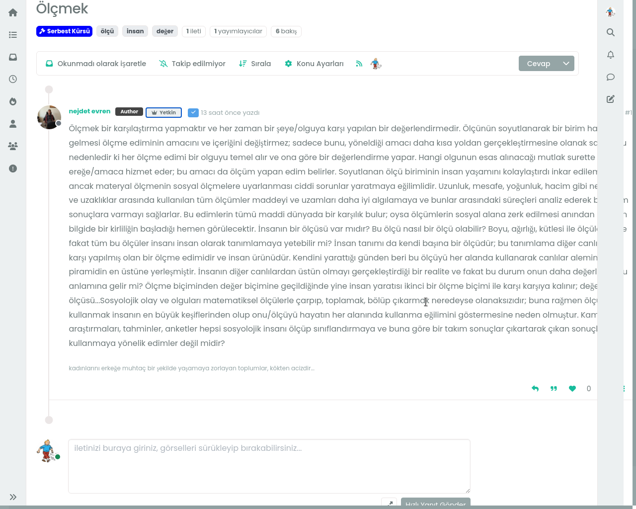
How can i add topic author icon? -
-
-
you can see the time section on home page,
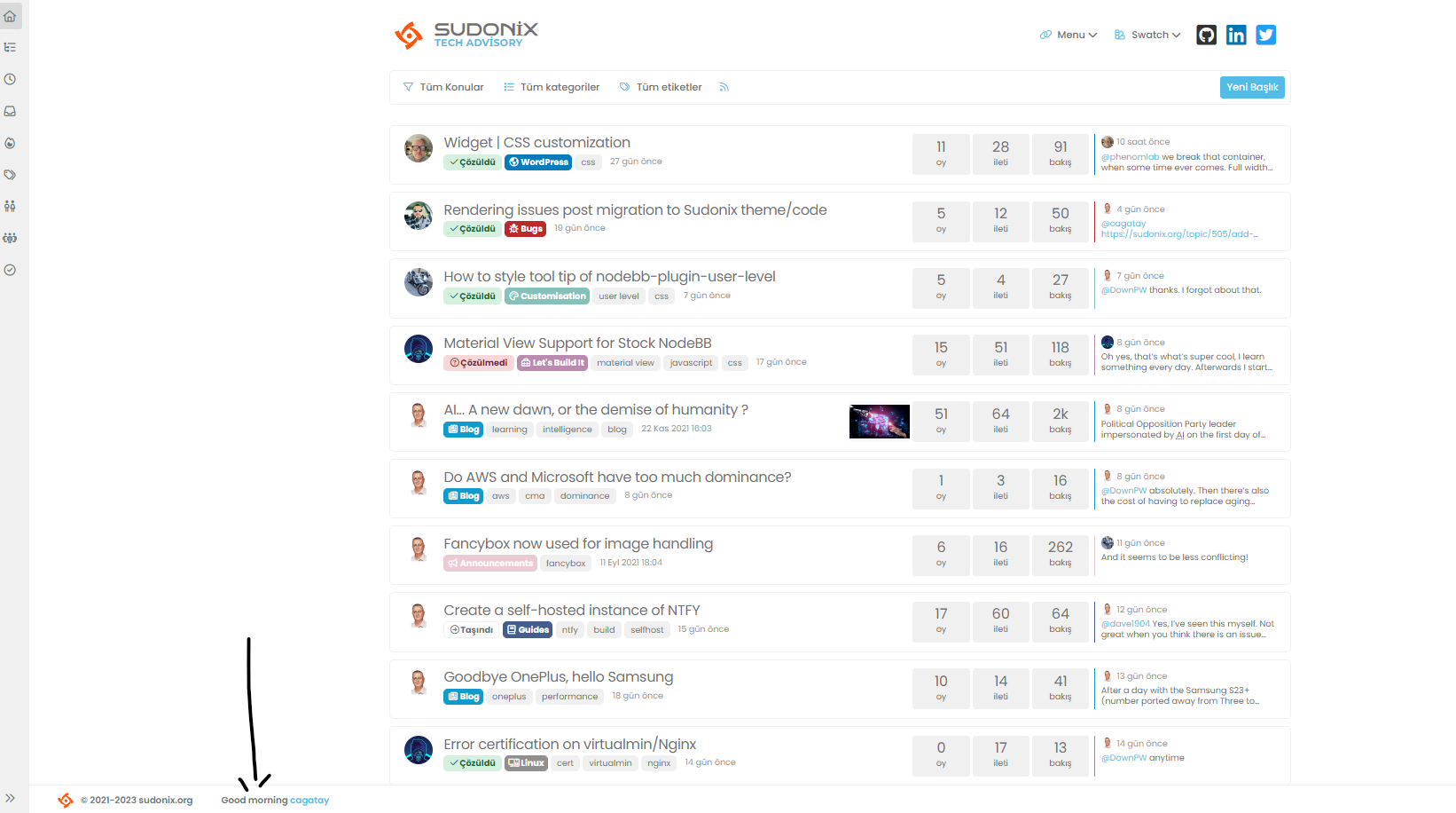
but we go to the another page, the time section disappears adn only username written.
how we can fix it?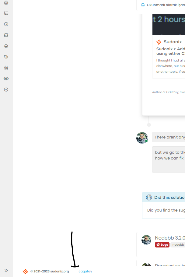
@cagatay In
ACP->/admin/appearance/customise#custom-jslocate the function with the description ofFooter GreetingDelete these lines
    if (window.location.href.indexOf("topic") > -1) {
        //console.log("This is a topic, so hide the user welcome message");
       bar.removeClass('show');
    } else {
        $('.getUsername').prepend(themessage);

    }
Remove the remark from
// $('.getUsername').prepend(themessage);So you have just
$('.getUsername').prepend(themessage);Complete code
// Footer Greeting
$(window).on('action:ajaxify.end', function(data) {
    var bar = $('.reading-meter');
    function updateUsername() {
        $('.getUsername .username').text(app.user.username);
        $('.topicUsername').text(app.user.username);
    }
    if (document.readyState === 'loading') {
        document.addEventListener('DOMContentLoaded', updateUsername);
    } else {
        updateUsername();
    }
    var thehours = new Date().getHours();
    var themessage;
    var morning = ('Good morning');
    var afternoon = ('Good afternoon');
    var evening = ('Good evening');
    var matched = false;
    $('#getConsent').attr("href", "/user/" + app.user.username + "/consent");
    if (thehours >= 0 && thehours < 12) {
        themessage = morning;

    } else if (thehours >= 12 && thehours < 17) {
        themessage = afternoon;

    } else if (thehours >= 17 && thehours < 24) {
        themessage = evening;
    }
    $('.getUsername').prepend(themessage);
});
That will enable the message again
-
@cagatay In
ACP->/admin/appearance/customise#custom-jslocate the function with the description ofFooter GreetingDelete these lines
if (window.location.href.indexOf("topic") > -1) { //console.log("This is a topic, so hide the user welcome message"); bar.removeClass('show'); } else { $('.getUsername').prepend(themessage); }Remove the remark from
// $('.getUsername').prepend(themessage);So you have just
$('.getUsername').prepend(themessage);Complete code
// Footer Greeting $(window).on('action:ajaxify.end', function(data) { var bar = $('.reading-meter'); function updateUsername() { $('.getUsername .username').text(app.user.username); $('.topicUsername').text(app.user.username); } if (document.readyState === 'loading') { document.addEventListener('DOMContentLoaded', updateUsername); } else { updateUsername(); } var thehours = new Date().getHours(); var themessage; var morning = ('Good morning'); var afternoon = ('Good afternoon'); var evening = ('Good evening'); var matched = false; $('#getConsent').attr("href", "/user/" + app.user.username + "/consent"); if (thehours >= 0 && thehours < 12) { themessage = morning; } else if (thehours >= 12 && thehours < 17) { themessage = afternoon; } else if (thehours >= 17 && thehours < 24) { themessage = evening; } $('.getUsername').prepend(themessage); });That will enable the message again
@phenomlab thank you Mark.
-
The mentioned codes are not in my CSS, I think we solved this situation with the widget?
-
The mentioned codes are not in my CSS, I think we solved this situation with the widget?
@cagatay said in Rendering issues post migration to Sudonix theme/code:
The mentioned codes are not in my CSS, I think we solved this situation with the widget?
Here :
@phenomlab said in Rendering issues post migration to Sudonix theme/code:
@cagatay In ACP->/admin/appearance/customise#custom-js
-
The mentioned codes are not in my CSS, I think we solved this situation with the widget?
@cagatay said in Rendering issues post migration to Sudonix theme/code:
The mentioned codes are not in my CSS, I think we solved this situation with the widget?
This is not CSS - it’s JS, hence
ACP->/admin/appearance/customise#custom-js -
ah soryy for my mistake

-
@cagatay dog you get this working eventually?
-
@phenomlab yes my friend, working correctly.
-
@phenomlab yes my friend, working correctly.
@cagatay good. Thanks for confirming.
-
-
Can we ensure that the section I show in the picture can be hidden after the user reads it once?

@cagatay Not easily without modifying the function itself. The function will look for the end of the thread and append the banner there. It’s possible to place a cookie on the user’s machine, although they will need to dismiss the banner for that to be saved.
One other immediate issue is that the cookie is browser session based, so you would need a unique identifier to determine if the message should be displayed or not - this essentially means that we test for the existence of a stored cookie on chat load and if we find a match, we hide the message.
This will have an impact on performance if you have hundreds of chat messages available, and for that reason, I’d recommend not taking this route.
-
got the point Mark, thank you for your explanation.
-
Did this solution help you?
Hello! It looks like you're interested in this conversation, but you don't have an account yet.
Getting fed up of having to scroll through the same posts each visit? When you register for an account, you'll always come back to exactly where you were before, and choose to be notified of new replies (ether email, or push notification). You'll also be able to save bookmarks, use reactions, and upvote to show your appreciation to other community members.
With your input, this post could be even better 💗
RegisterLog in
