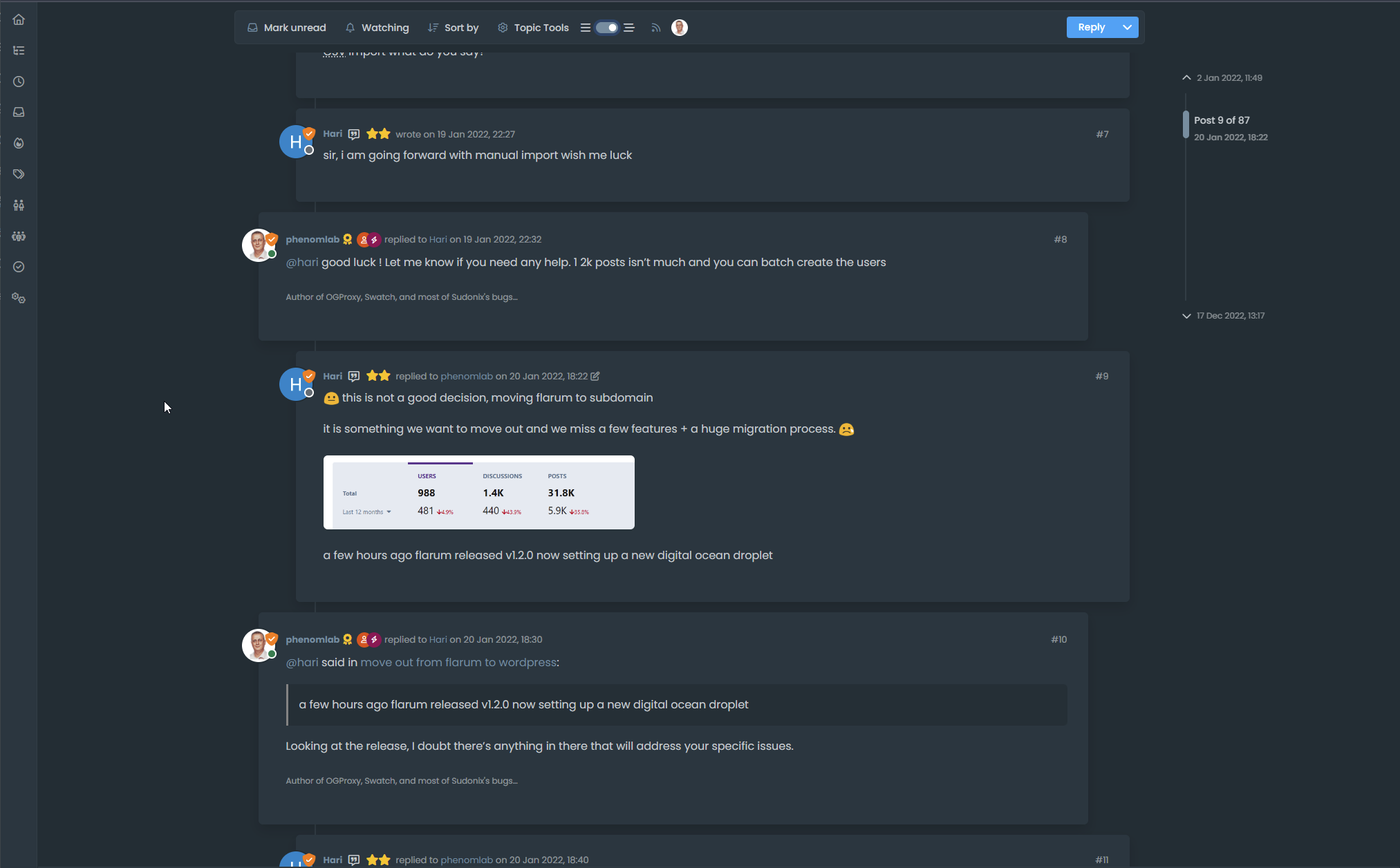
Threaded post support for NodeBB
-
this code does not work for me. No button
EDIT:
The code on github is OK, not the last share above
@DownPW said in Threading support for NodeBB:
The code on github is OK, not the last share above
Sorry - changed that to the Git link
-
Just don’t forget to comment out lines for browsing-users plugin
I’m got screwed

Good work my friend
@DownPW This part?
$('.topic .sticky-tools ul .hidden-xs').append(threadView); // If you have browsing users plugin, comment out the above line and uncomment the one below //$('.topic .sticky-tools ul [component="topic/browsing-users"]:last-of-type').append(threadView); Yes, I need to fix that! Thanks for the reminder.
-
For anyone else browsing here who has tried the code in
gitbut wants it to look exactly like Sudonix, please note that this code is not public because it is heavily adapted to match the layout of this site. There are some Sudonix “clones” around so you can actually have this code if you really want it, but it comes with some conditions;- You should consider buying me a coffee - see “Buy me a Coffee” link
- You have to provide a backlink to this site from your own - it needs to be visible and cannot be hidden - obviously, I can’t (and won’t) make you do this, but it’s courteous to recognize the original author - particularly when hundreds of hours were spent creating all of this eye candy

-
Hello @phenomlab
I see this, when someone composes, it is displayed via the plugin like this (To the left of the Thread View button.). I do not know if it’s normal or if it is better to put it on the right like the others ?
or myself for example :
-
Hello @phenomlab
I see this, when someone composes, it is displayed via the plugin like this (To the left of the Thread View button.). I do not know if it’s normal or if it is better to put it on the right like the others ?

or myself for example :

@DownPW Mmmm - I thought that this would happen. In your
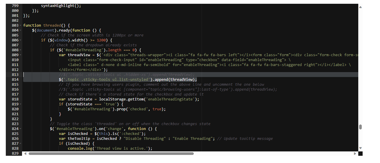
jsfunction, can you locate this line$('.topic .sticky-tools ul .hidden-xs').append(threadView);Replace it with
$('.topic .sticky-tools ul.list-unstyled').append(threadView);The issue here is that the
hidden-xsclass is being manipulated byjswhich forces the position and does not userelative. This new code should hopefully work around that. It will change the placement of the threaded toggle, but for the better I think. If this works, I’ll commit the code togit -
I don’t use this line, I commented out this line as stipulated in the script
$('.topic .sticky-tools ul .hidden-xs').append(threadView);But use this line :
$('.topic .sticky-tools ul [component="topic/browsing-users"]:last-of-type').append(threadView);maybe change for this ?
$('.topic .sticky-tools ul.list-unstyled [component="topic/browsing-users"]:last-of-type').append(threadView); -
I don’t use this line, I commented out this line as stipulated in the script
$('.topic .sticky-tools ul .hidden-xs').append(threadView);But use this line :
$('.topic .sticky-tools ul [component="topic/browsing-users"]:last-of-type').append(threadView);
maybe change for this ?
$('.topic .sticky-tools ul.list-unstyled [component="topic/browsing-users"]:last-of-type').append(threadView);@DownPW sorry, use this one.
$('.topic .sticky-tools ul.list-unstyled').append(threadView);Replace any existing line
-

With this code the entire plugin is now displayed to the left of the Thread View button. I even think I prefer the way it was before.
I find it more logical that all users are displayed to the right of the button and not to the left.@DownPW up to you of course but the browsing users plugin makes several adjustments to element positioning, and without moving the threading toggle outside of that, you’ll always have the issue where the composing user appears on the left because under the old code, the threading toggle shares the same space which causes the alignment issue.
Moving outside of that div is the only way to resolve the issue. There is another way which is to append the topic tools element but that then means that users without adequate permissions will not be able to use the threading toggle at all.
-
-
@DownPW yes, that’s definitely a
z-indexissue. -
After test, seems to be good with add this in JS function in
ifandelse:$('[component="topic/quickreply/container"]').addClass('threaded'); //test $('[component="topic/quickreply/container"]').removeClass('threaded'); //test and this to CSS :
[component="topic/quickreply/container"].threaded {
    z-index: -1 !important;
    position: relative;
}
Tell me if this seems correct to you @phenomlab
-
After test, seems to be good with add this in JS function in
ifandelse:$('[component="topic/quickreply/container"]').addClass('threaded'); //test $('[component="topic/quickreply/container"]').removeClass('threaded'); //testand this to CSS :
[component="topic/quickreply/container"].threaded { z-index: -1 !important; position: relative; }Tell me if this seems correct to you @phenomlab
@DownPW seems fine, yes. Any obvious conflict with other elements?
-
I haven’t tested everything. this is something to watch out for
-
-
@DownPW Let me have a look.
-
@phenomlab said in Threading support for NodeBB:
@DownPW Let me have a look.
Thanks Mark

@phenomlab said in Threading support for NodeBB:
@DownPW seems fine, yes. Any obvious conflict with other elements?
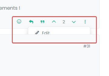
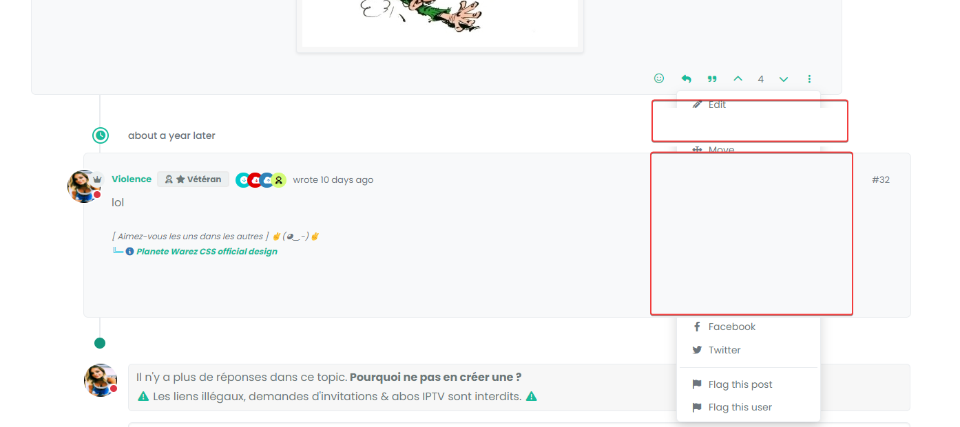
Besides, my solution above is only partial. It turns out that sometimes I can no longer click to reply to the post via quick Reply. Nothing happens when I click to enter text
It’s a bit the same problem as the previous bug.
It would be more interesting to act on the dropdown menu than the other elements one by one but my attempts are not fruitful for the moment.
We could kill one stone/two birds
-
@phenomlab said in Threading support for NodeBB:
@DownPW Let me have a look.
Thanks Mark

@phenomlab said in Threading support for NodeBB:
@DownPW seems fine, yes. Any obvious conflict with other elements?
Besides, my solution above is only partial. It turns out that sometimes I can no longer click to reply to the post via quick Reply. Nothing happens when I click to enter text
It’s a bit the same problem as the previous bug.
It would be more interesting to act on the dropdown menu than the other elements one by one but my attempts are not fruitful for the moment.
We could kill one stone/two birds
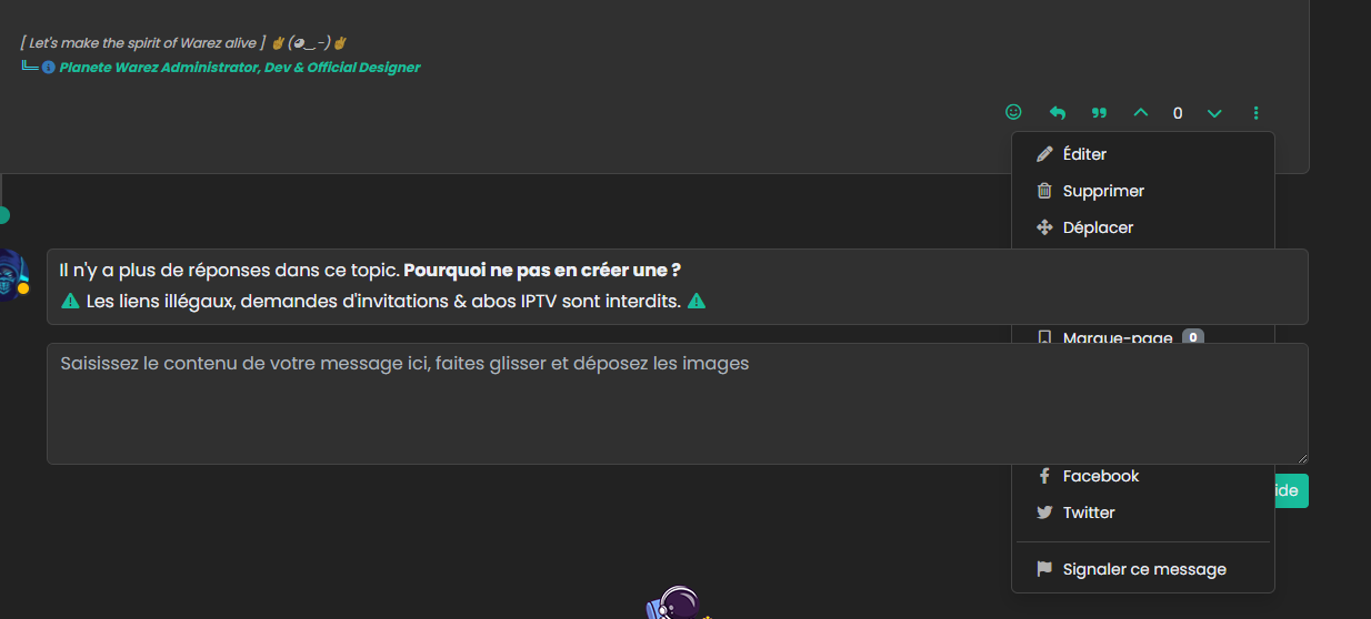
@DownPW I see the issue. Can you please make the below CSS changes - notice the ones commented out and their replacements (which you should follow)
.page-topic .topic .posts.timeline .timeline-event, .page-topic .topic .posts.timeline > [component="post/placeholder"], .page-topic .topic .posts.timeline > [component=post] { border-left: none; /* transition: transform 0.3s ease !important; */ transition: margin-left 0.3s ease, margin-right 0.3s ease !important; background: var(--bs-body-bg); border-radius: var(--bs-border-radius); } li[component=post].threaded { /* transform: translateX(-100px); */ /* transition: transform 0.3s ease !important; */ margin-left: -75px !important; transition: margin-left 0.3s ease, margin-right 0.3s ease !important; } My expectation is that this will still work (but using
margininstead oftransform), and also ensure that the reverse dropdown is not being hidden by the[component="post"]elements.When you use
transformon an element, a new stacking order is created for it. As you are transforming a parent which doesn’t havez-indexof it’s own, a new stacking order for itself and child elements is created. As a result, the child element withz-indexremains below the[component="post"]elements.If you want to see this in action before applying the CSS, you can remove
translateX(-100px)from theli[component=post].threadedclass and then try the dropdown menu again. You’ll notice it appears correctly this time, although the content is not being shifted because thetranslatehas been removed.We replace it with
marginwhich is slightly less performant when it comes to animation, but the nature of NodeBB is to lazyload posts, therefore, this negates the overall impact to theDOM.Let me know if this works.
