Nodebb 3.2.2
-
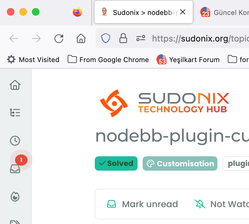
hi @phenomlab , favicon of this forum seems weird, it shows your profile picture, however, it goes away when I refresh the page. If I open 10 new pages, 1 of them looks like this but it goes away after I refresh it.
@crazycells hmm. That is odd. Can you provide me with a URL where you experience this?
-
@crazycells hmm. That is odd. Can you provide me with a URL where you experience this?
@phenomlab not a specific one… any topic link…
this is what I am talking about… I opened the last 10 topic link on the /recent page…
You see, one of them is your profile pic, but the rest is fine.
Firefox Browser 115.0.2 (64-bit)
-
@phenomlab not a specific one… any topic link…
this is what I am talking about… I opened the last 10 topic link on the /recent page…

You see, one of them is your profile pic, but the rest is fine.
Firefox Browser 115.0.2 (64-bit)
@crazycells thanks. I’ll check this, but can’t think of any reason as to why this would be happening.
-
previously @barisusakli mentioned that these two links should contain your favicon:
https://community.nodebb.org/post/88978
maybe you can check both, and if both are correct, I guess there is nothing else to do… but this is not a huge problem, when I go that tab and refresh it, it corrects itself… FYI…
-
-
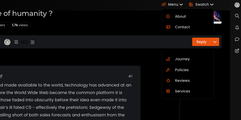
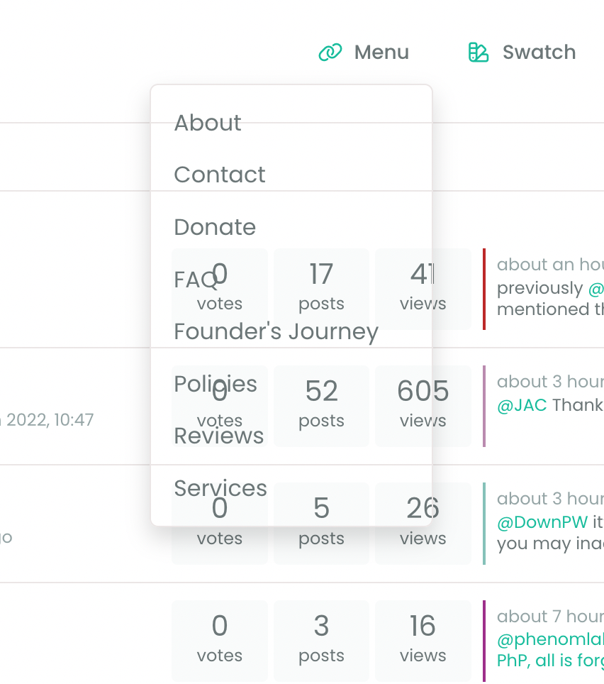
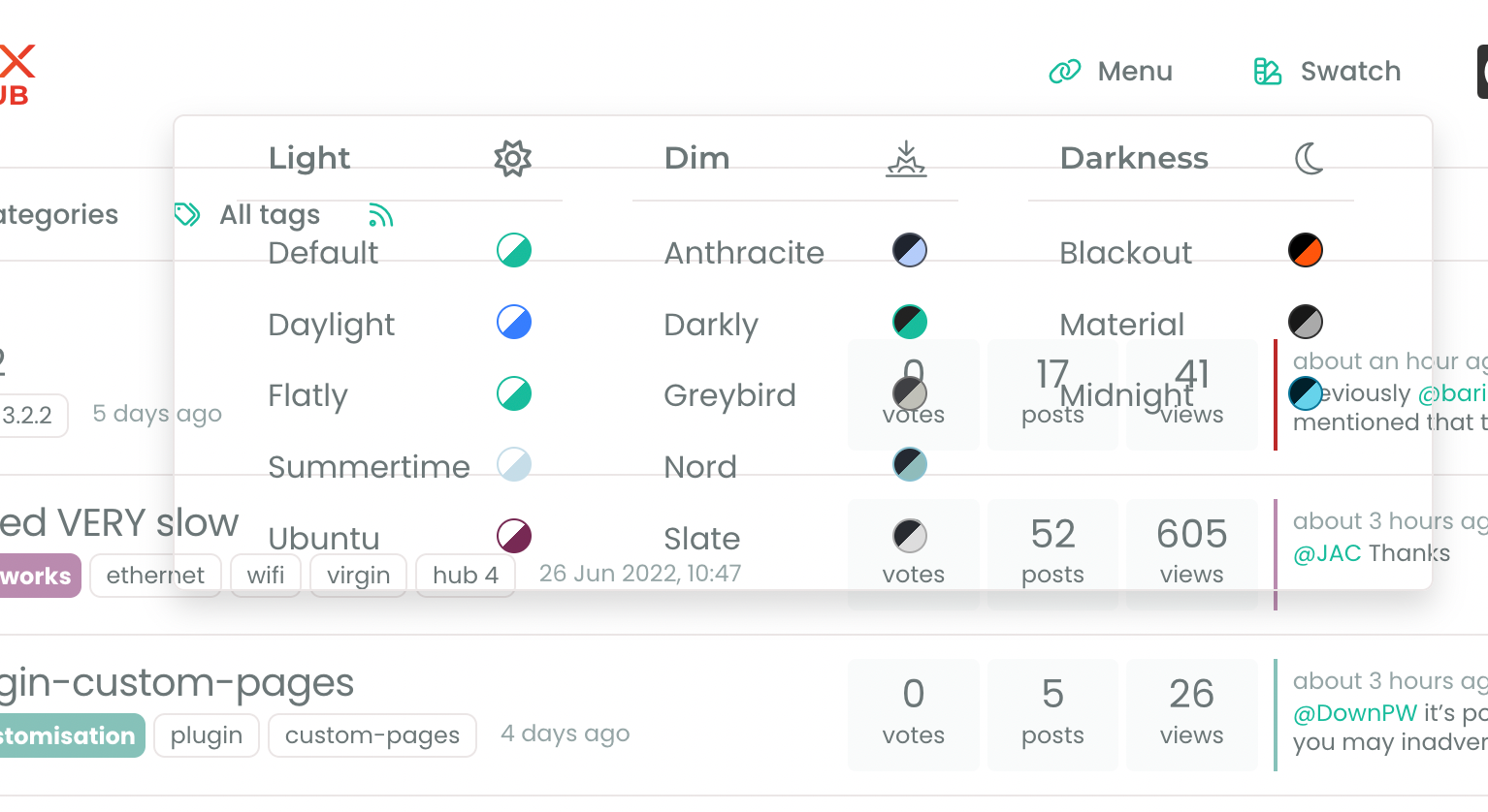
Additionally, there seems to be a problem with the background when there is an open panel…

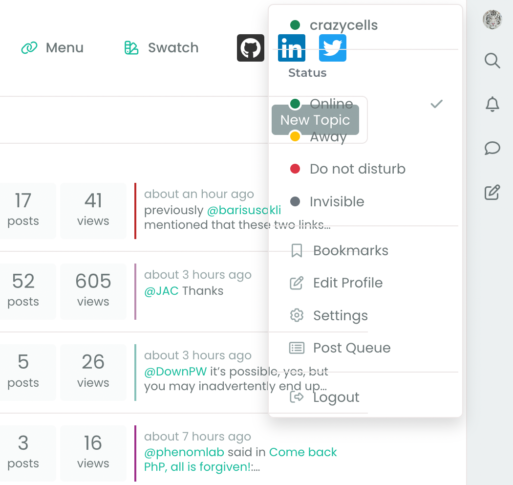
@crazycells This smells like a cache issue to me. Can you clear your cache, or try from an incognito session and let me know if that resolves it?
-
@phenomlab you are using 3.2.2 version for now?
@crazycells i think it will be fixed with 3.2.3 version as @barisusakli said.my problem also will be fixed 3.2.3 which relased today.
-
@phenomlab you are using 3.2.2 version for now?
@crazycells i think it will be fixed with 3.2.3 version as @barisusakli said.my problem also will be fixed 3.2.3 which relased today.
@cagatay I’m actually using 3.2.1
-
@crazycells This smells like a cache issue to me. Can you clear your cache, or try from an incognito session and let me know if that resolves it?
@phenomlab yeap, clearing cache solved the issues

-
-
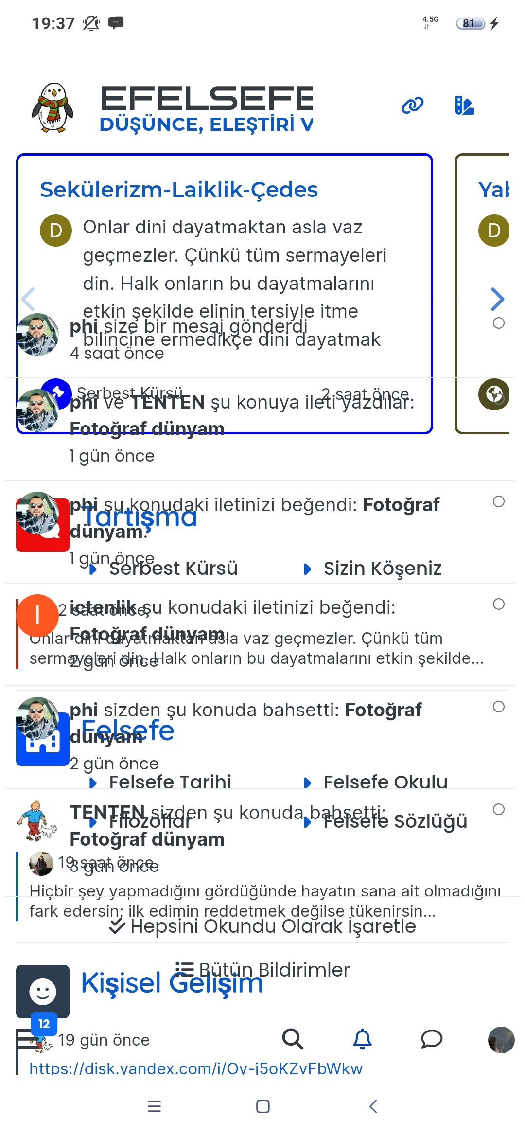
I think the color of SSO writings should be changed so they are visible.
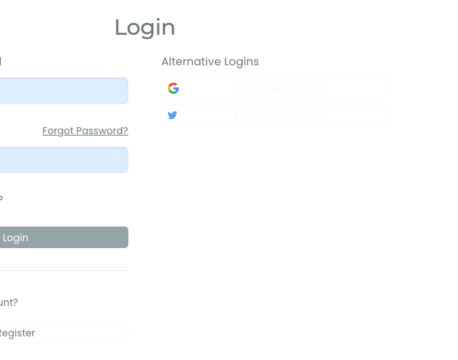
@crazycells hmm. That’s odd. I’ll need to check that. Thanks for reporting.
-
I think the color of SSO writings should be changed so they are visible.

@crazycells Should be fixed now
-
-
@crazycells yes, I’ve just seen that and modified the post. It seems to only happen if you have a space between the “greater than” symbol and the actual text.
Clearly a markdown thing.
Hello! It looks like you're interested in this conversation, but you don't have an account yet.
Getting fed up of having to scroll through the same posts each visit? When you register for an account, you'll always come back to exactly where you were before, and choose to be notified of new replies (ether email, or push notification). You'll also be able to save bookmarks, use reactions, and upvote to show your appreciation to other community members.
With your input, this post could be even better 💗
RegisterLog in
