Issues with Progress Bar on v3
-
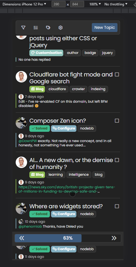
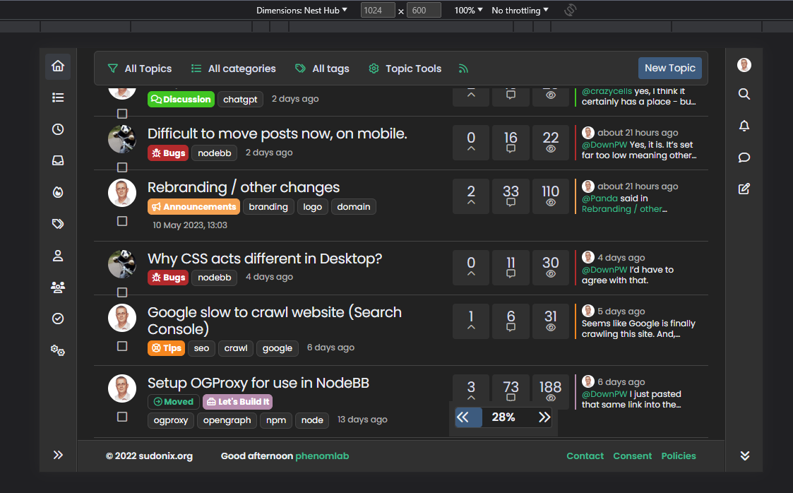
Status of my web site by android phone;
- Main page - bar not working
- topic - bar working
- chat - bar not working
@cagatay The reason this fails for you is because you have to auto-hide the bottom bar
I’ve made this change and it’s now working for the most part - but it should also float with the bottom bar depending on it’s position. Not sure why that’s not working but looking now.
-
all working now.
-
@cagatay Thanks. Also fixed the floating progress bar on mobile. It’s tied into the
footercode which you are not using so it wasn’t included in your build (but is now) -
whats is the fix ?
-
@DownPW The footer bar
jscode. -
You mean I have to change mine?
-
-
Mark hi,
on the Android phone when client at main page, footer bar which has new message, new post, profil etc. can not seen because of bar. How we can change or hide for andorid user this bar on main page?
-
Mark hi,
on the Android phone when client at main page, footer bar which has new message, new post, profil etc. can not seen because of bar. How we can change or hide for andorid user this bar on main page?
@cagatay Because of the progress bar, or the bottom bar?
-
because of progress bar, andorid user can not see new message, new post, profil bar.
-
because of progress bar, andorid user can not see new message, new post, profil bar.
@cagatay Send me a screenshot. I am connected to your forum now and am not able to replicate this.
-
-
@cagatay This appears to be a bug on your forum that is being caused by other CSS. I am using exactly the same code on Sudonix without any issues. In addition, your bottombar appears to be hiding on scroll, which is correct, but not returning when it reaches the correct position. My code does not touch the bottom bar.
Not sure where this is coming from presently.
-
how i can fix it? as i know i use also your css codes, i did not anything wihtouth you

@cagatay I’m not sure yet. I will need to look at this when I have some free time. For now, you could disable the progress bar by removing the header.
-
@cagatay The reason this fails for you is because you have to auto-hide the bottom bar
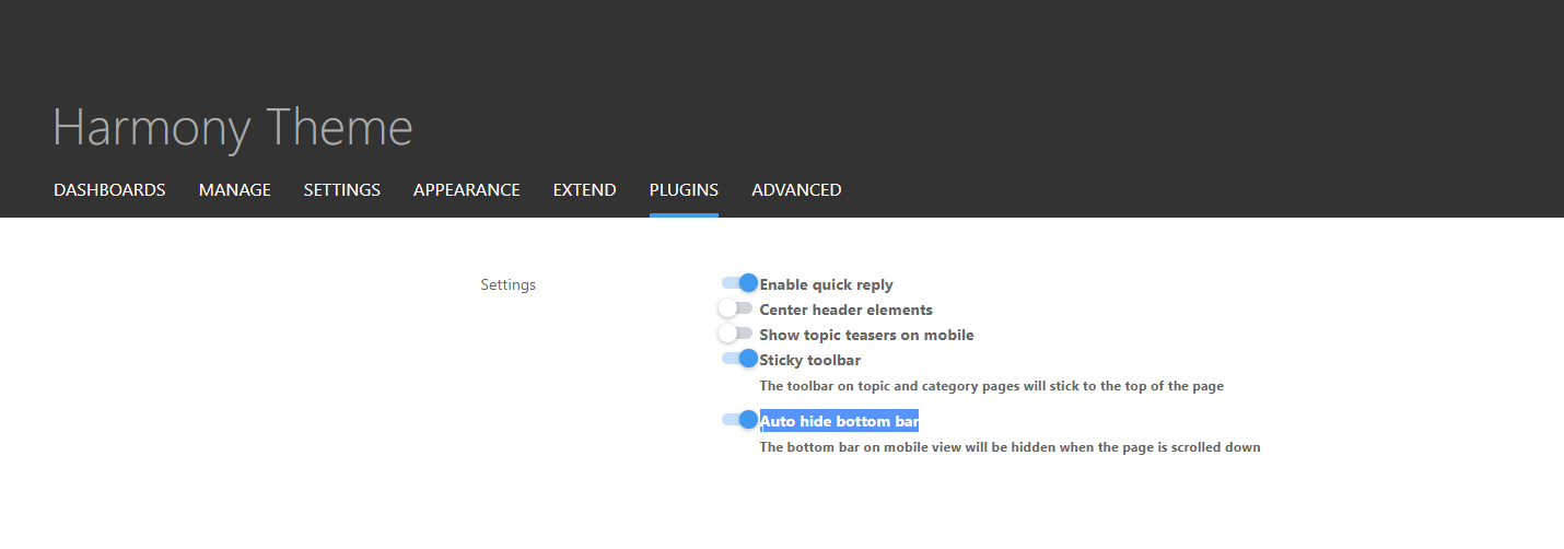
I’ve made this change and it’s now working for the most part - but it should also float with the bottom bar depending on it’s position. Not sure why that’s not working but looking now.
@phenomlab said in Issues with Progress Bar on v3:
@cagatay The reason this fails for you is because you have to auto-hide the bottom bar
I’ve made this change and it’s now working for the most part - but it should also float with the bottom bar depending on it’s position. Not sure why that’s not working but looking now.
i did disable mode auto hide
 now working normally on phones.
 -
@phenomlab said in Issues with Progress Bar on v3:
@cagatay The reason this fails for you is because you have to auto-hide the bottom bar

I’ve made this change and it’s now working for the most part - but it should also float with the bottom bar depending on it’s position. Not sure why that’s not working but looking now.
i did disable mode auto hide
 now working normally on phones.
@cagatay Excellent.
-
-
yop Mark

I see this on progress bar :
On small screen resolutions, the space between the arrows and the background div (progress bar) is not fixed.
It wouldn’t hurt to add fixed spaces no matter the resolution
-
OMG. Why on earth did I use percentages???

.pageUp {
    font-size: 1.25rem !important;
    left: 6%;
    line-height: 1.5;
    position: absolute;
    z-index: 10;
}
.pageDown {
    font-size: 1.25rem !important;
    line-height: 1.5;
    position: absolute;
    right: 6%;
    z-index: 10;
}
Change the
leftandrightvalues shown above to be1rem(or whatever value you’d prefer) and not6%
So
.pageUp {
    font-size: 1.25rem!important;
    left: 1rem;
    line-height: 1.5;
    position: absolute;
    z-index: 10;
}

.pageDown {
    font-size: 1.25rem!important;
    line-height: 1.5;
    position: absolute;
    right: 1rem;
    z-index: 10;
}
