Want to use Sudonix themes ?
-
twice what it is now
-
@cagatay that’s probably on for desktop, but might look out of place when viewed on a mobile device.
-
could you do for mobile also?
-
@cagatay yes, but I’d reiterate the concerns I’ve raised above in the sense that it may impact the flow of other elements.
Essentially, this is fm going to be a relatively simple CSS change.
-
Mark hi,
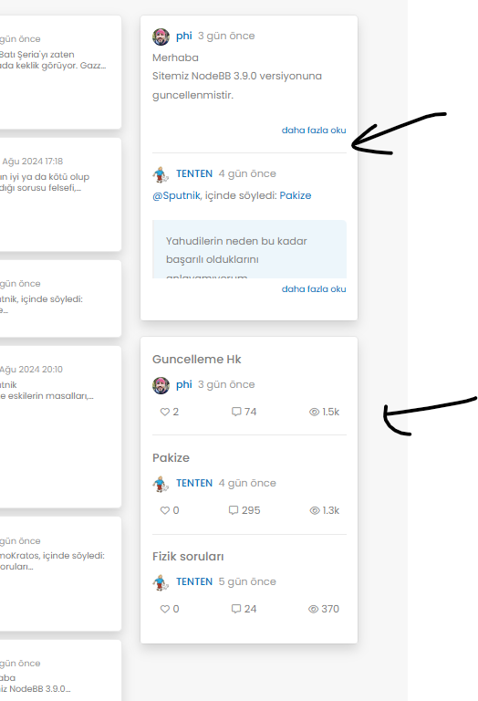
after upgrading 3.9 i have some problems with my web site.
Pls see below photos of my problems;
Also recent post and topics options i dont see my header
-
Mark hi,
after upgrading 3.9 i have some problems with my web site.
Pls see below photos of my problems;
Also recent post and topics options i dont see my header

@cagatay This will be because of the below changes
https://community.nodebb.org/topic/18292/nodebb-3.9.0
It’s related to the brand header section here
<button type="button" class="btn-ghost-sm d-flex gap-2 dropdown-toggle" data-bs-toggle="dropdown"It needs to be changed to
<button type="button" class="btn btn-ghost btn-sm d-flex gap-2 dropdown-toggle" data-bs-toggle="dropdown"I’ve made this change on your site, but you’ll also need some additional CSS. This ought to do it, and it’s been also applied to your forum.
.btn-ghost { --bs-btn-hover-border-color: var(--bs-body-navbar-active); --bs-btn-active-bg: var(--bs-body-navbar-active); } -
Of course, I am the same problem I have change the css class button on widget brand Header
except that I had an offset present on the brand header.
I did the same manipulations but I cannot remove this shift that we see on the screen.
Any idea how to remove this @phenomlab ?
Before :

After upgrade :

-
Of course, I am the same problem I have change the css class button on widget brand Header
except that I had an offset present on the brand header.
I did the same manipulations but I cannot remove this shift that we see on the screen.
Any idea how to remove this @phenomlab ?
Before :

After upgrade :

@DownPW Is this on your live site, or development? I cannot see any issue?
EDIT - I see it on your DEV site. Not sure where the additional padding is coming from to be honest, but one quick “fix” would be to target this CSS
[type=button]:not(:disabled), [type=reset]:not(:disabled), [type=submit]:not(:disabled), button:not(:disabled)And use this
[type=button]:not(:disabled), [type=reset]:not(:disabled), [type=submit]:not(:disabled), button:not(:disabled) {
    cursor: pointer;
    margin-top: 0.5rem;
    margin-bottom: 0.5rem;
}
I think you may have added
button.btn.btn-ghost.btn-sm.d-flex.gap-2 {
    padding-top: 0.8rem;
}
Although this isn’t very elegant as padding will in fact make the button much larger.
-
@DownPW Is this on your live site, or development? I cannot see any issue?
EDIT - I see it on your DEV site. Not sure where the additional padding is coming from to be honest, but one quick “fix” would be to target this CSS
[type=button]:not(:disabled), [type=reset]:not(:disabled), [type=submit]:not(:disabled), button:not(:disabled)And use this
[type=button]:not(:disabled), [type=reset]:not(:disabled), [type=submit]:not(:disabled), button:not(:disabled) {
    cursor: pointer;
    margin-top: 0.5rem;
    margin-bottom: 0.5rem;
}
I think you may have added
button.btn.btn-ghost.btn-sm.d-flex.gap-2 {
    padding-top: 0.8rem;
}
Although this isn’t very elegant as padding will in fact make the button much larger.
yep in dev, always for test before upgrade prod

@phenomlab said in Want to use Sudonix themes ?:
I think you may have added
button.btn.btn-ghost.btn-sm.d-flex.gap-2 {
padding-top: 0.8rem;
}Yep you’re right my friends.
But your method seems better :
[type=button]:not(:disabled), [type=reset]:not(:disabled), [type=submit]:not(:disabled), button:not(:disabled) {
    cursor: pointer;
    margin-top: 0.5rem;
    margin-bottom: 0.5rem;
}
Thanks
EDIT : ha noooo your code broke the “Answer” Button

keep for now this code
button.btn.btn-ghost.btn-sm.d-flex.gap-2 {
padding-top: 0.8rem;
} -
yep in dev, always for test before upgrade prod

@phenomlab said in Want to use Sudonix themes ?:
I think you may have added
button.btn.btn-ghost.btn-sm.d-flex.gap-2 {
padding-top: 0.8rem;
}Yep you’re right my friends.
But your method seems better :
[type=button]:not(:disabled), [type=reset]:not(:disabled), [type=submit]:not(:disabled), button:not(:disabled) {
    cursor: pointer;
    margin-top: 0.5rem;
    margin-bottom: 0.5rem;
}
Thanks
EDIT : ha noooo your code broke the “Answer” Button

keep for now this code
button.btn.btn-ghost.btn-sm.d-flex.gap-2 {
padding-top: 0.8rem;
}@DownPW that’s because it’s targeting the button type. Just change the post button class.
-
hmm sorry don’t understand
Edit :
like this maybe ?
.btn.btn-ghost.btn-sm:not(:disabled) { cursor: pointer; margin-top: 0.5rem; margin-bottom: 0.5rem; } -
hmm sorry don’t understand
Edit :
like this maybe ?
.btn.btn-ghost.btn-sm:not(:disabled) { cursor: pointer; margin-top: 0.5rem; margin-bottom: 0.5rem; }@DownPW Yes, that will work fine. What I meant was that the original CSS I provided targets
[type=button]so would impact all others on the page in addition to the intended target. -
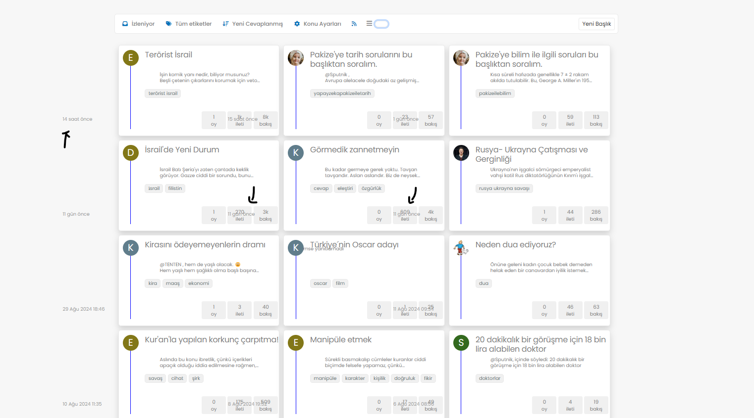
@phenomlab i have some problems with my below items when selected this type of tree;
-
@phenomlab i have some problems with my below items when selected this type of tree;

@cagatay In your CSS, locate the block starting
.category-card .text-muted.timeagoAnd remove
margin-left: -180px; -
Mark hi,
I know that you also update your own css and js along with nodebb’s updates but mine is old one when we first set it up.
I would like to your help to use your current css and js codes if its possible?
Thank you for your helping.
-
Mark hi,
I know that you also update your own css and js along with nodebb’s updates but mine is old one when we first set it up.
I would like to your help to use your current css and js codes if its possible?
Thank you for your helping.
@cagatay said in Want to use Sudonix themes ?:
I know that you also update your own css and js along with nodebb’s updates
I do update the CSS and JS here, but it’s not in line with NodeBB releases. All of the code I have written will work with prior releases, with the exception of Chat Threading, which requires a specific hook not present in some early versions. Again, this would still work, but not at full capacity.
@cagatay said in Want to use Sudonix themes ?:
mine is old one when we first set it up
It’s not “old” - it just isn’t the latest code. In fact, the code running on your website is not advertised anywhere else, so in fact, is newer than the Git links in this post.
@cagatay said in Want to use Sudonix themes ?:
I would like to your help to use your current css and js codes if its possible?
Possible, yes, but not yet. There are still some bugs in the code branch I’m using here, and I don’t want to introduce complexities into your installation - particularly when I know they exist, and you’d be left with issues that your users then have to put up with.
-
thank you for your advise Mark.
may i use your font ? what i have to do for it? -
@cagatay you are already using it.
-
i have many minor problems shown below photo, how can i fix it?
Chrome is moving towards a new experience that lets people make an informed choice with respect to third-party cookies.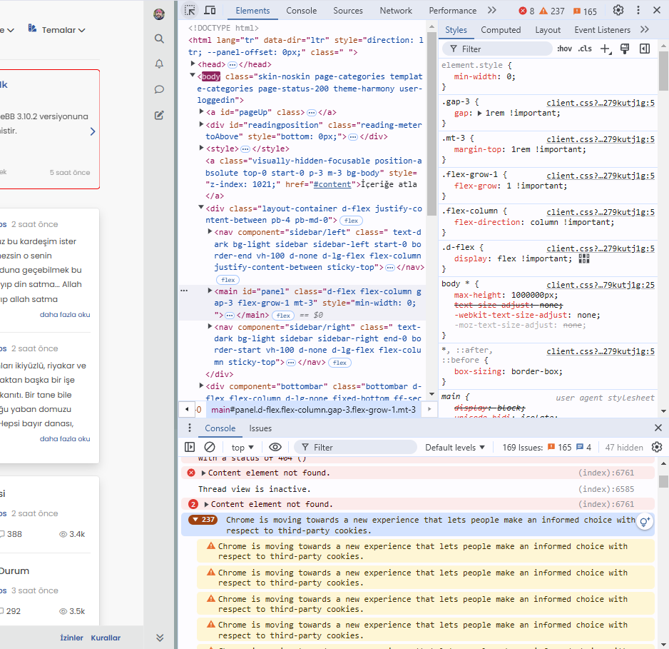
-
i have many minor problems shown below photo, how can i fix it?
Chrome is moving towards a new experience that lets people make an informed choice with respect to third-party cookies.
@cagatay This isn’t related to NodeBB, but how the Chrome browser itself behaves - see below
Yes, Google Chrome is shifting towards a more privacy-focused approach, particularly in how it handles third-party cookies. This change is part of a broader industry trend towards improving user privacy and transparency, as seen in regulations like the General Data Protection Regulation (GDPR) and the California Consumer Privacy Act (CCPA).
Key elements of Chrome’s new approach include:
-
Phasing out third-party cookies: Chrome has been working on a plan to phase out third-party cookies entirely, which are often used by advertisers and trackers to follow users across websites. This is part of Google’s Privacy Sandbox initiative.
-
User control and transparency: Chrome will provide users with more detailed options and controls over how third-party cookies are used. This will allow users to make an informed decision about which cookies they want to allow or block, helping them better understand how their data is being used.
-
Privacy Sandbox: Instead of third-party cookies, Google is introducing alternatives, like FLoC (Federated Learning of Cohorts), which aims to deliver relevant ads without exposing individual users’ browsing history to advertisers. FLoC is part of Privacy Sandbox, which focuses on creating new privacy-preserving mechanisms for digital advertising.
-
Better Consent Experiences: Chrome is also expected to improve how websites prompt users to give consent for cookies, reducing “cookie fatigue” and making the process more straightforward.
This new experience is expected to improve user privacy without entirely disrupting the ad-supported web ecosystem, which depends heavily on tracking technologies.
-
Hello! It looks like you're interested in this conversation, but you don't have an account yet.
Getting fed up of having to scroll through the same posts each visit? When you register for an account, you'll always come back to exactly where you were before, and choose to be notified of new replies (either via email, or push notification). You'll also be able to save bookmarks and upvote posts to show your appreciation to other community members.
With your input, this post could be even better 💗
Register LoginRelated Topics
-
-
-
-
-
-
NodeBB: Consent page
Solved Configure -
-
restarting nodebb on boot
Unsolved Configure
