Want to use Sudonix themes ?
-
@DownPW There are two places this can be changed. In the ACP, and also in your profile. Strange though as I do not recall changing the global setting.
-
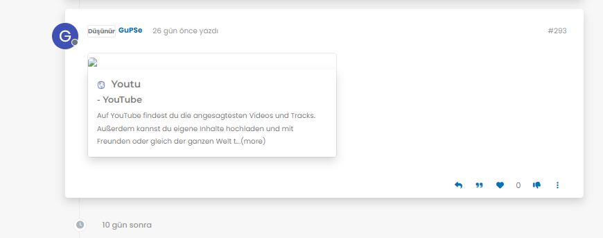
Mark hi
My youtube links are not working as it should be. photos not shown
what i sould do?

-
Mark hi
My youtube links are not working as it should be. photos not shown
what i sould do?
@cagatay Let me have a look at your site. Can you give me the URL where this issue is manifesting itself? Feel free to send it in a PM if you do not want to place it here.
EDIT - never mind, I found the link.
From what I see in the console
Failed to load resource: the server responded with a status of 404 ()OGProxy cannot retrieve the preview image from the source URL, so attempts to replace it with it’s own image called
404_3.webp. However, this image does not seem to exist in the relative path of/images/404.webpand so the result is what you see in the screenshot.To resolve this, download the file
404.webpfrom the below link, and place this into your OGProxy subdomain inside the folder ofimages -
i did but nothing changed.
-
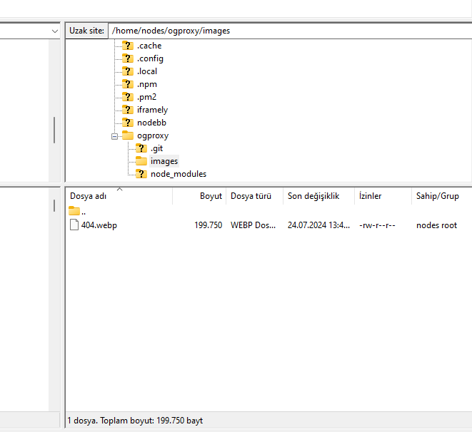
@cagatay I do not see it in the path I described above. The image is not there - in fact, from what I see, the
/imagesfolder does not exist at all? -
here
-
@cagatay You’ll need to change the owner of that file as it cannot be read. It’s set currently to root but needs to be the same user as your NodeBB runs under. The
imagesfolder needs to be set the same way. -
so i add file as user nodes then i add as root but two times not working correctly.
-
so i add file as user nodes then i add as root but two times not working correctly.
@cagatay I can’t see the image at all. Here’s the output from curl
HTTP/1.1 404 Not Found Server: nginx Date: Wed, 24 Jul 2024 11:42:02 GMT Content-Type: text/html Content-Length: 146 Connection: keep-alive -
i cant understand what i should to do,
folder images i have, i added your file as user and root but not worked … -
i cant understand what i should to do,
folder images i have, i added your file as user and root but not worked …@cagatay I’ll have a look
-
thank you Mark.
-
@cagatay Should be working now. I found the issue - your
nginx.conffile was set incorrectly. It was set tolocation /images { index index.php index.htm index.html; root /homes/nodes/ogproxy; } Should have been
location /images { index index.php index.htm index.html; root /home/nodes/ogproxy; } Basically,
homesneeded to behome")
-
hahahah
it was very easy for you but for me not same thank you Mark for all.
but as i see there is a problem for image founding,
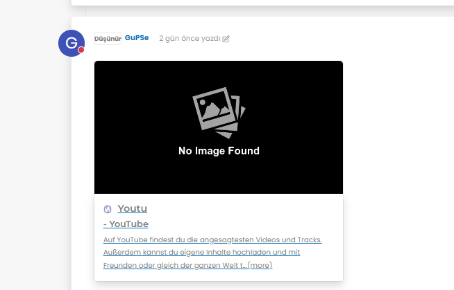
@cagatay It’s not an issue. The reason as to why OGProxy uses it’s own image is because the provided URL does not present one. This is for a variety of reasons - often to do with security and image scraping. If you want to embed YouTube videos, you should consider using
nodebb-plugin-ns-embedfor this purpose. -
Mark hi
As you know i m using your theme and codes.
My users want to biz size avatar, could we do it? -
Mark hi
As you know i m using your theme and codes.
My users want to biz size avatar, could we do it?@cagatay can you elaborate? Not sure what you’re referring to.
-
size of avatar we can do it big one?
-
@cagatay yes, that should be fairly simple to do, but what size? There may also be an impact to adjacent elements so I’d need an idea of the size you are looking for.
-
twice what it is now

Hello! It looks like you're interested in this conversation, but you don't have an account yet.
Getting fed up of having to scroll through the same posts each visit? When you register for an account, you'll always come back to exactly where you were before, and choose to be notified of new replies (ether email, or push notification). You'll also be able to save bookmarks, use reactions, and upvote to show your appreciation to other community members.
With your input, this post could be even better 💗
RegisterLog in
