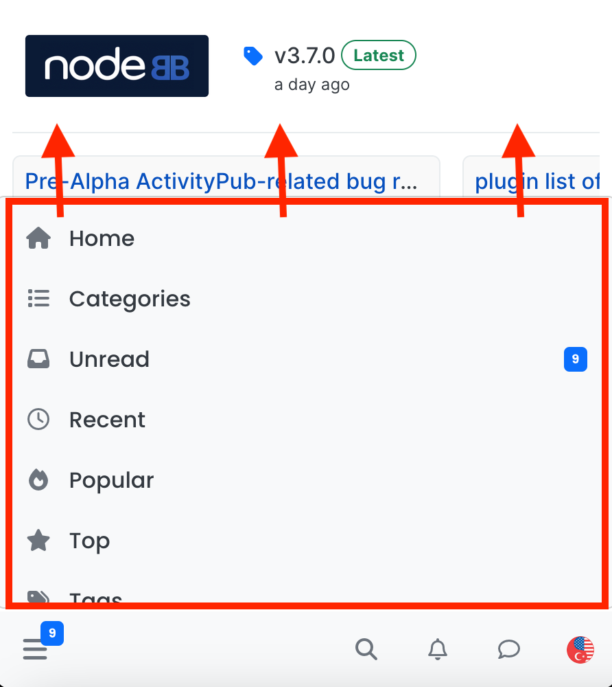
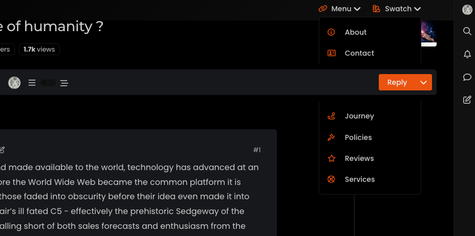
navigation bar is misplaced when the window gets smaller
-
I have the same things for the navbar when I have a lot of icons on the left.
the solution I found is to move the icons of the navbar to the left to have more room when you click on the search button and no longer have this rather annoying phenomenon
/*left*/ @media (min-width: 768px) { .container-fluid>.navbar-collapse, .container-fluid>.navbar-header, .container>.navbar-collapse, .container>.navbar-header { margin-right: 0; margin-left: -40px; } } /*right*/ @media (min-width: 768px) { .navbar-right { float: right!important; margin-right: -45px; } }@DownPW said in navigation bar is misplaced when the window gets smaller:
the solution I found is to move the icons of the navbar to the left to have more room when you click on the search button
I think perhaps the solution I posted is more elegant - that way, you don’t have to worry about elements shifting when you resize - just a thought

-
I always have the same problem when I click on the search button with your code. So I keep mine and add yours for the problem of window redimmension

-
I always have the same problem when I click on the search button with your code. So I keep mine and add yours for the problem of window redimmension

@DownPW sounds good.
Did this solution help you?
Hello! It looks like you're interested in this conversation, but you don't have an account yet.
Getting fed up of having to scroll through the same posts each visit? When you register for an account, you'll always come back to exactly where you were before, and choose to be notified of new replies (ether email, or push notification). You'll also be able to save bookmarks, use reactions, and upvote to show your appreciation to other community members.
With your input, this post could be even better 💗
RegisterLog in


