Visual enhancement to best answer
-
As much as I dislike Stack Overflow (see the below video for examples - it’s one of reasons why I created Sudonix in order to establish a fairer experience. This is an issue that sadly, has been rife on SA for years - in essence, it’s something of a toxic experience)
However, I do like the way they show accepted answers to posts
Below is an example
Simplistic, but effective. I also like the way it’s presented in NodeBB, so decided to create something of a “mash-up” to share with others.
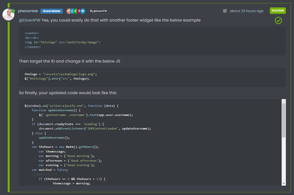
Here’s the default NodeBB experience
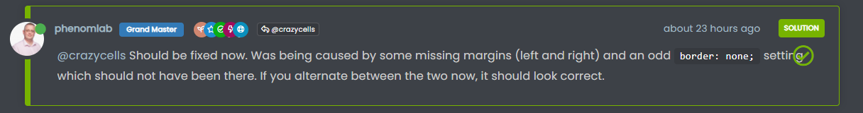
It’s effective - green border, with “solution” clearly stamped on it. Let’s take this a bit further with how we do this on Sudonix
Snazzy eh ??
")
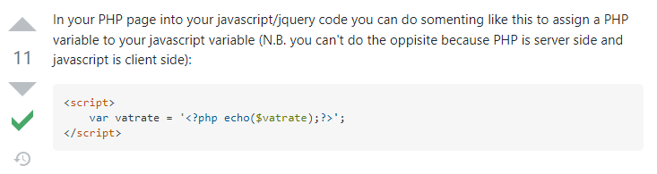
In reality, this isn’t difficult to do at all. Essentially, we just use the CSS
:aftertechnique like below.posts [component=post][data-index="-1"].isSolved:before { border-radius: 4px; top: -0.25rem; } .isSolved:after { content: "\f058"; font-family: "Font Awesome 5 Pro"; position: absolute; top: 43px; right: 35px; font-size: 3rem; font-weight: 400; color: #77B300; }Note that I’m using the Pro version of Font Awesome here, so if you want to use Font Awesome Free, you’ll need to substitute the block as below
    .isSolved:after {
        content: "\f058";
        font-family: "Font Awesome 5 Free";
        position: absolute;
        top: 43px;
        right: 35px;
        font-size: 3rem;
        font-weight: 900;
        color: #77B300;
    }
As I’m also using an
absoluteplacement here, it’s important I define two viewport classes, so@media (min-width: 1200px) { .isSolved:after { content: "\f058"; font-family: "Font Awesome 5 Pro"; position: absolute; top: 43px; right: 35px; font-size: 3rem; font-weight: 400; color: #77B300; } }And for mobile
@media (max-width: 767px) {
    .isSolved .clearfix.post-header {
        margin-left: 5px !important;
        margin-top: 20px;
    }
    .isSolved:after {
        content: "\f058";
        font-family: "Font Awesome 5 Pro";
        position: absolute;
        top: 14px;
        right: 97px;
        font-size: 2rem;
        font-weight: 400;
        color: #77B300;
    }
}
This means that in mobile view, I get the below
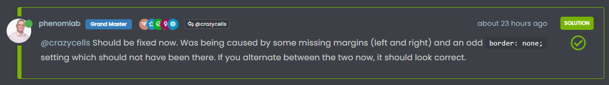
And when you combine CSS, imagination, code blocks, and real answers for real people, you get something like this
Enjoy…
-
 undefined phenomlab moved this topic from Announcements on
-
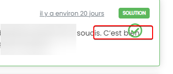
Looks very great !!
Good job Mark and Thanks for sharing
-
I have test your code on my forum @phenomlab
And I have this problem with police block content :
I resolv it by adding padding bottom on content with this code:
.isSolved .content {
    padding-top: 25px!important;
}
And I use this code for desktop :
.isSolved:after {
    content: "\f058";
    font-family: "Font Awesome 6 Pro";
    position: absolute;
    padding-left: 10px;
    padding-bottom: 10px !important;
    top: 40px;
    right: 40px;
    font-size: 2.5rem;
    font-weight: 400;
    color: #5cb85c;
}
And this for Mobile:
@media (max-width: 767px) {
.isSolved .clearfix.post-header {
    margin-left: -8px !important;
}

.posts [component=post][data-index="-1"].isSolved:before {
    margin-right: -10px;
}

.isSolved:after {
    content: "\f058";
    font-family: "Font Awesome 6 Pro";
    position: absolute;
    top: 40px;
    right: 30px;
    font-size: 2.5rem;
    font-weight: 400;
    color: #77B300;
}
}
RESULT:
Desktop:
Mobile:
Thanks Mark
PW and WS Spirit alive
-
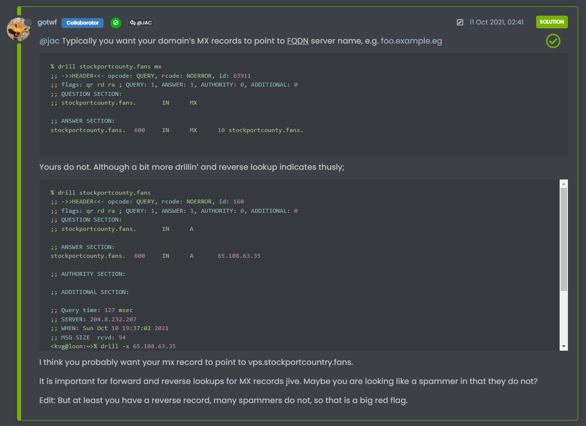
I have test your code on my forum @phenomlab
And I have this problem with police block content :
I resolv it by adding padding bottom on content with this code:
.isSolved .content {
    padding-top: 25px!important;
}
And I use this code for desktop :
.isSolved:after {
    content: "\f058";
    font-family: "Font Awesome 6 Pro";
    position: absolute;
    padding-left: 10px;
    padding-bottom: 10px !important;
    top: 40px;
    right: 40px;
    font-size: 2.5rem;
    font-weight: 400;
    color: #5cb85c;
}
And this for Mobile:
@media (max-width: 767px) {
.isSolved .clearfix.post-header {
    margin-left: -8px !important;
}

.posts [component=post][data-index="-1"].isSolved:before {
    margin-right: -10px;
}

.isSolved:after {
    content: "\f058";
    font-family: "Font Awesome 6 Pro";
    position: absolute;
    top: 40px;
    right: 30px;
    font-size: 2.5rem;
    font-weight: 400;
    color: #77B300;
}
}
RESULT:
Desktop:
Mobile:
Thanks Mark
@DownPW yes, I actually hide the welcome message on topics so I never factored this in

-
Me too, disabled on mobile.
-
I have test your code on my forum @phenomlab
And I have this problem with police block content :
I resolv it by adding padding bottom on content with this code:
.isSolved .content {
    padding-top: 25px!important;
}
And I use this code for desktop :
.isSolved:after {
    content: "\f058";
    font-family: "Font Awesome 6 Pro";
    position: absolute;
    padding-left: 10px;
    padding-bottom: 10px !important;
    top: 40px;
    right: 40px;
    font-size: 2.5rem;
    font-weight: 400;
    color: #5cb85c;
}
And this for Mobile:
@media (max-width: 767px) {
.isSolved .clearfix.post-header {
    margin-left: -8px !important;
}

.posts [component=post][data-index="-1"].isSolved:before {
    margin-right: -10px;
}

.isSolved:after {
    content: "\f058";
    font-family: "Font Awesome 6 Pro";
    position: absolute;
    top: 40px;
    right: 30px;
    font-size: 2.5rem;
    font-weight: 400;
    color: #77B300;
}
}
RESULT:
Desktop:
Mobile:
Thanks Mark
@DownPW Just reviewing this, as I just experienced the same symptoms as you. I decided on the below CSS, which might work better
@media (min-width: 1200px)
.isSolved p {
    width: 95%;
}
}
Some examples of how this looks.
On shorter messages, you don’t really notice the lesser width. Essentially, we go from this
to this
On larger messages, it looks as below
Because we only target the
pelement, and nothing else, the text width gets reduced, but other elements remain unchanged, so you don’t really notice the width being reduced -
Oh yeah great
-
undefined phenomlab moved this topic from Guides on
Hello! It looks like you're interested in this conversation, but you don't have an account yet.
Getting fed up of having to scroll through the same posts each visit? When you register for an account, you'll always come back to exactly where you were before, and choose to be notified of new replies (either via email, or push notification). You'll also be able to save bookmarks and upvote posts to show your appreciation to other community members.
With your input, this post could be even better 💗
Register Login