Tips for custom colors for forum categories
-
Hi @phenomlab , as I can see, you are expanding the color selection on this forum… and additionally, more are coming as I can tell from here https://sudonix.dev

However, I see that you do not use color tones that are compatible with each other. Some are way more vibrant than others. I recommend using this website below for color picking:
https://www.materialpalette.com/colors
You can pick any color, but it would look way better if colors belong to the same tone range… for example, if you pick 300 for green, use 300 for other colors too… Overall, using the same tone for different colors will create more aesthetically pleasant pages…

-
Hi @phenomlab , as I can see, you are expanding the color selection on this forum… and additionally, more are coming as I can tell from here https://sudonix.dev

However, I see that you do not use color tones that are compatible with each other. Some are way more vibrant than others. I recommend using this website below for color picking:
https://www.materialpalette.com/colors
You can pick any color, but it would look way better if colors belong to the same tone range… for example, if you pick 300 for green, use 300 for other colors too… Overall, using the same tone for different colors will create more aesthetically pleasant pages…

@crazycells not sure I understand. The colour schemes on sudonix.dev are part of the NodeBB harmony theme (they are actually taken directly from bootswatch) and aren’t created by me.
The Swatch colours in use in this site are my creation - is that what you are referring to ?
-
@crazycells not sure I understand. The colour schemes on sudonix.dev are part of the NodeBB harmony theme (they are actually taken directly from bootswatch) and aren’t created by me.
The Swatch colours in use in this site are my creation - is that what you are referring to ?
@phenomlab said in Tips for custom colors for forum categories:
@crazycells not sure I understand. The colour schemes on sudonix.dev are part of the NodeBB harmony theme (they are actually taken directly from bootswatch) and aren’t created by me.
The Swatch colours in use in this site are my creation - is that what you are referring to ?
Yes, unfortunately, NodeBB picks colors arbitrarily, but they are easily editable at ACP. I can see your category colors from “recent cards”…
Here on this website, I can see that on the main page, you go with the same color. On dev, it is more colorful.
I suggest you pick the colors according to their tones.
-
@phenomlab said in Tips for custom colors for forum categories:
@crazycells not sure I understand. The colour schemes on sudonix.dev are part of the NodeBB harmony theme (they are actually taken directly from bootswatch) and aren’t created by me.
The Swatch colours in use in this site are my creation - is that what you are referring to ?
Yes, unfortunately, NodeBB picks colors arbitrarily, but they are easily editable at ACP. I can see your category colors from “recent cards”…
Here on this website, I can see that on the main page, you go with the same color. On dev, it is more colorful.
I suggest you pick the colors according to their tones.
@crazycells said in Tips for custom colors for forum categories:
Here on this website, I can see that on the main page, you go with the same color. On dev, it is more colorful.
I suggest you pick the colors according to their tones.That’s because the swatches here are based on the appearance of established themes in use by Facebook, YouTube, etc - the categories are supposed to be one colour.
-
@crazycells said in Tips for custom colors for forum categories:
Here on this website, I can see that on the main page, you go with the same color. On dev, it is more colorful.
I suggest you pick the colors according to their tones.That’s because the swatches here are based on the appearance of established themes in use by Facebook, YouTube, etc - the categories are supposed to be one colour.
@phenomlab said in Tips for custom colors for forum categories:
@crazycells said in Tips for custom colors for forum categories:
Here on this website, I can see that on the main page, you go with the same color. On dev, it is more colorful.
I suggest you pick the colors according to their tones.That’s because the swatches here are based on the appearance of established themes in use by Facebook, YouTube, etc - the categories are supposed to be one colour.
Yes
 I am not arguing why you did that. I am just telling that the colors that are being used currently for categories are not compatible with each other, so they do not look in harmony…
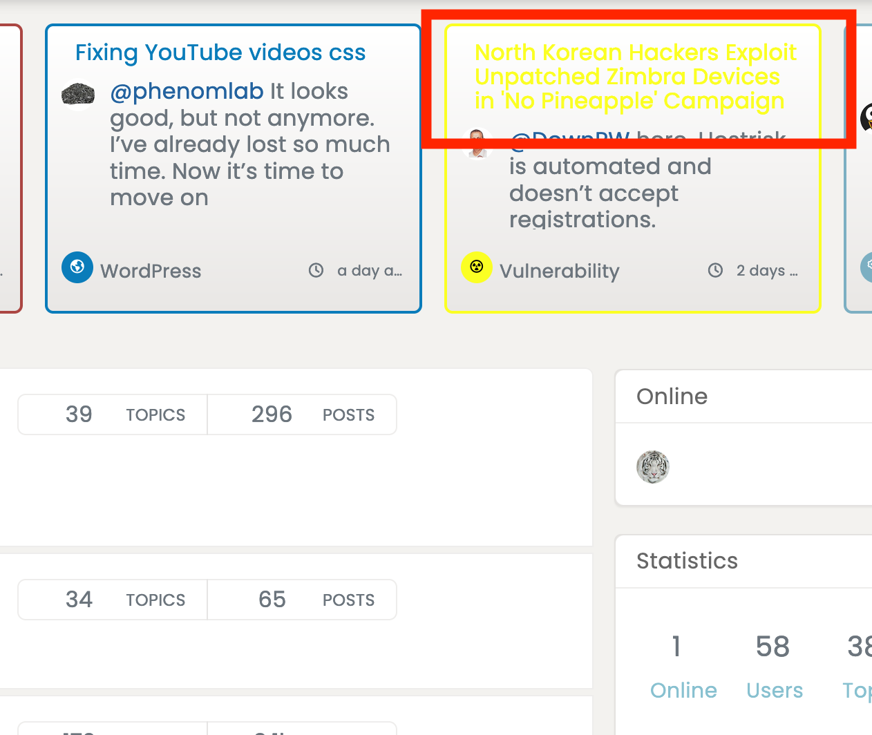
Please see the colors of various categories here:

So, if you pick colors according to their “tones” , the page will look much better

-
@phenomlab said in Tips for custom colors for forum categories:
@crazycells said in Tips for custom colors for forum categories:
Here on this website, I can see that on the main page, you go with the same color. On dev, it is more colorful.
I suggest you pick the colors according to their tones.That’s because the swatches here are based on the appearance of established themes in use by Facebook, YouTube, etc - the categories are supposed to be one colour.
Yes
 I am not arguing why you did that. I am just telling that the colors that are being used currently for categories are not compatible with each other, so they do not look in harmony…
Please see the colors of various categories here:

So, if you pick colors according to their “tones” , the page will look much better

@crazycells I agree, but with a (large) caveat

As my site uses a swatch changer, this alters the colour scheme. Given that the colours for categories are set in the ACP, this doesn’t lend itself very well to changing the colours dynamically when the theme changes.
Admittedly, I could use wildcard targets I suppose…
-
@phenomlab said in Tips for custom colors for forum categories:
@crazycells said in Tips for custom colors for forum categories:
Here on this website, I can see that on the main page, you go with the same color. On dev, it is more colorful.
I suggest you pick the colors according to their tones.That’s because the swatches here are based on the appearance of established themes in use by Facebook, YouTube, etc - the categories are supposed to be one colour.
Yes
 I am not arguing why you did that. I am just telling that the colors that are being used currently for categories are not compatible with each other, so they do not look in harmony…
Please see the colors of various categories here:

So, if you pick colors according to their “tones” , the page will look much better

@crazycells Actually, this has piqued my interest. I think this deserves a bit more thought, time, and ultimately, should be included in the themes I am developing.
Thanks !
-
@crazycells Actually, this has piqued my interest. I think this deserves a bit more thought, time, and ultimately, should be included in the themes I am developing.
Thanks !
-
@crazycells
 I’ll change that
Edit - done. -
@crazycells
 I’ll change that
Edit - done.
Hello! It looks like you're interested in this conversation, but you don't have an account yet.
Getting fed up of having to scroll through the same posts each visit? When you register for an account, you'll always come back to exactly where you were before, and choose to be notified of new replies (either via email, or push notification). You'll also be able to save bookmarks and upvote posts to show your appreciation to other community members.
With your input, this post could be even better 💗
Register LoginRelated Topics
-
-
-
Rank icons
Moved Resources -
-
-


