Effective usage of colours and gradients
-

I’m showing my age here, but back in the day when CSS started to mature to at least version 3 (CSS3), colours and gradients became all the rage. The thing about these new “toys” is that they looked pretty cool back in the 2000’s, but with today’s modern, flat, and minimalistic designs for websites, they can easily be overwhelming - sometimes to the point of repulsion if they are used in excess.Based on this, is it acceptable to use multiple colours and gradients in websites? There is no definitive answer here - much of this depends on the site’s design and overall requirements. My response to this is “yes”, but in moderation. In other words, don’t overdo it. Too many colours and gradients on one page means not only that the experience is detracted (and downgraded), but also means your design is very quickly viewed negatively meaning that visitors are immediately put off, and reach for the back button.
If a website looks “garish” by design, then why would anyone want to stay and read the content - regardless of it’s quality.
Here’s some examples
Take a look at this site. If there ever was an award for not only an assault on the eyes, but a complete abuse of colours that do not even use a sensible swatch, then this really is the blue ribbon winner.
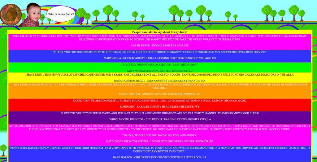
This is supposed to be a testimonials page, but honestly, the colours in use are so stark and painful on the eyes that nobody is going to stop and read this without either a screen visor (again showing my age) or a decent pair of sunglasses. If the colour bandings where not there, and had a light background with darker text, then it wouldn’t be so bad - you’d still have the background image (which in itself is far too bright and busy for a website), but would at least be able to read the content that is supposedly showcased.And finally, the font “Comic Sans” is just an absolute “no” in today’s designs. The same principle applied to animated GIFs in the 2000’s. On forums, they were the must-have in terms of an avatar. One or two on the screen at once is generally ok, but when everyone does this, it’s enough to trigger an epileptic fit
This is probably ***the ***worst website I have ever seen. It’s the ultimate assault on the eyes - not only the orgasm of CSS gradients that are animated, but the GIFs at the bottom make it so much worse (if that was even possible)
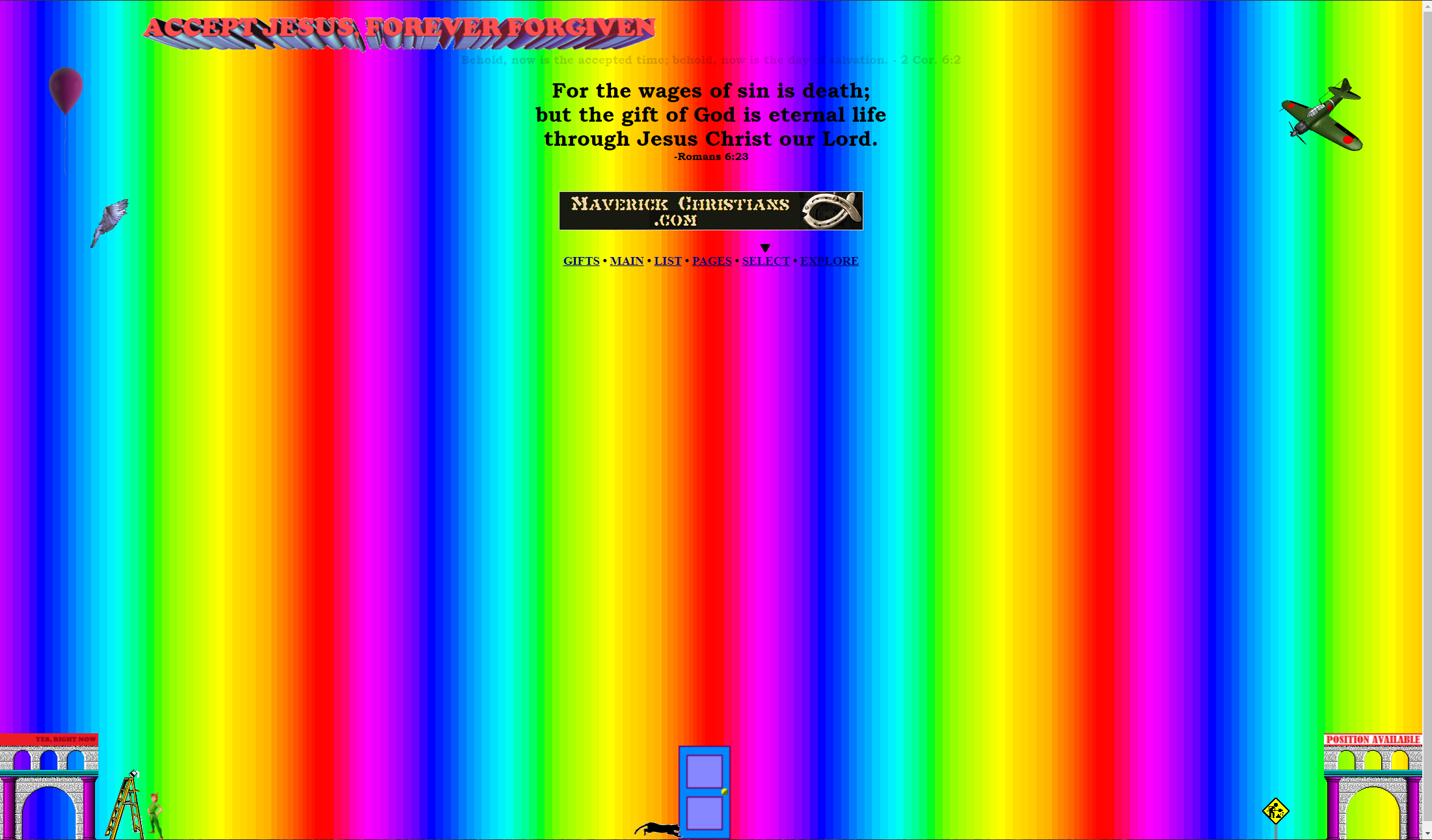
If you are bold, then feel free to visit yourself, but don’t say I didn’t warn you.
http://www.dokimos.org/ajff/ (be brave…and probably sick)Less is more
This is absolutely true - less is, in fact, **more **than more. The less colours you use on a site, the easier it is on the eye. That doesn’t mean you should immediately design a site in black and white - colour exists for a reason, but (certainly true in the case of the above image), less colour is more appealing to the eye. The image above looks like a cross between 70’s hippy psychedelic and the 80’s acid scene, or an the old VCR (absolutely showing my age now) test signal…
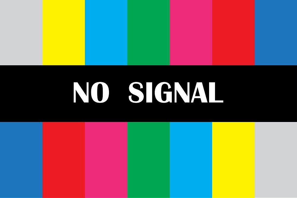
See what I mean
If you really want to get a head start in obtaining the best colours for your website, you really should consider using a swatch. One of my favourite sources to do this is https://coolors.co/ - a completely free site that provides easy on the eye colours that, most importantly, match each other. Other good sites are https://hexcolorcodes.org/ and probably one of the best ones I’ve seen is https://htmlcolorcode.in/color-wheel.html
Speaking of HexColorCodes, let’s take a look at how they are using gradients
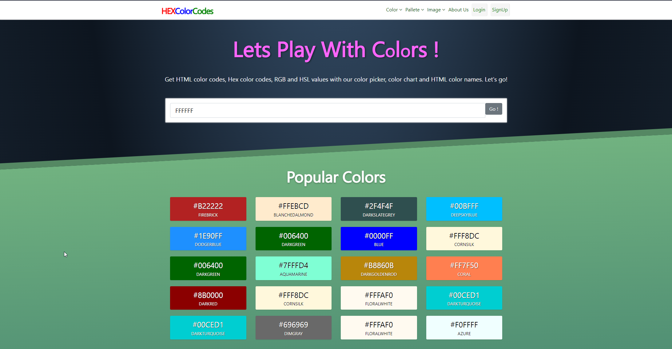
See - gradients actually do work, but only when used creatively, sparingly, and subtly. The usage oftransformis also interesting in the sense that a skew is being used to create the upwards trajectory / inclination effect. See below for an idea as to how that is achieved..colorboxed { background: #134e5e; background: -webkit-linear-gradient(to bottom,#71B280,#134E5E); background: linear-gradient(to bottom,#71B280,#134E5E); -webkit-transform: skewY(-3deg); transform: skewY(-3deg); z-index: 1; border-top: 20px solid #558863; }With CSS, it’s possible to be both imaginative, and the purveyor of nice looking effects. It’s not overdone, and the colours chosen are peaceful and easy on the eyes.
Using gradients for purpose
When I say “purpose”, I’m talking about providing a means of visual representation to the end user. In this case, my site makes use of a red > orange > green gradient (wait - don’t just think “yuk - sounds gross…” - it really does work) to display progress. Here’s a image of how that looks here

And if you want to test it out in real time, you can do that here (note that if you’re using a Dark theme on your PC, the site’s theme will follow that. If you are using a light theme, you’ll need to toggle the light/dark theme switch to see the effect
It’s a long thread discussing issues with broadband, routers, hubs, etc, and as you scroll down the screen, you’ll see the progress bar start to move. If you look closely, there’s also a progress bar at the top of the screen too.Creation of this gradient is simple in the sense that there are a number of CSS gradient generators online - one of my favourites is https://cssgradient.io/
As shown below, we simply select the colours we require (some advice about that here), and then we land up with the below resultant CSS code

The first line of the CSS class is actually designed for fallback purposes - in the sense that anyone visiting with an older browser that does not support gradients (this is pretty unlikely nowadays, but you never know…) will get the standard single colour. This is the line we are interested inbackground: linear-gradient(90deg, rgba(180,58,58,1) 0%, rgba(252,176,69,1) 50%, rgba(24,186,10,1) 100%);Not only is this gradient effective, but it’s also aesthetically pleasing to the eye. The scrolling and progress is smooth, and without jitter or odd “grey spaces” that would have been generated if we didn’t set a third colour.
Conclusion
Colours and gradients can greatly enhance the user experience if used sparingly, and most importantly, sensibly - in line with your brand. However, misuse or overuse them, and the eye police will be onto you… (just kidding - the real impact of this is a site that nobody wants to visit - regardless of the content, and nobody wants to be in that situation).
Use your colours and gradients wisely!
-
Very good tools

-
Not really for gradients, but for color tones I have previously written here:
https://community.nodebb.org/topic/14771/a-tip-for-custom-color-picking-for-categories
-
Not really for gradients, but for color tones I have previously written here:
https://community.nodebb.org/topic/14771/a-tip-for-custom-color-picking-for-categories
@crazycells love this article. You’re absolutely right about people using colors that are either completely at odds with the scheme on their own site, or have no real concept of theming itself or swatches.
There’s nothing worse than garish colour on a web site. Nothing more than back button fodder.
Hello! It looks like you're interested in this conversation, but you don't have an account yet.
Getting fed up of having to scroll through the same posts each visit? When you register for an account, you'll always come back to exactly where you were before, and choose to be notified of new replies (either via email, or push notification). You'll also be able to save bookmarks and upvote posts to show your appreciation to other community members.
With your input, this post could be even better 💗
Register Login