NodeBB customisation
-
@phenomlab said in NodeBB customisation:
@jac Not sure what you mean ?
How come the tags don’t show on mobile view?
@jac They are hidden by default because of the lack of screen estate.
-
@phenomlab I understand
 that’s fine
-
@phenomlab I understand
 that’s fine
@jac they could be displayed, but would need refactoring to ensure the layout and experience remain intact.
-
@jac they could be displayed, but would need refactoring to ensure the layout and experience remain intact.
@phenomlab thanks, something like that could work yes, I just don’t like it looking plain, that’s why I’m trying to make little changes here and there, thanks as always for the assistance

-
@phenomlab thanks, something like that could work yes, I just don’t like it looking plain, that’s why I’m trying to make little changes here and there, thanks as always for the assistance

@jac I think my only concern here is the size and placement. If it’s too crammed, that detracts from the user experience and removes the focus away from the actual content.
-
@jac I think my only concern here is the size and placement. If it’s too crammed, that detracts from the user experience and removes the focus away from the actual content.
@phenomlab said in NodeBB customisation:
@jac I think my only concern here is the size and placement. If it’s too crammed, that detracts from the user experience and removes the focus away from the actual content.
Of course yes, I’ll probably just leave it how it is and make other changes such as font etc.
-
@phenomlab said in NodeBB customisation:
@jac I think my only concern here is the size and placement. If it’s too crammed, that detracts from the user experience and removes the focus away from the actual content.
Of course yes, I’ll probably just leave it how it is and make other changes such as font etc.
@jac said in NodeBB customisation:
@phenomlab said in NodeBB customisation:
@jac I think my only concern here is the size and placement. If it’s too crammed, that detracts from the user experience and removes the focus away from the actual content.
Of course yes, I’ll probably just leave it how it is and make other changes such as font etc.
Hi Mark,
I thought if I made changes bit by bit that may be better…
How can I get the quotes background in blue with a nice font on? That stands out.
Many thanks.
-
@jac said in NodeBB customisation:
@phenomlab said in NodeBB customisation:
@jac I think my only concern here is the size and placement. If it’s too crammed, that detracts from the user experience and removes the focus away from the actual content.
Of course yes, I’ll probably just leave it how it is and make other changes such as font etc.
Hi Mark,
I thought if I made changes bit by bit that may be better…
How can I get the quotes background in blue with a nice font on? That stands out.
Many thanks.
@jac Like the above (the one used here) ?
-
@phenomlab said in NodeBB customisation:
@jac Like the above (the one used here) ?
Something like that if it’s possible yes without copying and upsetting the designer
 , as in don’t give me the code if you’re not happy to
  .
.Many thanks.
-
@phenomlab said in NodeBB customisation:
@jac Like the above (the one used here) ?
Something like that if it’s possible yes without copying and upsetting the designer
 , as in don’t give me the code if you’re not happy to
  .
.Many thanks.
@jac I’ve no issues at all with this.
-
@phenomlab said in NodeBB customisation:
@jac I’ve no issues at all with this.
Many thanks as always for this.
Of course the reason I asked was as discussed in our previous chats I didn’t want to copy what you have done although 100% loving your ideas / work.


-
@phenomlab said in NodeBB customisation:
@jac I’ve no issues at all with this.
Many thanks as always for this.
Of course the reason I asked was as discussed in our previous chats I didn’t want to copy what you have done although 100% loving your ideas / work.


@jac all the work in terms of design and layout is open source, so you can take what you want without needing to ask. The only point where I draw the line is where your site becomes a direct replica in terms of appearance to this one.
-
@jac all the work in terms of design and layout is open source, so you can take what you want without needing to ask. The only point where I draw the line is where your site becomes a direct replica in terms of appearance to this one.
@phenomlab said in NodeBB customisation:
@jac all the work in terms of design and layout is open source, so you can take what you want without needing to ask. The only point where I draw the line is where your site becomes a direct replica in terms of appearance to this one.
Absolutely mate, I wouldn’t do that
 .
. -
@phenomlab said in NodeBB customisation:
@jac all the work in terms of design and layout is open source, so you can take what you want without needing to ask. The only point where I draw the line is where your site becomes a direct replica in terms of appearance to this one.
Absolutely mate, I wouldn’t do that
 .
.@jac said in NodeBB customisation:
@phenomlab said in NodeBB customisation:
@jac all the work in terms of design and layout is open source, so you can take what you want without needing to ask. The only point where I draw the line is where your site becomes a direct replica in terms of appearance to this one.
Absolutely mate, I wouldn’t do that
 .
.Certainly interesting how the standard quote image is pretty much a line, it’s well changed and I’d have no clue how you managed to achieve it
 .
. -
@jac said in NodeBB customisation:
@phenomlab said in NodeBB customisation:
@jac all the work in terms of design and layout is open source, so you can take what you want without needing to ask. The only point where I draw the line is where your site becomes a direct replica in terms of appearance to this one.
Absolutely mate, I wouldn’t do that
 .
.Certainly interesting how the standard quote image is pretty much a line, it’s well changed and I’d have no clue how you managed to achieve it
 .
.@jac Standard line ? Not sure I follow
-
@phenomlab said in NodeBB customisation:
@jac Standard line ? Not sure I follow
Apologies I should have explained better.
The image shows a grey line to the left which is the quote, is that right?
What I’m thinking of is how on earth you managed to change it from how it is to what you have now which looks 100000% more professional

 .
.
-
@phenomlab said in NodeBB customisation:
@jac Standard line ? Not sure I follow
Apologies I should have explained better.
The image shows a grey line to the left which is the quote, is that right?
What I’m thinking of is how on earth you managed to change it from how it is to what you have now which looks 100000% more professional

 .
.
@jac yes, I understand now. You can replicate what I have here with the below CSS
blockquote {
    font-size: inherit;
    border-left: 5px solid #eee;
    background: #eeeeee;
    border-radius: 4px;
    margin: 0 auto 40px;
    padding: 15px;
    position: relative;
}
blockquote:after {
    border-right: 20px solid transparent;
    border-top: 20px solid #eee;
    bottom: -20px;
    content: "";
    position: absolute;
    left: 20px;
}
Be warned though that this is relatively advanced and any other changes to the
blockquoteclass will impact this. -
@jac yes, I understand now. You can replicate what I have here with the below CSS
blockquote {
    font-size: inherit;
    border-left: 5px solid #eee;
    background: #eeeeee;
    border-radius: 4px;
    margin: 0 auto 40px;
    padding: 15px;
    position: relative;
}
blockquote:after {
    border-right: 20px solid transparent;
    border-top: 20px solid #eee;
    bottom: -20px;
    content: "";
    position: absolute;
    left: 20px;
}
Be warned though that this is relatively advanced and any other changes to the
blockquoteclass will impact this.@phenomlab said in NodeBB customisation:
@jac yes, I understand now. You can replicate what I have here with the below CSS
blockquote {
    font-size: inherit;
    border-left: 5px solid #eee;
    background: #eeeeee;
    border-radius: 4px;
    margin: 0 auto 40px;
    padding: 15px;
    position: relative;
}
blockquote:after {
    border-right: 20px solid transparent;
    border-top: 20px solid #eee;
    bottom: -20px;
    content: "";
    position: absolute;
    left: 20px;
}
Be warned though that this is relatively advanced and any other changes to the
blockquoteclass will impact this.Many thanks mate,
I’ll try this when on the laptop.
-
@phenomlab said in NodeBB customisation:
@jac yes, I understand now. You can replicate what I have here with the below CSS
blockquote {
    font-size: inherit;
    border-left: 5px solid #eee;
    background: #eeeeee;
    border-radius: 4px;
    margin: 0 auto 40px;
    padding: 15px;
    position: relative;
}
blockquote:after {
    border-right: 20px solid transparent;
    border-top: 20px solid #eee;
    bottom: -20px;
    content: "";
    position: absolute;
    left: 20px;
}
Be warned though that this is relatively advanced and any other changes to the
blockquoteclass will impact this.Many thanks mate,
I’ll try this when on the laptop.
Would there be a way to make the background blue and the font white on the quote at all?.
-
Would there be a way to make the background blue and the font white on the quote at all?.
@jac said in NodeBB customisation:
Would there be a way to make the background blue and the font white on the quote at all?.
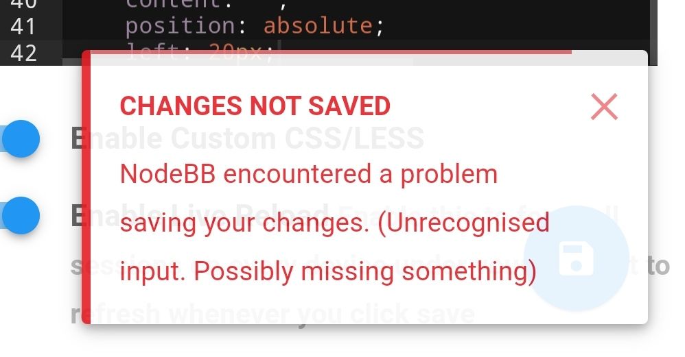
Encountered issue at first hurdle…hmm.

Hello! It looks like you're interested in this conversation, but you don't have an account yet.
Getting fed up of having to scroll through the same posts each visit? When you register for an account, you'll always come back to exactly where you were before, and choose to be notified of new replies (either via email, or push notification). You'll also be able to save bookmarks and upvote posts to show your appreciation to other community members.
With your input, this post could be even better 💗
Register LoginRelated Topics
-
-
-
-
-
-
NodeBB Footer
Solved Customisation -
-


