ineffecient use of space on mobile
-
Hi @phenomlab ,
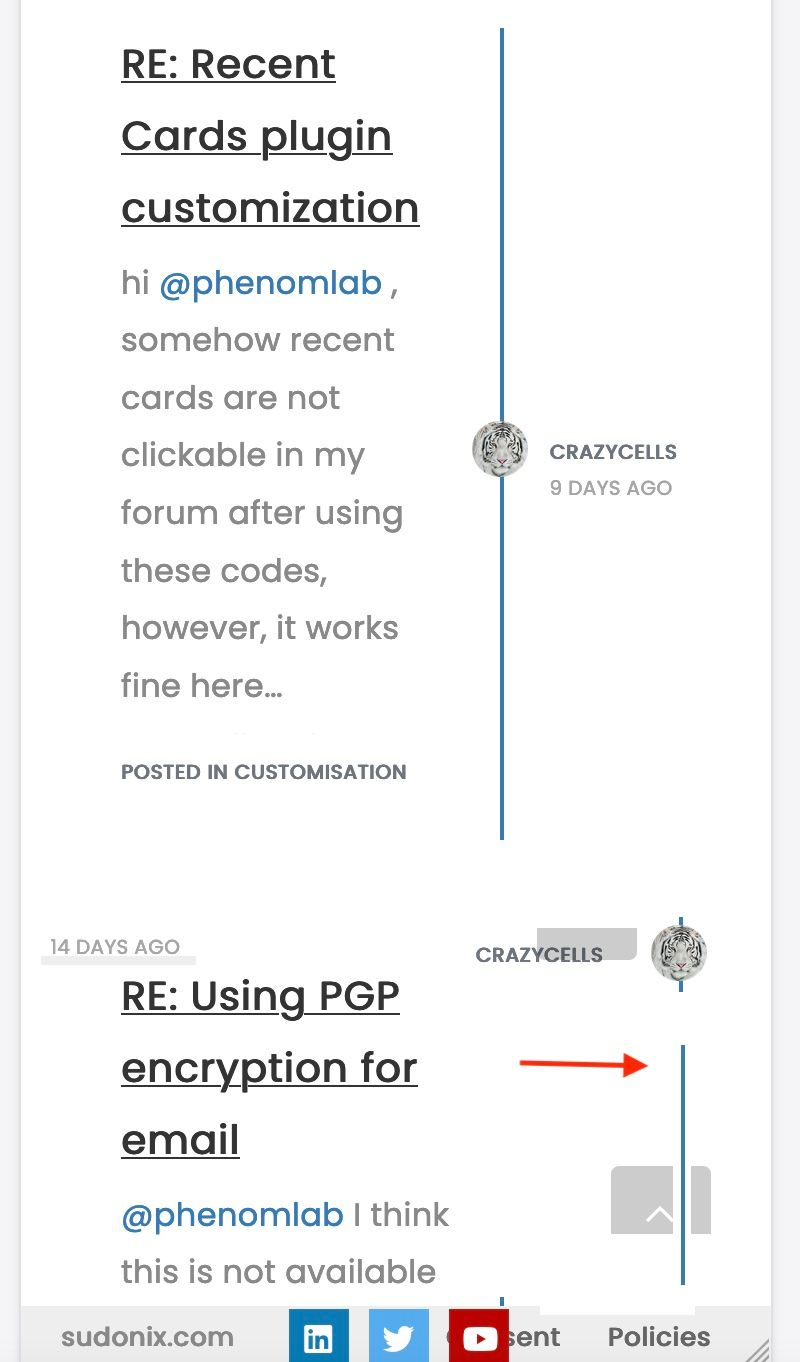
When I access these pages that show posts on mobile:
/posts
/best
/controversialI see something like this:
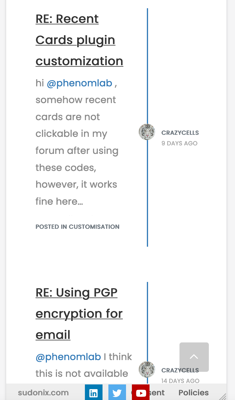
This is how it looks on default. Our forum is the same, NodeBB community forum is the same…
Although this page design does not bother me on desktop, I feel on mobile ~40% of the page is wasted for space…
-
I wonder your opinion about this.
-
Do you think these pages can be re-designed with CSS codes?
I thought something like this, as in the topics… so, the blue line and avatar goes to the right side edge… username comes next to avatar, date goes to the left side… And of course “the post area” will be expanded to whole page…
-
-
@phenomlab said in ineffecient use of space on mobile:
@crazycells It’s all CSS !
great. Can you please share it when it is ready? I am looking forward to it.
I have realized this recently, after using “/best-posts” plugin… it is very hard to follow these posts on mobile…
@crazycells I knew that was coming
 - here it is
@media (max-width: 767px) { .posts-list .posts-list-item { width: auto; } .posts-list .posts-list-item .post-body { border-right: none !important; width: 100%; } .posts-list .posts-list-item .post-info { position: revert; left: 0px; width: 500px; } .posts-list .posts-list-item .post-info .post-author { max-width: none !important; display: flex; } .posts-list .posts-list-item .post-info .post-author span { margin-left: 10px; } }Some other adjustments to get even more estate on mobile (30px either side) - your tastes may vary
@media (max-width: 767px) {
.posts-list .posts-list-item {
    width: auto;
}
.posts-list .posts-list-item .post-info {
    position: revert;
    left: 0px;
    width: 100%;
    margin-left: 15px;
}
.posts-list .posts-list-item .post-info .post-author {
    max-width: none !important;
    display: flex;
}
.posts-list .posts-list-item .post-body {
    border-right: none !important;
    width: 100%;
}
.posts-list .posts-list-item .post-info .post-author span {
    margin-left: 10px;
}
}
The second CSS block gives you this
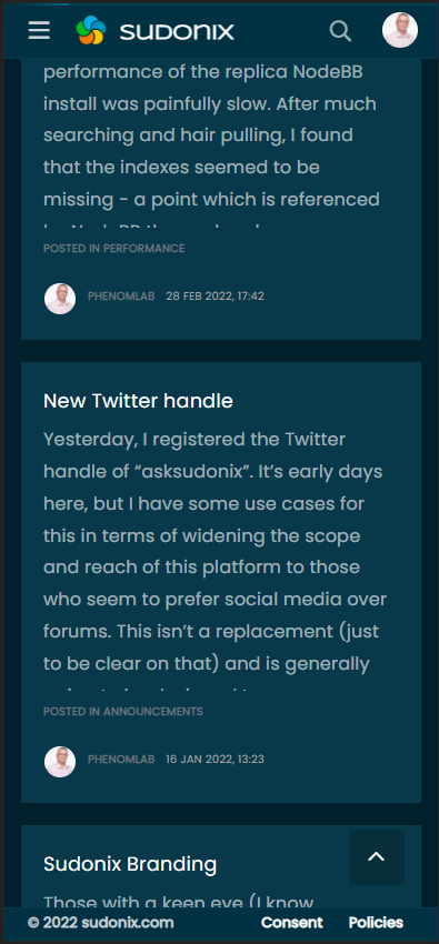
A final note that this of course does not include the colour scheme. This is from “Midnight” - a new theme I’ve developed in DEV which is almost ready for release, but has a few bugs I need to iron out first. I’ll publish a blog post on this new theme set soon.
Mark Cutting also advises organisations as a Fractional CIO, Fractional CISO and Executive Advisor, helping boards improve technology governance, cyber resilience and executive decision making. Learn more at Gratmore Ltd
-
Hi @phenomlab ,
When I access these pages that show posts on mobile:
/posts
/best
/controversialI see something like this:
This is how it looks on default. Our forum is the same, NodeBB community forum is the same…
Although this page design does not bother me on desktop, I feel on mobile ~40% of the page is wasted for space…
-
I wonder your opinion about this.
-
Do you think these pages can be re-designed with CSS codes?
I thought something like this, as in the topics… so, the blue line and avatar goes to the right side edge… username comes next to avatar, date goes to the left side… And of course “the post area” will be expanded to whole page…
@crazycells Funny you should mention that ! I was looking at this in my DEV environment yesterday and decided to alter the layout a bit
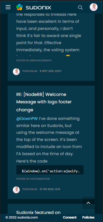
My personal thoughts are that this looks much better and is easier to read

Mark Cutting also advises organisations as a Fractional CIO, Fractional CISO and Executive Advisor, helping boards improve technology governance, cyber resilience and executive decision making. Learn more at Gratmore Ltd
-
-
@crazycells Funny you should mention that ! I was looking at this in my DEV environment yesterday and decided to alter the layout a bit
My personal thoughts are that this looks much better and is easier to read
@phenomlab said in ineffecient use of space on mobile:
@crazycells Funny you should mention that ! I was looking at this in my DEV environment yesterday and decided to alter the layout a bit
lol, let’s say “great minds think alike”
-
@crazycells Funny you should mention that ! I was looking at this in my DEV environment yesterday and decided to alter the layout a bit
My personal thoughts are that this looks much better and is easier to read
@phenomlab yes, I think this is definitely way better than the current form…
Is this all CSS? or have you changed the codes in files as well?
-
@phenomlab yes, I think this is definitely way better than the current form…
Is this all CSS? or have you changed the codes in files as well?
@crazycells It’s all CSS !
Mark Cutting also advises organisations as a Fractional CIO, Fractional CISO and Executive Advisor, helping boards improve technology governance, cyber resilience and executive decision making. Learn more at Gratmore Ltd
-
@crazycells It’s all CSS !
@phenomlab said in ineffecient use of space on mobile:
@crazycells It’s all CSS !
great. Can you please share it when it is ready? I am looking forward to it.
I have realized this recently, after using “/best-posts” plugin… it is very hard to follow these posts on mobile…
-
@phenomlab said in ineffecient use of space on mobile:
@crazycells It’s all CSS !
great. Can you please share it when it is ready? I am looking forward to it.
I have realized this recently, after using “/best-posts” plugin… it is very hard to follow these posts on mobile…
@crazycells I knew that was coming
- here it is@media (max-width: 767px) { .posts-list .posts-list-item { width: auto; } .posts-list .posts-list-item .post-body { border-right: none !important; width: 100%; } .posts-list .posts-list-item .post-info { position: revert; left: 0px; width: 500px; } .posts-list .posts-list-item .post-info .post-author { max-width: none !important; display: flex; } .posts-list .posts-list-item .post-info .post-author span { margin-left: 10px; } }Some other adjustments to get even more estate on mobile (30px either side) - your tastes may vary
@media (max-width: 767px) {
.posts-list .posts-list-item {
    width: auto;
}
.posts-list .posts-list-item .post-info {
    position: revert;
    left: 0px;
    width: 100%;
    margin-left: 15px;
}
.posts-list .posts-list-item .post-info .post-author {
    max-width: none !important;
    display: flex;
}
.posts-list .posts-list-item .post-body {
    border-right: none !important;
    width: 100%;
}
.posts-list .posts-list-item .post-info .post-author span {
    margin-left: 10px;
}
}
The second CSS block gives you this
A final note that this of course does not include the colour scheme. This is from “Midnight” - a new theme I’ve developed in DEV which is almost ready for release, but has a few bugs I need to iron out first. I’ll publish a blog post on this new theme set soon.
Mark Cutting also advises organisations as a Fractional CIO, Fractional CISO and Executive Advisor, helping boards improve technology governance, cyber resilience and executive decision making. Learn more at Gratmore Ltd
-
@crazycells I knew that was coming
- here it is@media (max-width: 767px) { .posts-list .posts-list-item { width: auto; } .posts-list .posts-list-item .post-body { border-right: none !important; width: 100%; } .posts-list .posts-list-item .post-info { position: revert; left: 0px; width: 500px; } .posts-list .posts-list-item .post-info .post-author { max-width: none !important; display: flex; } .posts-list .posts-list-item .post-info .post-author span { margin-left: 10px; } }Some other adjustments to get even more estate on mobile (30px either side) - your tastes may vary
@media (max-width: 767px) {
.posts-list .posts-list-item {
    width: auto;
}
.posts-list .posts-list-item .post-info {
    position: revert;
    left: 0px;
    width: 100%;
    margin-left: 15px;
}
.posts-list .posts-list-item .post-info .post-author {
    max-width: none !important;
    display: flex;
}
.posts-list .posts-list-item .post-body {
    border-right: none !important;
    width: 100%;
}
.posts-list .posts-list-item .post-info .post-author span {
    margin-left: 10px;
}
}
The second CSS block gives you this
A final note that this of course does not include the colour scheme. This is from “Midnight” - a new theme I’ve developed in DEV which is almost ready for release, but has a few bugs I need to iron out first. I’ll publish a blog post on this new theme set soon.
@phenomlab said in ineffecient use of space on mobile:
@crazycells I knew that was coming - here it is
lol of course
Thanks a lot. It is definitely much better than the previous version…
Since we have not adapted posts as boxes yet, I would like to separate the posts by a line from edge to edge… but not sure what classes should I use? I know the code will be something like this:
.posts-list .posts-list-item .post-info {
border-bottom: 1px solid #000;
}
but this does not extend from edge to edge. Do you have any other suggestions to separate posts from each other?
Actually, it looks good when I add:
margin-bottom: 35px;but, I wanted to ask in case you have a better solution.
-
@phenomlab said in ineffecient use of space on mobile:
@crazycells I knew that was coming - here it is
lol of course
Thanks a lot. It is definitely much better than the previous version…
Since we have not adapted posts as boxes yet, I would like to separate the posts by a line from edge to edge… but not sure what classes should I use? I know the code will be something like this:
.posts-list .posts-list-item .post-info {
border-bottom: 1px solid #000;
}
but this does not extend from edge to edge. Do you have any other suggestions to separate posts from each other?
Actually, it looks good when I add:
margin-bottom: 35px;but, I wanted to ask in case you have a better solution.
@crazycells This is fine. The generally accepted way of adding a space between elements is to use
marginso you’re on the right track.Mark Cutting also advises organisations as a Fractional CIO, Fractional CISO and Executive Advisor, helping boards improve technology governance, cyber resilience and executive decision making. Learn more at Gratmore Ltd
-
@crazycells This is fine. The generally accepted way of adding a space between elements is to use
marginso you’re on the right track.@phenomlab Thanks

-
 undefined phenomlab has marked this topic as solved on
-
 undefined crazycells referenced this topic on
Hello! It looks like you're interested in this conversation, but you don't have an account yet.
Getting fed up of having to scroll through the same posts each visit? When you register for an account, you'll always come back to exactly where you were before, and choose to be notified of new replies (either via email, or push notification). You'll also be able to save bookmarks and upvote posts to show your appreciation to other community members.
With your input, this post could be even better 💗
Register Login