"Glass" (shine) effect on Sudonix logo
-
A few users have commented on the new shiny logo that appears at the top of the navbar here
Want to know how I created that? Of course you do!
The logo itself makes use of a few techniques such as
webkit-background-clipand-webkit-text-stroketo make the font look like it has an outline only with no fill. This technique won’t appeal to everyone, so if you’re just looking for the shine code, you can skip this, and go straight to thejQuerycode andCSS.Firstly, I actually hide the
<img>so no actual logo is being displayed[component="brand/logo"] { display: none; }I then use a
jQueryfunction to create my own Brand Logo$(document).ready(function() { $('[component="brand/wrapper"]').append('<a component="siteTitle" href="/" title="Brand Logo"><h1 class="fs-6 fw-bold text-body mb-0 shine">sudonix</h1></a>'); });And then apply the below
CSSto achieve the style I want. Note, that the:rootvalues must be set on your site, or at the very least, alternatives if you are not using variables.:root { --bs-body-navbar: #E5E6E6; --bs-logo-bg: linear-gradient(45deg, #ff5733, #f73d45, #e54f6d, #c85e9e, #a874c0, #748bda, #4691f1, #0099f7); --bs-node-shine: linear-gradient(90deg, rgba(255, 255, 255, 0) 0%, rgba(255, 255, 255, 0.5) 50%, rgba(255, 255, 255, 0) 100%); } @keyframes shine { 0% { left: -100%; opacity: 0; } 5% { opacity: 1; } 25% { left: 100%; opacity: 1; } 26% { opacity: 0; } 100% { left: 100%; opacity: 0; } } a[component=siteTitle] h1 { font-size: 2.2rem !important; top: -1px; position: fixed; font-family: "Bruno Ace SC"; font-weight: 600 !important; letter-spacing: 0.05rem; -webkit-background-clip: text !important; color: var(--bs-body-navbar) !important; -webkit-text-stroke: 4px transparent; background: var(--bs-logo-bg); width: 172px; padding-left: 5px; } .shine::before { content: ""; position: absolute; top: 10px; width: 60px; height: 25px; background: var(--bs-node-shine); transform: skewX(-45deg); animation: shine 10s linear infinite; pointer-events: none; mix-blend-mode: screen; z-index: 1; } .shine { position: relative; display: inline-block; color: transparent; background-clip: text; -webkit-background-clip: text; overflow: hidden; }I’ve also included a CodePen so you can see this working in realtime
-
 undefined phenomlab referenced this topic on
-
Looking great Mark!
-
Many thnaks.
I’ll have to take a look because for now, the result is meh
")
2 tittles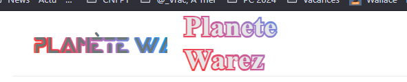
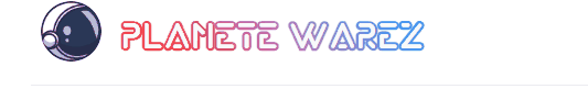
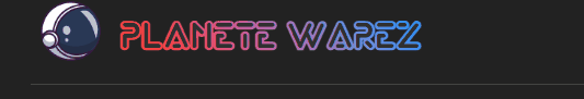
PW and WS Spirit alive
-
@DownPW Is this on your DEV server?
Mark – Founder, Phenomlab Ltd
Executive IT & Security Leadership
Phenomlab Ltd -
@phenomlab i cant do it why i dont understand.
 something added wrong think so.
 -
@phenomlab said in "Glass" (shine) effect on Sudonix logo:
@DownPW Is this on your DEV server?
Nope. Prod Server
Seems to be better after some CSS modification : police position, etc…
Ordisplay: noneon CSS title class if neededPerfect with White background theme but much less with black themes backgrounds (we see the edges of the shine effect)
PW and WS Spirit alive
-
@phenomlab said in "Glass" (shine) effect on Sudonix logo:
@DownPW Is this on your DEV server?
Nope. Prod Server
Seems to be better after some CSS modification : police position, etc…
Ordisplay: noneon CSS title class if neededPerfect with White background theme but much less with black themes backgrounds (we see the edges of the shine effect)
@DownPW said in "Glass" (shine) effect on Sudonix logo:
Perfect with White background theme but much less with black themes backgrounds (we see the edges of the shine effect)
Yes, you will need to modify the CSS according. For example, on Sudonix, I use
--bs-node-shine: linear-gradient(90deg, rgba(28, 38, 44, 0) 0%, rgba(74, 100, 116, 0.5) 50%, rgba(28, 38, 44, 0) 100%);Essentially, you choose the base background, the shine colour, and then the base background again.
Hello! It looks like you're interested in this conversation, but you don't have an account yet.
Getting fed up of having to scroll through the same posts each visit? When you register for an account, you'll always come back to exactly where you were before, and choose to be notified of new replies (either via email, or push notification). You'll also be able to save bookmarks and upvote posts to show your appreciation to other community members.
With your input, this post could be even better 💗
Register Login