Issues with Progress Bar on v3
-
@cagatay The reason this fails for you is because you have to auto-hide the bottom bar
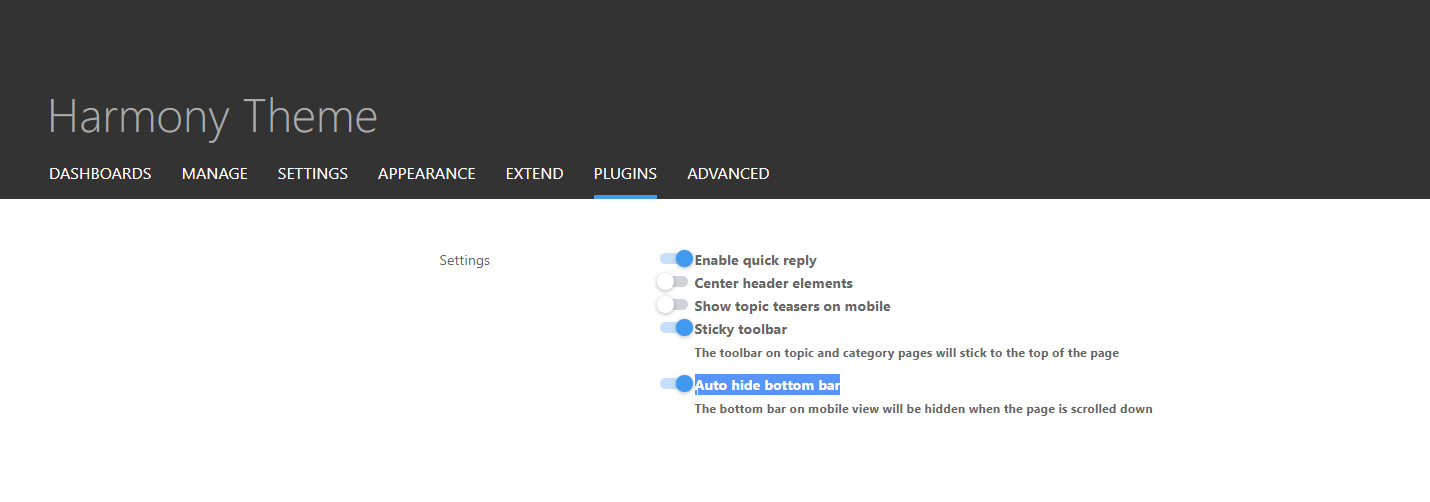
I’ve made this change and it’s now working for the most part - but it should also float with the bottom bar depending on it’s position. Not sure why that’s not working but looking now.
@phenomlab said in Issues with Progress Bar on v3:
@cagatay The reason this fails for you is because you have to auto-hide the bottom bar
I’ve made this change and it’s now working for the most part - but it should also float with the bottom bar depending on it’s position. Not sure why that’s not working but looking now.
i did disable mode auto hide
 now working normally on phones.
 -
@phenomlab said in Issues with Progress Bar on v3:
@cagatay The reason this fails for you is because you have to auto-hide the bottom bar

I’ve made this change and it’s now working for the most part - but it should also float with the bottom bar depending on it’s position. Not sure why that’s not working but looking now.
i did disable mode auto hide
 now working normally on phones.
@cagatay Excellent.
-
-
yop Mark

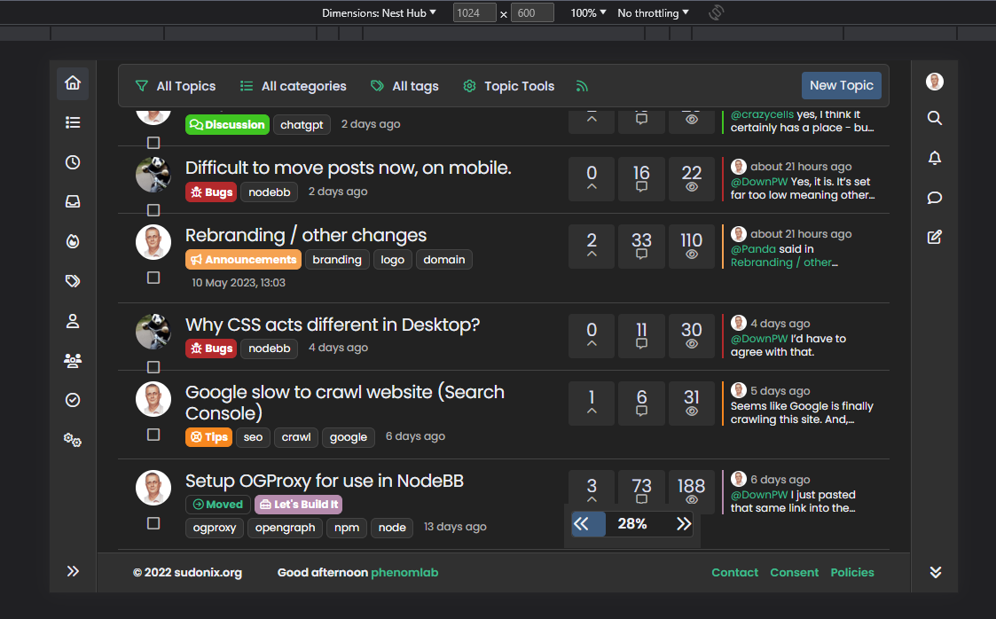
I see this on progress bar :
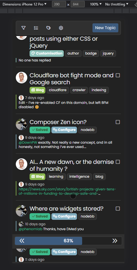
On small screen resolutions, the space between the arrows and the background div (progress bar) is not fixed.
It wouldn’t hurt to add fixed spaces no matter the resolution
-
OMG. Why on earth did I use percentages???

.pageUp {
    font-size: 1.25rem !important;
    left: 6%;
    line-height: 1.5;
    position: absolute;
    z-index: 10;
}
.pageDown {
    font-size: 1.25rem !important;
    line-height: 1.5;
    position: absolute;
    right: 6%;
    z-index: 10;
}
Change the
leftandrightvalues shown above to be1rem(or whatever value you’d prefer) and not6%
So
.pageUp { font-size: 1.25rem!important; left: 1rem; line-height: 1.5; position: absolute; z-index: 10; } .pageDown { font-size: 1.25rem!important; line-height: 1.5; position: absolute; right: 1rem; z-index: 10; } -
OMG. Why on earth did I use percentages???

.pageUp { font-size: 1.25rem !important; left: 6%; line-height: 1.5; position: absolute; z-index: 10; } .pageDown { font-size: 1.25rem !important; line-height: 1.5; position: absolute; right: 6%; z-index: 10; }Change the
leftandrightvalues shown above to be1rem(or whatever value you’d prefer) and not6%
So
.pageUp { font-size: 1.25rem!important; left: 1rem; line-height: 1.5; position: absolute; z-index: 10; } .pageDown { font-size: 1.25rem!important; line-height: 1.5; position: absolute; right: 1rem; z-index: 10; } -
-
I often use my mobile landscape, and then this progress bar takes up a lot of the screen.

Id rather remove it entirely.
How can I do that, another CSS fix?@Panda Yes, that would be the only way as this is part of the core.
-
@phenomlab ok how could I do that please?
I have an old flarum forum I had given up with, but I have to say its looking nicer than nodebb on mobile now. I prefer minimalistic and uncluttered look.
-
@phenomlab ok how could I do that please?
I have an old flarum forum I had given up with, but I have to say its looking nicer than nodebb on mobile now. I prefer minimalistic and uncluttered look.
@Panda You could use the below
.page-topic .pagination-block.ready { display: none; }
Did this solution help you?
Hello! It looks like you're interested in this conversation, but you don't have an account yet.
Getting fed up of having to scroll through the same posts each visit? When you register for an account, you'll always come back to exactly where you were before, and choose to be notified of new replies (ether email, or push notification). You'll also be able to save bookmarks, use reactions, and upvote to show your appreciation to other community members.
With your input, this post could be even better 💗
RegisterLog in
