Custom badges
-
hi @phenomlab , I have made some updates to the CSS elements, and right now it looks like a badge with a wavy edge…
.post-header a[href*="/forum/groups/verified"] {
    margin-right: 3px;
    margin-top: 1px;
    border-radius: 50%;
    line-height: 20px;
    display: inline-block;
    vertical-align: middle;
    overflow: hidden;
    position: relative;
}

.post-header a[href*="/forum/groups/verified"]::before {
    content: "\f00c";
    position: absolute;
    z-index: 1; /* Added z-index to bring it to the front */
    width: 20px;
    height: 20px;
    background-image: url("data:image/svg+xml;charset=utf-8,%3Csvg xmlns='http://www.w3.org/2000/svg' width='24' height='24' stroke-width='1.5' viewBox='0 0 24 24' fill='%23085EAC'%3E%3Cpath d='M10.5213 2.62368C11.3147 1.75255 12.6853 1.75255 13.4787 2.62368L14.4989 3.74391C14.8998 4.18418 15.4761 4.42288 16.071 4.39508L17.5845 4.32435C18.7614 4.26934 19.7307 5.23857 19.6757 6.41554L19.6049 7.92905C19.5771 8.52388 19.8158 9.10016 20.2561 9.50111L21.3763 10.5213C22.2475 11.3147 22.2475 12.6853 21.3763 13.4787L20.2561 14.4989C19.8158 14.8998 19.5771 15.4761 19.6049 16.071L19.6757 17.5845C19.7307 18.7614 18.7614 19.7307 17.5845 19.6757L16.071 19.6049C15.4761 19.5771 14.8998 19.8158 14.4989 20.2561L13.4787 21.3763C12.6853 22.2475 11.3147 22.2475 10.5213 21.3763L9.50111 20.2561C9.10016 19.8158 8.52388 19.5771 7.92905 19.6049L6.41553 19.6757C5.23857 19.7307 4.26934 18.7614 4.32435 17.5845L4.39508 16.071C4.42288 15.4761 4.18418 14.8998 3.74391 14.4989L2.62368 13.4787C1.75255 12.6853 1.75255 11.3147 2.62368 10.5213L3.74391 9.50111C4.18418 9.10016 4.42288 8.52388 4.39508 7.92905L4.32435 6.41553C4.26934 5.23857 5.23857 4.26934 6.41554 4.32435L7.92905 4.39508C8.52388 4.42288 9.10016 4.18418 9.50111 3.74391L10.5213 2.62368Z' stroke='none'/%3E%3C/svg%3E");
    background-size: cover;
    color: #ffffff; /* Added to set the color of the checkmark */
    font-family: "Font Awesome 5 Free";
    font-weight: 900;
    font-size:8px;
    text-align: center;
    line-height: 20px;
}
small.label.group-label.inline-block i {
    margin-top: 1px;
    margin-left: 0px;
    vertical-align: middle;
    justify-content: center;
    display: flex;
}
.post-header a[href*="/forum/groups/verified"] .group-label {
    min-width: 20px;
    display: flex;
    justify-content: center;
    background-color: transparent !important;
}
.group-label {
    vertical-align: -6px;
}
This is achieved thanks to ChatGPT… the code specifically uses this “#085EAC” color… it can of course be changed…
-
hi @phenomlab , I have made some updates to the CSS elements, and right now it looks like a badge with a wavy edge…

.post-header a[href*="/forum/groups/verified"] { margin-right: 3px; margin-top: 1px; border-radius: 50%; line-height: 20px; display: inline-block; vertical-align: middle; overflow: hidden; position: relative; } .post-header a[href*="/forum/groups/verified"]::before { content: "\f00c"; position: absolute; z-index: 1; /* Added z-index to bring it to the front */ width: 20px; height: 20px; background-image: url("data:image/svg+xml;charset=utf-8,%3Csvg xmlns='http://www.w3.org/2000/svg' width='24' height='24' stroke-width='1.5' viewBox='0 0 24 24' fill='%23085EAC'%3E%3Cpath d='M10.5213 2.62368C11.3147 1.75255 12.6853 1.75255 13.4787 2.62368L14.4989 3.74391C14.8998 4.18418 15.4761 4.42288 16.071 4.39508L17.5845 4.32435C18.7614 4.26934 19.7307 5.23857 19.6757 6.41554L19.6049 7.92905C19.5771 8.52388 19.8158 9.10016 20.2561 9.50111L21.3763 10.5213C22.2475 11.3147 22.2475 12.6853 21.3763 13.4787L20.2561 14.4989C19.8158 14.8998 19.5771 15.4761 19.6049 16.071L19.6757 17.5845C19.7307 18.7614 18.7614 19.7307 17.5845 19.6757L16.071 19.6049C15.4761 19.5771 14.8998 19.8158 14.4989 20.2561L13.4787 21.3763C12.6853 22.2475 11.3147 22.2475 10.5213 21.3763L9.50111 20.2561C9.10016 19.8158 8.52388 19.5771 7.92905 19.6049L6.41553 19.6757C5.23857 19.7307 4.26934 18.7614 4.32435 17.5845L4.39508 16.071C4.42288 15.4761 4.18418 14.8998 3.74391 14.4989L2.62368 13.4787C1.75255 12.6853 1.75255 11.3147 2.62368 10.5213L3.74391 9.50111C4.18418 9.10016 4.42288 8.52388 4.39508 7.92905L4.32435 6.41553C4.26934 5.23857 5.23857 4.26934 6.41554 4.32435L7.92905 4.39508C8.52388 4.42288 9.10016 4.18418 9.50111 3.74391L10.5213 2.62368Z' stroke='none'/%3E%3C/svg%3E"); background-size: cover; color: #ffffff; /* Added to set the color of the checkmark */ font-family: "Font Awesome 5 Free"; font-weight: 900; font-size:8px; text-align: center; line-height: 20px; } small.label.group-label.inline-block i { margin-top: 1px; margin-left: 0px; vertical-align: middle; justify-content: center; display: flex; } .post-header a[href*="/forum/groups/verified"] .group-label { min-width: 20px; display: flex; justify-content: center; background-color: transparent !important; } .group-label { vertical-align: -6px; }This is achieved thanks to ChatGPT… the code specifically uses this “#085EAC” color… it can of course be changed…
@crazycells oooohhhhh - I like!!!
-
@crazycells oooohhhhh - I like!!!
@phenomlab I had to ask ChatGPT 30 times to get this

the codes will be more clear to you than to me
 but I had to add a “transparent” background color, so that svg can be created with the color you want. otherwise svg is not visible.
I had to remove “text-align” because it is ruining the position of the badge.
And lastly, although there is a checkmark, unfortunately, it stays behind the SVG, so it had to add a checkmark using CSS codes to make it visible and changed its position using z-index. (or something like this
 )
) -
@phenomlab I had to ask ChatGPT 30 times to get this

the codes will be more clear to you than to me
 but I had to add a “transparent” background color, so that svg can be created with the color you want. otherwise svg is not visible.
I had to remove “text-align” because it is ruining the position of the badge.
And lastly, although there is a checkmark, unfortunately, it stays behind the SVG, so it had to add a checkmark using CSS codes to make it visible and changed its position using z-index. (or something like this
 )
)@crazycells it’s a lot of effort, but I really like the effect. I’m just wondering if it’s easier to use an actual image?
-
@crazycells oooohhhhh - I like!!!
@phenomlab said in Custom badges:
@crazycells oooohhhhh - I like!!!
that background URL is universal, right? I mean it will always be available and not be deleted?
I used this page to get that: https://fontawesomeicons.com/svg/icons/twitter-verified-badge#ex-tab1
-
@phenomlab said in Custom badges:
@crazycells oooohhhhh - I like!!!
that background URL is universal, right? I mean it will always be available and not be deleted?
I used this page to get that: https://fontawesomeicons.com/svg/icons/twitter-verified-badge#ex-tab1
@crazycells said in Custom badges:
that background URL is universal, right? I mean it will always be available and not be deleted?
Yes, correct.
-
@crazycells it’s a lot of effort, but I really like the effect. I’m just wondering if it’s easier to use an actual image?
@phenomlab I prefer this way, because I would like to change the color of it depending on profession. In our forum, I am not planning to use it for “email verified” users, it will mainly be used for professional users that we host. I can easily edit this depending on the groups.
-
@phenomlab I prefer this way, because I would like to change the color of it depending on profession. In our forum, I am not planning to use it for “email verified” users, it will mainly be used for professional users that we host. I can easily edit this depending on the groups.
@crazycells That makes sense.
-
good job @crazycells
I wonder if we could do it for each badge without changing the color of course and keep the color of the original badges.
Curious to see what it would look like

-
good job @crazycells
I wonder if we could do it for each badge without changing the color of course and keep the color of the original badges.
Curious to see what it would look like

@DownPW said in Custom badges:
good job @crazycells
I wonder if we could do it for each badge without changing the color of course and keep the color of the original badges.
Curious to see what it would look like

no, this does not work. the overlap of a wavy edge circle and a circle becomes a circle. so, you cannot detect any flower shape with this method. The way that I achieved this was by removing the background color (making it transparent by CSS although there is an assigned color for it in ACP) and then creating a new flower shape on top of it by CSS.
-
@DownPW said in Custom badges:
good job @crazycells
I wonder if we could do it for each badge without changing the color of course and keep the color of the original badges.
Curious to see what it would look like

no, this does not work. the overlap of a wavy edge circle and a circle becomes a circle. so, you cannot detect any flower shape with this method. The way that I achieved this was by removing the background color (making it transparent by CSS although there is an assigned color for it in ACP) and then creating a new flower shape on top of it by CSS.
@crazycells just thinking about this. Wouldn’t it be easier to just use font awesome?
-
@crazycells just thinking about this. Wouldn’t it be easier to just use font awesome?
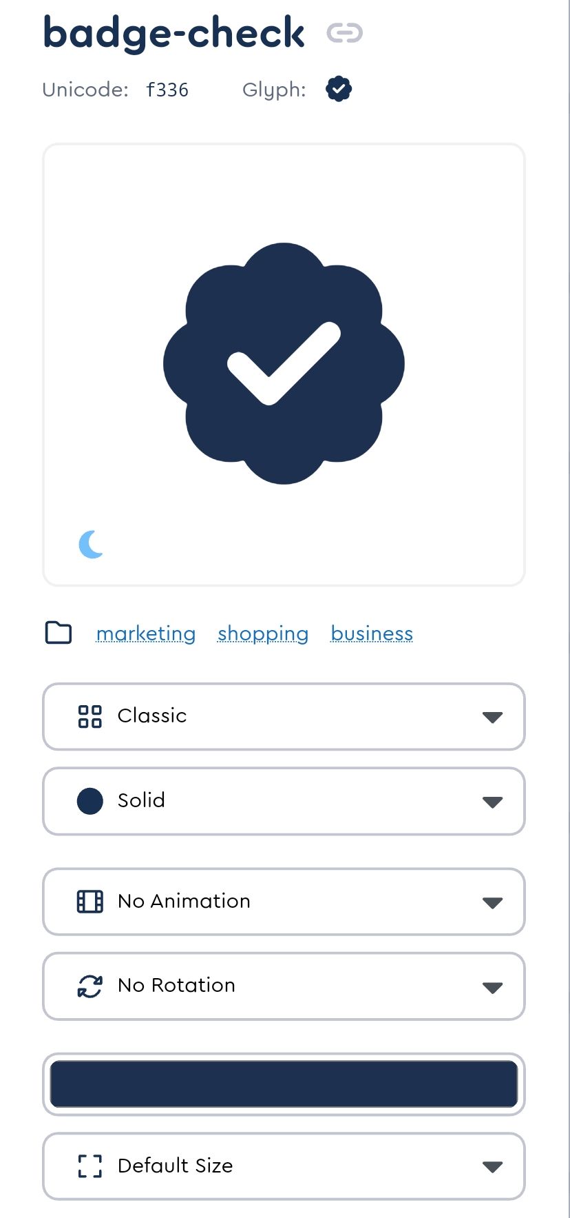
https://fontawesome.com/icons/badge-check?f=classic&s=solid
@phenomlab said in Custom badges:
@crazycells just thinking about this. Wouldn’t it be easier to just use font awesome?
as far as I remember, we discussed this before and you mentioned that that badge is not in the free tier.
-
@phenomlab said in Custom badges:
@crazycells just thinking about this. Wouldn’t it be easier to just use font awesome?
https://fontawesome.com/icons/badge-check?f=classic&s=solid

as far as I remember, we discussed this before and you mentioned that that badge is not in the free tier.
@crazycells Yes, you’re right

-
@phenomlab said in Custom badges:
@crazycells just thinking about this. Wouldn’t it be easier to just use font awesome?
https://fontawesome.com/icons/badge-check?f=classic&s=solid

as far as I remember, we discussed this before and you mentioned that that badge is not in the free tier.
@crazycells This intrigued me somewhat, I won’t lie
 I decided to take a stab at this myself.
HTML
<!DOCTYPE html>
<html>
<head>
<script src="https://cdnjs.cloudflare.com/ajax/libs/font-awesome/6.4.0/js/all.min.js" integrity="sha512-fD9DI5bZwQxOi7MhYWnnNPlvXdp/2Pj3XSTRrFs5FQa4mizyGLnJcN6tuvUS6LbmgN1ut+XGSABKvjN0H6Aoow==" crossorigin="anonymous" referrerpolicy="no-referrer"></script>
<link rel="stylesheet" href="https://cdnjs.cloudflare.com/ajax/libs/font-awesome/6.4.0/css/all.min.css" integrity="sha512-iecdLmaskl7CVkqkXNQ/ZH/XLlvWZOJyj7Yy7tcenmpD1ypASozpmT/E0iPtmFIB46ZmdtAc9eNBvH0H/ZpiBw==" crossorigin="anonymous" referrerpolicy="no-referrer" />
<meta charset=utf-8 />
<title>JS Bin</title>
</head>
<body>
  <div class="base"></div>
  <div class="inner"><i class="check fa-solid fa-check"></i></div>
</body>
</html>
CSS
.base {
  left: 100px;
  top: 100px;
  height: 80px;
  width: 80px;
  background: #067acc;
  position: absolute;
  border-radius: 10px;
}
.base:before {
  height: 80px;
  width: 80px;
  background: #067acc;
  content:"";
  position: absolute;
  transform: rotate(-30deg);
  border-radius: 10px;
}
.base:after {
  padding-top: 10px;
  text-align: center;
  vertical-align: middle;
  height: 70px;
  width: 80px;
  background: #067acc;
  content: "";
  position: absolute;
  transform: rotate(30deg);
  border-radius: 10px;
}
.inner {
  color: #000000;
  left: 95px;
  top: 95px;
  position: absolute;
  text-align:center;
  padding-top: 25px;
  width: 90px;
  height: 65px;
  background: #067acc;
  border-radius: 50px;
  background: #067acc; /* Old browsers */
}
.check {
  font-size: 36px;
  color: #ffffff;
}
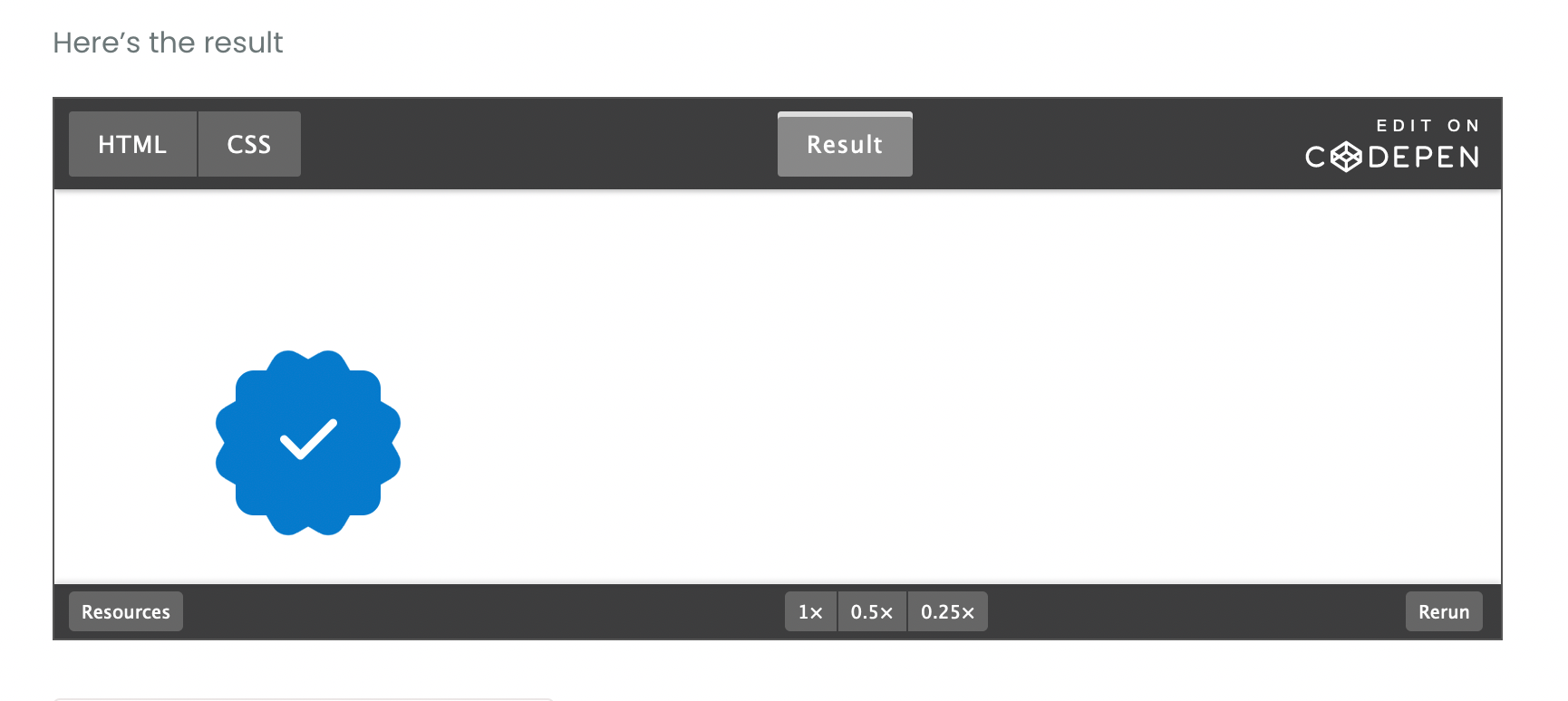
Here’s the result
-
@crazycells This intrigued me somewhat, I won’t lie
 I decided to take a stab at this myself.
HTML
<!DOCTYPE html> <html> <head> <script src="https://cdnjs.cloudflare.com/ajax/libs/font-awesome/6.4.0/js/all.min.js" integrity="sha512-fD9DI5bZwQxOi7MhYWnnNPlvXdp/2Pj3XSTRrFs5FQa4mizyGLnJcN6tuvUS6LbmgN1ut+XGSABKvjN0H6Aoow==" crossorigin="anonymous" referrerpolicy="no-referrer"></script> <link rel="stylesheet" href="https://cdnjs.cloudflare.com/ajax/libs/font-awesome/6.4.0/css/all.min.css" integrity="sha512-iecdLmaskl7CVkqkXNQ/ZH/XLlvWZOJyj7Yy7tcenmpD1ypASozpmT/E0iPtmFIB46ZmdtAc9eNBvH0H/ZpiBw==" crossorigin="anonymous" referrerpolicy="no-referrer" /> <meta charset=utf-8 /> <title>JS Bin</title> </head> <body> <div class="base"></div> <div class="inner"><i class="check fa-solid fa-check"></i></div> </body> </html>CSS
.base { left: 100px; top: 100px; height: 80px; width: 80px; background: #067acc; position: absolute; border-radius: 10px; } .base:before { height: 80px; width: 80px; background: #067acc; content:""; position: absolute; transform: rotate(-30deg); border-radius: 10px; } .base:after { padding-top: 10px; text-align: center; vertical-align: middle; height: 70px; width: 80px; background: #067acc; content: ""; position: absolute; transform: rotate(30deg); border-radius: 10px; } .inner { color: #000000; left: 95px; top: 95px; position: absolute; text-align:center; padding-top: 25px; width: 90px; height: 65px; background: #067acc; border-radius: 50px; background: #067acc; /* Old browsers */ } .check { font-size: 36px; color: #ffffff; }Here’s the result
-
@crazycells Sorry, yes. Fixed that now.
-
@crazycells Sorry, yes. Fixed that now.
@phenomlab it looks very nice
 but I guess one needs a subscription to use this, right?
I am looking forward to seeing that on the avatars as “verified badge”, please do not forget to share your CSS code for its position
 when you implement it.
 -
@phenomlab it looks very nice
 but I guess one needs a subscription to use this, right?
I am looking forward to seeing that on the avatars as “verified badge”, please do not forget to share your CSS code for its position
 when you implement it.
@crazycells said in Custom badges:
it looks very nice but I guess one needs a subscription to use this, right?
No, there’s no subscription - what do you see ? The CodePen should be public?
-
@crazycells said in Custom badges:
it looks very nice but I guess one needs a subscription to use this, right?
No, there’s no subscription - what do you see ? The CodePen should be public?
@phenomlab yes I can see it very well:
since your code has “/font-awesome/6.4.0/” in it, I assumed you are using pro version.
-
@phenomlab yes I can see it very well:
since your code has “/font-awesome/6.4.0/” in it, I assumed you are using pro version.
@crazycells No, it’s the free version
https://cdnjs.com/libraries/font-awesome
You only need the check mark itself


