[NODEBB] CSS Style Sheets SelectBox
-
@downpw said in [NODEBB] CSS Style Sheets SelectBox:
When I activate the widget
Other bug when i activate the widget
-
@downpw said in [NODEBB] CSS Style Sheets SelectBox:
When I activate the widget
Other bug when i activate the widget

Witout widgets, it’s normal :

@downpw This is being caused by the CSS you have set
.topic-list-header { position: -webkit-sticky; position: sticky; top: 50px; background-color: #fff; z-index: 1000; padding-top: 10px; padding-bottom: 10px; margin-bottom: 10px; border-top: 1px solid #eee; border-bottom: 1px solid #eee; } The topic list header in dark mode will work as there is no background, and the color set matches. However, the only way to get this to work in light mode is to set
background-color: transparent;but that also means as the list of threads grows and you scroll, you’ll be able to see through the panel.EDIT
I just set (in
aqua.cssvia front-end) the below.btn-default { color: black !important; background-color: aqua !important; border-color: black !important; box-shadow: 0px 0px 8px aqua !important; } This works fine. When you change to Dark Mode, the style is no longer being overwritten
-
@DownPW the dropdown selector will now populate the correct value when selecting the theme and reloading. New code here
$(window).on('action:ajaxify.end', function(data) { var isDefined = localStorage.getItem("s1"); var isDefinedLabel = localStorage.getItem("sLabel"); if (isDefined) { setStyleSource("s1", isDefined); } else { setStyleSource("s1", selected); } if (isDefinedLabel) { $('#mySelect').val(isDefined).change(); } else { } document.getElementById("mySelect").addEventListener("change", function() { var selected = this.options[this.selectedIndex].value; var selectedLabel = this.options[this.selectedIndex].text; setStyleSource("s1", selected); localStorage.setItem("s1", selected); localStorage.setItem("sLabel", selectedLabel); }); }); -
@DownPW As discussed via chat, if dark mode is selected, the themes should be stripped to prevent CSS conflicts. You can do that by using this code snippet
$(window).on('action:ajaxify.end', function(data) { var isDefined = localStorage.getItem("s1"); var isDefinedLabel = localStorage.getItem("sLabel"); if (isDefined) { setStyleSource("s1", isDefined); } else { setStyleSource("s1", selected); } if (isDefinedLabel) { $('#mySelect').val(isDefined).change(); } else { } var isDark = localStorage.getItem('user:theme'); if (isDark) { console.log("Dark mode is active"); setStyleSource("s1", ""); $('#mySelect').hide(); } document.getElementById("mySelect").addEventListener("change", function() { var selected = this.options[this.selectedIndex].value; var selectedLabel = this.options[this.selectedIndex].text; setStyleSource("s1", selected); localStorage.setItem("s1", selected); localStorage.setItem("sLabel", selectedLabel); }); }); -
@DownPW After we’d discussed this further, plus your ideal situation of having something like the “dark mode” switcher plugin, I’ve come up with the below (fully functional) code
$(document).ready(function () { // This variable gets the theme ID var whichTheme = localStorage.getItem("theme"); // This variable gets the active theme's actual URL var activeTheme = localStorage.getItem("activeTheme"); // This variable appends the dropdown list to the existing panel var panel = $('<li id="switcher" class="notifications dropdown xs navbar-form"> \ <label for="user-control-list-check" class="dropdown-toggle" data-toggle="dropdown" id="user_dropdown" title="" role="button" data-original-title="Theme" aria-expanded="false"> \ <a title="Theme Switcher" href="#"><i class="fa fa-fw fa-lightbulb-o"></i><span class="visible-xs-inline">Theme Switcher</span></a> \ </label> \ <ul id="theme" class="dropdown-menu"> \ <li><a id="default" href="#" rel="https://domain.com/assets/client.css?v=e02phpkima0">Default</a></li> \ <li><a id="Dark Neon Aqua" href="#" rel="https://domain.com/assets/customcss/dark_neon_aqua.css?version=1">Dark Neon Aqua</a></li> \ <li><a id="Dark Neon Blue" href="#" rel="https://domain.com/assets/customcss/dark_neon_blue.css?version=1">Dark Neon Blue</a></li> \ <li><a id="Dark Neon Green" href="#" rel="https://domain.com/assets/customcss/dark_neon_green.css?version=1">Dark Neon Green</a></li> \ <li><a id="Dark Neon Solary" href="#" rel="https://domain.com/assets/customcss/dark_neon_solary.css?version=1">Dark Neon Solary</a></li> \ <li><a id="Dark Neon White" href="#" rel="https://domain.com/assets/customcss/dark_neon_white.css?version=1"">Dark Neon White</a></li> \ <li><a id="Eva 00" href="#" rel="https://domain.com/assets/customcss/eva_00.css?version=1">Eva.00</a></li> \ <li><a id="Eva 01" href="#" rel="https://domain.com/assets/customcss/eva_01.css?version=1">Eva.01</a></li> \ <li><a id="Eva 01 Purple Green"href="#" rel="https://domain.com/assets/customcss/eva_01_purple_green.css?version=1">Eva.01_Purple/Green</a></li> \ <li><a id="Eva 02" href="#" rel="https://domain.com/assets/customcss/eva_02.css?version=1">Eva.02</a></li> \ </ul> \ </div> '); // See if there is an active theme selected in localStorage. If none selected, use the default. If there is a theme in localStorage, use that and apply it if (whichTheme) { $("head").append("<link href='" + activeTheme + whichTheme + " type=\'text/css\' rel=\'stylesheet\' />"); } else { // No need to include anything here as there's no CSS to add. } $('ul#logged-in-menu').prepend(panel); $('ul#logged-out-menu').prepend(panel); if (utils.findBootstrapEnvironment() === 'xs') { $('#menu').prepend(panel); } $(document).ready(function () { // Listen to the NAV dropdown for any changes $("#theme li a").click(function () { // If we detect a change, append the selected CSS file into the DOM $("head").append("<link href='" + $(this).attr("rel") + $(this).attr("id") + " type=\'text/css\' rel=\'stylesheet\' />"); // This variable stores the selected theme ID var selected = $(this).attr("id"); // This variable stores the selected theme link var theTheme = $(this).attr("rel"); // This variable updates the selected theme ID // See if "default" has been selected. If it has, then... if (selected === 'default') { localStorage.setItem("theme", ""); // This variable will strip the current appended theme ID localStorage.setItem("activeTheme", ""); // This variable will strip the current appended theme URL (HREF) // Finally, we have to reload the page to effect the changes location.reload(); } // If any other theme is selected, carry on as normal, and update localStorage else { localStorage.setItem("theme", selected); // This variable updates the actual href of the CSS file localStorage.setItem("activeTheme", theTheme); } // We use return false to prevent the browser from reloading or following any HREF links return false; }); }); }); This has been applied against the test site, and is proven to work 100%. It’s based on jQuery and is far more efficient than the previous versions above. Test it out, and let me know ref thoughts etc…

-
undefined phenomlab has marked this topic as solved on 3 Jan 2022, 18:13
-
First, I wanted to thank you for your great job

I have a lot of questions !
-
I don’t see a modification on client.css our my custom css file?
-
Just JS for all that ? No modified other file?
-
How do you fix the yesterday problem for CSS on chat? (How do you include default client.css with my custom CSS files?)
-
My custom CSS on ACP/custom CSS is just for default Theme (yes If I understood correctly) ?
-
Can I disable all my customcss code on body.lightout variables on ACP/Custom CSS, (used for night mode) ?
-
Can I add other theme? --> Just add following if I’m not mistaken?
And I have other cosmetic request :
-
How can I fix this little problem with the spacing between the search icon–the theme switcher icon–notification icon?

-
I have not mouse over color on theme switcher icon like other icons on navbar?

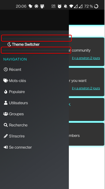
+On Mobile, can we delete these 2 lines
-
On mobile again, my wallpaper doesn’t apply (It was the case before, like default theme on ACP/custom CSS, the css code is the same)
-
I have this on console, normal ?
For resume, If I want to do all reproduce all that on production, If I understood correctly :
- Disable Night Mode. Rebuild NodeBB
- Copy my CSS file on prod server at the same repertories (or other if I change the JS code)
- Copy Paste your Custom JS Code on ACP/Custom JS
- Recover with Broswer Console the code ?v=XXXXX used by noidebb instance
- Modify URL of Stylesheets with my css custom files path and ?v=XXXXX on your JS Code
- Rebuild NodeBB
-
-
First, I wanted to thank you for your great job

I have a lot of questions !
-
I don’t see a modification on client.css our my custom css file?
-
Just JS for all that ? No modified other file?
-
How do you fix the yesterday problem for CSS on chat? (How do you include default client.css with my custom CSS files?)
-
My custom CSS on ACP/custom CSS is just for default Theme (yes If I understood correctly) ?
-
Can I disable all my customcss code on body.lightout variables on ACP/Custom CSS, (used for night mode) ?
-
Can I add other theme? --> Just add following if I’m not mistaken?
And I have other cosmetic request :
-
How can I fix this little problem with the spacing between the search icon–the theme switcher icon–notification icon?

-
I have not mouse over color on theme switcher icon like other icons on navbar?

It’s the same for all themes:

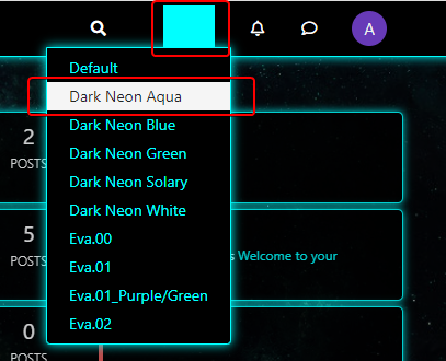
- When I select a theme, I have this, how to fix these :
+On Mobile, can we delete these 2 lines

-
On mobile again, my wallpaper doesn’t apply (It was the case before, like default theme on ACP/custom CSS, the css code is the same)
-
I have this on console, normal ?
For resume, If I want to do all reproduce all that on production, If I understood correctly :
- Disable Night Mode. Rebuild NodeBB
- Copy my CSS file on prod server at the same repertories (or other if I change the JS code)
- Copy Paste your Custom JS Code on ACP/Custom JS
- Recover with Broswer Console the code ?v=XXXXX used by noidebb instance
- Modify URL of Stylesheets with my css custom files path and ?v=XXXXX on your JS Code
- Rebuild NodeBB
@downpw said in [NODEBB] CSS Style Sheets SelectBox:
I don’t see a modification on client.css our my custom css file?
That’s correct. There is no need to modify any of the custom CSS files
@downpw said in [NODEBB] CSS Style Sheets SelectBox:
Just JS for all that ? No modified other file?
Yes - jQuery in fact. You no longer require the widget HTML either as it’s now all wrapped in a custom function.
@downpw said in [NODEBB] CSS Style Sheets SelectBox:
How do you fix the yesterday problem for CSS on chat? (How do you include default client.css with my custom CSS files?)
The default CSS is loaded by NodeBB, so will always be there. The custom function I wrote uses
.appendto simply add the custom CSS to what is already thereMy custom CSS on ACP/custom CSS is just for default Theme (yes If I understood correctly) ?
No. That’s a global setting. No matter what is loaded by the custom function, these additional styles will always be added inline.
@downpw said in [NODEBB] CSS Style Sheets SelectBox:
Can I disable all my customcss code on body.lightout variables on ACP/Custom CSS , (used for night mode) ?
Yes

@downpw said in [NODEBB] CSS Style Sheets SelectBox:
Can I add other theme? --> Just add following if I’m not mistaken?
Yes, you can. You just need to copy the same format with different theme names, ID’s, and of course, the
rellink.@downpw said in [NODEBB] CSS Style Sheets SelectBox:
How can I fix this little problem with the spacing between the search icon–the theme switcher icon–notification icon?
Looks like it’s already fixed ?
@downpw said in [NODEBB] CSS Style Sheets SelectBox:
I have not mouse over color on theme switcher icon like other icons on navbar?
You can instate that using class
.dropdown-toggle:hover@downpw said in [NODEBB] CSS Style Sheets SelectBox:
When I select a theme, I have this, how to fix these :
This also seems to be fixed ?
@downpw said in [NODEBB] CSS Style Sheets SelectBox:
On Mobile, can we delete these 2 lines
That is controlled by CSS class
.navbar-formusingbox-shadow: inset 0 1px 0 rgba(255,255,255,.1),0 1px 0 rgba(255,255,255,.1);so you’d need to either modify that, or remove it usingbox-shadow: none;@downpw said in [NODEBB] CSS Style Sheets SelectBox:
On mobile again, my wallpaper doesn’t apply (It was the case before, like default theme on ACP/custom CSS , the css code is the same)
I noticed this also, but now note that the wallpaper seems to be the same even on desktop despite the color being switched. Is this intended, as this was not the case yesterday ?
@downpw said in [NODEBB] CSS Style Sheets SelectBox:
I have this on console, normal ?
Sorry - I can’t see any screenshot ?
@downpw said in [NODEBB] CSS Style Sheets SelectBox:
For resume, If I want to do all reproduce all that on production, If I understood correctly :
Disable Night Mode. Rebuild NodeBB
Copy my CSS file on prod server at the same repertories (or other if I change the JS code)
Copy Paste your Custom JS Code on ACP/Custom JS
Recover with Broswer Console the code ?v=XXXXX used by noidebb instance
Modify URL of Stylesheets with my css custom files path and ?v=XXXXX on your JS Code
Rebuild NodeBBYes, that’s pretty much it

-
-
@downpw said in [NODEBB] CSS Style Sheets SelectBox:
I don’t see a modification on client.css our my custom css file?
That’s correct. There is no need to modify any of the custom CSS files
@downpw said in [NODEBB] CSS Style Sheets SelectBox:
Just JS for all that ? No modified other file?
Yes - jQuery in fact. You no longer require the widget HTML either as it’s now all wrapped in a custom function.
@downpw said in [NODEBB] CSS Style Sheets SelectBox:
How do you fix the yesterday problem for CSS on chat? (How do you include default client.css with my custom CSS files?)
The default CSS is loaded by NodeBB, so will always be there. The custom function I wrote uses
.appendto simply add the custom CSS to what is already thereMy custom CSS on ACP/custom CSS is just for default Theme (yes If I understood correctly) ?
No. That’s a global setting. No matter what is loaded by the custom function, these additional styles will always be added inline.
@downpw said in [NODEBB] CSS Style Sheets SelectBox:
Can I disable all my customcss code on body.lightout variables on ACP/Custom CSS , (used for night mode) ?
Yes

@downpw said in [NODEBB] CSS Style Sheets SelectBox:
Can I add other theme? --> Just add following if I’m not mistaken?
Yes, you can. You just need to copy the same format with different theme names, ID’s, and of course, the
rellink.@downpw said in [NODEBB] CSS Style Sheets SelectBox:
How can I fix this little problem with the spacing between the search icon–the theme switcher icon–notification icon?
Looks like it’s already fixed ?

@downpw said in [NODEBB] CSS Style Sheets SelectBox:
I have not mouse over color on theme switcher icon like other icons on navbar?
You can instate that using class
.dropdown-toggle:hover@downpw said in [NODEBB] CSS Style Sheets SelectBox:
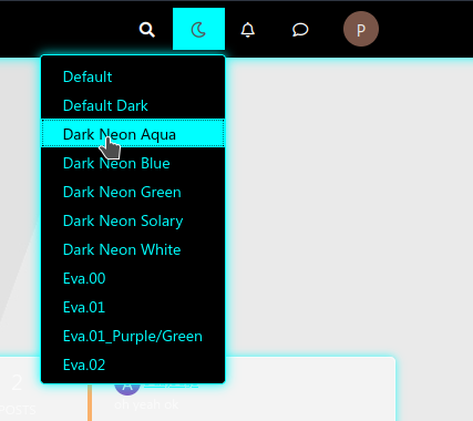
When I select a theme, I have this, how to fix these :
This also seems to be fixed ?
@downpw said in [NODEBB] CSS Style Sheets SelectBox:
On Mobile, can we delete these 2 lines
That is controlled by CSS class
.navbar-formusingbox-shadow: inset 0 1px 0 rgba(255,255,255,.1),0 1px 0 rgba(255,255,255,.1);so you’d need to either modify that, or remove it usingbox-shadow: none;@downpw said in [NODEBB] CSS Style Sheets SelectBox:
On mobile again, my wallpaper doesn’t apply (It was the case before, like default theme on ACP/custom CSS , the css code is the same)
I noticed this also, but now note that the wallpaper seems to be the same even on desktop despite the color being switched. Is this intended, as this was not the case yesterday ?
@downpw said in [NODEBB] CSS Style Sheets SelectBox:
I have this on console, normal ?
Sorry - I can’t see any screenshot ?
@downpw said in [NODEBB] CSS Style Sheets SelectBox:
For resume, If I want to do all reproduce all that on production, If I understood correctly :
Disable Night Mode. Rebuild NodeBB
Copy my CSS file on prod server at the same repertories (or other if I change the JS code)
Copy Paste your Custom JS Code on ACP/Custom JS
Recover with Broswer Console the code ?v=XXXXX used by noidebb instance
Modify URL of Stylesheets with my css custom files path and ?v=XXXXX on your JS Code
Rebuild NodeBBYes, that’s pretty much it

@phenomlab said in [NODEBB] CSS Style Sheets SelectBox:
Looks like it’s already fixed ?
Yes, I have fixed with this :
.notifications.dropdown.xs {
    margin-left: -18px;
    margin-right: -18px;
    margin-top: 6.2px;
    list-style: none;
}
@downpw said in [NODEBB] CSS Style Sheets SelectBox:
When I select a theme, I have this, how to fix these :
This also seems to be fixed ?
No, not fixed

I have test several things with no success:
@downpw said in [NODEBB] CSS Style Sheets SelectBox:
On mobile again, my wallpaper doesn’t apply (It was the case before, like default theme on ACP/custom CSS , the css code is the same)
I noticed this also, but now note that the wallpaper seems to be the same even on desktop despite the color being switched. Is this intended, as this was not the case yesterday ?
No change, It’s because I have Custom Header code on ACP (Your Reading Meter Bar) and he bug the css code of others theme except default theme.
Any code adding on ACP/Custom Header like a div for example crashes CSS themes :
If i disable code in ACP/Custom Header. The CSS custom themes is OK except wallpaper on Mobile
@downpw said in [NODEBB] CSS Style Sheets SelectBox:
I have this on console, normal ?
Sorry - I can’t see any screenshot ?
Sorry, I can’t edit the post yesterday:
@phenomlab said in [NODEBB] CSS Style Sheets SelectBox:
@downpw said in [NODEBB] CSS Style Sheets SelectBox:
I have not mouse over color on theme switcher icon like other icons on navbar?
You can instate that using class .dropdown-toggle:hover
I have test with that on ACP = doesn’t work :
.dropdown-toggle:hover {
    background: #3C3C3C;
}
But Ok with this code but the background doesn’t occupy the entire height of the navbar like other navbar icons :
.notifications.dropdown.xs .dropdown-toggle:hover { background: #3C3C3C; } -
@phenomlab said in [NODEBB] CSS Style Sheets SelectBox:
Looks like it’s already fixed ?

Yes, I have fixed with this :
.notifications.dropdown.xs { margin-left: -18px; margin-right: -18px; margin-top: 6.2px; list-style: none; }
@downpw said in [NODEBB] CSS Style Sheets SelectBox:
When I select a theme, I have this, how to fix these :
This also seems to be fixed ?

No, not fixed

I have test several things with no success: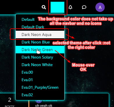
@downpw said in [NODEBB] CSS Style Sheets SelectBox:
On mobile again, my wallpaper doesn’t apply (It was the case before, like default theme on ACP/custom CSS , the css code is the same)
I noticed this also, but now note that the wallpaper seems to be the same even on desktop despite the color being switched. Is this intended, as this was not the case yesterday ?
No change, It’s because I have Custom Header code on ACP (Your Reading Meter Bar) and he bug the css code of others theme except default theme.
Any code adding on ACP/Custom Header like a div for example crashes CSS themes :
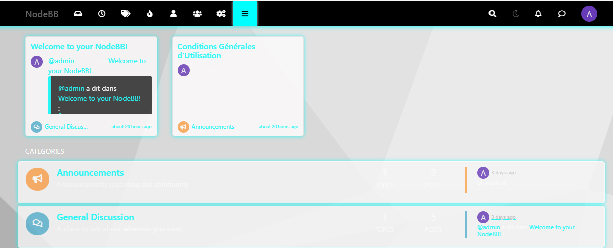
If i disable code in ACP/Custom Header. The CSS custom themes is OK except wallpaper on Mobile
@downpw said in [NODEBB] CSS Style Sheets SelectBox:
I have this on console, normal ?
Sorry - I can’t see any screenshot ?
Sorry, I can’t edit the post yesterday:
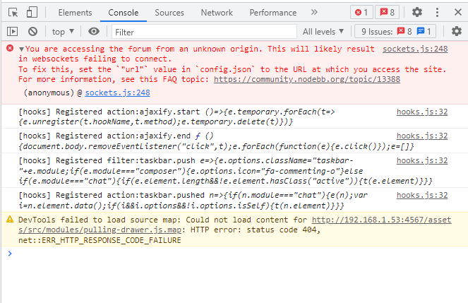
@phenomlab said in [NODEBB] CSS Style Sheets SelectBox:
@downpw said in [NODEBB] CSS Style Sheets SelectBox:
I have not mouse over color on theme switcher icon like other icons on navbar?
You can instate that using class .dropdown-toggle:hover
I have test with that on ACP = doesn’t work :
.dropdown-toggle:hover { background: #3C3C3C; }But Ok with this code but the background doesn’t occupy the entire height of the navbar like other navbar icons :
.notifications.dropdown.xs .dropdown-toggle:hover { background: #3C3C3C; }
Here, this is OK. Iwould like this result:

@downpw Ok. Let me have a look
-
@DownPW I’ve set this custom CSS in your ACP
// PLEASE DO NOT DELETE THIS .header #theme_dropdown { padding: 9px 15px; } .header #theme_dropdown { padding: 9px 15px; padding-top: 9px; padding-bottom: 9px; margin-top: -6px; padding-top: 14px; padding-bottom: 13px; } This is the basis which should make it work, but you’ll need to “fiddle” with it to get it how you need.
I also changed the jQuery code slightly, as I realized there was a conflict with another ID, which I’ve fixed.
EDIT: It’s this line
<label for="user-control-list-check" class="dropdown-toggle" data-toggle="dropdown" id="***theme***_dropdown" title="" role="button" data-original-title="Theme" aria-expanded="false"> \ -
OK Thanks.
You have change id="user_dropdown with id=“theme_dropdown”Can you will see for others problem after?
@downpw I’m running low on free time now sadly, but more then happy to get this resolved for you tomorrow or later in the week of that works for you.
The issue here is that I’ve reused some of the existing code from NodeBB and that may be causing some issues. Don’t worry. We’ll get there

-
@phenomlab said in [NODEBB] CSS Style Sheets SelectBox:
@downpw I’m running low on free time now sadly, but more then happy to get this resolved for you tomorrow or later in the week of that works for you.
The issue here is that I’ve reused some of the existing code from NodeBB and that may be causing some issues. Don’t worry. We’ll get thereOK Thanks sir

I really hope ! You are a super hero !I also hope that when done this will work on future nodeBB updates/upgrade.
PM me when you have the time for that I turn on the VM -
@phenomlab said in [NODEBB] CSS Style Sheets SelectBox:
@downpw I’m running low on free time now sadly, but more then happy to get this resolved for you tomorrow or later in the week of that works for you.
The issue here is that I’ve reused some of the existing code from NodeBB and that may be causing some issues. Don’t worry. We’ll get thereOK Thanks sir

I really hope ! You are a super hero !I also hope that when done this will work on future nodeBB updates/upgrade.
PM me when you have the time for that I turn on the VM@downpw no issues. It’ll work across upgrades as it’s a standard function and doesn’t rely on any NodeBB components. If you can just ensure that the VM is available around the same time each day, that would also help.
-
@downpw no issues. It’ll work across upgrades as it’s a standard function and doesn’t rely on any NodeBB components. If you can just ensure that the VM is available around the same time each day, that would also help.
@phenomlab said in [NODEBB] CSS Style Sheets SelectBox:
If you can just ensure that the VM is available around the same time each day, that would also help.
Ok no problem Sir

-
@phenomlab said in [NODEBB] CSS Style Sheets SelectBox:
If you can just ensure that the VM is available around the same time each day, that would also help.
Ok no problem Sir

@downpw Right. I think I have this working the way you’d like
This uses the below CSS I have placed into your ACP. It should not be deleted
// PLEASE DO NOT DELETE THIS

.header #theme_dropdown {
    padding: 9px 15px;
    padding-top: 9px;
    padding-bottom: 9px;
    margin-top: -4px;
    padding-top: 14px;
    padding-bottom: 16px;
}
#switcher{
    position: absolute;
    right: 33%;
}
The
:hoverclass is always going to look like the belowThe reason for this is because you have it hard coded in the ACP CSS as below
/*VIOLENCE: Couleur du background au survol souris */
.navbar-default .navbar-nav>li>label:hover {
    background: #555555;
}
You should remove this, and set it based on the color you want in each external CSS file. This way, it will display correctly.
The slight caveat with this is that it has to use
absolutepositioning meaning that if you resize the browser, the theme switcher icon will use a percentage to work out where it needs to be, and won’t be governed by the<ul><li>it sits inside. This is the only way to get the effect you are looking for. -
@downpw Right. I think I have this working the way you’d like
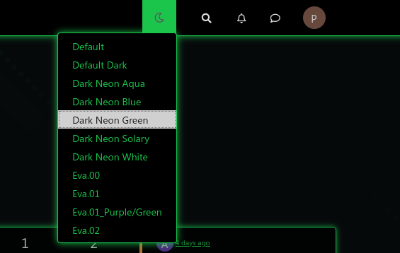
This uses the below CSS I have placed into your ACP. It should not be deleted
// PLEASE DO NOT DELETE THIS

.header #theme_dropdown {
    padding: 9px 15px;
    padding-top: 9px;
    padding-bottom: 9px;
    margin-top: -4px;
    padding-top: 14px;
    padding-bottom: 16px;
}
#switcher{
    position: absolute;
    right: 33%;
}
The
:hoverclass is always going to look like the below
The reason for this is because you have it hard coded in the ACP CSS as below
/*VIOLENCE: Couleur du background au survol souris */
.navbar-default .navbar-nav>li>label:hover {
    background: #555555;
}
You should remove this, and set it based on the color you want in each external CSS file. This way, it will display correctly.
The slight caveat with this is that it has to use
absolutepositioning meaning that if you resize the browser, the theme switcher icon will use a percentage to work out where it needs to be, and won’t be governed by the<ul><li>it sits inside. This is the only way to get the effect you are looking for.@phenomlab said in [NODEBB] CSS Style Sheets SelectBox:
@downpw Right. I think I have this working the way you’d like
This uses the below CSS I have placed into your ACP. It should not be deleted
// PLEASE DO NOT DELETE THIS .header #theme_dropdown { padding: 9px 15px; padding-top: 9px; padding-bottom: 9px; margin-top: -4px; padding-top: 14px; padding-bottom: 16px; } #switcher{ position: absolute; right: 33%; } The
:hoverclass is always going to look like the belowThe reason for this is because you have it hard coded in the ACP CSS as below
/*VIOLENCE: Couleur du background au survol souris */ .navbar-default .navbar-nav>li>label:hover { background: #555555; } You should remove this, and set it based on the color you want in each external CSS file. This way, it will display correctly.
The slight caveat with this is that it has to use
absolutepositioning meaning that if you resize the browser, the theme switcher icon will use a percentage to work out where it needs to be, and won’t be governed by the<ul><li>it sits inside. This is the only way to get the effect you are looking for.Hmmm, it’s problematic. It’s not very aesthetic.
I am amazed because it works very well on your site or with night mode.

-
@phenomlab said in [NODEBB] CSS Style Sheets SelectBox:
@downpw Right. I think I have this working the way you’d like

This uses the below CSS I have placed into your ACP. It should not be deleted
// PLEASE DO NOT DELETE THIS .header #theme_dropdown { padding: 9px 15px; padding-top: 9px; padding-bottom: 9px; margin-top: -4px; padding-top: 14px; padding-bottom: 16px; } #switcher{ position: absolute; right: 33%; }The
:hoverclass is always going to look like the below
The reason for this is because you have it hard coded in the ACP CSS as below
/*VIOLENCE: Couleur du background au survol souris */ .navbar-default .navbar-nav>li>label:hover { background: #555555; }You should remove this, and set it based on the color you want in each external CSS file. This way, it will display correctly.
The slight caveat with this is that it has to use
absolutepositioning meaning that if you resize the browser, the theme switcher icon will use a percentage to work out where it needs to be, and won’t be governed by the<ul><li>it sits inside. This is the only way to get the effect you are looking for.Hmmm, it’s problematic. It’s not very aesthetic.
I am amazed because it works very well on your site or with night mode.

I see red background too on fa -faw ???

@downpw said in [NODEBB] CSS Style Sheets SelectBox:
Hmmm, it’s problematic. It’s not very aesthetic.
I am amazed because it works very well on your site or with night mode.The theme switcher you have doesn’t work the same way as the night mode plugin. What you have is a dropdown which is not the same as the toggle selection hence it will behave differently.
What isn’t aesthetic exactly ?
@downpw said in [NODEBB] CSS Style Sheets SelectBox:
I see red background too on fa -faw ???
Yes, that comes from the below class on line 415 of your CSS in the ACP
/*VIOLENCE: Couleur du background de l'icone de recherche au survol souris */ .navbar-default .btn-link:hover { background: red; } -
@DownPW another way…
Remove
#switcher{
    position: absolute;
    right: 33%;
}
Add
.navbar-default {
    height: 50px;
}
This way, it’s aesthetic…I just set the changes. Let me know what you think.
-
@DownPW another way…
Remove
#switcher{ position: absolute; right: 33%; }Add
.navbar-default { height: 50px; }This way, it’s aesthetic…I just set the changes. Let me know what you think.
It’s better.
I have just to set space between icon
For the red, i have disable CSS on line number 415, it’s not that
Did this solution help you?
Hello! It looks like you're interested in this conversation, but you don't have an account yet.
Getting fed up of having to scroll through the same posts each visit? When you register for an account, you'll always come back to exactly where you were before, and choose to be notified of new replies (ether email, or push notification). You'll also be able to save bookmarks, use reactions, and upvote to show your appreciation to other community members.
With your input, this post could be even better 💗
RegisterLog in


