CSS code customization for the link preview plugin
-
Hi @phenomlab ,
I am working on CSS codes to customize the link-preview plugin for some time, but I was unsuccessful
 so, I wanted to consult you in case I am missing an important line…
Unfortunately, normal previews of this plugin are too big for our taste, just like how iframely used to be…
I ended up something like this:
.post-container .content .card {
    display: contents !important;
}

.link-preview {

    .card-img-top {
        height:120px !important;
        width: auto !important;
        overflow: hidden !important;
        float: left !important;
        padding: 0 5px 0 0 !important;
    }

    .card-body {
        padding: 1px 1px 1px 1px !important;
    }

    .card-footer {
        position: relative !important;
    }
}
But this is nowhere near close to what I was aiming…
This is how it used to be with iframely and what we are aiming:
This is how ugly it looks right now
I hope you can help with this transformation
Thanks, -
Hi @phenomlab ,
I am working on CSS codes to customize the link-preview plugin for some time, but I was unsuccessful
so, I wanted to consult you in case I am missing an important line…Unfortunately, normal previews of this plugin are too big for our taste, just like how iframely used to be…
I ended up something like this:
.post-container .content .card {
    display: contents !important;
}

.link-preview {

    .card-img-top {
        height:120px !important;
        width: auto !important;
        overflow: hidden !important;
        float: left !important;
        padding: 0 5px 0 0 !important;
    }

    .card-body {
        padding: 1px 1px 1px 1px !important;
    }

    .card-footer {
        position: relative !important;
    }
}
But this is nowhere near close to what I was aiming…
This is how it used to be with iframely and what we are aiming:
This is how ugly it looks right now
I hope you can help with this transformation
Thanks,@crazycells technically possible, yes - I can get somewhere near the desired layout as below
However, this isn’t great from the CSS perspective as it’s something of a hack, and will not look good on mobile devices. Here’s the CSS for that if you want to use it.
.post-container .content .card {
    display: contents !important;
}
.link-preview .card-title {
    margin-left: -238px;
    float: left;
}
.link-preview .card-img-top {
    height: 120px !important;
    width: auto !important;
    overflow: hidden !important;
    float: left !important;
    padding: 0 5px 0 0 !important;
    margin-top: 35px;
}
.link-preview .card-text {
    margin-top: 20px;
    padding-left: 15px;
}
.link-preview .card-footer {
    position: relative !important;
    margin-top: 70px;
}
.link-preview .card-body {
    padding: 1px 1px 1px 1px !important;
}
.link-preview .card-text {
    margin-top: 35px;
    padding-left: 15px;
}
The real issue with
nodebb-plugin-link-previewis that it has no flexibility in terms of HTML layout meaning you have to get clever with CSS (and even then, it’s not clever at all).Using my OGProxy function, it would look like this by default
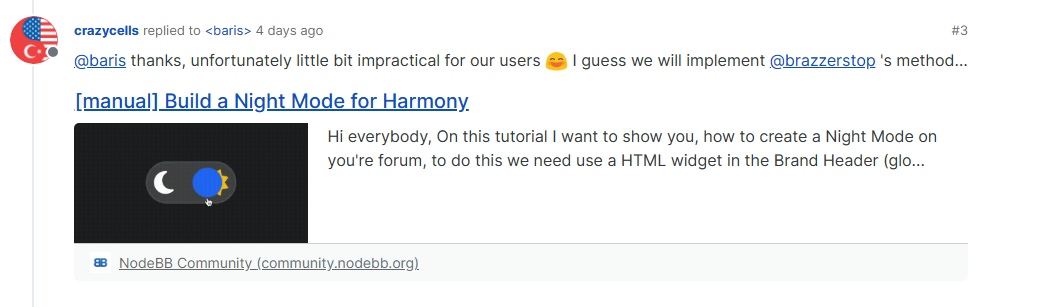
https://community.nodebb.org/topic/17109/manual-build-a-night-mode-for-harmony
However, because you have control over the HTML, you can simply rearrange it to suit your own needs.
Mark – Founder, Phenomlab Ltd
Executive IT & Security Leadership
Phenomlab Ltd -
 undefined phenomlab has marked this topic as solved on
-
@crazycells technically possible, yes - I can get somewhere near the desired layout as below
However, this isn’t great from the CSS perspective as it’s something of a hack, and will not look good on mobile devices. Here’s the CSS for that if you want to use it.
.post-container .content .card {
    display: contents !important;
}
.link-preview .card-title {
    margin-left: -238px;
    float: left;
}
.link-preview .card-img-top {
    height: 120px !important;
    width: auto !important;
    overflow: hidden !important;
    float: left !important;
    padding: 0 5px 0 0 !important;
    margin-top: 35px;
}
.link-preview .card-text {
    margin-top: 20px;
    padding-left: 15px;
}
.link-preview .card-footer {
    position: relative !important;
    margin-top: 70px;
}
.link-preview .card-body {
    padding: 1px 1px 1px 1px !important;
}
.link-preview .card-text {
    margin-top: 35px;
    padding-left: 15px;
}
The real issue with
nodebb-plugin-link-previewis that it has no flexibility in terms of HTML layout meaning you have to get clever with CSS (and even then, it’s not clever at all).Using my OGProxy function, it would look like this by default
https://community.nodebb.org/topic/17109/manual-build-a-night-mode-for-harmony
However, because you have control over the HTML, you can simply rearrange it to suit your own needs.
@phenomlab does OGProxy show the pdf previews as well?
-
@phenomlab does OGProxy show the pdf previews as well?
@crazycells said in CSS code customization for the link preview plugin:
does OGProxy show the pdf previews as well?
Not yet, but it could with a bit of additional code.
-
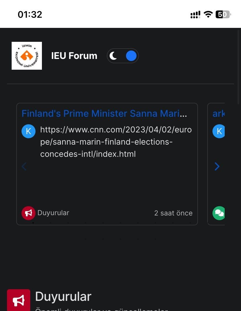
How can I remove the white space at the top? I set html and body to black in CSS, but it didn’t work. Is there another solution? -
How can I remove the white space at the top? I set html and body to black in CSS, but it didn’t work. Is there another solution?@kadir-ay-0 marking as resolved based on
https://community.nodebb.org/topic/17109/manual-build-a-night-mode-for-harmony/5
Please do not raise requests in two places - here and the NodeBB forums. All this does is create unnecessary load for both parties.
Mark – Founder, Phenomlab Ltd
Executive IT & Security Leadership
Phenomlab Ltd

Hello! It looks like you're interested in this conversation, but you don't have an account yet.
Getting fed up of having to scroll through the same posts each visit? When you register for an account, you'll always come back to exactly where you were before, and choose to be notified of new replies (either via email, or push notification). You'll also be able to save bookmarks and upvote posts to show your appreciation to other community members.
With your input, this post could be even better 💗
Register LoginDid this solution help you?
Related Topics
-
-
-
-
Link Not Working
Solved Customisation -
-
-
-
WordPress & NodeBB
Solved WordPress