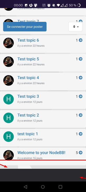
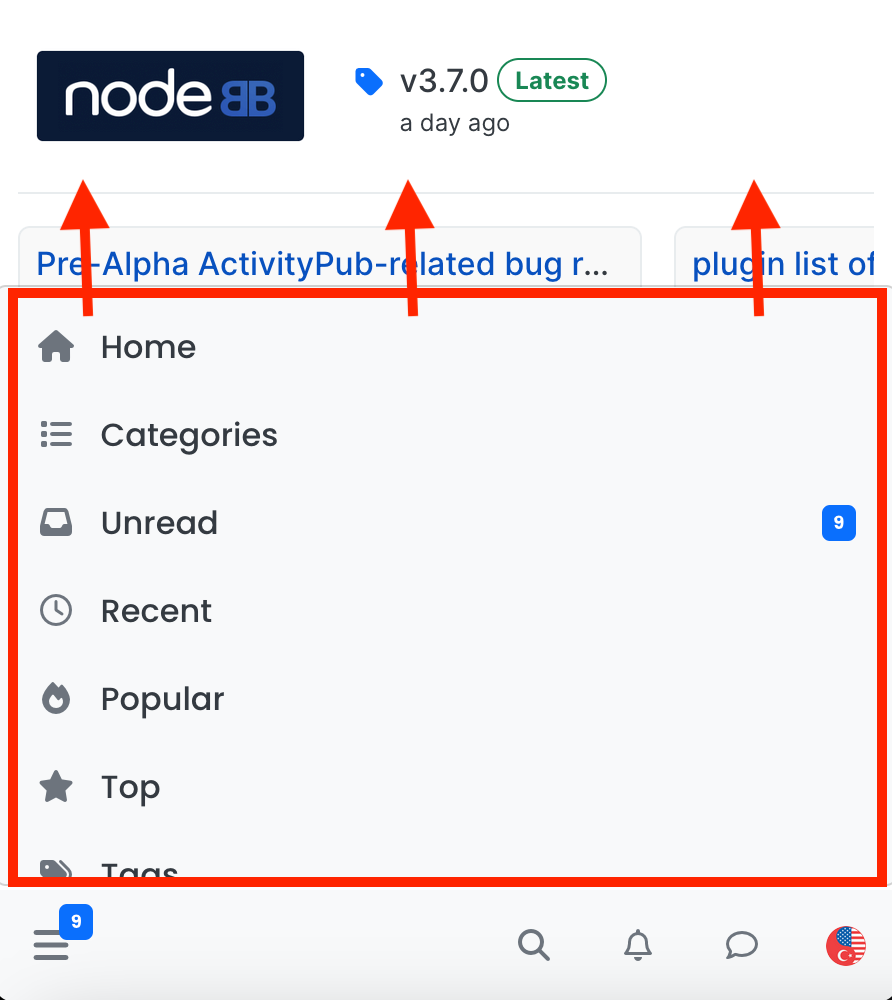
navigation menu panel on mobile
-
-
Well, I figured it out and leaving the codes here in case others are interested…
.bottombar-nav .navigation-dropdown, .bottombar-nav .user-dropdown {
  max-height: 80vh !important;
}
max height is coded to be 60vh, I changed it to 80vh…
-
 undefined crazycells has marked this topic as solved on
-
 undefined phenomlab has marked this topic as solved on
-
@phenomlab I have just realized that you are already using this as 80vh in this forum… very smart move

-
-
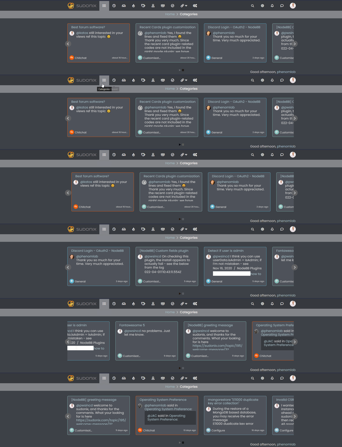
hi @phenomlab , it is hard to browse the sudonix categories on mobile, fyi… I believe there is a bug on ios, but it is not fixed since it is not acting the same on android…
-
hi @phenomlab , it is hard to browse the sudonix categories on mobile, fyi… I believe there is a bug on ios, but it is not fixed since it is not acting the same on android…
@crazycells I’ve disabled the auto hiding of the bottom bar here. Does this resolve the issue?
Mark Cutting also advises organisations as a Fractional CIO, Fractional CISO and Executive Advisor, helping boards improve technology governance, cyber resilience and executive decision making. Learn more at Gratmore Ltd
-
@crazycells I’ve disabled the auto hiding of the bottom bar here. Does this resolve the issue?
@phenomlab much better… thanks…
Additionally, somehow bottom menu bar of the sudonix looks smaller than the original? I would even suggest using slightly higher icons for people with sausage fingers lol

-
@phenomlab much better… thanks…
Additionally, somehow bottom menu bar of the sudonix looks smaller than the original? I would even suggest using slightly higher icons for people with sausage fingers lol
@crazycells hmm. That’s odd. I haven’t made any changes from recollection but I could be wrong. I’ll need to check.
EDIT - very strange. I honestly don’t recall adding the below CSS block to alter the bottom bar, but you’re right…
.bottombar-nav {
  padding: 0px !important;
}
I’ve removed this so it reflects stock Harmony.


Hello! It looks like you're interested in this conversation, but you don't have an account yet.
Getting fed up of having to scroll through the same posts each visit? When you register for an account, you'll always come back to exactly where you were before, and choose to be notified of new replies (either via email, or push notification). You'll also be able to save bookmarks and upvote posts to show your appreciation to other community members.
With your input, this post could be even better 💗
Register Login