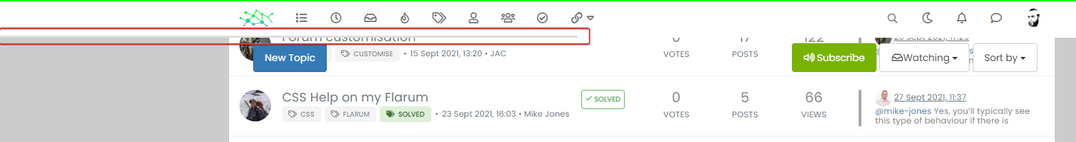
Switch between list and card view function
-
After a significant rewrite of the code plus the CSS, I’m pleased to release this stable version. There are some changes however.
- The external
CSSfile is no longer needed (you can delete it). As a result, the CSS you see in the below file needs to be copied into
/admin/appearance/customise#custom-csshttps://github.com/phenomlab/harmony-card-view/blob/main/card.css
- The
JScode has been refactored, and the code contained in the link below needs to be copied into
/admin/appearance/customise#custom-jsYou need to overwrite existing code if you have it
https://github.com/phenomlab/harmony-card-view/blob/main/functions.js
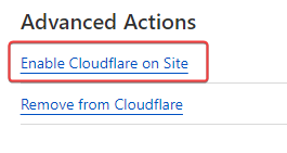
IMPORTANT
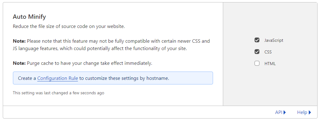
If you use Cloudflare, you MUST disable the HTML minification if you use it
If everything went well, you should see this

If it doesn’t look like the above, the main reason for this is that you are using Cloudflare and have not disabled HTML minification. If this setting is enabled, the JS code will insert additional classes into the
DOMas it should, although CF has a bad habit of changing the execution order meaning the CSS is not correctly applied to the first set of returned topics - an example of that below
If you experience this issue, please ensure that you’ve disabled HTML minification.
Enjoy the new layout. Any issues, let me know.
- The external
-
 undefined phenomlab moved this topic from Customisation on
-
Test ASAP this version on my dev environment with CF my friend.
Thank you so much -
Still doesn’t work for me

I’m in DNS only mode in CF,
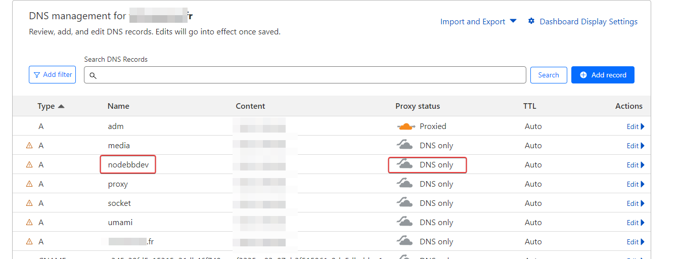
I deactivated CF and it’s the same :
I deleted all my custom CSS and JS on nodebb ACP, leaving only those for the card view and I have the same problem.
I admit that I don’t understand anything anymore.
PW and WS Spirit alive
-
Still doesn’t work for me
I’m in DNS only mode in CF,
I deactivated CF and it’s the same :
I deleted all my custom CSS and JS on nodebb ACP, leaving only those for the card view and I have the same problem.
I admit that I don’t understand anything anymore.
@DownPW I think I see why.
Can you locate this css block
.category-card .lastpost a img {
    margin-top: 10px;
    margin-left: -185px;
}
and change it to
.category-card .lastpost a img, span.avatar.avatar-tooltip.not-responsive.avatar-rounded {
    margin-top: 10px;
    margin-left: -178px;
}
I did not account for the usage of standard avatars (the ones were it uses the first letter of the username) - I use a custom “guest” or “no upload” image defined here
Whereas your site doesn’t have this and therefore replaces the CSS class which we have not previously targeted
I’m confident that this will resolve the issue (famous last words)…
Mark – Founder, Phenomlab Ltd
Executive IT & Security Leadership
Phenomlab Ltd -
I’m with my childs, test asap
")
PW and WS Spirit alive
-
@DownPW I see you set a default avatar
?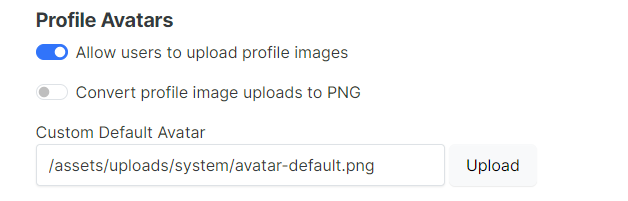
On checking your site, this has resolved the issue, but you should still have that CSS I defined above. As soon as you validate, I will add this to the code.
-
@DownPW I think I see why.
Can you locate this css block
.category-card .lastpost a img {
    margin-top: 10px;
    margin-left: -185px;
}
and change it to
.category-card .lastpost a img, span.avatar.avatar-tooltip.not-responsive.avatar-rounded {
    margin-top: 10px;
    margin-left: -178px;
}
I did not account for the usage of standard avatars (the ones were it uses the first letter of the username) - I use a custom “guest” or “no upload” image defined here
Whereas your site doesn’t have this and therefore replaces the CSS class which we have not previously targeted
I’m confident that this will resolve the issue (famous last words)…
@phenomlab said in Switch between list and card view function:
Can you locate this css block
.category-card .lastpost a img { margin-top: 10px; margin-left: -185px;}
and change it to.category-card .lastpost a img, span.avatar.avatar-tooltip.not-responsive.avatar-rounded { margin-top: 10px; margin-left: -178px;}
I did not account for the usage of standard avatars (the ones were it uses the first letter of the username) - I use a custom “guest” or “no upload” image defined hereWhereas your site doesn’t have this and therefore replaces the CSS class which we have not previously targeted
I’m confident that this will resolve the issue (famous last words)…
Seems to work
So actually all the avatars where the problem occurs are account avatars which have no profile image (very good remark)
If i set default avatar, the bug is resolved.
PW and WS Spirit alive
-
@phenomlab said in Switch between list and card view function:
Can you locate this css block
.category-card .lastpost a img { margin-top: 10px; margin-left: -185px;}
and change it to.category-card .lastpost a img, span.avatar.avatar-tooltip.not-responsive.avatar-rounded { margin-top: 10px; margin-left: -178px;}
I did not account for the usage of standard avatars (the ones were it uses the first letter of the username) - I use a custom “guest” or “no upload” image defined hereWhereas your site doesn’t have this and therefore replaces the CSS class which we have not previously targeted
I’m confident that this will resolve the issue (famous last words)…
Seems to work
So actually all the avatars where the problem occurs are account avatars which have no profile image (very good remark)
If i set default avatar, the bug is resolved.
@DownPW Yes, but it’s not a “bug” - it’s something I didn’t consider during the design, but the updated CSS will address that. Glad it works!!
Updated CSS committed.
https://github.com/phenomlab/harmony-card-view/commit/f0d95fff9fc545a7155ae50055336a173ffe4064
Mark – Founder, Phenomlab Ltd
Executive IT & Security Leadership
Phenomlab Ltd -
Yes, I completely understand what you mean.
Finally the first code should work but it’s a blessing in disguise. I think the no external stylesheet approach is much better.
PW and WS Spirit alive
-
Yes, I completely understand what you mean.
Finally the first code should work but it’s a blessing in disguise. I think the no external stylesheet approach is much better.
@DownPW said in Switch between list and card view function:
I think the no external stylesheet approach is much better.
Yes it’s better to have it all in one place, but the custom css is not minified so not optimised out of the gate. Easy to address but if you frequently change css then you’d have to reverse the minify each time to make what you have readable.
-
oh yeahh, actually I hadn’t thought about that
-
I notice this my friend whe we use this css:
.category-card .lastpost a img, span.avatar.avatar-tooltip.not-responsive.avatar-rounded {
    margin-top: 10px;
    margin-left: -178px;
}
with no default avatar on ACP (OK with default avatar on ACP)

PW and WS Spirit alive
-
I notice this my friend whe we use this css:
.category-card .lastpost a img, span.avatar.avatar-tooltip.not-responsive.avatar-rounded {
    margin-top: 10px;
    margin-left: -178px;
}
with no default avatar on ACP (OK with default avatar on ACP)
@DownPW that’s odd. I’ll need to check that. When I looked at your dev server earlier with the default avatar left blank, I used the custom css which worked fine.
-
I notice this my friend whe we use this css:
.category-card .lastpost a img, span.avatar.avatar-tooltip.not-responsive.avatar-rounded {
    margin-top: 10px;
    margin-left: -178px;
}
with no default avatar on ACP (OK with default avatar on ACP)
My bad. That should be
.category-card .lastpost a img, .category-card span.avatar.avatar-tooltip.not-responsive.avatar-rounded { margin-top: 10px; margin-left: -178px; } -
Hi,
seems to broke Users display
PW and WS Spirit alive
-
@DownPW OK. That’s just css. I’ll issue a fix for that.
-
you hit the right point
Thanks dude.
PW and WS Spirit alive
-
@DownPW Hmm, yes, that CSS is very greedy and is likely to have been taken from existing code (sorry).
Find this block
.category-card ul.topics-list li, .category-card li[component="chat/message"], .category-card [component="chat/recent/room"], div#users-container aReplace it with
.category-card ul.topics-list liThat will resolve it. I’ve also updated this in GIT
https://github.com/phenomlab/harmony-card-view/commit/35224d77563c7c8fabe84a9747e6246a5df7ebd3
-
Work like a charm now
")
-
Mark hi,
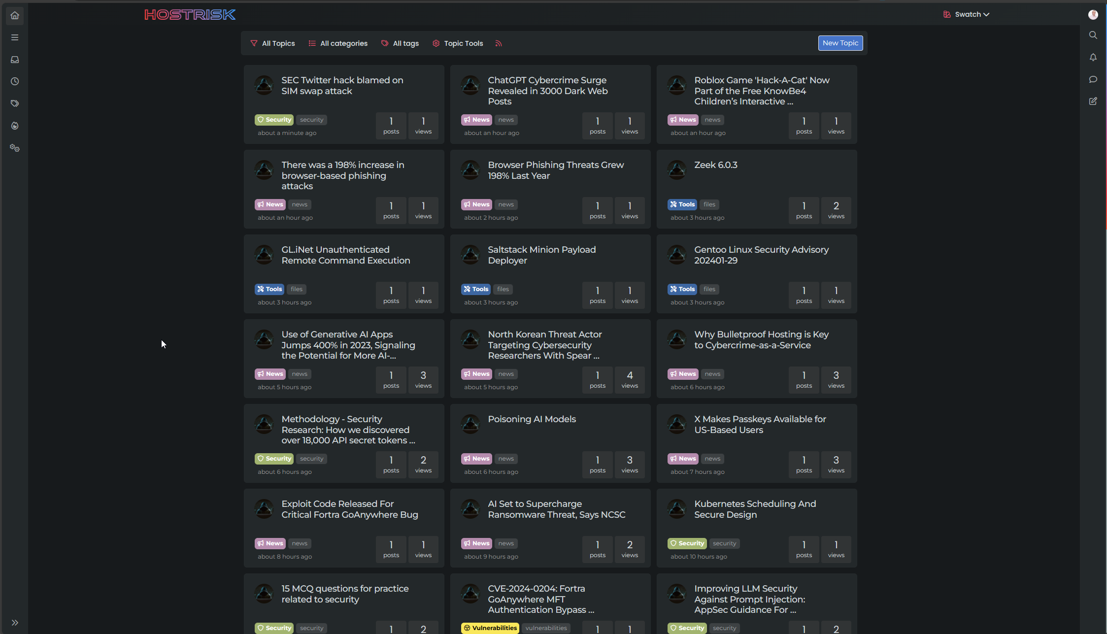
When the use those codes, the sub forums seems as below photo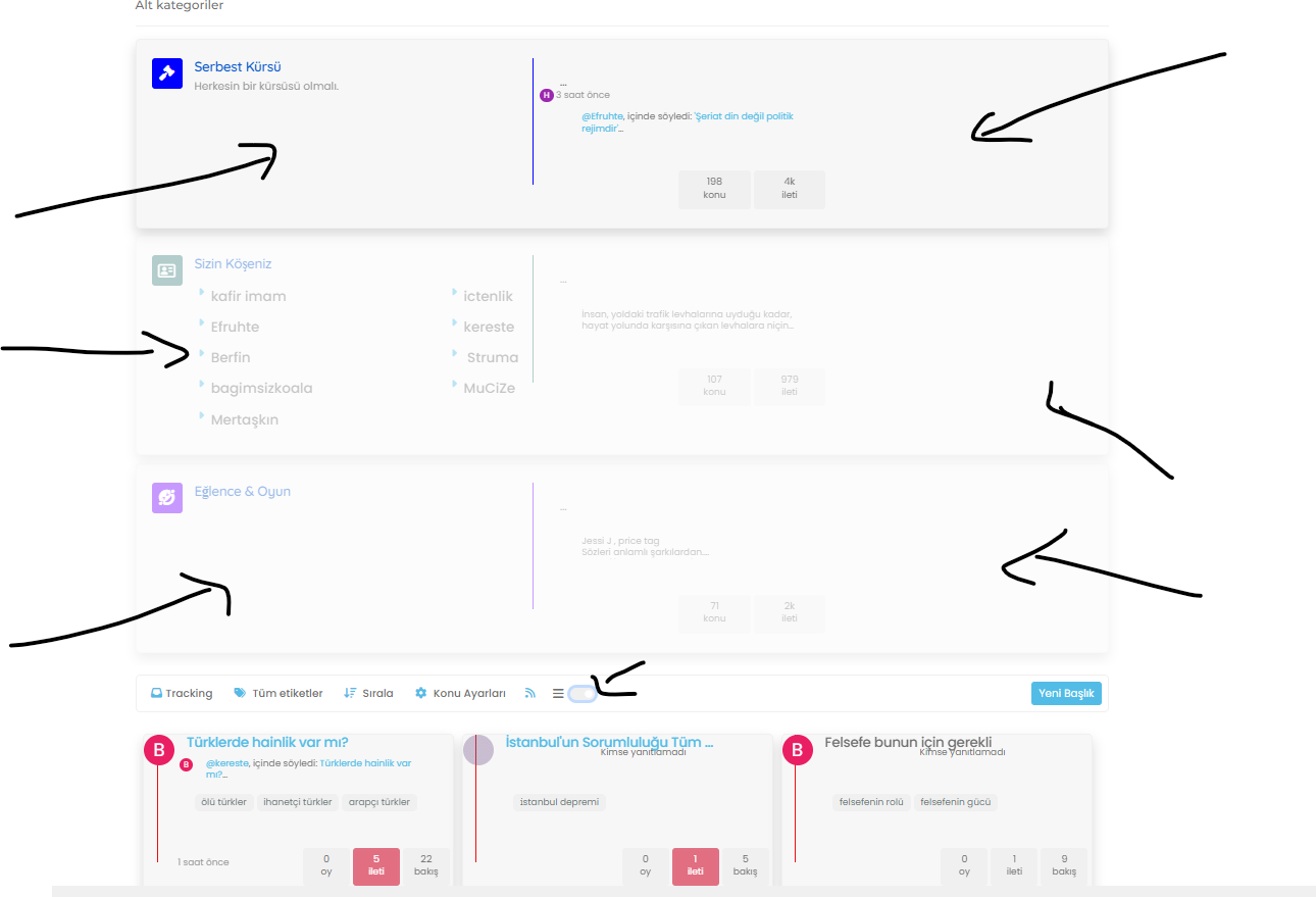
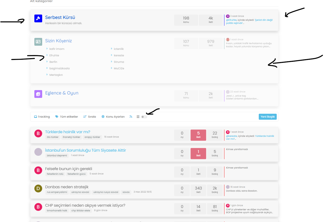
When disabled seems as below;

Hello! It looks like you're interested in this conversation, but you don't have an account yet.
Getting fed up of having to scroll through the same posts each visit? When you register for an account, you'll always come back to exactly where you were before, and choose to be notified of new replies (either via email, or push notification). You'll also be able to save bookmarks and upvote posts to show your appreciation to other community members.
With your input, this post could be even better 💗
Register Login